


“Selling outcomes, not hours.” — LinkedIn Banner
Quality
Certified
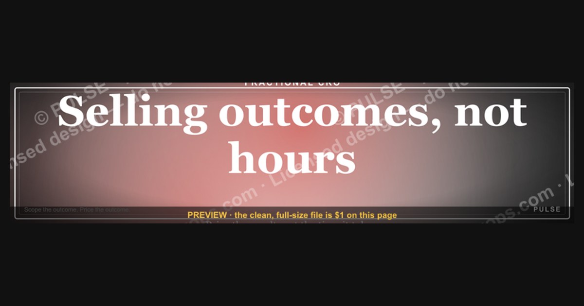
"Selling outcomes, not hours" is a positioning statement — and as a LinkedIn banner, it tells profile visitors in under two seconds that you price on results, not time. It works because the cover slot is the largest real estate on your profile and the only element a visitor sees before reading a single word of your headline.
The scenario: a fractional CRO whose profile keeps losing deals at the pricing conversation
Picture a fractional revenue operator six months into independent work. The pipeline is not the problem — connection requests get accepted, discovery calls get booked, and the work itself is solid. The problem shows up at minute thirty of every first call, when the prospect asks the same question: "So what's your hourly rate?"
Once that question is asked, the frame is set. Every subsequent sentence becomes a negotiation about time. The prospect mentally compares the number against an internal benchmark — what they pay a recruiter, what their last agency charged, what a full-time hire costs divided by 2,080 working hours. The conversation stops being about the $400K of stalled pipeline sitting in their CRM and starts being about whether $250 an hour is defensible.
The banner is one of the few levers that changes this before the call happens. When a prospect lands on a profile, the sequence of attention is well documented in basic visual hierarchy: the largest, highest-contrast element at the top of the page registers first, then the profile photo, then the headline, then the About section — and most visitors never reach the About section at all. A LinkedIn cover image occupies a 1584×396 pixel band, roughly 4:1, spanning the full width of the profile card. It is the single largest branded surface a professional controls on the platform, and by default it is either empty blue or a stock skyline photo doing zero work.
Putting "Selling outcomes, not hours." in that slot does something specific: it pre-loads the frame before the prospect reads anything else. By the time they get to the headline, they have already been told the pricing model. The hourly-rate question either doesn't get asked, or it gets asked in a softened form — "how do you usually structure engagements?" — which is a fundamentally easier question to answer.
The secondary line on this particular banner, "Trust · Scope · Impact," does a different job. It compresses an engagement sequence into three words: establish trust, define scope, deliver impact. A prospect who has been burned by a consultant who skipped straight to execution reads that as reassurance. A prospect who hasn't reads it as a process, which is still better than reading nothing.
None of this closes a deal. What it does is change which conversations you have and where they start. That is the honest scope of what a banner accomplishes — it is a frame-setter, not a sales asset, and treating it as more than that leads to the disappointment described further down this page.
How the banner actually moves someone from scroll to conversation
The mechanism is a chain, and each link has a measurable drop-off. Understanding where the drops happen tells you what the banner can and cannot fix.
Impression. Your profile gets viewed. This happens through three main paths: someone clicks your name from a post or comment, someone finds you in search or a recruiter tool, or someone clicks through from a connection request. LinkedIn surfaces a weekly profile-view count in the analytics panel, and for most individual operators that number is in the low double digits unless they are posting regularly. Posting is what drives the impression volume; the banner does nothing to increase it.
Frame. The visitor's eye lands on the cover image before anything else, because it is at the top and it is the largest element. This is where the banner works. The phrase has to be legible at both the desktop render and the mobile render — and this is the single most common execution failure, covered in the pitfalls section.
Read. The visitor reads the headline and possibly the first two lines of the About section, which is all LinkedIn shows before the "see more" fold. If the banner said "outcomes, not hours" and the headline says "Consultant | Available for hourly engagements," the contradiction registers as noise and the frame collapses. Consistency across banner, headline, and the top two About lines is what makes the frame hold.
Act. The visitor connects, messages, clicks a link, or leaves. The banner cannot contain a clickable link — LinkedIn cover images are not hyperlinked — so any call to action has to route through your featured section, your headline, or the website field.
The practical implication of the chain is that the banner is a conversion-rate lever on traffic you already have, not a traffic generator. If nobody views the profile, a perfect banner produces nothing. The order of operations for anyone building this out is: create the posting cadence that generates views first, then optimize the banner that converts them.
Real dimensions, file specs, and the numbers that actually matter
The LinkedIn personal profile cover image is 1584 × 396 pixels, a 4:1 aspect ratio. LinkedIn accepts JPG, PNG, and GIF for the cover slot, with a maximum file size of 8 MB. It does not accept SVG as a direct upload — which matters, because the source file for this banner is an SVG. The workflow is: edit the SVG, export a PNG at 1584×396 (or a 2× export at 3168×792, which LinkedIn will downscale and which renders more cleanly on high-DPI displays), then upload the PNG.
The crop behavior is where most banners break. LinkedIn overlays the profile photo on the lower-left of the cover on desktop, and on mobile the visible band narrows considerably while the photo overlay moves and grows proportionally. The practical rule that survives both renders: keep all critical text inside the center-right 60% of the canvas and away from the bottom 40% of the left third. For a 1584-wide canvas, that means your primary phrase should start no earlier than roughly x=350 and the baseline should sit in the upper half.
Text sizing on a 396-pixel-tall canvas: the primary phrase wants to be somewhere in the 48–72 px range at the 1584 export size. Below about 40 px, the phrase becomes hard to read on a phone. Above about 80 px, "Selling outcomes, not hours." starts wrapping to two lines or crowding the safe zone. The secondary line — "Trust · Scope · Impact" — sits comfortably at roughly 40–50% of the primary size, so 20–32 px, with generous letter-spacing so it reads as a supporting element rather than competing copy.
Contrast is the other hard number. Web Content Accessibility Guidelines set 4.5:1 as the minimum contrast ratio for normal text and 3:1 for large text (18 pt and above, which your banner text comfortably is). A dark banner with near-white text clears this by a wide margin. A mid-gray on dark navy does not. Any free contrast checker will give you the ratio in seconds, and it is worth checking because the banner renders on both light-mode and dark-mode LinkedIn, and a design that assumes one can look wrong in the other.
On the pricing side that the banner is signaling toward: the honest answer is that outcome-based fee ranges vary enormously by market, deal size, and the measurability of the outcome, and anyone quoting you a universal multiple is guessing. What holds across arrangements is the structural logic. If an engagement is credibly tied to a defined revenue improvement, the fee has to be small enough relative to that improvement that the buyer's return is obvious, and large enough relative to your delivery cost that a slower-than-expected timeline doesn't turn the engagement into a loss. Practitioners typically resolve this with a hybrid — a base retainer that covers delivery cost and a success component tied to a defined milestone — rather than pure contingency, precisely because pure contingency puts all timeline risk on the seller.
The metric worth tracking after you swap the banner is narrow and specific: what percentage of first calls open with an hourly-rate question. Log it for twenty calls before the change and twenty after. That is the only number that tells you whether the frame is doing its job. Profile views will not move — the banner doesn't drive traffic — and connection acceptance rates are too noisy at individual-operator volumes to read anything from.
Trade-offs: banner text, and what you give up by choosing this one
A cover image can carry exactly one message legibly. Choosing "Selling outcomes, not hours." means not choosing several other things that could occupy the same pixels, and each alternative has a real case.
A specific result claim — something like "Took a $2M ARR SaaS to $3.2M in 90 days" — is more concrete and more memorable than a philosophy statement. It works better if you have one flagship result and a narrow ICP that recognizes it. It works worse if your work spans several outcome types, because a single number narrows you. It also ages: a claim from three years ago starts reading as stale, and updating it means re-exporting the file every time you land a new flagship engagement.
A service description — "Fractional CRO for Series A–B SaaS" — is the clearest option for search-adjacent discovery and for visitors who don't know what you do. Its weakness is that it duplicates the headline, which sits eight pixels below it. Two elements saying the same thing waste the largest surface on the page.
A visual-only banner — brand marks, a product screenshot, a pattern — carries no claim but also no risk of contradiction, and it survives repositioning without a re-export. For anyone whose offer is still in flux, this is the low-regret choice.
"Selling outcomes, not hours." sits in the middle: less specific than a result claim, less descriptive than a service line, more committed than a visual. Its advantage is that it does a job no other option does — it disarms the pricing conversation before it starts. Its cost is that it is a *category* statement rather than a *you* statement. Plenty of consultants could run the same banner. It differentiates you from hourly billers; it does not differentiate you from other outcome-based operators.

There is also a live trade-off in how far you commit. The banner is cheap to change — an SVG edit and a re-upload, ten minutes. Your actual contract structure is not. A profile that promises outcome pricing while every engagement letter bills hours creates a gap that shows up on the first call, and prospects notice it immediately.
Pitfalls that kill the banner before anyone reads it
Text buried under the profile photo. The most common failure. A design that centers the phrase looks perfect in the editor and gets its left third occluded by the avatar on desktop. Always preview on both desktop and mobile after uploading, on a real profile, before deciding the banner is done.
Uploading the SVG. LinkedIn does not accept SVG for the cover slot. Export to PNG first. Keep the SVG as the master so you can recolor, re-letter, and re-export without quality loss — that is the entire reason the source file is vector.
Text too small on mobile. A phrase that reads fine on a 27-inch monitor can be unreadable on a phone, where the cover renders at a fraction of the width. The check is trivial: upload it, open LinkedIn on your phone, look at your own profile. If you have to squint, size up.
A banner that contradicts the rest of the profile. "Selling outcomes, not hours." above a headline reading "Consultant | $250/hr" is worse than no banner at all, because the contradiction is visible in a single glance and reads as either carelessness or dishonesty. The banner is the top of a stack — headline, first two About lines, and featured section all have to agree with it.
Treating the banner as the strategy. The banner signals a pricing model. It does not create one. If a prospect asks "so how do you actually price this?" and the answer is improvised, the signal was hollow. Before shipping the banner, be able to state your structure in two sentences — what the base covers, what the success component is tied to, how the outcome gets measured, and what happens when a deliverable falls outside scope.
Promising outcomes you cannot measure. "Better strategy" is not an outcome, it is a feeling, and pricing against it invites disputes. Convert vague promises into verifiable deliverables: a documented plan with a named number of prioritized channels, a forecast covering a defined period, a hiring roadmap. If you cannot describe how the outcome gets checked, you cannot price against it — and a banner that promises otherwise is writing a check your contracts have to cash.
Attracting pure-contingency shoppers. Some readers interpret "outcomes, not hours" as "only pays on success." That subset skews toward buyers with broken products or unrealistic timelines. Handle it in your first reply, not in the banner: outcome pricing means the engagement is structured around a defined result, not that the work is free until it lands.
Never updating it. A banner is a positioning artifact, and positioning drifts. Revisit it when your ICP, your offer, or your pricing structure changes — and note that this file is an SVG specifically so that recoloring to your brand palette, swapping the background, and re-exporting takes minutes rather than a redesign.
Related questions
Does a LinkedIn banner affect search ranking on the platform?
No. LinkedIn's people-search relevance draws on text fields — headline, About, experience, skills, and keywords in your posts. Image files carry no indexable text. The banner affects conversion of visitors who already found you, not whether they find you.
Can I put a clickable link in my LinkedIn cover image?
No. The cover image is not a hyperlink. Route calls to action through the website field beneath your headline, a Featured section link, or a link in your About text. Printing a URL on the banner forces manual typing and almost never gets used.
What size should the banner be for a Company Page instead of a personal profile?
Company Page cover images use a different specification from the 1584×396 personal profile cover, and LinkedIn publishes current dimensions in its Help Center. Check there before exporting, since page and profile specs have diverged and changed over time.
Should the banner match my website's colors?
Ideally yes — a visitor moving from profile to site should recognize the same palette. The SVG source exists for this: recolor to your brand, change or clear the background, re-export. Consistency across surfaces makes an independent operator look like an established practice.
How often should I change my LinkedIn banner?
There is no engagement benefit to rotating it. Change it when the underlying positioning changes — new ICP, new offer, new pricing structure — or when a claim on it goes stale. Otherwise leave it; recognition compounds with repetition.
FAQ
What exactly does "Selling outcomes, not hours" mean?
It means the engagement is priced against a defined result — a revenue target, a shipped system, a documented plan — rather than against elapsed time. The buyer purchases a destination instead of a meter. It does not mean unlimited work, and it does not mean free work until the result lands.
What are the exact dimensions and file format for this banner?
1584 × 396 pixels, a 4:1 ratio. LinkedIn accepts JPG, PNG, and GIF up to 8 MB for the profile cover, but not SVG. Export the vector source to PNG — a 2× export at 3168 × 792 renders more crisply on high-DPI screens and LinkedIn downscales it cleanly.
Where do I put the text so the profile photo doesn't cover it?
Keep critical copy in the center-right 60% of the canvas and out of the bottom-left corner. The avatar overlays the lower-left on desktop, and mobile crops the sides while enlarging the avatar. Preview on both after uploading — the editor preview is not reliable.
Can I edit this banner to add my own name or brand colors?
Yes. It ships as SVG, which opens in Figma, Illustrator, Canva, PowerPoint, and any browser. Recolor the fills, change or clear the background, add your name or a secondary line, then export a PNG at 1584 × 396. No attribution required.
Will this banner get me more profile views?
No, and no banner will. Views come from posting, commenting, search appearances, and outreach. The banner converts views you already have into conversations that start from the right frame. Fix the traffic problem first if there isn't any traffic.
Should I use this banner if I still bill hourly?
Not without changing something. The gap surfaces on the first call and costs more credibility than the banner gains. Either restructure at least some engagements around defined outcomes, or pick a banner message that matches how you actually work today.
Sources
- https://www.linkedin.com/help/linkedin — LinkedIn Help Center, official image sizes and profile specifications
- https://www.w3.org/WAI/WCAG21/Understanding/contrast-minimum.html — W3C, minimum text contrast ratios
- https://developer.mozilla.org/en-US/docs/Web/SVG — MDN Web Docs, SVG format reference and editing behavior
- https://hbr.org/topic/subject/pricing — Harvard Business Review, pricing strategy and value-based pricing coverage
- https://www.mckinsey.com/capabilities/growth-marketing-and-sales/our-insights — McKinsey & Company, pricing and commercial strategy insights
- https://www.nngroup.com/articles/ — Nielsen Norman Group, research on visual hierarchy and scanning behavior
- https://www.ama.org/marketing-news/ — American Marketing Association, customer value perception research
- https://www.forbes.com/business/ — Forbes, coverage of outcome-based and subscription business models
Related on PULSE
- "Selling better outcomes." — LinkedIn Banner
- "Selling expertise and outcomes." — LinkedIn Banner
- "People buy outcomes, not features." — Quote Card
- Sell outcomes, not features. — LinkedIn Wallpaper
- "People buy outcomes, not features." — LinkedIn Banner
- The Value Selling Ladder — Infographic
This page will be disappearing soon. Save it to your device for $1 — or read it free while it is here.
@Kory-White- · if Venmo asks, the last 4 of my number are 2012
This page is gone.
This one is off the shelf now. $1 keeps it on your phone for good — the whole page, pictures and diagrams included.
 graphicStartup Founder — LinkedIn Banner
 graphic“Sell the problem, not the product.” — LinkedIn Banner
 graphicInspect. Qualify. Commit. — LinkedIn Wallpaper
 graphic“More pipeline, less panic.” — LinkedIn Banner
 graphicSpeech-to-Text Operator — LinkedIn Banner
 graphicVector Database CTO — LinkedIn Banner
 graphicSell outcomes, not features. — LinkedIn Wallpaper
 graphic“Clarity closes.” — LinkedIn Banner
 graphicComputer Vision Engineer — LinkedIn Banner
 graphicField Sales Rep — LinkedIn Banner