


“Clarity closes.” — LinkedIn Banner
Quality
Certified
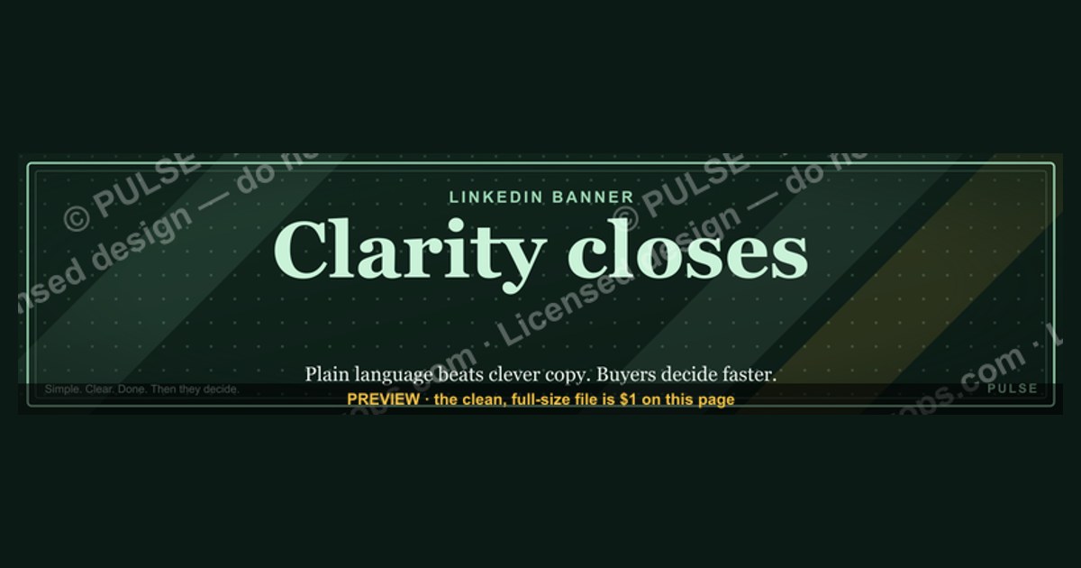
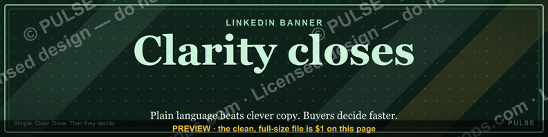
This is a LinkedIn profile banner (1584×396 px) that reads "Clarity closes." in bold serif type against a solid dark background. It is a free downloadable PNG designed for sales, RevOps, and consulting professionals who want their LinkedIn banner to signal a philosophy — that clear communication, not pressure or volume, is what moves deals to close — before a visitor ever reads the headline below it.
What this banner is and why the line works
The graphic itself is deliberately simple: a single line of text, "Clarity closes." set in a serif weight (echoing the confidence of a pull-quote rather than the utility feel of a sans-serif dashboard font), centered or left-third aligned depending on the export, sitting on a near-black or deep-charcoal field. There is no logo lockup baked into the file, no secondary tagline, no photography — just the four words and negative space. That restraint is the point. A LinkedIn banner is viewed for roughly one to two seconds before a visitor's eye drops to your profile photo and headline, so anything busier than a single message competes with itself and loses.
"Clarity closes." is built as a maxim, not a slogan — it reads like something a sales leader would say in a QBR, not something a marketing team would write for an ad. That distinction matters because LinkedIn banners function as unpaid, always-on identity statements. Unlike a post, which disappears from view within days, a banner sits behind your name every time someone opens your profile: after a connection request, after a comment, after a cold outreach reply. It is one of the few pieces of LinkedIn real estate a person controls completely and that gets re-seen dozens of times by the same audience without you doing anything.

The underlying message — clarity, not clever positioning or aggressive framing, is what actually closes revenue — targets a specific audience: sellers, account executives, RevOps leaders, sales enablement managers, and founders doing their own selling. For that audience, the line works as a small credibility signal. It tells a prospect scanning a LinkedIn profile before a call, "this person values being direct with you," which lowers guard before the conversation even starts. For a hiring manager or investor skimming a founder's profile, the same four words imply an operating philosophy: this person doesn't hide behind jargon.
Where it can misfire is contrast with content. If a profile's actual posts are dense with acronyms, stacked frameworks, or hard-sell CTAs, "Clarity closes." reads as ironic rather than aspirational — visitors notice the gap between banner and behavior fast. The banner is a promise the rest of the profile has to keep.
Building the banner: layout, wording, and step-by-step setup
The production and install path for this asset follows a short, repeatable sequence, whether you're using the file as-is or rebuilding it in your own brand kit.
First, confirm the canvas. LinkedIn's desktop banner renders at 1584×396 px (a 4:1 ratio), but the platform crops differently on mobile and when the profile photo overlaps the left side of the banner — roughly the left 200–250 px and a vertical band behind the photo circle are frequently obscured on phones. That is why the text in this graphic sits right-of-center or dead-center rather than flush left: text placed too close to the left edge gets clipped by the profile photo on most viewports.
Second, set the typography hierarchy. Because there is only one line of copy, the entire visual weight rests on font choice, tracking, and size. A serif at roughly 72–96pt (scaled to the 1584 px canvas) reads clearly even when LinkedIn's CDN compresses the image, which it does aggressively. Sans-serif works too, but serif carries more "stated principle" gravity, which fits the maxim format better than a rounded, friendly sans would.
Third, choose contrast, not decoration. A dark ground (near-black, deep navy, or charcoal) with light or gold-toned text reads at a glance and survives LinkedIn's compression without banding. Busy gradients, photography, or texture behind text tend to reduce legibility once the platform re-compresses the upload, so flat or near-flat backgrounds outperform textured ones for a text-only banner.
Fourth, export and upload. Save as a PNG (not JPEG, to avoid compression artifacting on flat color fields) at the native 1584×396 dimensions. On LinkedIn, go to your profile, click the pencil/edit icon on the existing banner or the camera icon if none exists, upload the file, and use LinkedIn's built-in crop tool to confirm the safe zone around your profile photo isn't cutting into the text.
Fifth, pair it with the headline. The banner states a philosophy; the 220-character headline beneath your name should give it a subject — role, outcome, or specialty — so the pairing reads as one thought: banner sets the frame, headline supplies the specifics (title, who you help, what outcome you drive).
Costs, timelines, and typical specs for a banner like this
As a downloadable, pre-built asset, the direct cost is zero and the timeline is however long it takes to download and upload — typically under two minutes. But it's worth knowing the surrounding cost and time ranges if you want to customize it or commission something similar, because the effort scales sharply with how much you change.
If you're using the PNG as delivered, swapping nothing, expect a two-step process: download, then upload through LinkedIn's own banner editor. LinkedIn's crop tool is free and built into every account tier, so there's no software purchase required at this stage.
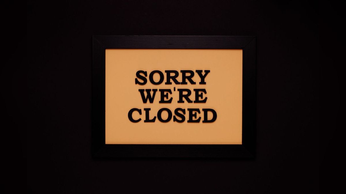
If you want to adjust the wording, font, or colors yourself, a free design tool with a preset LinkedIn banner template (1584×396) gets a competent non-designer to a finished export in 10–20 minutes. Recoloring text, swapping the line for a different maxim, or changing the background from charcoal to a brand color are all single-layer edits in most template-based tools and don't require design skill beyond dragging and typing.
If you want a fully custom, on-brand version — your logo mark integrated, a custom typeface matched to your other marketing assets, multiple export variants for A/B testing — that's realistically a freelance design task. Simple, single-message banner commissions on freelance marketplaces typically run in the neighborhood of $25–$150 for a one-off, with turnaround in 24–72 hours; a design agency doing it as part of a larger personal-branding package will price it inside that package rather than as a line item, and turnaround stretches to a week or more because it's sequenced behind other deliverables.
For teams standardizing this across a sales org — say, giving every AE and SDR a matching "Clarity closes." or house-slogan banner — the real cost isn't the design, it's the rollout: getting 10, 50, or 200 reps to actually update their profile. That's a change-management problem, not a design problem, and the realistic timeline is measured in weeks, not days, because it depends on reminders, not effort. A short Slack message with the file attached and a one-line instruction converts a meaningfully higher percentage of reps than a corporate brand-guidelines PDF; specificity of the ask, not thoroughness of the guidelines, is what moves adoption.

There's also a refresh cadence worth planning for. Banners don't need frequent updates, but a slogan-only banner left unchanged for a year or more starts to read as neglected on an otherwise active profile — most people quietly refresh personal branding assets every two to four quarters, in step with a new role, a new quota, or a new positioning push, not on a fixed schedule.
Where teams get LinkedIn banners wrong
The most common failure is treating the banner as decoration rather than message real estate. Stock photography of handshakes, skylines, or generic "team collaborating" imagery fills the space without saying anything, so a visitor's eye slides past it entirely. A banner that states a specific point of view — like "Clarity closes." — gets noticed precisely because it's rare; most profiles in any given feed or search result default to the same three or four stock-photo categories.
The second failure is illegibility at small sizes. LinkedIn displays the banner large on desktop but shrinks it dramatically in some contexts — search result previews, certain mobile layouts — and text under roughly 60pt on the 1584 px canvas, or text with low contrast against its background, disappears at those smaller renders. Designers who preview only at full desktop size miss this and ship banners that read fine in Photoshop and fail on a phone.

Third, teams frequently ignore the profile-photo overlap zone. Placing text, especially the first word of a sentence, in the left 200–250 px means it's partially or fully hidden behind the circular profile photo on most devices. This is the single most common reason a otherwise well-designed banner looks broken once it's live — it tested fine as a flat file and only failed after upload, which is why a live preview check (not just an export check) matters.
Fourth is message-behavior mismatch, already noted above: a banner claiming "clarity" sitting above a headline stuffed with buzzwords, or above a feed of hard-sell posts, undermines itself. The banner is read in context with everything else on the profile, not in isolation, so consistency between the stated value and the visible behavior matters more than the banner's design quality.
Fifth, teams over-rotate the message. A banner is not a campaign asset that needs weekly refreshing — changing it too often (chasing every new company initiative or slogan) reads as indecisive rather than current, and it forfeits the compounding recognition value of a consistent visual anchor that connections come to associate with you specifically.
Finally, some teams skip testing the crop entirely and only discover a problem when a colleague or prospect mentions the banner looks cut off. A thirty-second check — uploading the file and viewing your own profile on both desktop and a phone browser before telling anyone it's "done" — catches nearly every layout failure described above.
Decision framework: customizing this banner for your team

Not every team should use "Clarity closes." verbatim, and not every team should build a fully custom banner from zero. The right choice depends on how much the line already matches your actual selling philosophy, and how much bandwidth you have for design and rollout.
If the phrase genuinely matches how your team sells — direct, consultative, allergic to jargon — use the banner as-is or with only a color swap to match brand palette. There's no upside to reinventing wording that already fits; the effort is better spent on rollout (getting the team to actually upload it) than on redesign.
If your selling philosophy is different but adjacent — say, "Trust closes," "Speed closes," or a phrase specific to your category — keep the exact layout, font, and contrast approach from this banner and swap only the four-word line. This preserves everything that makes the format work (legibility, safe-zone placement, restraint) while making the message accurate to your team.

If you want the banner to carry a logo mark or a more complex brand system, budget for the freelance or agency path described above, and plan for a longer timeline — this is no longer a same-day swap, and it's worth doing once, correctly, rather than iterating live on LinkedIn.
If you're rolling this out to more than a handful of people, treat it as a change-management project: pick one finished file (or a very small set of on-brand variants), send it directly to each person with upload instructions rather than a link to a shared drive, and follow up once after a week. Standardization efforts that rely on people finding time to design their own version generally stall; ones that hand over a finished file generally don't.
Related questions
What size should a LinkedIn banner be?
1584×396 px is LinkedIn's standard desktop banner size (a 4:1 ratio). Export at that exact resolution as a PNG to avoid LinkedIn's cropping or compression introducing artifacts or clipping text near the edges.
Why does my LinkedIn banner text look cut off on mobile?
The circular profile photo overlaps roughly the left 200–250 px of the banner on most mobile layouts. Keep important text centered or right-of-center, and preview the live upload on a phone before calling it finished.
Should my LinkedIn banner have a photo or just text?

Text-only banners with a strong single message often outperform photography for personal branding, because they state a clear point of view instead of blending into generic stock-image visuals used across thousands of other profiles.
How often should I update my LinkedIn banner?
There's no fixed rule, but most people refresh personal-branding assets like this every two to four quarters, or when a role, positioning, or quota focus genuinely changes — not on a rigid calendar.
Can I use this banner for my whole sales team?
Yes — treat it as a rollout, not just a design task. Send the finished file directly to each rep with a one-line instruction rather than relying on a shared drive or brand guidelines document.
FAQ
What does the "Clarity closes." LinkedIn banner say and look like? It's a text-only banner reading "Clarity closes." in bold serif type, centered or right-of-center, on a flat dark (near-black or charcoal) background at LinkedIn's standard 1584×396 px size — no photo, logo, or secondary tagline included in the base file.
Is the banner free to download and use?

Yes. It's provided as a free PNG download. There's no cost to use it as-is; costs only arise if you commission a custom redesign with your own logo or typeface.
What file format and size do I need to upload it to LinkedIn? Upload a PNG at the native 1584×396 px resolution. PNG avoids the color-banding that JPEG compression can introduce on flat, solid-color backgrounds like this one.
Will the text get cut off by my profile photo? It shouldn't, because the layout keeps text out of the left-edge zone that LinkedIn's circular profile photo typically overlaps — but always preview the live upload on both desktop and mobile before considering it final.
Can I change the wording to match my own team's philosophy? Yes. Keep the same layout, font weight, and contrast approach, and swap only the four-word line for a phrase that matches how your team actually sells — that preserves the legibility and restraint that make the format work.
Does a banner like this actually help with sales or networking? It functions as a passive credibility signal, not a direct sales tool — it's seen repeatedly by the same connections and prospects and can lower guard before a call or reply, but it works only if the rest of your profile and behavior support the message.
Sources
- https://www.linkedin.com/help/linkedin/answer/a566331
- https://business.linkedin.com/marketing-solutions/success/best-practices/linkedin-profile-best-practices
- https://www.canva.com/create/linkedin-banners/
- https://www.adobe.com/express/create/banner/linkedin
- https://blog.hootsuite.com/linkedin-banner-size/
- https://buffer.com/library/linkedin-cover-photo/
- https://sproutsocial.com/insights/linkedin-banner-size/
Related on PULSE
- How to write a LinkedIn headline that converts profile views into replies
- The ideal LinkedIn posting cadence for individual sales reps
- Personal branding checklist for account executives and RevOps leaders
- How to standardize sales team profiles without killing individuality
- Free downloadable graphics for sales and RevOps LinkedIn profiles
This page will be disappearing soon. Save it to your device for $1 — or read it free while it is here.
@Kory-White- · if Venmo asks, the last 4 of my number are 2012
This page is gone.
This one is off the shelf now. $1 keeps it on your phone for good — the whole page, pictures and diagrams included.
 graphicVector Database CTO — LinkedIn Banner
 graphic“Available for sales consulting.” — LinkedIn Banner
 graphicPredictable revenue, by design. — LinkedIn Wallpaper
 graphic"Build, don't chase." — LinkedIn Banner
 graphic“Sell the problem, not the product.” — LinkedIn Banner
 graphicSell outcomes, not features. — LinkedIn Wallpaper
 graphicInspect. Qualify. Commit. — LinkedIn Wallpaper
 graphic“Ready to lead a sales team.” — LinkedIn Banner
 graphicOffensive Security Pentest CRO — LinkedIn Banner
 graphicFractional CRO — LinkedIn Banner