


“People buy outcomes, not features.” — LinkedIn Banner
Quality
Certified
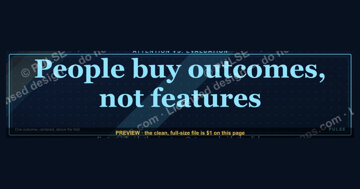
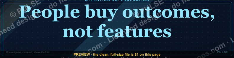
The line signals that buyers care about the result you produce, not the mechanics you use to produce it. On a LinkedIn banner it works because the cover slot gets seconds of attention, so a single promised outcome — faster onboarding, fewer lost deals, predictable revenue — earns a profile scroll where a feature list earns a bounce.
What the phrase is really claiming, and why a banner is the right place for it
The claim underneath "People buy outcomes, not features" is narrower than it sounds. It is not that features are irrelevant — nobody signs a contract without eventually checking whether the thing works. It is that features are *evaluation* criteria, while outcomes are *attention* criteria. A buyer uses outcomes to decide whether to engage at all, and features to decide whether to sign once they are already engaged. Putting evaluation criteria in the attention slot is the mistake the banner is correcting.
The LinkedIn cover image is the purest attention slot on a professional profile. It occupies roughly 1584 × 396 pixels at full desktop width, sits above your name and headline, and is the first pixel-dense object a visitor's eye lands on before it drops to the headline text. On mobile the same file is cropped hard — the safe center band is much narrower than the full canvas, and the profile photo covers part of the lower-left. That cropping behavior alone rules out feature lists: three bullets of capability copy will be clipped, shrunk, or hidden behind an avatar. One short outcome statement, centered and set large, survives every crop.
There is a second reason the banner is the right surface. Everything else on a LinkedIn profile is text the visitor must read sequentially — headline, about, experience, recommendations. The banner is the only element processed as an image, which means it is processed roughly in parallel with everything else in the viewport rather than in sequence. A promise delivered as an image lands before the reading starts. That is why "Your team stops losing deals to slow follow-up" as banner art outperforms the identical sentence buried in paragraph three of your About section: same words, radically different position in the visitor's processing order.

The trade-off is real and worth naming. Outcome-first messaging is less specific about *what you actually sell*. A banner that reads "Predictable revenue, quarter after quarter" tells a visitor nothing about whether you are a consultant, a SaaS product, a fractional executive, or an agency. That ambiguity is fine when your headline immediately resolves it — the banner sets the stakes and the headline names the category. It is a problem when the headline is also vague, and you end up with a profile that promises a transformation nobody can place. The working rule: the banner carries the outcome, the headline carries the category, and the About section carries the features. Each layer answers a different question, in the order the visitor asks them.
One more nuance that gets lost in the mantra. Outcomes are not the same as benefits, and benefits are not the same as adjectives. "Powerful reporting" is an adjective. "Better visibility into your pipeline" is a benefit — directionally right, but abstract. "You walk into the forecast call already knowing which three deals will slip" is an outcome, because it describes a specific moment in the buyer's week that changes. The gradient from adjective to benefit to outcome is the actual work of writing the banner, and most drafts stop one step too early.
Building the banner from a real outcome, step by step

The process below produces a banner you can defend, rather than a slogan you liked the sound of. It runs about two to four hours of actual work spread over a week, mostly because the evidence-gathering step involves other people.
Step one: harvest the language from real conversations. Pull five to ten recent won-deal notes, renewal calls, or client kickoff transcripts. Look specifically for the sentence where the buyer described what changed after working with you — not what they bought, what changed. These sentences are almost never in your marketing copy, because they use the buyer's vocabulary, not yours. If you have no notes, ask three current clients directly: "What is different in your week now versus before?" Their answers are your raw material. This is the step people skip, and it is the reason most outcome banners still sound like they were written by the seller.
Step two: strip to a single outcome. You will surface four or five candidate outcomes. Pick one. Not two joined by an ampersand — one. The banner has room for roughly six to ten words at a legible size, and a compound promise reads as neither. When choosing, favor the outcome that is (a) hardest for a competitor to also claim and (b) closest to something the buyer is already worried about this quarter. An outcome nobody is currently anxious about is technically true and commercially inert.
Step three: test the sentence at three specificity levels. Write your chosen outcome as an adjective, as a benefit, and as a scene. Read all three aloud. The scene version is almost always the one that survives, but occasionally it is too long for the canvas and the benefit version wins on legibility. That is an acceptable trade — legibility beats vividness, because an unreadable banner has an outcome of zero.
Step four: lay it out for the crop, not the canvas. Set your text inside the horizontally centered safe zone and vertically above the lower-left region where the profile photo overlaps. Use one weight for the promise and, if you need a second line, set it at roughly 40–50% of the primary size so the hierarchy is unmistakable at thumbnail scale. Test by shrinking the export to 300 px wide and looking at it on your phone — if the promise is still readable there, it is readable everywhere.
Step five: match the banner to the headline and the first featured item. A visitor who reads "Fewer deals stall in procurement" on the banner should find the category in the headline within one second, and a proof artifact — a case write-up, a short post, a testimonial — in the Featured section within one scroll. A banner that promises something the rest of the profile never substantiates reads as bluster and costs more trust than a boring banner would have.
Step six: ship it and mark the date. Changing your cover image does not notify your network, so you can iterate without cost. Write down the swap date somewhere you will find it, because you cannot evaluate the change without knowing when it happened.
What it costs, how long it takes, and what to expect from the numbers
The direct cost of an outcome-driven banner ranges from zero to a few hundred dollars, and the spread is almost entirely about who does the design rather than who does the thinking.

Do it yourself with a template. Free to low cost. Canva, Figma, PowerPoint, and Google Slides all export a clean 1584 × 396 image, and any of them will do the job if you keep the design to text on a solid or gently gradient background. Budget one to two hours once you have the sentence. The failure mode here is decoration creep — stock photography, three fonts, a drop shadow — which reliably lowers legibility at the size the banner is actually viewed.
Hire a freelance designer. Typically a modest per-project fee on the common freelance marketplaces, usually delivered in two to five business days. Worth it if your brand already has established type and color and you want the banner to match a deck and a site. Give the designer the finished sentence — do not ask a designer to figure out your outcome. That is a positioning task, not a design task, and paying design rates for it produces a beautiful banner that says nothing.
Have it done inside a brand refresh. If you are already paying an agency for identity work, the banner is a line item that rounds to nothing. The real cost is calendar time, because it queues behind everything else.
The time costs that actually matter are not design hours. Step one — harvesting client language — takes the longest in wall-clock terms because it depends on other people replying. Plan on three to seven days from asking to having usable quotes. The sentence-writing step takes twenty to forty minutes if you have the raw quotes and three days if you do not, which is the whole argument for doing step one properly.
On results, be careful with the numbers you accept. Claims that outcome banners multiply inbound engagement circulate widely and are rarely tied to a controlled comparison. What you can measure yourself, cheaply and honestly: LinkedIn's profile-view count over matched 30-day windows, connection-request volume, the reply rate on outbound where the recipient viewed your profile first, and the share of inbound messages that reference the promise on the banner. That last one is the most diagnostic and the least tracked. If people start opening conversations with language from your banner, the banner is doing its job regardless of what the view counter says.

Set expectations on magnitude. A banner change is a conversion-rate lever on traffic you already get, not a traffic-generation lever. If twenty people look at your profile a month, a perfect banner still gets you a handful of extra conversations at most. The banner is worth doing because it is cheap and permanent, not because it is the growth channel. The pairing that actually moves numbers is a clear outcome banner plus a reason for people to arrive at the profile in the first place — posting, outbound, speaking, referrals. Fixing the banner while nobody visits is optimizing an empty room.
Where this goes wrong in practice
Choosing an outcome you cannot substantiate. The most common failure is promising a result you have delivered once, or never, because it sounds impressive. This costs you on the second interaction rather than the first: the prospect arrives at a discovery call expecting the banner's promise and hears a different story. If your honest range is wide, say the honest range or say the qualitative version. A vaguer true claim outperforms a sharper false one every time, because the sharper claim gets tested.
Writing the outcome from your side of the table. "I help companies scale revenue" is an outcome for you, not for the buyer. The buyer's version is what changes in their job: the board meeting they stop dreading, the hire they no longer have to make, the report they stop assembling by hand. Test every draft by asking whether the sentence describes a change in the *reader's* week. If it describes a change in your revenue, rewrite it.
Making the banner do the headline's job. Because the outcome sentence is deliberately category-agnostic, some people compensate by cramming the category, the outcome, a URL, and a call to action onto one image. At banner scale that produces four unreadable elements instead of one readable one. Let the headline carry the category. Let the Featured section carry the call to action. The banner carries one thing.
Ignoring the mobile crop. A large share of LinkedIn traffic is mobile, where the cover is cropped to a much narrower band and partially obscured by the profile photo. Designs that put the promise at far-left or far-right vanish. This is a pure QA failure and takes ninety seconds to catch — open your own profile on your phone after publishing.
Contrast that fails in dark mode or on a bad screen. Mid-gray text on a mid-blue field passes on a calibrated monitor and disappears on a phone in sunlight. Push toward high contrast; the banner is read in worse conditions than you designed it in.
Treating "no features" as a rule instead of a sequencing principle. Buyers do eventually want the mechanism. A profile that never explains what you actually do — no methodology, no scope, no deliverables anywhere — reads as evasive, and evasive is worse than boring. Outcomes go first because they earn attention. Features go later because they close. Dropping the second half is not following the principle; it is misreading it.
Changing the banner and changing nothing else. The banner is a promise. If your About section still opens with a list of tools and your Featured items are unrelated, the visitor experiences a mismatch they will not articulate but will act on. Swap the banner as part of a profile pass, not as an isolated edit.

Never measuring, then declaring it worked. Because banner swaps are free and invisible, people change them constantly and attribute every good week to the current version. Pick a version, leave it up for at least 30 days, and compare against a matched prior window before deciding.
Choosing what to put on the banner, given where you actually are
Not everyone should lead with a hard outcome number, and the right choice depends mostly on what evidence you have and who is looking. Four practical positions:
You have repeatable, documented results and a narrow audience. Lead with the specific outcome, stated at the level of a scene or an honest range. This is the strongest position and the one the phrase is written for. Pair it with a Featured item that substantiates the claim within one click.
You have results but they vary a lot by client. Lead with the *category* of outcome rather than a number — the change in the buyer's week, not the percentage. You keep the emotional pull without writing a number you would have to walk back. This is where most consultants and fractional operators actually sit, and where invented statistics do the most damage.
You are early, with few or no case results. Lead with the problem you are pointed at, framed as the reader's situation. Naming the problem precisely still signals competence — it demonstrates you understand the buyer's world — without claiming a result you have not produced. Swap to an outcome claim the moment you have one you can defend.

Your audience is recruiters or peers rather than buyers. The outcome frame still applies but the outcome is different: what a team gets when they hire you, not what a client gets when they buy. A banner optimized for buyers can read as sales noise to a hiring manager. Know which audience your profile is actually serving this quarter and write for that one.
Across all four, apply the same two filters before publishing. First, the substantiation filter: can you point to something within one click that supports the claim? Second, the specificity filter: would a stranger in your target audience know, in about two seconds, whether this is for them? A banner that fails the first is a liability; one that fails the second is merely wasted space.
Revisit the choice when your evidence changes, not on a calendar. The trigger to rewrite is a new defensible result, a shift in who you are selling to, or a repeated piece of feedback that people cannot tell what you do. Absent one of those, leave it alone and let it accumulate impressions.
Related questions
How many words should the banner line be?
Roughly six to ten. That is what stays legible across the desktop canvas and the mobile crop at a size that reads as deliberate. Longer lines force smaller type, and smaller type on a cover image is functionally invisible on a phone.
Should the banner include my logo?
Only small and to one side, if at all. On a personal profile the logo competes with the promise for the single largest piece of attention you get. On a company page it belongs. The banner has room for one dominant element, and on a personal profile that should be the sentence.
Can I put a call to action on it?

You can, but it rarely earns its space. The banner is not clickable, so the CTA cannot be acted on directly — a visitor has to remember it and find the link elsewhere. If you include one, keep it to two or three words and let the promise stay dominant.
How often should I change it?
When your evidence or your audience changes, not on a schedule. Leave any version up at least 30 days so you can compare against a matched prior window. Constant swapping makes it impossible to tell whether anything worked.
Does this apply to a company page banner too?
Yes, with one adjustment. Company page covers crop differently and carry the logo separately, so you get slightly more room for the promise. The sequencing logic is unchanged: outcome earns the scroll, the page description carries the category, the products section carries the features.
FAQ
What does "People buy outcomes, not features" actually mean?
It means buyers use outcomes to decide whether to pay attention and features to decide whether to sign. The classic illustration is that someone buying a drill wants a hole, not a drill. In B2B the same holds: clients pay for a solved problem, and the methodology is how you deliver it, not what they are buying.
Isn't this advice a cliché by now?
The phrase is, but the execution rarely is. Most profiles still lead with capabilities, tooling, or years of experience, which means the principle is widely repeated and thinly applied. What makes a banner feel fresh is not the concept — it is that the outcome came from a real client's words rather than a template.

Does this mean I should hide my features entirely?
No. Sequencing is the point, not suppression. The banner carries the outcome, the headline carries the category, and the About and Featured sections carry the mechanism. A profile that never explains what you actually do reads as evasive, which costs more trust than a plain feature list would.
What if I don't have client results yet?
Lead with a precisely named problem instead of a claimed result. Demonstrating that you understand the buyer's situation in specific terms still signals competence, and it does not commit you to a number you cannot defend. Upgrade to an outcome claim as soon as you have one you can substantiate.
How do I know whether the new banner is working?
Compare matched 30-day windows on profile views, connection requests, and inbound message volume — and watch for the strongest signal, which is people quoting your banner language back to you when they reach out. Do not change anything else on the profile during the window, or you cannot attribute the difference.
Does the same principle work outside sales and marketing?
Broadly, yes, because it is about the order in which people evaluate things rather than about any one industry. A surgeon's patients care about restored function, a designer's clients care about how their brand is perceived. Identify the change your audience actually values, then lead with that and keep the mechanism for later.
Sources
- https://hbr.org/2005/12/marketing-malpractice-the-cause-and-the-cure
- https://www.linkedin.com/help/linkedin/answer/a522734
- https://hbr.org/2016/09/know-your-customers-jobs-to-be-done
- https://www.nngroup.com/articles/f-shaped-pattern-reading-web-content-discovered/
- https://www.nngroup.com/articles/legibility-readability-comprehension/
- https://www.w3.org/WAI/WCAG21/Understanding/contrast-minimum.html
- https://www.mckinsey.com/capabilities/growth-marketing-and-sales/our-insights
- https://business.linkedin.com/marketing-solutions/blog
Related on PULSE
- “People buy outcomes, not features.” — Quote Card
- Sell outcomes, not features. — LinkedIn Wallpaper
- “Selling outcomes, not hours.” — LinkedIn Banner
- Deals Do Not Stall, People Do — Banner
- “Sell something people love.” — LinkedIn Banner
- “Selling to people leaders.” — LinkedIn Banner
Recently Added — Related
This page will be disappearing soon. Save it to your device for $1 — or read it free while it is here.
@Kory-White- · if Venmo asks, the last 4 of my number are 2012
This page is gone.
This one is off the shelf now. $1 keeps it on your phone for good — the whole page, pictures and diagrams included.
 graphicRevOps Manager — LinkedIn Banner
 graphic"Pipeline is the product." — LinkedIn Banner
 graphic“Never give without a get.” — LinkedIn Banner
 graphic“More pipeline, less panic.” — LinkedIn Banner
 graphic“Trusted advisor, never a vendor.” — LinkedIn Banner
 graphicFractional CRO — LinkedIn Banner
 graphic“Clarity closes.” — LinkedIn Banner
 graphic“A confused buyer never buys.” — LinkedIn Banner
 graphicMake it predictable. — LinkedIn Wallpaper
 graphicOne team. One number. — LinkedIn Wallpaper