


“Ready to lead a sales team.” — LinkedIn Banner
Quality
Certified
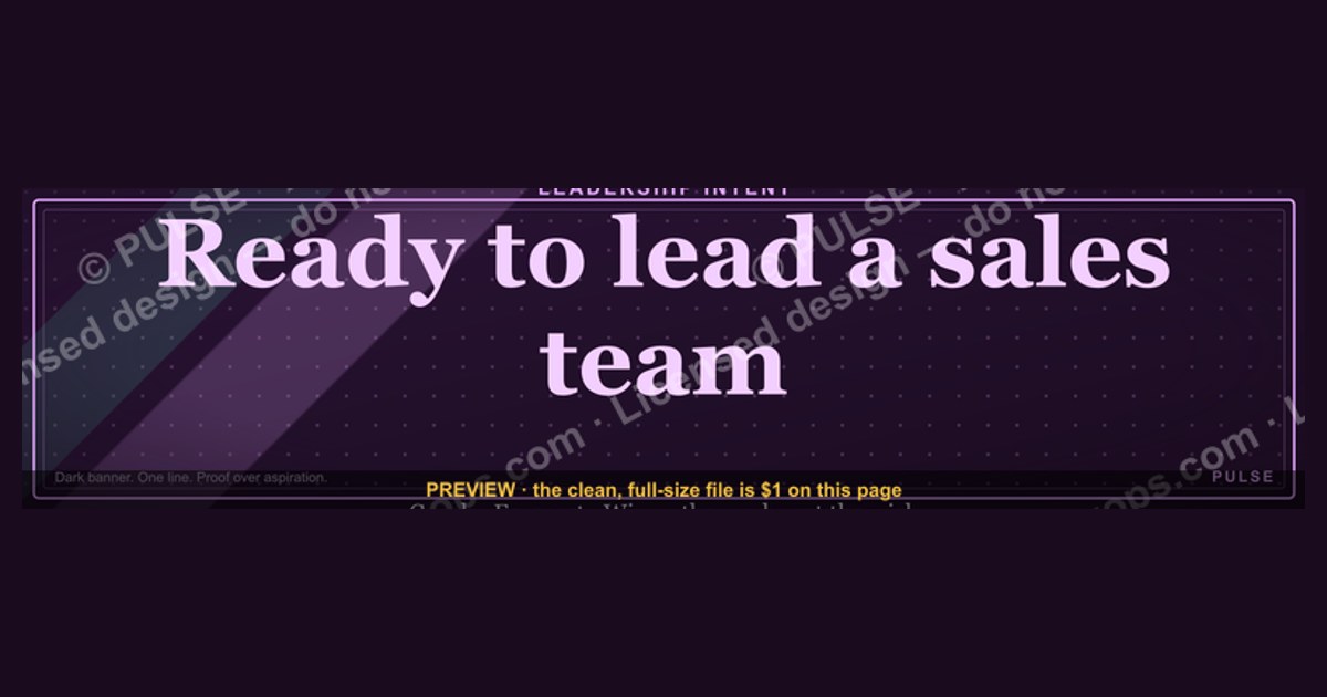
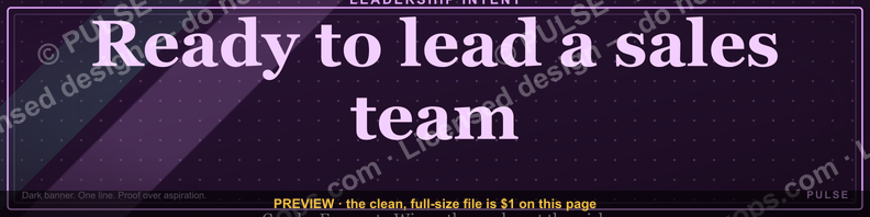
This is a LinkedIn profile banner, sized 1584×396 px, that reads "Ready to lead a sales team." in bold serif type against a dark, uncluttered background. It's built to sit behind your profile photo as a quiet headline extension — a one-line positioning statement for a rep or manager actively signaling readiness for a sales leadership role. Download the PNG and swap it in from your LinkedIn profile settings in under two minutes.
A concrete scenario that frames the problem
Picture a senior account executive, three years into closing enterprise deals, who has just been told by her manager that a sales manager opening will post internally next quarter. She has the numbers — quota attainment above 110% for six straight quarters, a mentoring track record with two ramped reps — but her LinkedIn profile still reads like an individual contributor's: a headline listing her title, a photo, and nothing that signals intent. Recruiters and internal hiring panels skim profiles in seconds, and nothing on the page tells a stranger she wants to lead. This is the exact gap this banner closes. Where a headline is limited to a single line of text competing with a job title, a banner occupies the entire visual top of the profile — the first thing anyone sees before they read a word. "Ready to lead a sales team." placed there does the positioning work a resume objective statement used to do, except it's visible to every recruiter, hiring manager, and internal stakeholder who views the profile, not just the people who get as far as opening a PDF. The scenario generalizes past this one AE: any individual contributor angling for a first management role — in sales, but also in adjacent revenue functions like customer success or partnerships — faces the identical problem of a profile built around what they've done rather than what they're aiming for next.
How the mechanism actually works
The banner works because of where LinkedIn places it in the visual hierarchy of a profile, not because of anything clever in the design itself. When someone opens a profile, the banner is the largest single graphic element above the fold, rendering full-width behind a circular profile photo that sits roughly a third of the way in from the left edge on desktop, and centered above the name on mobile. Because the photo overlaps the bottom-left of the banner, the safe text zone is the right two-thirds to three-quarters of the canvas — which is exactly where this design places "Ready to lead a sales team." in large serif type, left-aligned within that safe zone rather than dead-centered, so it reads cleanly on both desktop and the cropped mobile view.

The mechanism only works if the message on the banner, the headline text beneath it, and the About section all point the same direction. A banner that says "Ready to lead a sales team." next to a headline that still reads "Account Executive at [Company]" creates a small cognitive gap — not a dealbreaker, but a missed chance to reinforce the signal three times in the first five seconds of a profile view. The stronger sequence pairs the banner's declarative statement with a headline that adds proof ("Account Executive, 110%+ attainment 6 quarters running | Ready to lead") and an About section opening line that repeats the intent explicitly before pivoting into a track record.
The compounding effect in that diagram is the whole mechanism: a banner alone is a mild signal, a banner plus an aligned headline is a strong one, and a banner plus an aligned headline plus an About section that opens with concrete leadership evidence (people managed, ramp programs built, forecast accuracy owned) is what actually moves a hiring manager from noticing to acting.
Real numbers, ranges, and benchmarks
The graphic itself is fixed at 1584×396 px, which is LinkedIn's current desktop banner specification as of this writing. LinkedIn compresses and re-encodes anything uploaded, so exporting at that exact resolution (rather than something smaller that gets upscaled) keeps the serif text sharp instead of soft — a banner exported below roughly 1000px wide will visibly blur when LinkedIn's CDN serves it back at full size. File size should stay under 8MB; a clean PNG of a mostly solid-color banner with one line of text typically lands well under 1MB, so there's no reason to compress hard enough to introduce artifacts around the letterforms.

The practical safe zone for text, accounting for the profile photo overlap, is roughly the right 1100–1200px of the 1584px width on desktop, and closer to the full width minus a centered circular crop on mobile — which is why this design keeps the statement short enough (six words) to survive both crops without truncation or awkward wrapping. Anything longer than roughly eight to ten words at this font size risks wrapping to two lines and colliding with the photo edge.
On timing: a banner change alone doesn't trigger a notification to your network the way a new post does, so there's no "burst" of visibility the day you change it — the value compounds passively every time someone views the profile afterward, which is why pairing the swap with an active job-search push (reaching out to former managers, posting an open-to-work update, commenting on relevant industry posts) matters more than the banner working in isolation. Profiles under active review by a hiring team are typically viewed multiple times across a hiring cycle — once at the resume-screen stage, again before a hiring-manager interview, sometimes a third time before an offer — so a banner installed early in that cycle gets more total impressions than one added the week of an interview.
Trade-offs and alternatives

A bold, declarative banner like this one is a deliberate choice, and it isn't free. The upside is unambiguous positioning: nobody has to infer intent from a bullet-point resume. The downside is that it's a public, permanent-feeling statement visible to your current manager, your current teammates, and anyone at your current company who happens to view your profile — which makes it a poor fit for someone who wants to explore a leadership move quietly before their employer knows. For that situation, the safer alternative is a subtler signal: leaving the banner neutral (a clean brand-color background with no text, or a professional stock photo) while doing the positioning work in the About section instead, which is read far less passively than a banner is seen.
There's also a design trade-off inside the banner category itself. A text-only statement banner like this one reads as confident and direct, but it says nothing about proof — no metrics, no company logos, no visual credibility markers. An alternative style swaps the bare statement for a banner that pairs a shorter phrase with a small stat line ("110% attainment · 6 quarters · Ready to lead"), trading some of the boldness for evidence baked directly into the graphic. That version tends to work better for someone whose achievements aren't yet reflected anywhere else prominent on the profile; the plain statement version works better for someone whose Experience section already documents the track record in detail, so the banner's only job is to state intent rather than repeat proof.

Neither path is objectively better — the choice depends on how public the job search can safely be and how much proof already lives elsewhere on the profile. What doesn't change across either path is that the banner is a supporting signal, not a substitute for the Experience section actually documenting leadership-adjacent work: mentoring, deal-desk ownership, forecasting, cross-functional projects. A striking banner on a profile with no supporting evidence reads as aspirational at best and hollow at worst.
Common pitfalls and how to avoid them
The most common mistake is leaving everything else on the profile unchanged while swapping in a banner that promises leadership readiness. If the headline, About section, and most recent Experience bullet still read purely as an individual-contributor account, the banner creates a mismatch a careful reader notices immediately. Fix this by updating at least the headline and the opening line of About in the same sitting as the banner swap — the three should tell one consistent story.
A second pitfall is text that's too small or too long for the safe zone, so it either wraps awkwardly on mobile or gets partially hidden behind the profile photo on desktop. Before publishing, preview the banner on both a desktop browser and the LinkedIn mobile app rather than trusting how it looks in an image editor — the crop behavior differs enough between the two that a banner that looks perfect in Photoshop can crop mid-word on a phone.
A third pitfall is treating the banner as a one-time task disconnected from the rest of a job search. A banner statement with no accompanying activity — no posts, no comments, no outreach — sits static and gets diminishing exposure over time, since LinkedIn's algorithm surfaces active profiles more than dormant ones in search and "people also viewed" panels. The banner earns its keep as part of an active push, not as a substitute for one.
A fourth, subtler pitfall is visibility to the wrong audience. Because a banner change doesn't post to the feed by default, most people assume it's low-visibility — but anyone who visits the profile directly, including a current manager doing a routine check or a colleague browsing connections, will see it. Before publishing a banner this direct, it's worth a candid gut-check on whether the current employer finding out this way (rather than through a direct conversation) creates a problem worth avoiding.
Finally, a cosmetic pitfall: exporting the file as a JPEG at aggressive compression to save space introduces visible banding around the dark background and softens the serif edges of the text. Export as PNG — the file size difference at this simple a composition is negligible, and the text stays crisp.
Related questions
Should the banner match my company's brand colors or my personal brand?
Once you're actively signaling a move, personal brand wins — a banner in your current employer's exact brand colors reads as company-owned messaging rather than a personal statement, undercutting the "I want to lead" signal you're trying to send.
Does changing my banner notify my connections?

No — banner and headline edits don't generate a feed notification by default, unlike a new post or a job-change update, so the change is visible only to people who visit the profile directly.
What headline pairs best with this banner?
A headline that states current role plus a concrete leadership-adjacent proof point works best — for example, "Account Executive | Mentoring 2 ramping reps | Ready to lead a sales team" — so the banner's claim and the headline's evidence reinforce each other in the same glance.
Can I use this banner if I'm not yet in sales but want to move into sales management?
It's built for someone already carrying a sales quota or sales-adjacent role; for a lateral move into sales from another function, a banner naming the specific transition ("Moving into sales leadership") reads more accurately than this one's assumption of existing sales experience.
FAQ
What size should I export this banner at? Export at exactly 1584×396 px as a PNG. LinkedIn compresses whatever you upload, and starting from the native size keeps the text sharp instead of letting the platform upscale a smaller file and soften the edges.
Will this banner look the same on mobile as on desktop?
Mostly, but the profile photo crops differently and the visible canvas is narrower on mobile, so always preview on the LinkedIn app before finalizing — text placed too close to the left edge can end up partially hidden behind the photo on desktop specifically.
Should I remove the banner once I land the leadership role? Yes — once the move is made, swap it for a banner or plain background that reflects the new title and scope rather than "ready to," since "ready to lead" reads as slightly stale messaging once you're already leading.
Is a text-only banner less effective than one with a photo or graphic? Not necessarily — a clean statement banner is easier to read at a glance than a busy photo composition, and for a short declarative message like this one, simplicity usually reads as more confident, not less.
Can I customize the wording for a different target role, like sales operations or customer success leadership? Yes — the same layout works with any short declarative phrase substituted in ("Ready to lead a CS team," "Ready to run revenue operations"), as long as the replacement stays around six to eight words to fit the safe zone cleanly.
Does the banner actually influence hiring decisions, or is it just cosmetic? It's a supporting signal, not a decision-maker on its own — no graphic substitutes for a documented track record — but as the first thing a viewer sees, it shapes the frame a reader brings to everything below it on the profile.
Sources
- https://www.linkedin.com/help/linkedin/answer/a521735
- https://business.linkedin.com/talent-solutions/blog
- https://www.shrm.org
- https://www.hubspot.com/sales
- https://www.gartner.com/en/sales
- https://www.themuse.com/advice
- https://www.themuse.com/advice/career-advice
Related on PULSE
- What should a sales manager's LinkedIn headline say?
- How long should a LinkedIn About section be for a sales leadership candidate?
- What does a hiring manager look for in an internal promotion to sales manager?
- How do you show leadership experience on a resume with no direct reports?
- What's the difference between a sales manager and a sales director role?
This page will be disappearing soon. Save it to your device for $1 — or read it free while it is here.
@Kory-White- · if Venmo asks, the last 4 of my number are 2012
This page is gone.
This one is off the shelf now. $1 keeps it on your phone for good — the whole page, pictures and diagrams included.
 graphicLLM Builder AI Engineer — LinkedIn Banner
 graphicProduct Marketing Lead — LinkedIn Banner
 graphic“Bring the energy every call.” — LinkedIn Banner
 graphicFractional CRO — LinkedIn Banner
 graphicInspect. Qualify. Commit. — LinkedIn Wallpaper
 graphic“Open to sales leadership roles.” — LinkedIn Banner
 graphicSell outcomes, not features. — LinkedIn Wallpaper
 graphic“More pipeline, less panic.” — LinkedIn Banner
 graphicBring the energy. — LinkedIn Wallpaper
 graphic“Speed to lead wins.” — LinkedIn Banner