


Product Marketing Lead — LinkedIn Banner
Quality
Certified
A Product Marketing Lead LinkedIn banner is a 1584×396 px cover image that states your specialty and one proof point in under ten words. Keep text in the upper-right two-thirds, use one bold sans-serif headline plus a lighter subline, and match your employer's palette so the profile reads as a single, deliberate brand.
What it is and why it matters
The LinkedIn cover image sits directly above your headline, your current role, and your connect button. It is the largest single element on the profile and the only one you fully control visually. For a Product Marketing Lead — a role whose entire job is positioning — a vague or default banner is a live demonstration that you cannot position yourself. Recruiters and hiring managers notice this. So do the PMM peers you want in your network.
Mechanically, LinkedIn asks for a 1584×396 pixel image (a 4:1 ratio) under 8 MB, accepted as PNG, JPG, or GIF. That aspect ratio is the constraint that breaks most designs: it is extremely wide and extremely short, so anything you would put on a slide will not survive the crop. LinkedIn overlays your circular profile photo on the lower-left corner of the banner on desktop, and the overlap area shifts on mobile and in the app. Practically, treat roughly the left 20–25% and the bottom 25% of the canvas as dead zones. Any headline that starts at the far left will get a face parked on top of it.
The strategic value is compression. Your headline field is 220 characters and your About section runs to 2,600 characters, but neither is read first. The banner is scanned in the same glance as your name. That gives you one line to answer the question a visitor actually has: *what kind of product marketer is this?* "Product Marketing Lead" alone does not answer it — there are hundreds of thousands of people who could write that. "Product Marketing Lead · B2B SaaS launches, PLG onboarding" answers it. So does a single outcome line like "I make the market care" paired with a three-word process spine such as *Position · Message · Launch*.
There is a second, quieter function: the banner sets a tone that the rest of the profile has to live up to. If the banner says "growth-stage GTM" and your experience section is all enterprise field marketing, the mismatch reads as noise. Treat the banner as the thesis statement and everything below it as the evidence. When they agree, a visitor forms a clean impression in three to five seconds and either connects or moves on — both are better outcomes than confusion.
Finally, a banner is one of the cheapest assets you will ever produce. A good one costs an hour of your time or roughly $0–$150 if you buy a template or hire a designer, and it works on every profile view for the next six to twelve months without further effort. Very little else in personal branding has that ratio.
The step-by-step process
Build it in a fixed order. Skipping ahead to visuals before you have settled the message is the single most common reason people redo a banner three times.
Step one — write the message before you open any design tool. Draft five candidate lines on paper. Each must be under ten words and must survive the "so what" test. "Product Marketing Lead" fails. "Turning complex SaaS into a story buyers repeat" passes. Pick the one that matches where you are going, not where you have been — if you want to move into a Director role, the line should point at strategy and revenue impact; if you want fractional work, it should point at availability and outcome.
Step two — pick exactly one proof point. One measurable achievement, phrased with a number if you can share it honestly: launches shipped, adoption lift, pipeline influenced, a segment you opened. If you cannot disclose numbers under your employment agreement, use a category instead: "3 platform launches · 2 category repositions." Never stack three metrics. The banner has room for one and a reader remembers one.
Step three — set the canvas at 1584×396 px. Work at 2× (3168×792) if your tool supports it, then export down; the extra resolution keeps type crisp on high-DPI screens. Draw guides marking the left 25% and bottom 25% as no-go zones for critical text.
Step four — lay type into the safe zone. Headline at roughly 48–72 px on the 1584-wide canvas, subline at 24–32 px, and nothing below about 20 px — small type is what disappears on phones. Two font weights of one family beats two families. Align left within the safe zone rather than centering; centered text on a 4:1 canvas tends to look stranded.
Step five — choose color from your employer's or your own palette. Two brand colors plus one neutral. Dark backgrounds with light type are the safest default for LinkedIn's mostly-white interface — they give the profile a visible edge and hide compression artifacts better than pale gradients do.
Step six — export and test before you commit. Export a PNG for flat color and type; use SVG as your working master so you can recolor later without redrawing. Upload, then look at the profile on a desktop browser, in the LinkedIn mobile app, and on a phone browser. Check that the profile photo does not sit on a word and that the subline is still legible.
Step seven — align the rest of the profile. Update the headline so it echoes, not repeats, the banner. If the banner says "launches," the headline should say what kind and for whom.
Costs, timelines, and typical ranges
The realistic range runs from free to a few hundred dollars, and the difference in outcome is smaller than people expect.
Free template route — 20 to 45 minutes. Free banner libraries, including the Pulse Graphics set, ship layouts already sized to 1584×396. You swap the text, recolor to your palette, and export. This is the right choice for the large majority of Product Marketing Leads, because the design decisions that matter — safe zones, type scale, contrast — are already made. Budget the time in message drafting, not in pixel-pushing.
Do it yourself in Canva or Figma — 1 to 3 hours. Canva's free tier covers this completely; Canva Pro runs roughly $12–$15 per month if you want brand kits and background removal. Figma's free tier also handles a single banner fine. Choose this if you want a layout no one else has or you need to match an unusual brand system. The time cost is real: most people spend an hour on layout and another hour discovering their type is too small on mobile.
Freelance designer — $50 to $250, 2 to 5 business days. Marketplace designers will produce a banner in this range, usually with two rounds of revision. Worth it if you are also getting a matched deck template, a slide header, or a set of social cards from the same person, because the per-asset cost drops sharply. Paying $250 for one banner alone is rarely justified.
Brand or agency package — $500 and up. Only sensible if you are building a personal brand as a business: fractional PMM consulting, a course, a newsletter with sponsors. At that point the banner is one asset inside a system that includes a wordmark, color tokens, and templates.
Refresh cadence. Plan on updating every 6 to 12 months, and immediately on any of these triggers: a title change, a company change, a shift from employed to open-to-work, or a new specialty you want to be found for. Event-timed swaps — updating during a conference week and again the week after — take about 10 minutes each if you kept the SVG master, which is the strongest argument for keeping one.
What the time actually buys. There is no reliable public benchmark that says a banner lifts profile views by a specific percentage, and you should be skeptical of anyone who quotes one. What you can observe directly is your own before/after: LinkedIn shows profile views and search appearances for the last 90 days. Change the banner, leave everything else alone for four weeks, and compare. That is a weak experiment — seasonality and posting activity confound it — but it is the only honest measurement available to an individual.
Where teams get it wrong

Cramming a slide onto a 4:1 canvas. The most frequent failure. Three bullet points, two logos, a certification badge, a QR code, and a tagline all fit technically and all become unreadable. The fix is subtraction: one headline, one subline, one mark. If you cannot decide what to cut, cut the logo — your employer's brand is already listed twice below the banner.
Putting critical text at the far left. The profile photo overlay lands there and the crop tightens on mobile. Words vanish. Always mock the photo circle into your design file so you can see the collision before LinkedIn shows it to you.
Type under 20 px on the 1584-wide canvas. It looks fine at 100% zoom on a large monitor and is illegible on a phone, where the banner renders at a fraction of its authored width. Test at 50% zoom as a proxy: if you cannot read it, neither can a recruiter scrolling on a train.
Soft gradients and low-contrast pairings. Pale gradients band badly under LinkedIn's compression and wash out on low-brightness phone screens. Aim for strong contrast between text and background — dark background with near-white type, or the inverse — and check it rather than eyeballing it.
Stretching a small image. Exporting from a 800 px-wide source and scaling to 1584 produces the blur that reads instantly as amateur. Author at 1584×396 or larger and scale down, never up.
Generic stock imagery. Handshakes, skylines, abstract network graphics, and rainbow gradients all say "I picked the first template." A flat brand-colored field with good type outperforms nearly all stock photography in this slot, because the banner's job is to be read, not admired.
Making it a résumé. Listing four achievements, a degree, and three tools is a common instinct and always backfires. The banner exists to prompt one action — a click into the profile or a connection request. Every element that does not serve that is competing with the elements that do.
Letting it go stale. A banner still advertising a company you left eighteen months ago, or a conference from two years back, does more damage than no banner at all: it signals disengagement from your own professional presence. Put a calendar reminder at six months.
Ignoring the alignment problem. A banner that promises "product-led growth expertise" over an experience section full of enterprise sales enablement creates a credibility gap. Either change the banner or change what you emphasize below it — but do not let them disagree.
Decision framework: when to choose what

The right banner depends on one question: who are you trying to reach right now? The message that lands with a recruiter is not the message that lands with a prospective consulting client.
If you are actively job hunting, lead with role and one hard outcome. "Product Marketing Lead · 3 launches, 2 category repositions" gives a recruiter the shape of your experience before they scroll. Pair it with LinkedIn's own #OpenToWork photo frame rather than writing "seeking opportunities" into the banner art — the native frame is filterable by recruiters and the banner text is not, and you can remove the frame in a click when you land.
If you are passively open, drop the availability signal entirely and lead with specialty. "B2B SaaS positioning · developer-tools GTM" tells inbound recruiters whether you are a fit without announcing anything to your current employer. This is the most common correct answer for a Product Marketing Lead who is employed and content but not closed off.
If you are selling fractional or consulting work, lead with the outcome your buyer cares about and add a light call to action. Buyers do not hire "product marketing" — they hire someone to fix a launch that is not converting or a message no one repeats. Say that, then add "Open to fractional PMM engagements" in the lower-right, and make sure your featured section actually contains a case study to land on.
If you are building an audience around a newsletter, a course, or conference speaking, the banner becomes brand furniture: wordmark, one thematic line, consistent color across every platform. Swap in event-timed variants during conference weeks and revert afterward.

If you are early in the role — newly promoted to Lead, or moving into PMM from an adjacent function — resist the urge to fabricate a metric. Use a capability line instead: "Positioning · messaging · launch enablement." It is honest, it is searchable, and it does not set up a question you cannot answer in an interview.
Related questions
What size should a LinkedIn banner be?
1584×396 pixels, a 4:1 ratio, under 8 MB, as PNG, JPG, or GIF. Author at that size or a 2× multiple and scale down. Keep critical text out of the left quarter and bottom quarter, where the profile photo overlay and mobile cropping interfere.
Should the banner include my company logo?
Usually not. Your employer already appears in your headline and experience section, so the logo is redundant and eats space the message needs. Include it only if you own the company or the brand recognition itself is the point you are making.
Does a LinkedIn banner affect search ranking?
No. Banner images are not indexed as profile text, so nothing in the artwork helps you appear in LinkedIn search. Keywords belong in your headline, About section, and skills. The banner's job is conversion after someone lands, not discovery.
How often should I update my banner?
Every 6 to 12 months, plus immediately on any title change, company change, shift to open-to-work, or new specialty. Keeping an editable SVG master turns each refresh into a ten-minute edit rather than a rebuild.
Can I use the same banner across other platforms?

Not directly — the 4:1 crop is specific to LinkedIn. Rebuild from the same SVG master at each platform's native dimensions instead of stretching one file. Keep color, type, and message identical so the brand reads as one system.
FAQ
What text should a Product Marketing Lead put on a LinkedIn banner?
One headline under ten words plus one proof point. The headline states your specialty or the outcome you produce — "I make the market care," "Turning complex SaaS into a story buyers repeat," or "B2B SaaS positioning and launch." The proof point is a single achievement or a three-word process spine like *Position · Message · Launch*. Anything beyond that competes with itself.
Where exactly do the profile photo and cropping cut into the banner?
The circular profile photo overlays the lower-left corner on desktop, and mobile crops the sides more aggressively than desktop does. Treat the left 20–25% and the bottom 25% of the 1584×396 canvas as unusable for anything you need read. Mock the photo circle into your design file before exporting so you see collisions early.
Is SVG or PNG better for a LinkedIn banner?

Upload a PNG — LinkedIn accepts PNG, JPG, and GIF, not SVG. Keep an SVG as your working master, because vector lets you recolor to a new employer's palette or change the title text without redrawing anything. Export a fresh PNG each time you edit the master.
Should I put a call to action on the banner?
Only if you are selling something — fractional engagements, consulting, a newsletter. A short line like "Open to fractional PMM engagements" in the lower-right works. If you are employed and simply open to inbound, skip the CTA and let specialty do the work; a CTA on an otherwise passive profile reads as pressure.
How do I know whether the new banner actually worked?
You cannot isolate it cleanly, but you can approximate. LinkedIn reports profile views and search appearances for the trailing 90 days. Swap the banner, hold your posting and outreach steady for about four weeks, then compare. Treat the result as directional, not proof — activity and seasonality move those numbers more than artwork does.
Do I need a designer, or is a template enough?
A template is enough for most people. The decisions that make a banner work — safe zones, type scale, contrast, one message — are baked into a well-built template, and swapping text and color takes under an hour. Hire a designer when you need a matched set of assets (deck, social cards, wordmark) or when the banner supports actual revenue, such as a consulting practice.
Sources
- https://www.linkedin.com/help/linkedin/answer/a570658 — LinkedIn Help Center, profile background photo requirements
- https://www.linkedin.com/help/linkedin/answer/a507508 — LinkedIn Help Center, Open to Work settings and photo frame
- https://www.canva.com/learn/ — Canva Design School, layout and typography tutorials
- https://www.nngroup.com/articles/visual-hierarchy-ux-definition/ — Nielsen Norman Group, visual hierarchy
- https://www.nngroup.com/articles/legibility-readability-comprehension/ — Nielsen Norman Group, legibility and readability
- https://www.w3.org/WAI/WCAG21/Understanding/contrast-minimum.html — W3C, minimum contrast ratio guidance
- https://blog.hubspot.com/marketing — HubSpot Marketing Blog, profile and brand optimization
- https://www.figma.com/resource-library/ — Figma Resource Library, design fundamentals
- https://developer.mozilla.org/en-US/docs/Web/SVG — MDN Web Docs, SVG format reference
Related on PULSE
This page will be disappearing soon. Save it to your device for $1 — or read it free while it is here.
@Kory-White- · if Venmo asks, the last 4 of my number are 2012
This page is gone.
This one is off the shelf now. $1 keeps it on your phone for good — the whole page, pictures and diagrams included.
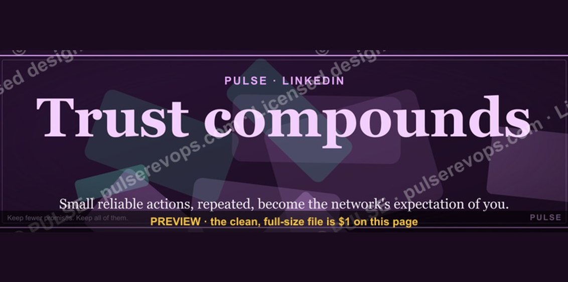 graphicTrust compounds. — LinkedIn Wallpaper
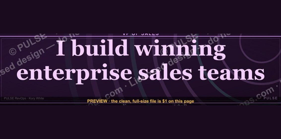 graphicVP of Sales — LinkedIn Banner
 graphicIndustrial Robotics CRO — LinkedIn Banner
 graphic“The next call is the most important one.” — LinkedIn Banner
 graphicStartup Founder — LinkedIn Banner
 graphic“Join a team that runs on pipeline.” — LinkedIn Banner
 graphic“Sell the problem, not the product.” — LinkedIn Banner
 graphicSell outcomes, not features. — LinkedIn Wallpaper
 graphicReady reps win. — LinkedIn Wallpaper
 graphicRevOps Manager — LinkedIn Banner