


Win the week. — LinkedIn Wallpaper
Quality
Certified
The "Win the week." LinkedIn wallpaper is a free 1584×396 SVG cover banner — dark dot-grid background, single line of type, Pulse mark. Download it, recolor it to your brand, and set it as your profile banner. It works as a public commitment to weekly cadence rather than quarterly panic.
The two ways to use this banner — decoration versus operating system
Most people treat a LinkedIn cover as wall art. They pick something that looks tidy, upload it once, and never touch it again. That's option one: the banner is a background, and the words on it are ambient. Nobody's harmed, but nobody's helped either. A dark dot-grid with "Win the week." reads as competent, and competent is fine.
Option two treats the same file as the visible tip of a real operating rhythm. The words become a claim you're accountable to. If your banner says "Win the week." and your activity feed shows three posts in seven months, an inconsistent cadence, and a headline that hasn't changed since a job two roles ago, the banner works against you — it's a promise the profile can't cash. But if the banner sits above a headline that names the cadence, a Featured section that shows the weekly artifact you publish, and a posting rhythm that actually lands on the same day each week, the whole profile starts reading as one argument instead of six unrelated widgets.
The distinction matters more for revenue roles than most. A rep, an AE, a RevOps lead, a fractional CRO — these are people whose buyers check LinkedIn before a first call. The cover image is the largest single visual element above the fold on desktop, and it's the first thing rendered. A buyer decides something about you in that half-second, whether you intended a decision or not.
The trade-off is honest: option one costs you four minutes and gets you a cleaner profile. Option two costs you a recurring 20–30 minutes a week forever, and gets you a profile that compounds. Neither is wrong. What's wrong is picking option two's banner and running option one's behavior, because the gap is legible to anyone who scrolls.
There's a third, quieter use worth naming: the same asset as a desktop or lock-screen background, seen only by you. No audience, no accountability theater — just a cue in your own field of view. That version has no branding value at all and possibly more behavioral value, because it shows up during the hours when the week is actually won or lost.
How to decide which version you're running
The decision isn't aesthetic. It's about whether you have a weekly rhythm to advertise, and whether your public activity can corroborate it. Run the honest audit before you upload anything.
Ask four questions in order. First: do you already have a recurring weekly ritual — a Monday plan, a Friday review, a standing pipeline scrub? If no, the banner is decoration and you should treat it as such, which is fine. Second: does anything public reflect that ritual? A weekly post, a newsletter, a repeating format. If the ritual exists but is entirely private, the banner is a private cue that happens to be visible. Third: does your headline and Featured section reinforce the same idea, or contradict it? Fourth: are you comfortable with a stranger holding you to the sentence?
If you answer yes to the first three, the public version earns its place. If you answer no to the first, skip the profile-banner path and use the file as a lock screen instead — same asset, no exposure, and you can upgrade later once the habit is real.
One more decision branch: brand colors or stock dark. If you're an individual contributor or independent, the default dark version is usually stronger — it's distinct against LinkedIn's blue-heavy default palette and it doesn't tie you to an employer you might leave. If you're representing a company and the team is standardizing covers across a group, recolor to the brand palette so the sales org reads as a unit when a buyer looks up three people from the same account team. That consistency is worth more than any individual's preference.
The concrete numbers that actually govern this file
Specificity beats vibes here, so the real constraints:
Canvas. LinkedIn's personal profile cover is 1584×396 pixels — a 4:1 ratio. Company pages use a different slot (1128×191), so a personal banner dropped onto a company page will crop badly. Keep the two separate; don't reuse.
Safe area. The desktop render shows close to the full width, but the mobile app crops in from the sides and the profile photo overlays the lower-left corner. Treat roughly the left 25% and the bottom third of that corner as unusable. Center the type or push it right of center, and keep it in the vertical middle band. The "Win the week." line in this file already sits in the safe band — if you add your name or a URL, that's where the mistake usually happens.
Format. The source is SVG, which means it scales to any size without softening. LinkedIn wants a raster upload — export to PNG at 1584×396, or at 3168×792 (2×) if you want it crisp on high-DPI displays and don't mind the file size. Do not upload a JPEG for this: flat dark backgrounds with sharp type are exactly where JPEG compression produces visible banding and halos around letterforms. PNG holds the edges clean.
File size. Keep the export under a few megabytes. A flat dark PNG at these dimensions typically lands well under 1 MB, so if you're seeing 8 MB you've probably exported at an unnecessary multiple or included a rasterized gradient you don't need.
Contrast. White type on near-black clears accessibility contrast thresholds comfortably. If you recolor to a brand palette, check the type against the new background — mid-tone brand colors (a medium blue, a mid-gray-green) are where people accidentally drop text contrast below readable, especially on a phone in daylight.
Cadence. Changing your banner registers as a profile update. That's a small, real signal, but it is not a growth lever — swapping the image weekly reads as fidgeting, not activity. Quarterly is a reasonable rhythm if you want the profile to feel maintained; tied to a genuine event (a launch, a talk, a role change) is better than tied to the calendar.
Time cost. Download and upload: under five minutes. Recolor and export: 10–15 minutes in Figma, Photopea, Canva, or Vectr. Rewriting your headline and Featured section to match: 30–45 minutes, and that's the part that actually moves anything.
License. Free to use, no attribution required. Recolor it, put your name on it, use it commercially.
Implementation, in the order that avoids rework
Sequence matters because two of these steps invalidate earlier ones if done out of order. Recolor before you export. Check the mobile crop before you publish. Everything else is cleanup.
Step one — decide the palette. If you're going brand-colored, get the hex values first: background, type, and accent. Pull them from an actual brand file, not from a screenshot eyedropper, or you'll be one shade off from every other asset your team ships and nobody will be able to say why it looks wrong.
Step two — recolor. Use the color picker on the graphic page, or open the SVG in a vector editor. SVG is plain markup underneath, so if you're comfortable in a text editor you can swap fill values directly and skip the design tool entirely. Set the background — including transparent if you're layering it onto something else. Keep the dot-grid; it's what stops a flat dark rectangle from reading as an upload error.

Step three — add your own line, or don't. The design holds a single sentence well. Adding a name, a title, and a URL turns it into a business card and dilutes the one thing the banner is doing. If you must add text, add one element, match the sans-serif weight, and keep it in the safe band.
Step four — export. PNG at 1584×396, or 2× if you want retina sharpness. Keep the SVG source somewhere you'll find it in six months, because you will want to make a variant and re-deriving it from a PNG is miserable.
Step five — check the crop on a phone before you publish. Upload, then open your own profile in the LinkedIn mobile app. This is the step people skip and then live with a half-cut word for a year.
Step six — align the rest of the profile. Headline, Featured, About. The banner is one line of a three-line argument.
Rolling it out to a team. If a sales org is standardizing, do it once centrally and distribute the exported PNG plus the SVG source, not instructions. Ten reps each recoloring individually produces ten near-misses. Ship the file, ship a one-paragraph note on where it goes, and audit the profiles once two weeks later. That audit is the step that gets skipped, and it's why half-rolled-out branding is more common than either fully-branded or unbranded.
What the phrase is actually claiming, and whether you can back it
"Win the week." is a cadence claim. It says: my planning horizon is seven days, not ninety, and I close loops inside it. That's a defensible position in revenue work, where the quarter is the reporting unit but the week is the only unit where behavior can still change the outcome. By the time a quarter is visibly off, the pipeline that would have saved it needed to be built six weeks earlier.
Practically, backing the claim means something like: a fixed weekly planning block, three to five outcomes committed on paper, a mid-week checkpoint where you cut what isn't moving, and a Friday review that produces the next week's list. Thirty to forty-five minutes total. The specific format matters less than the fact that it's the same format every week, because the value is in not re-deciding how to plan.
Where this breaks: weekly cadence is a poor fit for work with long, lumpy cycles. If you sell enterprise deals with 9-month cycles, "win the week" can't mean "close something." It has to mean advance a defined stage, run the multi-threading conversation you've been avoiding, or produce the artifact the champion needs for their internal review. Weekly goals in long-cycle work should be leading-indicator goals, not lagging ones. Set weekly targets on outcomes you don't control and you'll teach yourself to ignore your own goals by week four.
There's a failure mode worth naming: the week becomes a treadmill. Seven-day sprints with no quarterly frame produce a lot of motion and no direction — you win fifty-two weeks and end the year roughly where you started. The banner is a rhythm claim, not a strategy claim. It needs a longer arc above it, and the longer arc needs to be written down somewhere you actually look, or the weekly cadence just optimizes locally.
Where the same asset works outside LinkedIn
Once you've recolored the SVG, you've effectively got a brand-consistent 4:1 dark plate, and that shape shows up in more places than you'd guess.
Slide dividers. A 4:1 banner scaled to full slide width makes a clean section break in a deck. Swap the line of type per section. Costs nothing, and it makes a QBR deck look designed rather than assembled.
Email signature block. Trim it down, keep it narrow, and it reads as a signature banner. Keep it small — a heavy image in a signature is a good way to land in a promotions tab.
Sales enablement one-pagers. The dot-grid plate works as a header strip on a PDF leave-behind, which is exactly the kind of asset that gets made badly under time pressure.
Zoom or Teams virtual background — with a caveat. The aspect ratio is wrong (16:9 versus 4:1), so it'll stretch or crop badly. If you want a call background, rebuild it on a 1920×1080 canvas with the same colors and dot-grid rather than stretching this file.
Internal dashboards and wiki headers. A recolored plate at the top of a Notion page or a pipeline dashboard makes internal tooling feel deliberate. This is genuinely underrated — teams tolerate ugly internal tools and then wonder why nobody looks at them.
Physical print. SVG means it prints without pixelation. Same file, wall-sized, above the desk where the weekly plan actually gets written.
The connective tissue: one file, one palette, one sentence, showing up across your profile, your deck, your leave-behinds, and your walls. That repetition is what brand consistency is — not a style guide nobody reads, but the same plate appearing enough times that it becomes recognizable.
Related questions
What size should a LinkedIn banner be?
1584×396 pixels for a personal profile — a 4:1 ratio. Company pages use 1128×191. Export as PNG, not JPEG, since flat dark backgrounds with sharp type show compression artifacts badly. A 2× export (3168×792) looks sharper on high-DPI screens.
Will the text get cut off on mobile?
It can. The LinkedIn mobile app crops in from the sides and the profile photo overlays the lower-left corner. Keep type centered or right of center in the vertical middle band, then preview your own profile in the app before you consider it published.
Do I need to credit the source?
No. This wallpaper is free to use with no attribution required. Recolor it, add your name, use it commercially. Keep the SVG source file so you can produce variants later without re-deriving anything from a flattened PNG.
How often should I change my banner?

Quarterly, or when something real changes — a new role, a launch, a talk. Weekly swapping reads as restlessness rather than activity. Profile updates do register a small signal, but that signal isn't worth manufacturing.
Can I use this for my whole sales team?
Yes. Recolor once centrally to your brand palette, then distribute both the exported PNG and the SVG source. Ten people recoloring independently produces ten near-misses. Audit the profiles two weeks after rollout — that's the step teams skip.
FAQ
What exactly am I downloading?
An SVG file sized for the LinkedIn personal cover slot at 1584×396 — a dark dot-grid background, the line "Win the week.", and the Pulse mark. SVG means it's vector, so it scales to any size without going soft, and you can open it in Figma, Photopea, Canva, PowerPoint, or any free vector editor to change colors and type.
Why SVG instead of just a PNG?
Because SVG is editable and resolution-independent. You can recolor the background to your brand, swap the text, or export at 4× for print, all from one source file. LinkedIn itself wants a raster upload, so you'll export to PNG for the actual profile — but keeping the vector means every future variant starts from a clean original rather than an upscaled screenshot.
Does a banner like this actually affect anything?
Directly, no. A cover image doesn't drive inbound on its own. What it does is set a first impression at the top of the page before anyone reads a word of your headline, and it either supports or undercuts everything below it. In revenue roles where buyers check your profile before a first call, that half-second of framing is worth the four minutes.
Can I put my name and title on it?
You can, and it's a common instinct, but it usually weakens the design. LinkedIn already displays your name and headline directly beneath the banner in larger type — repeating it inside the image is redundant and crowds the one sentence that's doing the work. If you add anything, add one element and keep it in the safe band away from the mobile crop.
What if I don't actually run a weekly cadence?
Then use the file as a desktop or lock-screen background instead of a public banner. Same asset, same cue, no claim being made to an audience that could check. Build the habit for a month, and if it sticks, move the image to your profile. A banner that contradicts your visible behavior is worse than a plain one.
Does this work for a company page?
Not directly — company pages use a 1128×191 slot with a different ratio, so this file would crop wrong. Open the SVG, rebuild it on the company-page canvas with the same palette and dot-grid, and export separately. Fifteen minutes, and the two assets will read as a matched set rather than one stretched file.
Sources
- https://www.linkedin.com/help/linkedin/answer/a570076 — LinkedIn Help: profile background photo requirements and dimensions
- https://www.linkedin.com/help/linkedin/answer/a552766 — LinkedIn Help: adding and editing a background photo
- https://developer.mozilla.org/en-US/docs/Web/SVG — MDN Web Docs: SVG reference and structure
- https://www.w3.org/Graphics/SVG/ — W3C: the SVG specification and working group
- https://www.w3.org/WAI/WCAG21/Understanding/contrast-minimum.html — W3C WAI: minimum contrast ratio guidance
- https://hbr.org/2011/05/the-power-of-small-wins — Harvard Business Review: The Power of Small Wins
- https://developer.mozilla.org/en-US/docs/Web/Media/Formats/Image_types — MDN: image format comparison, PNG vs JPEG trade-offs
- https://help.figma.com/hc/en-us/articles/360040028034-Export-from-Figma — Figma Help: exporting assets at scale factors
Related on PULSE
This page will be disappearing soon. Save it to your device for $1 — or read it free while it is here.
@Kory-White- · if Venmo asks, the last 4 of my number are 2012
This page is gone.
This one is off the shelf now. $1 keeps it on your phone for good — the whole page, pictures and diagrams included.
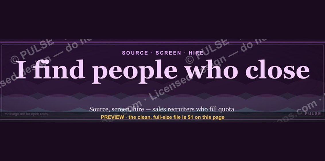 graphicSales Recruiter — LinkedIn Banner
 graphicLLM Builder AI Engineer — LinkedIn Banner
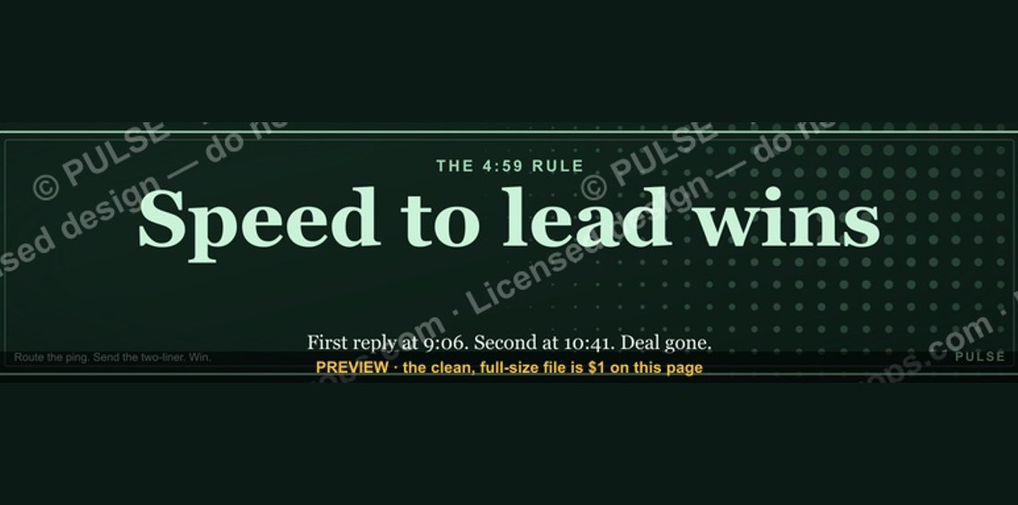 graphic“Speed to lead wins.” — LinkedIn Banner
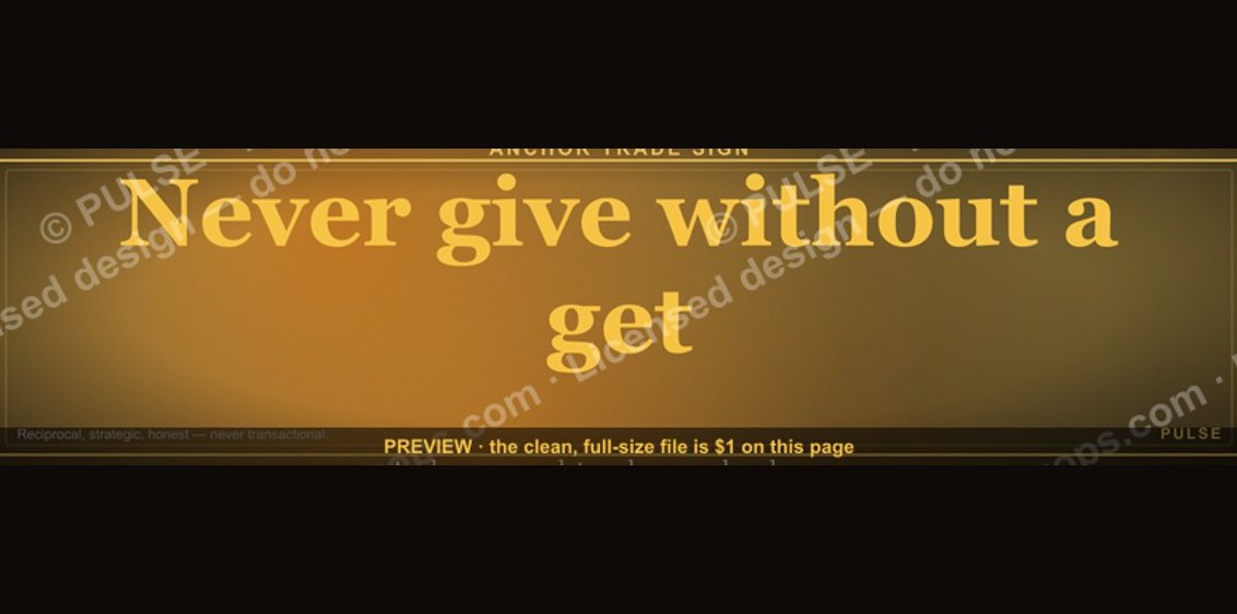 graphic“Never give without a get.” — LinkedIn Banner
 graphicCommercial Director — LinkedIn Banner
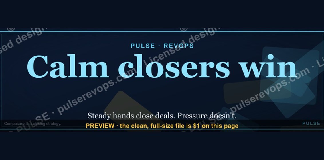 graphicCalm closers win. — LinkedIn Wallpaper
 graphicRenewals Manager — LinkedIn Banner
 graphicProduct Marketing Lead — LinkedIn Banner
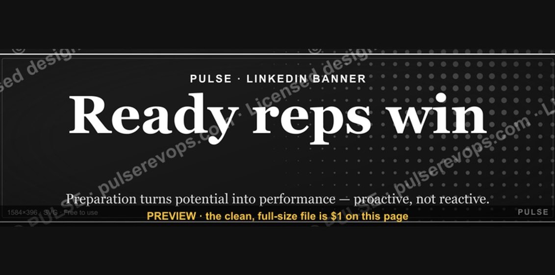 graphicReady reps win. — LinkedIn Wallpaper
 graphicHead of Sales — LinkedIn Banner