
Account Executive — LinkedIn Banner
 Curated byKory White · Fractional CRO · Maryland
 PULSEKNOWLEDGE LIBRARY
Quality
Certified
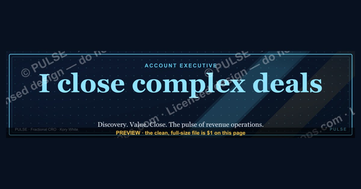
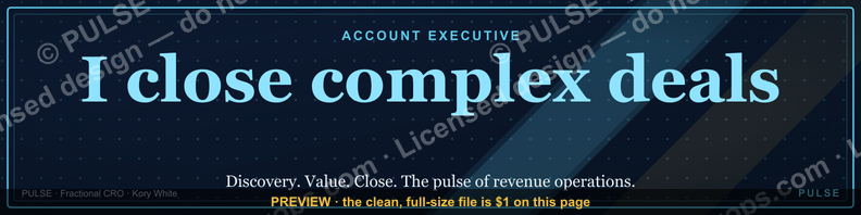
This is a LinkedIn profile banner sized 1584×396 px for an Account Executive, reading "Account Executive" in a clean sans-serif treatment over a dark, on-brand background with a thin accent line. Use it as your LinkedIn cover photo to signal role and credibility instantly, pairing it with a headline that states your specialty and the outcomes you drive.
The outcome you should expect
Swapping a default or blank LinkedIn cover for a purpose-built Account Executive banner changes the first three seconds of every profile visit. A visitor's eye lands on the banner before it reaches your headline copy, so the banner is doing pre-read work: it tells a prospect, recruiter, or partner what seat you hold before they've read a single word. For an Account Executive, that seat carries specific expectations — quota ownership, pipeline management, closing authority — and a banner that states "Account Executive" plainly, without clutter, confirms the visitor is looking at the right person for a sales conversation rather than a support or marketing contact.
The realistic outcome is not a dramatic spike in profile views by itself; a banner rarely goes viral or drives inbound traffic on its own. What it reliably does is raise the completion rate of the "who is this and are they legitimate" judgment a viewer makes in the first glance. Recruiters scanning search results, prospects checking out a rep before a call, and referral partners deciding whether to make an introduction all benefit from a banner that removes ambiguity. Teams that roll out a consistent Account Executive banner across their sales org also get a secondary effect: uniformity reads as organizational maturity. A buyer who clicks through three reps' profiles and sees the same design language with different names infers a company that trains and brands its go-to-market team deliberately, which is a small but real trust signal in enterprise and mid-market selling motions where the buyer is evaluating the vendor as much as the individual.

There's also a practical, tactical outcome worth naming: the banner is prime real estate for a value statement, not just a job title. Many AEs waste the space by leaving it blank or using a generic company banner meant for every employee. A banner built specifically for the Account Executive role can carry a short line under the title — territory, vertical, or the kind of outcome the rep delivers (for example, "Helping mid-market ops teams cut ramp time") — turning passive branding into an active pitch that works even when the viewer never opens a message.
What drives that outcome (mermaid)
The banner's effect is a function of a handful of concrete design choices, each of which either reinforces or undermines the read. The first is contrast: the title text needs to remain legible against LinkedIn's circular profile photo, which overlaps the bottom-left quadrant of the banner on desktop and a differently-cropped area on mobile. If "Account Executive" sits where the profile photo will cover it, the outcome above simply doesn't happen — the words never reach the viewer. The second is typographic weight: a bold, medium-size sans-serif reads at a glance; a thin, decorative, or script font forces the viewer to stop and decode it, and most scrolling viewers won't bother. The third is background restraint: a busy photographic background competes with the text for attention, while a dark or muted solid/gradient background with one accent line lets the role title win the eye immediately.
A fourth driver, easy to overlook, is consistency with the rest of the profile. A banner that says "Account Executive" but sits above a headline about something unrelated, or above a profile photo that's a low-resolution screenshot, creates dissonance instead of confidence — the banner promises polish that the rest of the page doesn't deliver. The banner works best as one piece of a coordinated profile: banner states the role, headline states the specialty and value, About section backs it up with specifics. Finally, file quality drives the outcome directly — LinkedIn compresses uploaded images, so a banner exported at low resolution or heavy JPEG compression will look soft or show visible artifacts once live, undercutting the "polished professional" signal the banner is meant to send.
Benchmarks and realistic ranges
LinkedIn's cover photo canvas is 1584×396 pixels, an aspect ratio of exactly 4:1. That's the export size to design against, but it is not the safe zone — the visible safe zone that survives both desktop and mobile cropping, and clears the profile-photo overlap, is narrower. As a practical range, keep primary text (the role title) within the vertical band roughly 100–260 px from the top of the 396 px canvas, and keep it clear of the left-most 300–320 px where the profile photo circle sits at typical breakpoints. Horizontally, centering the title in the right two-thirds to three-quarters of the canvas is a reliable range that holds up across both desktop wide-view and the more aggressively cropped mobile view.

For file specs, export as PNG for text-heavy banners like this one — PNG preserves sharp text edges better than JPEG, which introduces compression artifacts around high-contrast letterforms. Keep the file under LinkedIn's upload ceiling (historically in the 8 MB range for cover images; check current limits before upload since platforms adjust these) and target a resolution that renders crisply at the full 1584×396 export rather than scaling up a smaller image, which produces visible blur.
On font sizing, a role title like "Account Executive" reads clearly on both desktop and mobile in a range of roughly 60–90 px at the 1584×396 canvas size, set in a semi-bold to bold weight. Anything much smaller risks disappearing on a phone screen, where the banner renders at a fraction of its native size; anything larger risks the title running into the safe-zone edges or overlapping the profile photo. If you add a secondary line (specialty, territory, or a value statement), keep it at roughly 40–50% of the primary title's size so the hierarchy stays clear — one dominant statement, one supporting detail, not two competing headlines.
Risks, edge cases, and failure modes
The most common failure mode is the profile-photo overlap: designers frequently build and preview a banner on a wide desktop browser, where the circular photo sits comfortably in the corner, then discover on mobile that the crop shifts and the photo now sits directly over part of the title text. Always preview the exported banner inside an actual LinkedIn profile — on both a desktop browser and a phone — before treating it as final; a banner that looks perfect in a design tool but has never been checked inside LinkedIn's real container is the single most avoidable mistake here.
A second failure mode is over-genericizing the role. "Account Executive" alone, with no specialty, vertical, or differentiator, tells a viewer the seat but nothing about why this particular AE is worth a conversation. For a rep in a competitive market, a bare title banner can actually read as less distinctive than no banner at all, because it invites the "so what" reaction without answering it. The fix is the secondary line discussed above — but it has its own edge case: overloading that line with a full value proposition, multiple claims, or small print turns a glanceable banner into a paragraph nobody reads. One short phrase, not a sentence, is the ceiling.

A third risk is brand mismatch across a team. If a sales org rolls this banner out to some AEs but not others, or lets each rep customize colors and fonts freely, the org loses the consistency benefit described earlier and instead signals a lack of coordination — arguably worse than if no one had a custom banner at all. The failure surfaces slowly: individually each banner looks fine, but a prospect who has looked at three reps' profiles before a group call notices the inconsistency and it reads as disorganization.
A fourth edge case is stale accuracy: a banner built for an Account Executive title stops matching reality the moment that person is promoted to Senior AE, moves to a management track, or shifts territory. Because banners are easy to set once and forget, they tend to lag title changes by months, and a title mismatch between banner and headline undermines the exact trust signal the banner exists to create. Treat the banner as part of the same update checklist as the headline and job title fields, not a one-time asset.

Finally, watch for platform-level compression artifacts. LinkedIn re-encodes uploaded images, and a banner with fine gradients or thin decorative lines can show banding or softening after upload even when the source file was clean. Testing the live, uploaded version — not just the export file on your desktop — is the only way to catch this before a prospect does.
A practical rollout plan (mermaid)
For a single Account Executive updating their own profile, the rollout is quick: design or select the banner at the correct 1584×396 canvas, drop in the "Account Executive" title plus an optional one-line specialty, export as PNG, upload to LinkedIn, and then immediately open the live profile on both desktop and mobile to confirm nothing is cropped or obscured by the photo. Adjust and re-upload if the safe zone was violated, then move on to aligning the headline and About section so the three pieces tell one coherent story.

For a sales team standardizing this across every Account Executive, the rollout benefits from a shared template rather than individual freelance design work. Build one master file with the company's approved colors, font, and logo placement, with the role title and optional specialty line as the only editable fields. Distribute that template (as an editable file, not just a finished PNG) to each rep or to whoever manages employer branding, so every AE swaps in their own specialty line without touching layout, font, or color — preserving the consistency benefit while still letting each banner say something specific about that rep.
Roll this out in small batches — a handful of reps at a time — so any layout problem surfaces and gets fixed in the master template before the whole team uploads a flawed version. Once live, put a recurring reminder (quarterly is reasonable) to check that titles, territories, and specialty lines still match reality, since role changes and promotions are the most common reason a once-accurate banner quietly goes stale.
Related questions
Should every sales rep on a team use the same banner design?
Yes, with per-rep customization limited to the specialty line or name — shared layout and color builds brand consistency, while identical text across every rep removes the individual differentiation that makes a viewer want to connect with that specific person.
Does a LinkedIn banner actually influence whether someone accepts a connection request?
It's a minor factor compared to a personalized connection note and shared context, but a banner that clearly and credibly states "Account Executive" with a relevant specialty reduces hesitation for a prospect deciding whether the requester is a legitimate business contact worth accepting.
What image format should I use when uploading a text-heavy LinkedIn banner?
PNG, not JPEG — PNG avoids the compression artifacts around sharp text edges that JPEG introduces, which matters most for a banner whose entire value is a crisp, legible title.
How often should an Account Executive update their LinkedIn banner?
Whenever the title, territory, or specialty actually changes, plus a periodic quarterly check even without a role change, since visual assets are easy to forget once uploaded and a stale claim undercuts credibility faster than no claim.
FAQ
What size should a LinkedIn banner be for an Account Executive profile? Export at 1584×396 pixels, LinkedIn's standard cover photo canvas, but keep primary text within the safe zone that avoids the profile-photo overlap and survives mobile cropping — roughly the right two-thirds of the canvas, vertically centered.
Can I just use my company's generic banner instead of a role-specific one? You can, but a generic company banner doesn't communicate that you're specifically an Account Executive, which is the exact context a prospect or recruiter is trying to establish in the first few seconds on your profile — a role-specific banner does that work for you.
Will a LinkedIn banner get me more profile views on its own? Not directly — a banner doesn't drive discovery or search ranking, but it improves the conversion of the views you already get, helping visitors quickly confirm your role and credibility instead of leaving uncertain.
What's the biggest mistake people make designing this kind of banner? Placing the title text where the circular profile photo will cover it, usually because the design was previewed outside of LinkedIn's actual profile layout instead of checked live on both desktop and mobile.
Should the banner include my photo or just text and background? Text and a clean background generally outperform a photo-heavy banner for this use case, since LinkedIn already displays your profile photo separately — the banner's job is to add context (the role) that the photo can't convey, not to duplicate the photo.
Can I customize this banner for a different sales title, like Senior Account Executive or Sales Director? Yes — keep the same layout, font, and color system and simply swap the title text and any specialty line, which is exactly how a team should standardize banners across multiple seniority levels without redesigning from scratch each time.
Sources
- https://www.linkedin.com/help/linkedin/answer/a566274
- https://www.linkedin.com/business/marketing/blog/linkedin-tips/how-to-create-linkedin-banner
- https://www.canva.com/create/linkedin-banners/
- https://blog.hubspot.com/marketing/linkedin-banner-image
- https://www.adobe.com/express/create/cover/linkedin
- https://sproutsocial.com/insights/linkedin-image-sizes/
- https://buffer.com/library/linkedin-image-sizes/
Related on PULSE
- Sales Development Rep — LinkedIn Banner
- How to Write a LinkedIn Headline That Books Meetings
- Sales Manager — LinkedIn Banner
- What to Put in Your LinkedIn About Section as an AE
- Customer Success Manager — LinkedIn Banner
- LinkedIn Profile Checklist for B2B Sales Reps
This page will be disappearing soon. Save it to your device for $1 — or read it free while it is here.
@Kory-White- · if Venmo asks, the last 4 of my number are 2012
 graphicSales Cycle Timeline Infographic in 2027
 graphic“Trusted advisor, never a vendor.” — LinkedIn Banner
 graphic“Clarity closes.” — LinkedIn Banner
 graphicCalm closers win. — LinkedIn Wallpaper
 graphicSales Recruiter — LinkedIn Banner
 graphic“Selling to people leaders.” — LinkedIn Banner
 graphicHow do you build a Champions sell motion from scratch in 2027?
 graphic“Motion creates momentum.” — LinkedIn Banner
 graphic“Process over pressure.” — LinkedIn Banner
 graphic“Great reps wanted.” — LinkedIn Banner