
Customer Success — LinkedIn Banner
 Curated byKory White · Fractional CRO · Maryland
 PULSEKNOWLEDGE LIBRARY
Quality
Certified
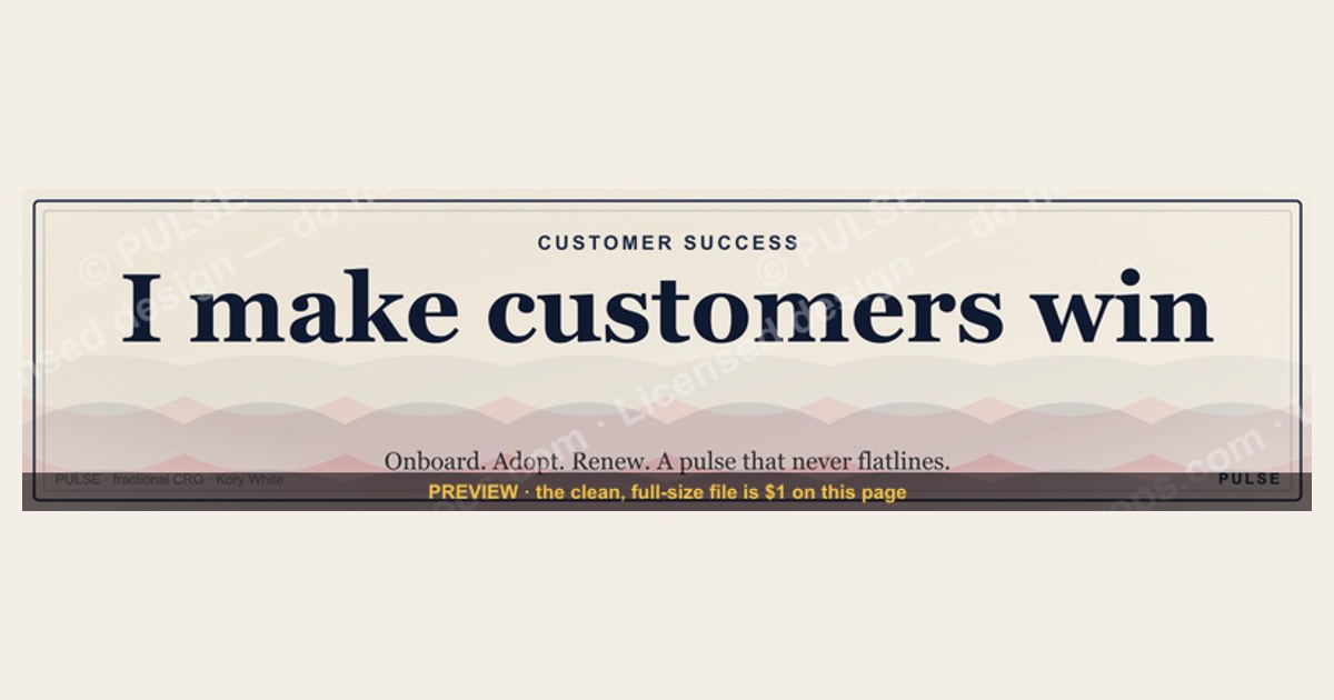
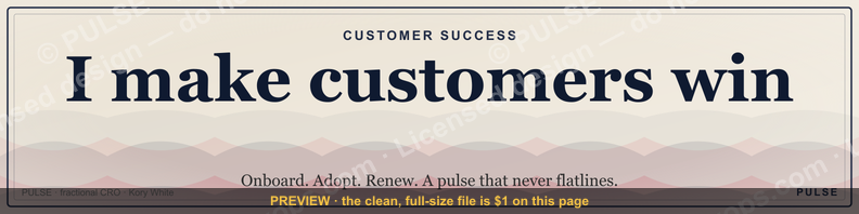
This is a LinkedIn profile banner sized 1584×396 px for Customer Success professionals — a deep navy-to-teal gradient background with the wordmark "CUSTOMER SUCCESS" in bold white sans-serif on the left-center, a thin rising-line accent graphic on the right, and a small tagline reading "Renewals. Retention. Relationships." underneath. Download it as a PNG and set it as your LinkedIn cover image to signal your function at a glance.
A CS lead's profile, three weeks before renewal season
Picture a Customer Success Manager updating her LinkedIn profile the week before a renewal-heavy quarter starts. Her headline says "Customer Success Manager at [Company]," her headshot is fine, but the banner behind it is the default LinkedIn pattern — the same faint gray brushstroke every unedited profile carries. A prospect who gets forwarded her LinkedIn URL by a champion inside the target account, a recruiter scanning for CS talent, or a peer she's about to connect with at a QBR — none of them see anything that says "Customer Success" until they read three lines down. The banner is prime visual real estate that most CS professionals leave blank or default.
This is the exact gap this graphic closes. It's not a slogan for slogan's sake — it's a piece of profile furniture that does the identification work before a single word of the headline gets read. Someone landing on the profile in the 1-2 seconds before they decide to keep scrolling or click away sees "CUSTOMER SUCCESS" spelled out large, in a clean, confident layout, and immediately knows the domain and the seniority level being signaled. That's the same logic sales teams have used for years with "Enterprise AE" or "SDR Team" banners — Customer Success has been slower to adopt it, in part because the function is newer and its visual language is less standardized than sales'. This banner gives that visual language a starting point: a wordmark, a supporting line about the job's actual outcomes (renewals, retention, relationships — not vague values language), and a subtle data-motif accent that reads as competence without looking like a stock photo of a handshake.

The scenario generalizes past the individual CSM. A VP of Customer Success prepping for a board update, a CS Ops analyst who just built the health-score model, a renewal specialist three weeks out from a big contract — all of them share the same profile-page problem, and all of them benefit from the same fix.
What's actually on the banner, element by element
The graphic is built from four layered elements, each doing a specific job inside the fixed 1584×396 px canvas that LinkedIn imposes on every profile cover photo.

Background layer: a diagonal gradient running from a deep navy (roughly #0B1F3A) in the upper-left to a muted teal (roughly #1B4D4A) in the lower-right. The gradient direction matters — it draws the eye from where the profile photo sits (left side, on top of the banner) toward the open right side where the wordmark and tagline live. A flat single color would work but reads as cheaper; a photographic background would compete with the profile photo for attention, which is why this design stays abstract.
Primary wordmark: "CUSTOMER SUCCESS" set in a bold, wide-tracked sans-serif (a Helvetica Neue Bold or equivalent geometric sans), all-caps, positioned center-right so it clears LinkedIn's profile-photo overlap zone on the left. The letters are pure white for maximum contrast against the navy-teal gradient — this is the single most important design decision, because a banner viewed at thumbnail size on a phone needs the headline text legible without zooming.
Supporting tagline: directly below the wordmark, in a smaller weight of the same typeface, the line "Renewals. Retention. Relationships." Three words, each starting with R, each naming an actual CS outcome rather than an abstract value — this is deliberate. A tagline like "Empowering Success" says nothing a hiring manager or prospect can act on; "Renewals. Retention. Relationships." tells them exactly what this person's job produces.
Accent graphic: a thin, single-stroke line chart motif in a lighter teal, positioned in the far right third of the canvas, trending upward left-to-right. It's small enough not to compete with the text but present enough to signal "this role is measured, this role moves numbers." It echoes the kind of health-score or NRR trend line a CS team actually watches, without trying to fabricate a specific chart or number.

Here's how those four elements stack, in the order they're built and the order the eye should travel:
Specs, safe zones, and where it holds up
The file is delivered as a PNG at the exact 1584×396 px LinkedIn requires for a personal profile background photo — this is a fixed dimension, not a suggestion, and LinkedIn will crop or reject an image that doesn't match that aspect ratio (roughly 4:1). Keep the exported file under LinkedIn's file-size ceiling, which sits around 8 MB for a background photo; a clean PNG at this resolution typically lands well under 1 MB, so size is rarely the binding constraint.
The bigger constraint is the safe zone. LinkedIn's desktop layout overlays your profile photo on the left third of the banner and, on most viewports, clips a further strip along the bottom edge behind your name-and-headline card. In practice that means roughly the left 400px and the bottom 60-80px of the 396px-tall canvas are unreliable for text — anything placed there risks being covered on desktop or cropped on mobile, where LinkedIn's app frequently shows a tighter center-crop of the banner than desktop does. This banner's layout was built around that constraint: the wordmark and tagline sit in the center-right two-thirds of the canvas, comfortably clear of both the photo overlay and the bottom name card, and the accent line motif is placed high enough that it survives the mobile center-crop.
For benchmarking against your own profile: if you already have a banner installed, open your profile on both desktop and the mobile app before swapping — note exactly where the current image gets cut off in each view. That's your empirical safe zone, and it varies slightly by how large your profile photo is set. Text closer than about 15% of the canvas width from the left edge is the highest-risk zone; text in the vertical center of the right two-thirds of the canvas is the safest.
One more number worth knowing: LinkedIn banners render at a fairly aggressive compression on mobile data-saver settings, which can soften fine detail. That's why this design avoids thin serif type or small supporting text below about 24px effective height — bold, wide strokes survive compression; delicate ones blur first.
When this banner helps — and when it backfires
This banner is not universally the right move, and it's worth being honest about the trade-off before installing it.
It helps most when the viewer needs a fast, unambiguous signal of function and seniority — a CSM applying for roles, a CS leader whose profile gets shared with prospects or partners as a credibility check, a CS Ops person building a personal brand around the discipline before it's fully standardized as a career track. In those cases the banner does real work: it removes a full second of "wait, what does this person do" from the viewer's read of the profile.
It backfires in a few specific situations. If your company has a strict personal-branding or social-media policy that requires employee profiles to carry company-branded assets instead of role-branded ones, a generic function banner like this can read as off-message — check with marketing or brand before swapping a company template out. If your actual title or scope is narrower than "Customer Success" broadly (say, you're specifically a renewal specialist, or you lead only onboarding), a banner that overclaims function can create a mismatch the moment someone reads your headline underneath it — better to either customize the wordmark to your actual scope or skip the function-wordmark approach entirely. And if you're actively interviewing outside CS — moving into product, sales, or general management — a banner that visually locks you into "Customer Success" works against the story you're trying to tell; swap it out or go generic during that window.
The realistic alternative to a typographic banner like this one is a photo-based banner — either a candid team photo from an offsite or QBR, or a professional headshot-adjacent lifestyle photo. Photo banners read as warmer and more personal but say nothing about function or seniority to a viewer who doesn't already know you; typographic banners like this one are the opposite trade — instantly legible, less personal. A third option, a plain solid-color banner with no text at all, is the safest choice when you're unsure which direction to go, but it also does zero identification work. Here's how those three paths compare:
Avoiding the common mistakes, and how to make it your own
The most frequent mistake with any function-wordmark banner is letting the text run into the profile-photo overlap zone — because the safe zone shifts slightly depending on how large a given viewer's browser renders your profile photo, text that looks clear on your own screen can get clipped on someone else's. The fix is to preview on both desktop and mobile after upload, and if anything looks tight, nudge the composition right rather than trusting the preview thumbnail LinkedIn shows during upload, which is not always representative of the final render.
A second common mistake is over-customizing the tagline into jargon. "Renewals. Retention. Relationships." works because each word is concrete and it's short enough to read in under a second. Teams that swap this for something like "Driving Customer-Centric Value Creation" lose the entire benefit of the format — the point of a banner tagline is speed of comprehension, not corporate vocabulary. If you're customizing the wording for your own role, keep it to two or three concrete nouns or short phrases, not a sentence.
To customize this for your own team: the wordmark text is the easiest lever — swap "CUSTOMER SUCCESS" for your actual title or team name ("RENEWAL TEAM," "CS OPERATIONS," "ONBOARDING") and keep the same weight and tracking so it still reads clearly at thumbnail size. Colors are the second lever — if your company has brand colors, substitute them for the navy-teal gradient, but keep enough contrast between the background and the white wordmark that legibility doesn't suffer; a light background will need the wordmark text switched to a dark color instead of white, or the text disappears. Role-based variants for a whole team (e.g., every CSM on the team runs the same banner with only their name changed, or omits a name entirely and just uses the shared team banner) create a small but real brand-consistency effect across a team's collective LinkedIn presence, something sales teams have used for years with SDR or AE banners.
To download and install: grab the PNG from the top of this page, go to your LinkedIn profile, click the pencil/edit icon on your current background photo (or the camera icon if none is set), upload the file, and LinkedIn's built-in cropper will let you fine-tune position before saving — use that cropper to double-check nothing important lands in the profile-photo overlap zone described above.
Related questions
Does a LinkedIn banner actually affect profile views or connection acceptance?
There's no universal published rate for this, and it varies heavily by audience and industry. What's well established is that a banner with legible, relevant text answers a viewer's "what does this person do" question faster than a headline alone, which shortens the decision window before they click away.
Should every person on a Customer Success team use the identical banner?
A shared team banner (same design, no personal name) builds visual consistency across a team's collective LinkedIn footprint and works well for teams doing coordinated outreach. Individual CSMs who want more personal branding may prefer a variant with their name or a slightly different tagline.
What's the difference between a LinkedIn banner and a company page cover photo?
A personal profile banner (1584×396 px) sits behind an individual's photo and headline; a LinkedIn Company Page cover photo uses a different aspect ratio and represents the brand, not a person. They should never carry identical text.
Can I use this same banner design on other platforms?
The 1584×396 aspect ratio is LinkedIn-specific. X/Twitter, Facebook, and YouTube each use different header dimensions, so the file would need to be re-cropped or regenerated at each platform's own spec rather than reused as-is.
FAQ
What exact dimensions does a LinkedIn banner need to be? 1584×396 pixels, roughly a 4:1 aspect ratio. LinkedIn will accept other sizes but will crop them to fit that ratio, which can cut off text or graphics placed near the edges.
Is this graphic free to download and use? Yes — download the PNG from the top of this page and upload it directly as your LinkedIn background photo. No account or purchase is required.
Can I edit the text or colors myself? The PNG itself is a flattened image, so editing it directly requires an image editor (Canva, Photoshop, or similar) where you can overlay new text or adjust the gradient. Keep the same safe-zone logic described above if you customize it.
Will the wordmark get cut off on mobile? Not with this layout — the wordmark and tagline are placed in the center-right two-thirds of the canvas specifically to survive LinkedIn's tighter mobile center-crop. Always preview on your own phone after uploading to confirm.
What file format and size is the download? A PNG file at the full 1584×396 resolution, typically well under 1 MB — comfortably inside LinkedIn's roughly 8 MB upload limit for background photos.
Is a function-based banner like this appropriate for a job search profile? Generally yes — it signals domain and seniority quickly to recruiters skimming search results. The one exception is if you're actively pivoting to a different function, where a more neutral banner may serve you better during the transition.
Sources
- https://www.linkedin.com/help/linkedin
- https://www.canva.com/create/linkedin-banners/
- https://www.adobe.com/express/create/banner/linkedin
- https://blog.hubspot.com/marketing/linkedin-banner-image-size
- https://www.hootsuite.com/social-media-glossary
- https://sproutsocial.com/insights/
- https://www.gainsight.com/blog/
Related on PULSE
- Customer Success — Team Photo LinkedIn Banner
- Customer Success Manager LinkedIn headline templates
- LinkedIn banner for Sales teams
- Customer Success onboarding checklist
- How CS Ops builds a health-score model
- QBR deck template for Customer Success
This page will be disappearing soon. Save it to your device for $1 — or read it free while it is here.
@Kory-White- · if Venmo asks, the last 4 of my number are 2012
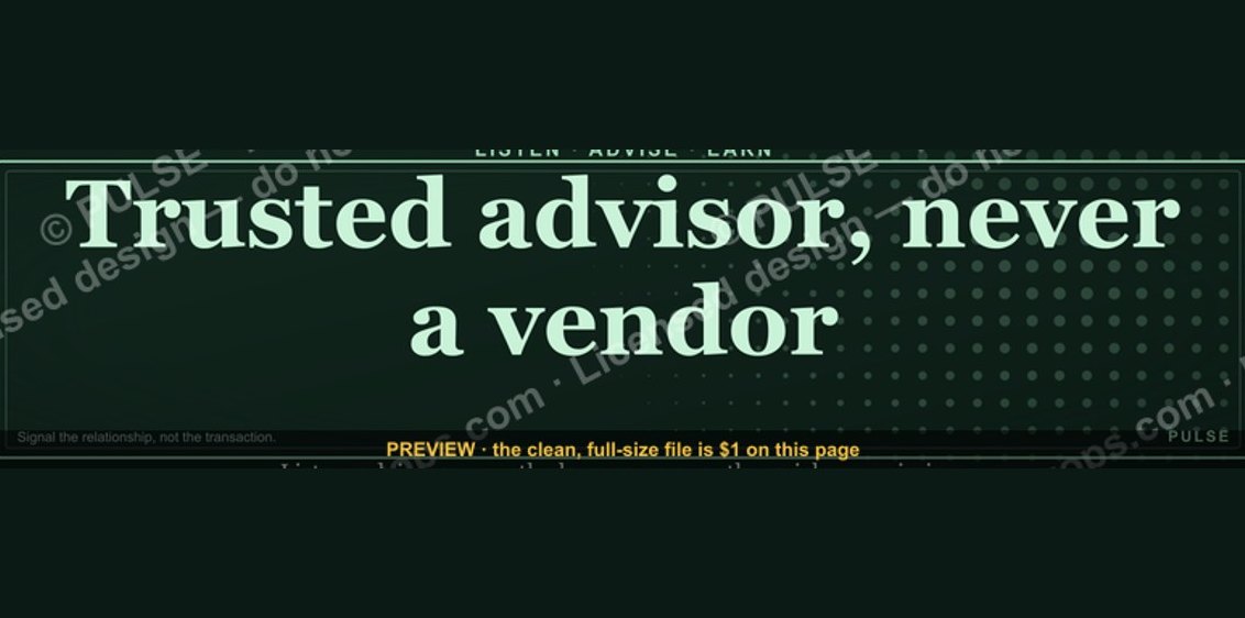 graphic“Trusted advisor, never a vendor.” — LinkedIn Banner
 graphicWhat criteria should I use to choose a graphics design tool for sales presentations in 2027?
 graphicBuild the revenue engine. — LinkedIn Wallpaper
 graphicHow to build a champion seller playbook in 2027
 graphicLLM Builder AI Engineer — LinkedIn Banner
 graphic“Never give without a get.” — LinkedIn Banner
 graphic"Win the quarter." — LinkedIn Banner
 graphicRenewals Manager — LinkedIn Banner
 graphic“The next call is the most important one.” — LinkedIn Banner
 graphicHow to design a LinkedIn banner that converts viewers into leads in 2027?