
Renewals Manager — LinkedIn Banner
 Curated byKory White · Fractional CRO · Maryland
 PULSEKNOWLEDGE LIBRARY
Quality
Certified
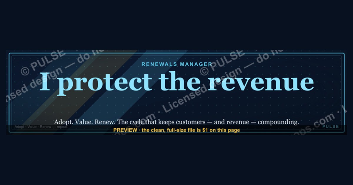
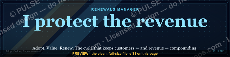
This is a downloadable LinkedIn profile banner (1584×396 px) for a Renewals Manager. It reads "Renewals Manager" as the primary headline in bold serif type on a dark, high-contrast background, with a short supporting line naming the core mandate — retention, expansion, and customer trust. Use it as your LinkedIn cover image, paired with a headline that states your book size or renewal rate underneath it.
A quiet Tuesday in a renewals queue
Picture a Renewals Manager three weeks out from a contract's anniversary date. The account has gone quiet — usage dipped last quarter, the champion changed roles, and the CFO is asking procurement to "benchmark alternatives" before signing off. This is the daily texture of the job: not closing net-new logos, but defending revenue that already exists against apathy, budget scrutiny, and quiet competitive evaluation. It's a role that rarely gets the spotlight a closer gets, yet a single missed renewal can erase months of new-business gains in one quarter.
That mismatch between impact and visibility is exactly why a Renewals Manager's LinkedIn presence matters more than it first appears. A recruiter, a VP of Customer Success scouting for a team lead, or a peer at a partner company scrolling a profile sees a wall of job titles and bullet points that look interchangeable with an Account Manager's or a Customer Success Manager's. The profile photo and headline do the differentiating work in the first two seconds of a glance — and the banner sits directly behind both, occupying more visual real estate than either. A generic default LinkedIn banner (or worse, the empty gray placeholder) wastes that space. This graphic exists to fill it with a single, unambiguous signal: this person owns renewals, and they own them on purpose.

The scenario extends past the individual. Renewals leaders increasingly build out full pods — renewal managers, renewal ops analysts, contract specialists — and when those pods want to present as a cohesive function inside a company's LinkedIn presence (shared visual language across a team page, a careers post, a LinkedIn newsletter banner), a clean, purpose-built "Renewals Manager" banner becomes a template other team members can adapt with their own name and specialty layered on top.
What's actually on the banner, and how it earns its spot
The graphic is built at 1584×396 pixels — LinkedIn's exact desktop banner dimension — so nothing gets cropped or repositioned by the platform's automatic resize when it's uploaded. At the center-left, where LinkedIn's profile photo circle sits on top of the banner on desktop, the design keeps that zone clear of critical text so the photo never covers a word. The dominant element is the headline "Renewals Manager," set large enough to read at thumbnail size in a LinkedIn search result list, not just at full profile-page width.

Below the headline sits a shorter supporting line focused on outcome rather than task — language oriented around retention, expansion, and renewal rate rather than a generic "results-driven professional" phrase. The color treatment favors a dark, low-saturation background (navy or charcoal) with a single accent color carrying the text, which keeps the banner legible whether the viewer is on LinkedIn's light mode or has an ad blocker or dark-mode browser extension altering the surrounding chrome. No stock photography, no clip-art handshake icons, no gradient mesh — the design leans on typography and spacing because a role-identity banner needs to be read in under two seconds, not admired.
The mechanism by which this actually changes a viewer's behavior is straightforward but worth tracing end to end, because it explains why the banner is worth the five minutes it takes to swap in:

The banner's job in this chain isn't to close a deal on its own — it's to remove the ambiguity that causes a viewer to disengage before reaching the sections that actually carry proof (Experience, recommendations, featured posts). A viewer who already knows "this is a Renewals Manager" reads the rest of the profile looking for renewal-specific evidence — net revenue retention numbers, renewal rate, save-rate on at-risk accounts — rather than generic sales metrics that don't map to the role.
The numbers behind banner-driven profile views
LinkedIn's own platform behavior gives a rough sense of scale here, even without profile-specific analytics. A completed profile — one with a banner image rather than the default gray placeholder — reads as materially more finished and current to a viewer scanning quickly, and recruiters routinely describe scanning a profile in under ten seconds before deciding whether to open it fully or move to the next search result. In that window, the banner and headline are the only two elements guaranteed to be visible without a click or scroll, since the About section and Experience list sit below the fold on both desktop and mobile.
On the design-constraint side, the 1584×396 pixel dimension is not arbitrary — it is LinkedIn's published desktop banner size, and the platform crops more aggressively on mobile, showing roughly the center 60-70% of that width depending on device. That's why this banner keeps its headline text centered rather than pushed to either edge: text placed near the left or right third risks being trimmed on a phone screen, where a large share of profile views now happen. File weight matters too — LinkedIn accepts JPG, PNG, and GIF up to 8MB for banners, but a banner in the 200KB–1MB range uploads and renders faster with no visible quality loss at this pixel count, which is the range this graphic is sized to.
For a renewals-specific headline pairing underneath the banner, the strongest performing pattern in practice is a number plus a scope: something like "$14M renewal book · 96% gross retention" reads faster and carries more signal than an adjective-led headline like "Dedicated Renewals Professional." The banner sets the role identity; the headline text carries the differentiating proof point. Together they cover both halves of what a scanning viewer needs in the first two seconds — who you are, and why it matters.
Off-the-shelf banner vs. custom design vs. no banner at all
There are really three paths available to a Renewals Manager updating their LinkedIn presence, and each carries a different cost-to-benefit ratio:
The pre-built path — downloading this banner and uploading it directly — trades some personalization for speed and consistency. It's the right call when the goal is simply to stop looking unfinished this week, or when a renewals team wants every member's profile to carry the same visual identity without asking each person to become a part-time designer. The custom path makes sense when a Renewals Manager has a personal brand already in motion — a distinct color palette used across a newsletter, a portfolio site, or a recurring LinkedIn content series — and wants the banner to match that existing identity exactly rather than adopt a generic one. It costs real time, though: even a fast freelance turnaround runs a few days, and a from-scratch Canva attempt by someone without design habits often produces a cluttered result that undercuts the same two-second scan the banner is supposed to win.
Leaving the default is the most common choice by inertia rather than decision, and it's the costliest one in relative terms — not because a blank banner actively repels a viewer, but because it wastes the single largest piece of visual real estate on the profile at zero cost to fix. There is no scenario in which the blank default outperforms either alternative; the only real trade-off sits between pre-built speed and custom personalization.
Common mistakes that turn a good banner into noise
The most frequent misstep is treating the banner as a second headline and cramming it with multiple lines of small text — a role title, a tagline, a phone number, a list of certifications. At banner scale, and especially at the reduced size LinkedIn displays in search results and the mobile app, anything beyond a short headline and one supporting line becomes unreadable, and unreadable text reads to a viewer as clutter rather than content. Keep it to two text elements maximum.
A second common error is low contrast — light gray text on a white or pale background, or a busy photographic background behind the headline that fights for attention with the words themselves. Since LinkedIn overlays the profile photo circle and, on some layouts, action buttons directly on top of the banner, any design that depends on the full image being visible will lose part of its message regardless of contrast. Test the banner with a circle masked out over the lower-left area before finalizing it.
A third mistake is letting the banner drift out of sync with the headline text below it. A banner that says "Renewals Manager" paired with a headline still reading "Sales Development Representative | Hunting new logos" sends a contradictory signal that undercuts the very clarity the banner was meant to add — viewers notice the mismatch even if they can't immediately articulate why the profile feels off. Whenever the banner changes, the headline text should be updated in the same sitting.
Finally, many people upload a banner once and never revisit it. A Renewals Manager who moves from managing a $5M book to a $20M book, or who shifts focus from commercial to enterprise renewals, should treat the banner (and the headline underneath it) as a living asset that gets revised alongside a title change or a major account win — not a one-time setup task.
Related questions
What size should a LinkedIn banner be?
1584×396 pixels is LinkedIn's standard desktop banner size. Files should stay under roughly 8MB, with JPG or PNG in the 200KB–1MB range offering the best balance of quality and fast upload.
Does a LinkedIn banner actually affect profile views?
It affects how quickly a viewer forms an accurate impression during the first few seconds of a scan, which shapes whether they continue reading — it doesn't guarantee more views on its own, but it reduces early drop-off.
Should a Customer Success Manager use the same banner as a Renewals Manager?
No — the roles overlap but the metrics that matter differ (retention/expansion vs. adoption/health scores), so the banner's headline and supporting line should reflect the specific title and mandate.
How often should I update my LinkedIn banner?
Whenever your title, book size, or core metric changes meaningfully — treat it as tied to career milestones rather than a fixed schedule.
Can I use this banner if my title is "Renewal Account Manager" instead?
Yes — download it and swap the headline text to match your exact title; the layout and sizing stay valid for any renewals-adjacent title.
FAQ
Is this banner free to download? Yes. It's provided as a PNG at the full 1584×396 LinkedIn banner dimension, ready to upload directly with no design software required.
Will LinkedIn crop or resize the image after I upload it? LinkedIn may reposition the banner slightly depending on your device and browser, and mobile view shows a narrower center crop than desktop. Because this banner keeps its text centered with generous margin, the headline stays intact across both.
Can I edit the text on the banner myself? The downloaded file is a flattened PNG, so editing requires opening it in an image editor (Canva, Photoshop, or similar) and adding your own text layer over the existing background, or requesting a custom variant with different wording.
Does the banner include my photo? No — LinkedIn banners and profile photos are separate uploads. The banner is designed with a clear zone where your profile photo circle will sit on top of it, so the two don't visually collide.
What if I'm a renewals leader managing a team, not an individual contributor? The same design principles apply — swap "Renewals Manager" for "Renewals Team Lead" or "Director of Renewals" and adjust the supporting line to reference team-level retention rather than an individual book.
Is a banner really worth the effort compared to just having a good headline? The banner and headline work together, not in competition — the banner establishes role identity in the first glance, and the headline carries the specific proof point. Skipping the banner means relying on text alone to do both jobs.
Sources
- https://www.linkedin.com/help/linkedin/answer/a542918
- https://business.linkedin.com/talent-solutions/blog
- https://www.gainsight.com/resources
- https://www.clientsuccess.com/blog
- https://www.forrester.com/blogs
- https://www.hubspot.com/state-of-marketing
- https://www.salesforce.com/resources
- https://www.zendesk.com/blog
Related on PULSE
- What Net Revenue Retention Actually Measures
- Customer Success Manager — LinkedIn Banner
- How to Structure a Renewals Pod Inside Customer Success
- Renewal Rate vs. Gross Retention: What's the Difference
- Account Manager — LinkedIn Banner
- Building a LinkedIn Headline That Gets Recruiter Replies
This page will be disappearing soon. Save it to your device for $1 — or read it free while it is here.
@Kory-White- · if Venmo asks, the last 4 of my number are 2012
 graphicHow to design a LinkedIn banner that converts viewers into leads in 2027?
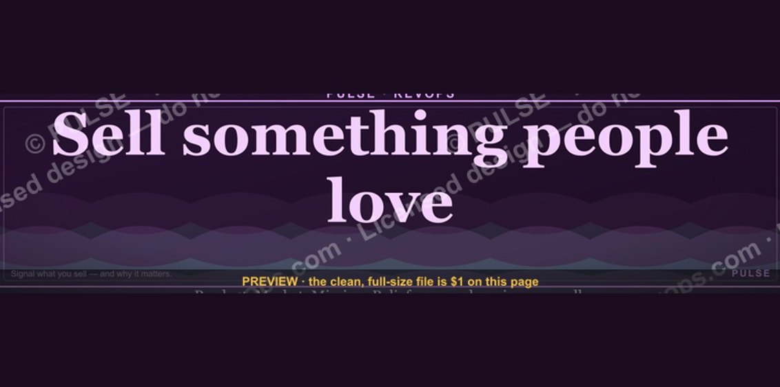 graphic“Sell something people love.” — LinkedIn Banner
 graphicWhat do top-performing graphic designers do differently in 2027?
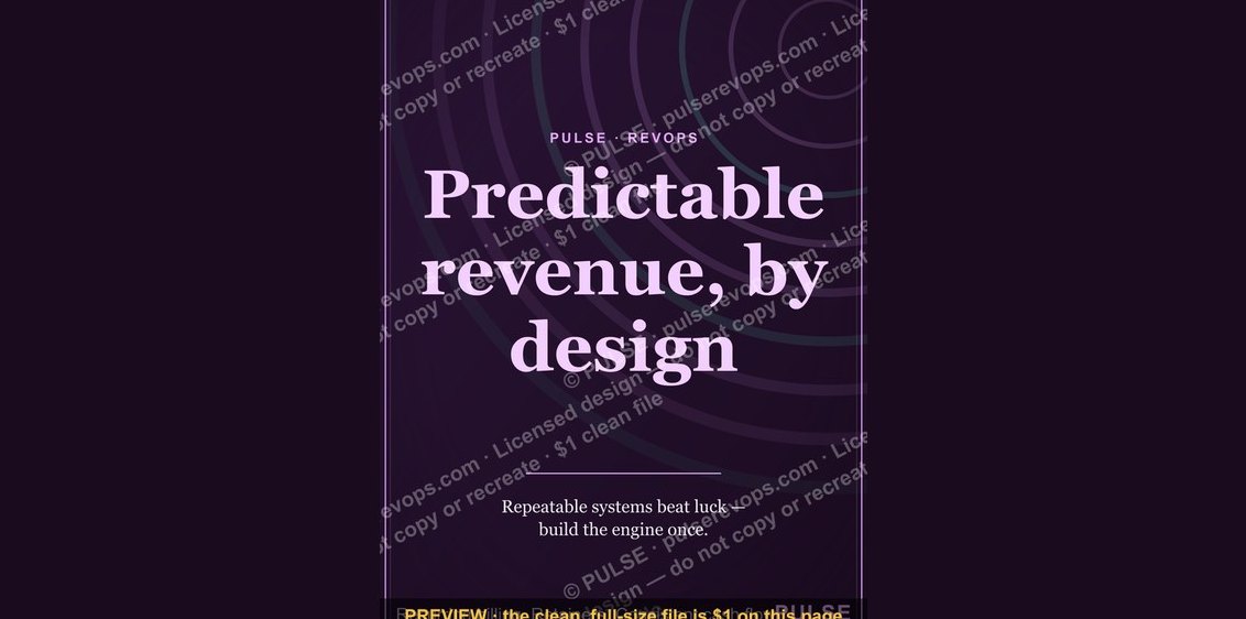 graphicPredictable revenue, by design. — LinkedIn Wallpaper
 graphicPipeline Conversion Rate Funnel — Infographic in 2027
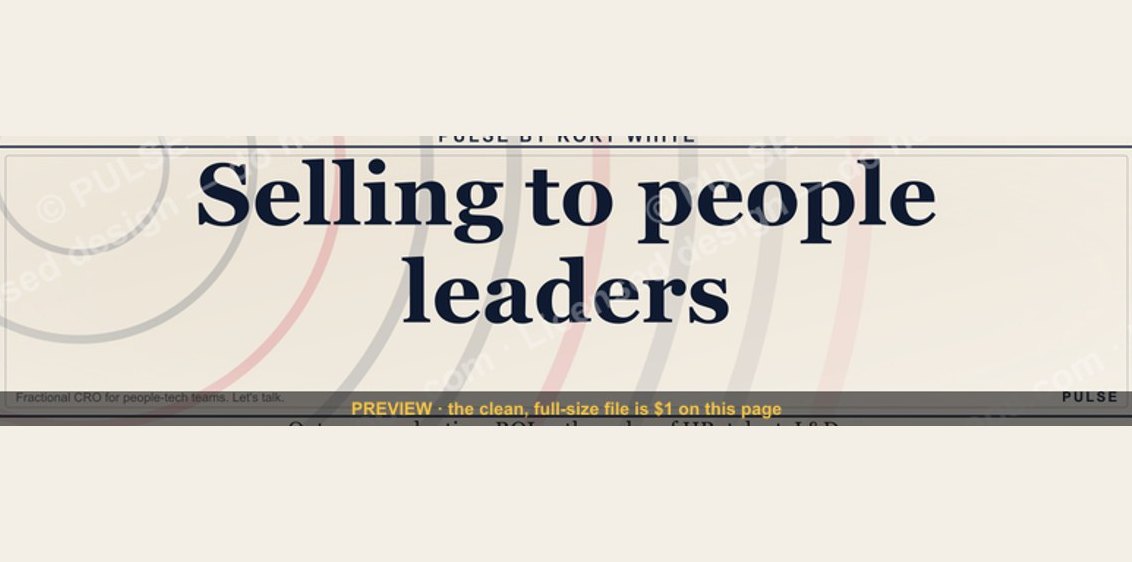 graphic“Selling to people leaders.” — LinkedIn Banner
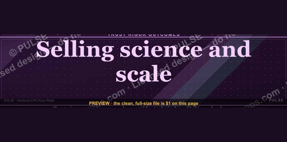 graphic“Selling science and scale.” — LinkedIn Banner
 graphicHow to find champions before the first call in 2027
 graphic“Never give without a get.” — LinkedIn Banner
 graphicSIEM and Data Lake CRO — LinkedIn Banner