
“Trusted advisor, never a vendor.” — LinkedIn Banner
 Curated byKory White · Fractional CRO · Maryland
 PULSEKNOWLEDGE LIBRARY
Quality
Certified
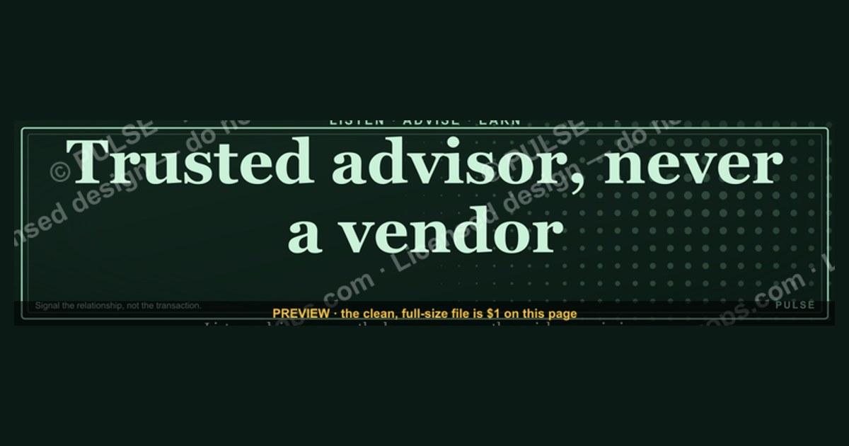
This is a LinkedIn profile banner (1584×396px) that reads "Trusted advisor, never a vendor." in bold, high-contrast type across a dark, neutral background — designed to sit behind your profile photo and headline. It signals, before a prospect reads a single word of your summary, that you sell through diagnosis and counsel rather than pitch-and-close pressure. Download the PNG and drop it straight into your LinkedIn profile.
The outcome you should expect
Once this banner is live behind your headshot, three things change about how a visitor reads your profile in the first two seconds — before they scroll, before they read your headline, before they check your job title. First, the word "Trusted" sits in the visual hierarchy above everything else on the page except your name, because banners render at full width and your eye lands there before it lands on the smaller headline text beneath your photo. Second, the phrase frames every subsequent word on the page: a headline that says "Enterprise Account Executive @ Acme" now reads as "an account executive who has explicitly rejected the vendor posture," not just a job title. Third — and this is the part people underestimate — it pre-answers the objection a buyer forms unconsciously the moment they see "salesperson" or "account executive" in a title: the assumption that the person reaching out wants something from them rather than for them.
The exact wording on the graphic is a single line, center-set: "Trusted advisor, never a vendor." No sub-line, no logo, no company name baked into the image — that separation is deliberate, because a banner with a company wordmark stops being portable if you change employers, and this one is meant to survive a job change intact. The typography is a serif or clean sans in white-on-near-black (the source file uses a near-black backdrop around #0b0d12 with white or warm-gold text so it holds contrast at LinkedIn's forced compression), set large enough to be legible on a phone screen, where LinkedIn crops the banner aggressively on both edges. There is no photograph, no stock imagery, no gradient mesh — just typography and negative space, because a banner competing with a headshot for attention loses; a banner that recedes and lets the words do the work wins.

The realistic outcome, in practical terms: this is a positioning cue, not a growth hack. It will not by itself generate inbound messages or move a pipeline number. What it reliably does is reduce the "here comes another pitch" flinch that a cold viewer has when they land on a seller's profile from a mutual connection, a comment, or a search result — and it gives you a one-line answer, already written, the next time someone asks "how would you describe your approach" in a discovery call or an interview.
What drives that outcome
The mechanism is about sequencing, not persuasion. A LinkedIn profile is read top-to-bottom, but it is *scanned* left-to-right-then-down in a predictable path: banner, photo, name, headline, then (only if the first four earned it) the About section. Because the banner occupies the widest, highest-contrast real estate on the page, it functions as a pre-frame — it sets the interpretive lens the visitor applies to everything that follows, the same way a headline in a news article shapes how a reader interprets the body copy beneath it, even when the body copy is neutral.
Where this breaks down is when the graphic contradicts the content beneath it. If the banner says "trusted advisor" and the headline says "Crushing quota @ Acme | #1 rep 2025," the visitor experiences cognitive dissonance — the two signals compete, and the more aggressive one (quota-crushing) usually wins the interpretation, because bravado is a stronger, more primal signal than a stated value. The banner is not a substitute for headline and About-section alignment; it is the first domino, and the other dominoes have to fall the same direction or the whole sequence reads as inconsistent, which is worse than having no positioning statement at all. The advisor framing only compounds when the headline names an outcome or a problem solved for a specific buyer type, the About section opens with a client situation rather than a personal biography, and the featured section links to something educational (a framework, a benchmark report, a diagnostic) rather than a demo request form.
Benchmarks and realistic ranges
File specs. LinkedIn's banner slot is 1584×396px (a 4:1 ratio), with a maximum file size around 8MB, JPG or PNG. PNG is the better export here because the graphic is flat typography on a solid or near-solid background — PNG compresses that losslessly, while JPG can introduce visible banding around the text edges at LinkedIn's re-compression pass. Export at the full 1584×396 canvas; do not upscale a smaller file, because LinkedIn will render it soft on high-DPI (Retina) displays if the source resolution is under-spec.
Safe zone. The desktop and mobile crops differ meaningfully. On desktop, roughly the center 1584×340px band is visible without the profile photo overlapping it; the bottom ~56px is covered by your photo and name block on desktop layouts. On mobile, LinkedIn crops the banner far more aggressively — often to a narrow horizontal strip in the 1080×300px range depending on device — and it centers the crop, so text set flush to either edge of the 1584px canvas will be clipped on a phone. Practical rule: keep all text and any wordmark inside the center 70% of the canvas width (roughly a 1100px-wide safe column centered in the 1584px frame) and vertically biased toward the upper two-thirds, so it survives both the desktop photo-overlap and the mobile crop.
Type size ranges that hold up. For a single-line statement like this one, a realistic working range is 60–90px cap-height for the primary line on the 1584×396 canvas — small enough to leave breathing room, large enough to read clearly when LinkedIn compresses the banner to its actual displayed width (which is smaller than the native upload on most screens, often rendered around 1128px wide). Below roughly 48px cap-height, the phrase starts to fight for attention against a headshot; above 110px, single words start to feel like a billboard rather than a statement and edge toward the safe-zone boundary described above.

Contrast ranges. White text on a background lighter than roughly 20% luminance risks washing out under LinkedIn's JPG re-compression if you exported as JPG; the safer range is background luminance under 15% (near-black, near-navy, near-charcoal) with text luminance over 85% (near-white or a warm off-white/gold), giving a contrast ratio comfortably above 7:1 — well past the 4.5:1 WCAG AA minimum for normal text, which matters here because a banner that fails on a phone screen in direct sunlight has failed at its one job.
Adoption pattern. Among sellers who adopt a positioning banner like this one, the realistic pattern is that it gets swapped or refreshed every 6–12 months — tied to a role change, a repositioning of personal brand, or simply fatigue with looking at the same graphic. Treat the file as a template you'll re-skin, not a permanent fixture: keep the source layers (background, type, any accent line) editable rather than flattening early.

Risks, edge cases, and failure modes
The single biggest failure mode is the mismatch case already described: banner says "advisor," everything else on the profile screams "vendor." A featured section stacked with case study PDFs titled "Why Acme Beats Competitor X," a headline built entirely around quota rank, or a posting history that is 90% product announcements will all actively undermine the banner's claim. A visitor who notices the contradiction doesn't just discount the banner — they discount the person's self-awareness, which is a worse outcome than never having claimed the advisor position at all.
A second failure mode is genericness. "Trusted advisor, never a vendor" is a strong, specific line, but it has become common enough in sales-positioning circles that a visitor who has seen it on five other profiles this month reads it as a category cliché rather than a personal claim — the same way "results-driven professional" stopped meaning anything years ago. This risk is mitigated, not eliminated, by everything downstream of the banner actually demonstrating the claim: a headline naming a specific problem you solve for a specific buyer, an About section that opens with a client's situation instead of your own résumé, and post history that shares frameworks or diagnostic questions instead of product pitches. The banner buys you a first impression; the surrounding content has to cash the check.
A third, more technical failure mode is the crop-and-compress problem covered above: text set too close to the edges gets clipped on mobile, and text under-sized against a low-contrast background goes illegible after LinkedIn's compression pass, especially in dark mode where LinkedIn adds its own overlay treatment around the photo. Always preview the uploaded banner on an actual phone, not just the desktop editor preview, before considering the swap final — LinkedIn's own upload preview does not accurately represent the mobile crop.
A fourth edge case is industry mismatch. In categories where "vendor" is a neutral, even respected term — procurement, logistics, government contracting, some manufacturing supply chains — a banner that positions against "vendor" as a dirty word can read as tone-deaf or as implicitly criticizing the buyer's own vendor relationships. This framing works best in consultative, complex-sale contexts (SaaS, professional services, enterprise software, financial advisory) where "just another vendor" genuinely is the objection being defused. Before adopting it wholesale, confirm the phrase lands as intended with a colleague or manager who sells into your specific buyer population — a five-minute gut check that catches the mismatch before a thousand profile views do.
A fifth risk is over-claiming without backup: using the word "Trusted" on a banner while your profile has fewer than a handful of recommendations, no visible client outcomes, and a short tenure history can read as aspirational rather than earned. The claim carries more weight paired with even two or three specific, named-outcome recommendations sitting directly beneath it in the Recommendations section — trust is a claim other people make about you, and a banner asserting it on your own behalf works best when it is visibly corroborated one scroll down.
A practical rollout plan
For a single individual, the rollout is a five-minute task: export the 1584×396 PNG, upload it via the profile edit screen, and audit the headline and About section for the alignment issue described above before calling it done. For a sales team or a company rolling this out as a shared brand asset across a whole revenue org, the sequence matters more, because a team-wide banner swap done carelessly produces the exact "everyone copy-pasted the same corporate line" effect this graphic is trying to avoid.
Start with a small pilot of three to five reps whose existing outbound and post history already reflects a consultative, diagnostic style — they're the ones for whom the banner will read as confirmation rather than aspiration. Before anyone swaps the image, have them do the fifteen-minute audit of headline and About section described in the risks section above; a banner rollout is a good forcing function for a broader profile cleanup, not just a graphic swap.
Customization matters for a team rollout: identical banners across ten reps' profiles read as a corporate mandate, which undercuts the individual, personal-trust claim the line is making. Keep the core message ("Trusted advisor, never a vendor," or a close paraphrase) but let each rep adjust the accent color, the exact typographic treatment, or swap in a second line naming their specific specialty (industry vertical, buyer persona, or problem category) so the graphic still reads as theirs rather than issued from marketing.

Roll it out as an opt-in asset with an editable source file (Canva template or layered PSD/Figma file) rather than a single locked PNG hard-mandated top-down — sellers who choose their own positioning language stick with it longer than sellers handed a corporate template, and a banner someone doesn't believe in shows in every other signal on their profile within weeks. After 30 days, a light-touch check on profile views and connection/InMail acceptance rate trend (not a rigorous attribution study — this is a soft signal, not a pipeline metric) tells you whether the swap is worth extending team-wide or worth revising first.
Related questions
What size should a LinkedIn banner be?
1584×396px (4:1 ratio), exported as PNG for flat typography or JPG for photographic backgrounds, under LinkedIn's roughly 8MB file cap, with key text kept inside the center 70% of the canvas to survive mobile cropping.
Does a LinkedIn banner actually affect response rates?
It's a soft positioning signal, not a direct response driver — it shapes the frame a visitor applies to your headline and About section rather than generating messages on its own. Alignment with the rest of the profile is what makes it work.
What's the difference between a trusted advisor and a vendor in sales language?
A vendor is defined by the transaction — they sell what's asked for. A trusted advisor is defined by the diagnosis — they question the ask, surface the real problem, and sometimes recommend against their own product if it isn't the right fit.
Should every rep on a team use the same LinkedIn banner?
No — identical banners read as corporate mandate and undercut the personal-trust claim. Share a template with editable wording and color so each rep's version still reads as their own voice.
How often should I update my LinkedIn banner?
Every 6–12 months is a realistic cadence, tied to a role change, a repositioning of your personal brand, or simple visual fatigue — treat the source file as a template to re-skin, not a permanent fixture.
FAQ
Is this graphic a photo or just text? It's typography only — a single centered line of text on a dark, near-solid background, with no stock photography, logo, or gradient imagery. That restraint is deliberate so the words carry the full weight of the statement.
Can I add my company logo to this banner? You can, but consider keeping the logo small and off to one side rather than centered, since a company wordmark ties the banner to your current employer and reduces its portability if you change roles.
What if my headline already says something like 'Sales Executive'? That's fine and common — the banner's job is to reframe how that title is read, not replace it. Pair it with a headline that names a buyer outcome or problem solved, and the two reinforce each other instead of contradicting.
Will this banner work in dark mode LinkedIn? Yes, because it's already designed on a near-black background with high-contrast light text, which holds up well against LinkedIn's dark-mode chrome; just verify the specific export on an actual phone screen before finalizing.
Does the phrase 'never a vendor' risk sounding arrogant? It can, in industries where "vendor" is a neutral or respected term rather than a pejorative. Check the framing against your specific buyer population before adopting it — it lands best in consultative, complex-sale contexts like SaaS or enterprise services.
Where do I actually upload this once I've downloaded it? From your own LinkedIn profile, click your existing banner image (or the camera/edit icon if you have none), choose "Change photo," upload the PNG, and adjust the crop preview — then check the result on both desktop and mobile before leaving the editor.
Sources
- https://www.linkedin.com/help/linkedin
- https://www.linkedin.com/business/marketing
- https://blog.hubspot.com/sales
- https://www.canva.com/linkedin-banner/templates/
- https://www.salesforce.com/resources/articles/consultative-selling/
- https://hbr.org/topic/sales
- https://www.gartner.com/en/sales
- https://sandler.com/blog/
- https://www.challengerinc.com/blog/
Related on PULSE
- What makes a strong LinkedIn headline for a salesperson?
- Consultative selling vs. transactional selling: what actually changes in the pitch
- How to build a personal brand as an account executive
- Other downloadable LinkedIn banners and profile graphics in this series
- What belongs in the About section of a sales leader's LinkedIn profile?
This page will be disappearing soon. Save it to your device for $1 — or read it free while it is here.
@Kory-White- · if Venmo asks, the last 4 of my number are 2012
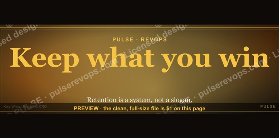 graphicKeep what you win. — LinkedIn Wallpaper
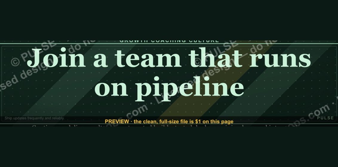 graphic“Join a team that runs on pipeline.” — LinkedIn Banner
 graphicHow to build a champion champion plan in 2027?
 graphic“Clarity closes.” — LinkedIn Banner
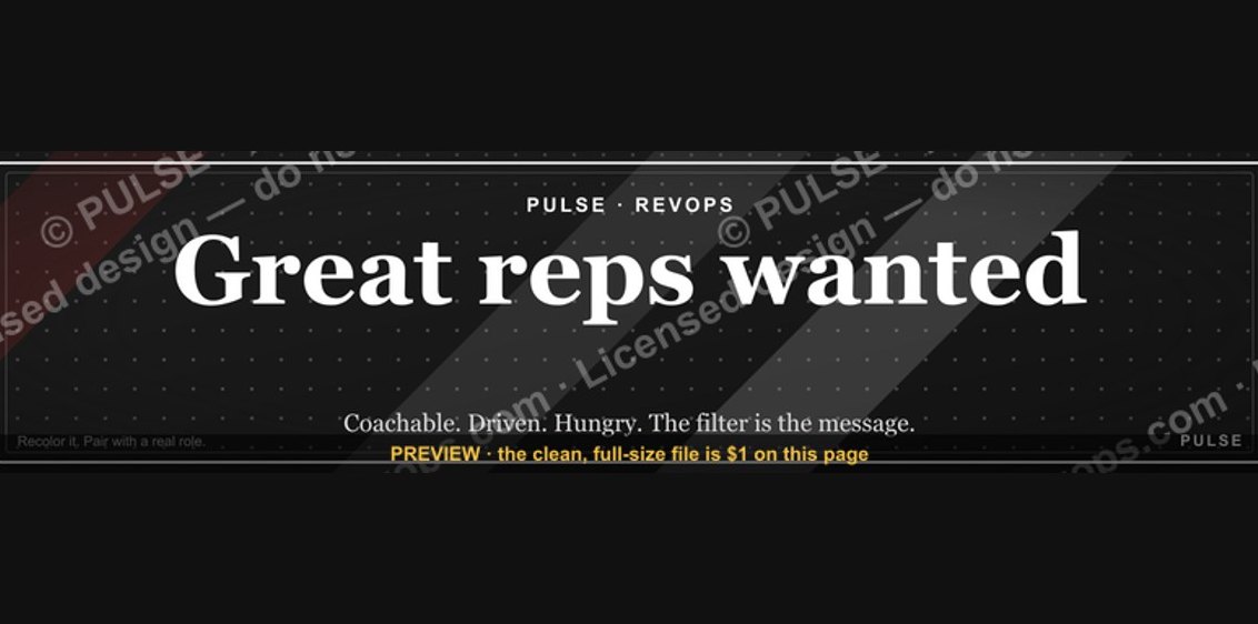 graphic“Great reps wanted.” — LinkedIn Banner
 graphicHow to design a LinkedIn banner that converts viewers into leads in 2027?
 graphicSales Coach — LinkedIn Banner
 graphicRight market, right motion. — LinkedIn Wallpaper
 graphicStay in the deal. — LinkedIn Wallpaper
 graphicHow to build a champion seller playbook in 2027