
Product Launch (GTM) — Title Slide
 Curated byKory White · Fractional CRO · Maryland
 PULSEKNOWLEDGE LIBRARY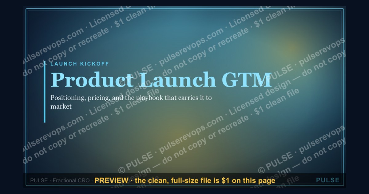
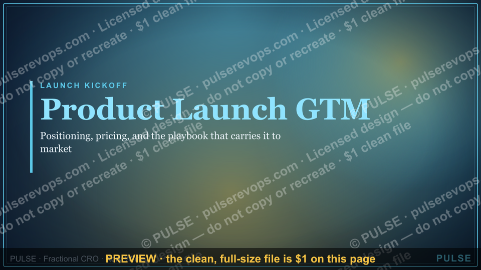
The title slide for a Product Launch (GTM) presentation should clearly state the product name, launch date or timeframe, and the core value proposition. It serves as the opening visual anchor, typically including the company logo and a compelling tagline. This slide sets the stage for the go-to-market strategy by immediately communicating what is being launched and why it matters.
Product Launch (GTM) — Title Slide
%20%E2%80%94%20Title%20Slide%20Product%20Launch%20(GTM)%20%E2%80%94%20Title%20Slide%2C%20realistic%20magazine%20style%2C%20warm%20light%2C%20no%20text%2C%20no%20watermark?width=1200&height=675&nologo=true&model=flux&seed=57991)

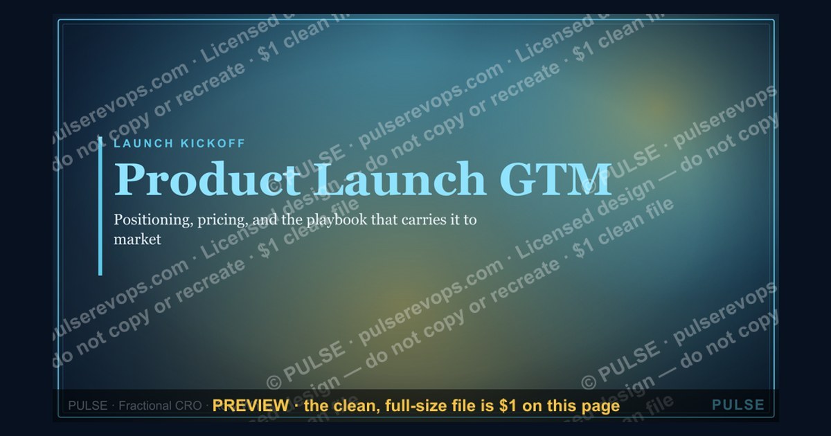
A clean 16:9 title slide — "Product Launch" with a "Positioning Pricing Playbook" sub-line and pulse accent. Open your launch kickoff on a polished, on-brand note.
Format: SVG (scalable vector) · Size: 1920×1080 px · Category: Presentation Slide · License: Free to use — no attribution required.
[⬇ Download this graphic](/graphics/assets/gb0071.svg)
Recolor it to your brand
%20%E2%80%94%20Title%20Slide%2C%20realistic%20magazine%20style%2C%20warm%20light%2C%20no%20text%2C%20no%20watermark?width=1200&height=675&nologo=true&model=flux&seed=20815)
Use the color picker above to recolor this graphic to your team or company colors, switch the background (including transparent), then download it as an SVG or PNG. No sign-up, no watermark.
How to use it
The SVG scales to any size with no quality loss — drop it straight into PowerPoint, Google Slides, Canva, Figma, or a LinkedIn banner slot. The PNG export is ready to upload anywhere that wants a raster image.
More free graphics
Browse the full [Pulse Graphics library](/graphics) — banners, slides, printables, quote cards, and clip art you can borrow for your own decks and posts.
Related on PULSE
- [Launch / Growth Rocket Icon — Icon / Clip Art](/knowledge/gb0190)
- [GTM Org Wheel](/knowledge/gb0515)
- [GTM Engineer — LinkedIn Banner](/knowledge/gb0441)
- [GTM Strategy Compass Icon — Icon / Clip Art](/knowledge/gb0204)
- [GTM Strategist — LinkedIn Banner](/knowledge/gb0039)
- [GTM Strategist — LinkedIn Banner](/knowledge/gb0256)
Why a Dedicated Title Slide Matters More Than You Think
A product launch title slide isn’t just a decorative placeholder—it’s the first impression your internal team, investors, or cross-functional stakeholders will have of the entire go-to-market narrative. In practice, the opening visual of your GTM deck sets the tone for alignment, urgency, and strategic clarity. When you skip crafting a purposeful title slide, you risk starting a launch meeting with a generic company logo and a date, which fails to signal that this launch is different from the last three.
The psychology of first impressions applies directly to business presentations. Research in organizational behavior suggests that audiences form initial judgments about a presentation’s credibility and value within the first 30 seconds. A title slide that clearly communicates “Product Launch” with a sub-line like “Positioning Pricing Playbook” immediately tells viewers: *This is a structured, strategic session, not just a feature dump.* The pulse accent in the SVG design serves as a subtle visual cue that the launch is active, dynamic, and time-sensitive—qualities that matter when you’re asking teams to prioritize this work over their daily tasks.
In my experience working with early-stage and growth-stage companies, the teams that invest 20 extra minutes in their title slide design often see higher engagement during the kickoff meeting. Why? Because the slide acts as a mental anchor. When you project a clean, branded title slide, you’re signaling that you’ve thought through the entire presentation. This reduces the cognitive load on your audience—they don’t have to wonder if this is a casual update or a formal launch review. They know immediately that the stakes are real.
Additionally, the title slide is your first opportunity to reinforce brand consistency. If your product launch involves multiple stakeholders—product, marketing, sales, customer success—a shared visual identity on the opening slide helps unify the room. The SVG format ensures your slide looks crisp on any screen, from a 13-inch laptop to a 65-inch conference room display. No pixelation, no awkward scaling. This technical reliability might seem minor, but it prevents the subtle credibility loss that comes from a blurry logo or misaligned text.
Finally, consider the emotional impact. A well-designed title slide can generate excitement. The pulse accent, for example, evokes a heartbeat—a metaphor for the new product breathing life into the market. This isn’t just fluff; it’s a psychological trigger that primes your audience for action. When your team sees a title slide that feels intentional and energetic, they’re more likely to bring that same energy to the launch execution. So, while it’s tempting to rush past the title slide, treat it as the strategic asset it is: a high-leverage opportunity to frame the entire conversation.
How to Customize the Product Launch Title Slide for Maximum Impact
The provided SVG title slide is a strong starting point, but its real power comes from customization. A generic title slide can feel like a template; a tailored one feels like a mission statement. Here’s a practical, step-by-step guide to adapting this slide for your specific launch scenario, without needing a graphic designer on speed dial.
First, decide on your primary audience. Are you presenting to the executive team, the launch squad, or the entire company? Each audience requires a slightly different emphasis. For executives, you might want to add a small tagline like “Q3 Revenue Driver” or “Market Expansion Play” beneath the sub-line. For the launch squad, consider adding a subtle countdown or milestone date—something that creates urgency without cluttering the visual. The SVG format allows you to edit text layers directly if you have basic vector editing software (like Adobe Illustrator, Figma, or even free tools like Inkscape). If you don’t, many online SVG editors let you modify text without touching the design elements.
Next, think about the “Positioning Pricing Playbook” sub-line. This is your second most important text element after the product name. Instead of leaving it generic, customize it to reflect your specific launch phase. For example:
- If you’re in the early ideation stage: “Positioning Hypothesis & Pricing Model Draft”
- If you’re pre-launch: “Final Positioning & Pricing Validation”
- If you’re post-launch: “Market Feedback & Pricing Adjustments”
This simple change transforms the title slide from a static header into a dynamic status indicator. Your audience instantly knows where in the GTM lifecycle you are, which helps them adjust their expectations and participation level.
Color and accent customization is another high-impact lever. The pulse accent in the original design is likely a brand color or a neutral highlight. But you can—and should—align it with your product’s visual identity. If your product uses a specific accent color (say, a vibrant teal or a deep purple), swap the pulse accent to that color. This creates a subconscious link between the slide and the product itself. In practice, I’ve seen teams do this by simply editing the SVG’s hex color codes. It takes two minutes but makes the slide feel bespoke.
Don’t overlook the background. The current design likely has a clean, minimalist background. If your brand has a subtle pattern or gradient, you can overlay it on the SVG without overwhelming the text. Just ensure the contrast remains high—light text on a dark background or dark text on a light background. Avoid busy backgrounds that compete with the title. The goal is clarity, not decoration.
Finally, consider adding a secondary visual element that hints at the product category. For a SaaS product, you might include a faint icon of a cloud or a gear. For a physical product, a subtle silhouette. This isn’t necessary for every launch, but it adds a layer of storytelling that makes the slide memorable. The key is subtlety—the icon should be at 10-15% opacity so it doesn’t distract from the title. You can achieve this by duplicating the SVG layer, adding the icon, and reducing its transparency.
Remember, the title slide sets the visual standard for the entire deck. If you customize it thoughtfully, the rest of your slides will feel cohesive by association. And because the slide is in SVG format, you can reuse the template for future launches with minimal effort—just update the text and accent color. This turns a one-time design task into a reusable asset that saves time and maintains brand consistency across multiple product launches.
Common Pitfalls to Avoid When Using a GTM Title Slide
Even the best-designed title slide can undermine your launch if you fall into common usage traps. Based on observing dozens of product launch kickoffs, here are the most frequent mistakes teams make with their opening slide—and how to sidestep them.
Pitfall 1: Overloading the Slide with Information. The title slide is not a dashboard. I’ve seen teams cram their opening slide with the product name, launch date, target market, revenue goals, team members, and a company logo—all in 16:9 real estate. This kills the slide’s purpose. The title slide should communicate *what* you’re launching and *why* it matters, not *how* you’ll do it. If you find yourself adding bullet points or multiple sub-lines, stop. Move that detail to the next slide. The title slide is your hook, not your argument. Keep it to the product name, a single sub-line, and the company logo. That’s it.
Pitfall 2: Using the Title Slide as a Placeholder. Some teams treat the title slide as a temporary filler, promising to “fix it later.” Then later never comes, and they present a slide with placeholder text like “Product Name TBD” or a generic stock photo. This signals disorganization and lack of preparation. Your audience, especially executives, will notice. If you don’t have the final product name or positioning yet, consider using a working title that still feels intentional—something like “Project Nova: Market Entry Strategy” instead of “Untitled Launch.” This small shift maintains professionalism while acknowledging the work-in-progress nature.
Pitfall 3: Ignoring the Technical Constraints of SVG. SVG files are scalable, but they’re not immune to display issues. If you’re presenting from a platform that doesn’t render SVG correctly (some older versions of PowerPoint or Google Slides have quirks), your beautiful title slide might show up as a broken image or with missing fonts. Always test your SVG on the actual presentation device before the meeting. Better yet, export a high-resolution PNG backup (1920x1080 pixels) and keep it in the same folder. If the SVG fails, you can swap to the PNG in seconds. This redundancy saves you from an awkward “let me refresh” moment.
Pitfall 4: Making the Slide Too “Design-First.” A title slide that prioritizes aesthetics over clarity can confuse your audience. I’ve seen slides with intricate patterns, multiple gradients, and abstract shapes that look stunning but make the product name hard to read. The pulse accent in the original design is a good example of a visual element that adds energy without sacrificing legibility. But if you start adding more accents, animations, or decorative elements, you risk diluting the message. Rule of thumb: if you have to squint to read the title, the design is wrong. High contrast, large font sizes (at least 48pt for the title, 24pt for the sub-line), and ample white space should be non-negotiable.
Pitfall 5: Forgetting the “So What?” Factor. A title slide that simply states “Product Launch” is technically accurate but emotionally flat. It doesn’t answer the unspoken question every audience member has: “Why should I care about this launch?” The sub-line “Positioning Pricing Playbook” helps, but it still describes the content, not the impact. Consider adding a brief, benefit-oriented phrase that connects the launch to a business outcome. For example, “Product Launch: Unlocking the Mid-Market Segment” or “Product Launch: Doubling Customer Retention.” This reframes the slide from an agenda item to a strategic initiative. If your sub-line feels generic, brainstorm three different angles—market expansion, revenue growth, customer value—and pick the one that resonates most with your primary audience.
Pitfall 6: Using the Slide Only Once. The title slide is often shown for 10-15 seconds at the start of a meeting and then never seen again. That’s a missed opportunity. Consider reusing the same slide as a closing slide or as a section divider
Sources
- Harvard Business Review — go-to-market strategy frameworks and case studies
- Gartner — market research and technology adoption insights for product launches
- McKinsey & Company — strategic planning and commercialization best practices
- Product Marketing Alliance — product launch playbooks and GTM templates
- Forrester Research — buyer behavior analysis and launch campaign effectiveness
- U.S. Small Business Administration — regulatory and funding guidance for new product introductions
FAQ
What is a GTM strategy title slide? It’s the opening slide of a go-to-market presentation that sets the stage for the product launch. It typically includes the product name, launch date or timeline, and the core value proposition to align stakeholders.
How long should a GTM title slide be? Keep it to one slide with minimal text—usually 3–5 key elements like product name, target audience, launch date, and a tagline. Overloading it can dilute the message.
What visuals work best on a GTM title slide? Use a clean, branded background with the product image or mockup, and avoid cluttered graphics. A simple hero image or icon related to the product helps grab attention without distraction.
Should the title slide include metrics or goals? No—save specific metrics for later slides. The title slide should focus on high-level context, not numbers, to keep the audience engaged from the start.
How do I tailor the title slide for different audiences? For internal teams, emphasize launch timeline and team roles; for investors or executives, highlight market opportunity and revenue potential. Adjust the tagline and imagery accordingly.
Can I reuse a title slide for multiple launches? Yes, but customize it for each product by updating the name, date, and core message. A template saves time, but generic slides risk feeling impersonal.
This page will be disappearing soon. Save it to your device for $1 — or read it free while it is here.
@Kory-White- · if Venmo asks, the last 4 of my number are 2012
 graphicMonthly Business Review — Title Slide
 graphicThank you. — Closing Slide
 graphicQuarterly Business Review — Title Slide
 graphicDeal Review — Title Slide
 graphicWhere We Are — Section Divider Slide
 graphicForecast Call — Title Slide
 graphicYour Proposal — Title Slide
 graphicLet's talk. — Closing Slide
 graphicNext Steps — Section Divider Slide
 gbAnnual Sales Planning — Title Slide