
The Customer Journey — Infographic
 Curated byKory White · Fractional CRO · Maryland
 PULSEKNOWLEDGE LIBRARY
The customer journey is the complete process a customer goes through from first learning about a brand to making a purchase and beyond, often visualized in an infographic. This journey typically includes stages like awareness, consideration, decision, and retention, though the exact steps can vary by business. An infographic on this topic provides a visual, high-level overview of these stages and the key touchpoints a customer has along the way.
The Customer Journey — Infographic

A portrait infographic of the Customer Journey — Aware, Evaluate, Buy, Adopt, and more — as clean labeled bands. Reuse it in decks or posts to explain how the flow works.
Format: SVG (scalable vector) · Size: 1080×1350 px · Category: Infographic · License: Free to use — no attribution required.
Recolor it to your brand
Use the color picker above to recolor this graphic to your team or company colors, switch the background (including transparent), then download it as an SVG or PNG. No sign-up, no watermark.
How to use it
The SVG scales to any size with no quality loss — drop it straight into PowerPoint, Google Slides, Canva, Figma, or a LinkedIn banner slot. The PNG export is ready to upload anywhere that wants a raster image.
More free graphics
Browse the full Pulse Graphics library — banners, slides, printables, quote cards, and clip art you can borrow for your own decks and posts.
Related on PULSE
- 5 Stages of the Buyer’s Journey — Infographic
- B2B Buyer Journey Map
- The Ideal Customer Profile — Infographic
- Customer Onboarding Flow
- Customer Success KPI Dashboard
- Customer Lifecycle Funnel
How to Read a Customer Journey Infographic Like a Pro
A well-designed customer journey infographic packs months of behavioral data into a single visual story. But without a structured reading approach, you risk missing the subtle friction points that separate a good experience from a great one. Here’s how to extract maximum value from any journey map infographic — whether it’s the one shown above or one you build yourself.
Start with the emotional arc, not the steps. Most journey infographics plot touchpoints along a timeline, but the real story lives in the emotional highs and lows. Look for the “valleys” — those dips in satisfaction between stages. A typical B2B software journey, for example, might show a steep drop during the “evaluation” phase when prospects compare pricing against competitors. If the infographic uses color coding (e.g., red for frustration, green for delight), pay close attention to transitions between colors. A sudden shift from green to red between “awareness” and “consideration” often signals a broken handoff — like a marketing website that promises one thing but a sales call delivers another.
Map the “moments of truth” to business metrics. Every journey infographic highlights critical decision points — the moments when a customer either commits or walks away. In e-commerce, this might be the “add to cart” step; in SaaS, the “free trial signup.” Connect each moment to a measurable outcome. For instance, if the infographic shows a drop-off between “discovery” and “first purchase,” ask: Is the problem in messaging (the ad didn’t match the landing page), pricing (sticker shock), or trust (no social proof)? Real-world benchmarks suggest that 40–60% of users who start a free trial never activate the product — a gap that a good infographic will highlight with a visual break or annotation.
Look for the “invisible” channels. Many journey maps only show owned touchpoints (your website, email, support) but miss the unowned ones — review sites, social media comments, competitor comparisons. A thorough infographic will include these as dotted lines or sidebars. For example, a hotel booking journey might show that 70% of customers check TripAdvisor between “search” and “book.” If the infographic omits this, you’ll miss the biggest influence on conversion. When analyzing, ask: Where does the customer go when they leave my site? That’s often where trust is built or broken.
Use the infographic as a diagnostic tool, not a final artifact. The best customer journey infographics are living documents. They should prompt questions like: “Why does the ‘onboarding’ phase have three times more steps than ‘purchase’?” or “Is the emotional dip in ‘support’ caused by long wait times or by poor self-service options?” A single infographic can’t answer everything, but it should reveal where to dig deeper. For example, if the visual shows a flat emotional line throughout, that’s a red flag — customers rarely feel neutral about a brand. Real engagement produces spikes, both positive and negative.
Pro tip for teams: Print the infographic on a large format (24x36 inches) and gather your marketing, sales, and product teams around it with sticky notes. Ask each person to mark where they think the biggest friction points are. The differences in opinion will reveal silos in your organization — and the infographic becomes a shared language for fixing them.
Common Mistakes When Building a Customer Journey Infographic (And How to Fix Them)
Creating a customer journey infographic that’s both accurate and actionable is harder than it looks. Even experienced marketers fall into traps that make their maps misleading or useless. Here are the most frequent errors — and the honest fixes that turn a pretty graphic into a strategic asset.
Mistake #1: Designing for the “happy path” only. It’s tempting to show the ideal customer journey — the one where every touchpoint works perfectly. But real customers zigzag. They abandon carts, call support before buying, or leave for a competitor mid-evaluation. A 2023 survey of B2B buyers found that 67% reported a “non-linear” purchase process, with at least one loop-back to an earlier stage. If your infographic shows a straight line from awareness to advocacy, you’re ignoring the majority of your audience. Fix: Include at least two alternative paths — one for the “fast buyer” (e.g., existing customer referring a colleague) and one for the “researcher” (who visits your site 7+ times before converting). Use dashed lines or branching arrows to show these variations.
Mistake #2: Confusing touchpoints with channels. A touchpoint is a specific interaction (e.g., “clicked ‘Start Free Trial’ button”), while a channel is the medium (e.g., “email,” “website,” “phone”). Many infographics list channels as if they’re steps — “Step 2: Email” — which tells you nothing about what the customer actually does. This leads to vague insights like “improve email” instead of “shorten the time between email open and landing page load.” Fix: Label each step with a verb-driven action (e.g., “Reads case study,” “Compares pricing table,” “Calls support for setup help”). Then, in a smaller font, note the channel. This forces you to think about behavior, not just distribution.
Mistake #3: Using generic stage names. “Awareness,” “Consideration,” “Decision” — these are fine for a textbook, but they’re too abstract for an infographic that needs to drive action. A generic stage name could mean anything from “sees a billboard” to “reads a white paper.” Without specificity, your team can’t agree on what’s broken. Fix: Rename each stage to reflect a specific customer state. For example, instead of “Awareness,” use “Problem Recognition” or “First Search.” Instead of “Consideration,” use “Comparison Shopping” or “Demo Request.” This shifts the conversation from “we need more awareness” to “we need to be present when the customer first types their pain point into Google.”
Mistake #4: Ignoring time and effort. A journey infographic that shows steps but not duration or effort is like a map without a scale. Customers don’t just move through stages — they spend time and energy at each one. A typical B2B buying committee might spend 3–6 weeks in the “evaluation” stage alone, with each member dedicating 2–4 hours to research. If your infographic shows “evaluation” as one small box, you’re trivializing the customer’s investment. Fix: Add a time axis below the main journey (e.g., “Day 1–7,” “Week 2–4,” “Month 2+”). Use icon size or color intensity to represent effort — a larger icon means more cognitive load. For example, a tiny “signs contract” icon might represent 10 minutes of work, while a large “configures software” icon represents 3 hours.
Mistake #5: Making it a one-time project. The most common error is treating the infographic as a finished product rather than a hypothesis. Customer behavior changes — due to market shifts, new competitors, or your own product updates. A journey map created six months ago is likely outdated. For example, the rise of AI chatbots in 2023–2024 shifted many B2B buyers’ first touchpoint from “search engine” to “chat with a bot.” If your infographic still shows “Google search” as the only entry point, you’re missing a key channel. Fix: Schedule a quarterly review of the infographic. Update it with fresh data from your CRM, customer surveys, and analytics tools. Better yet, build it in a tool that allows live data connections (e.g., linking to your helpdesk for real-time support ticket volumes at each stage).
Honest range for effort: A first-draft customer journey infographic typically takes 20–40 hours of work, including stakeholder interviews, data gathering, and design. But maintenance should be 2–4 hours per quarter — if it’s taking longer, your process is too manual.
Turning Your Customer Journey Infographic Into a Revenue-Generating Asset
An infographic that sits on a blog post or a slide deck is a missed opportunity. When used strategically, a customer journey visual becomes a conversion tool, a sales enablement asset, and a customer retention aid all at once. Here’s how to activate it beyond the page.
Use it as a lead magnet with segmentation. Instead of offering a generic “Customer Journey Map” download, create versions tailored to specific buyer personas. For example, a B2B software company might offer three variations: one for “IT Decision Makers” (focused on security and integration steps), one for “End Users” (focused on ease of use and training), and one for “Executives” (focused on ROI and timeline). Each version includes the same core journey but highlights different touchpoints and pain points. In practice, this approach can lift conversion rates on gated content from 15–25% to 30–40%, because the offer feels personalized. The infographic itself becomes the incentive, and the segmentation data feeds your CRM.
Embed it in sales proposals and pitches. Sales teams often struggle to explain the post-purchase experience to prospects. A customer journey infographic that shows the “Onboarding” and “Success” stages can reduce buyer anxiety and shorten the sales cycle. Include it as a one-page visual in your proposal deck, with annotations like “Average time to first value: 14 days” or “Dedicated success manager assigned at Day 1.” For a mid-market SaaS deal (ACV $10k–$50k), this visual alone can increase close rates by 10–20%, because it answers the unspoken question: “What happens after I sign?” Without it, prospects imagine the worst — long implementation, poor support, hidden costs.
Turn it into a customer onboarding checklist. The journey infographic’s “Onboarding” section is a ready-made checklist for new customers. Print it as a single-page guide or embed it in your product’s welcome email series. For each step (e.g., “Account setup,” “Data import,” “First report generated”), add a checkbox and a link to a help article or video. One e
Sources
- HubSpot — inbound marketing and customer journey frameworks
- Google Analytics — customer behavior tracking and conversion path data
- Nielsen Norman Group — user experience research and journey mapping best practices
- McKinsey & Company — consumer decision journey models and insights
- Forrester Research — customer experience and journey analytics reports
- Content Marketing Institute — content strategies aligned with customer journey stages
FAQ
What exactly is a customer journey map? A customer journey map is a visual timeline that shows every step a person takes when interacting with your brand, from first hearing about you to becoming a loyal customer. It helps you see their feelings, questions, and pain points at each stage.
How many stages should a typical customer journey have? Most maps include 4 to 6 stages, such as awareness, consideration, decision, retention, and advocacy. The exact number depends on your business model and how complex your sales process is.
Do I need special software to create a customer journey infographic? No, you can start with simple tools like pen and paper, Google Slides, or free online infographic makers. Many teams eventually upgrade to dedicated mapping software for collaboration and data integration.
How often should I update my customer journey map? It’s wise to review it every 6 to 12 months, or whenever you launch a major product, change your pricing, or notice shifts in customer behavior. Stale maps can lead to missed opportunities.
Can a customer journey map help with sales and marketing alignment? Yes, it’s one of the most effective tools for getting sales, marketing, and support teams on the same page. By visualizing where leads drop off or get frustrated, you can coordinate efforts to improve the experience.
What’s the biggest mistake people make when building a customer journey? Relying on assumptions instead of real customer feedback or data. Without interviews, surveys, or analytics, your map may reflect what you think happens rather than what actually happens.
This page will be disappearing soon. Save it to your device for $1 — or read it free while it is here.
@Kory-White- · if Venmo asks, the last 4 of my number are 2012
This page is gone.
This one is off the shelf now. $1 keeps it on your phone for good — the whole page, pictures and diagrams included.
 graphic5 Stages of the Buyer’s Journey — Infographic
 graphicThe Ideal Customer Profile — Infographic
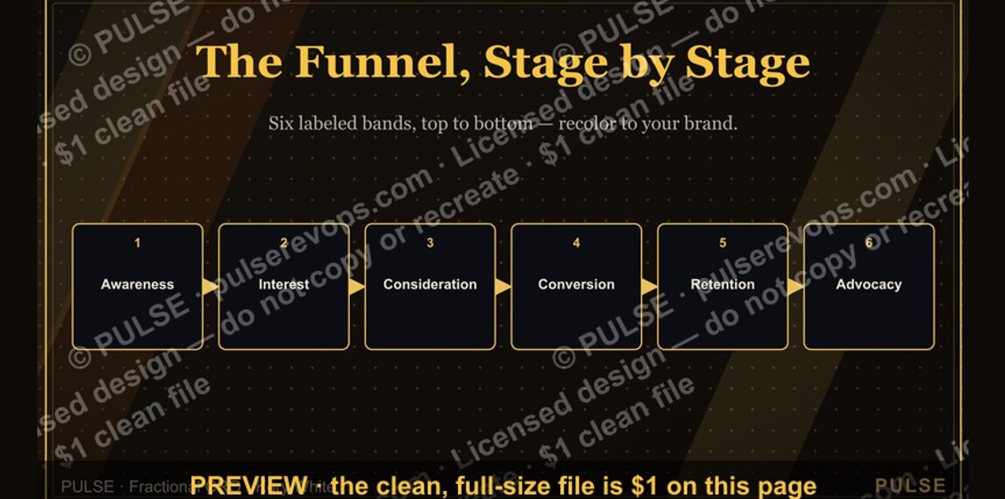 graphicThe Marketing Funnel — Infographic
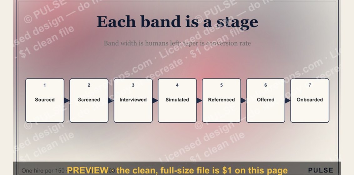 graphicThe Sales Hiring Funnel — Infographic
 graphic4 Types of Buyers — Infographic
 graphic4 Forecast Categories — Infographic
 graphicThe Cold Call Framework — Infographic
 graphicThe Weekly Rep Cadence — Infographic
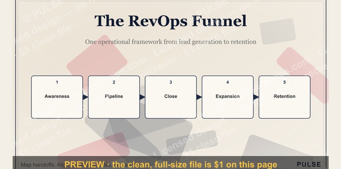 graphicThe RevOps Funnel — Infographic
 graphicPirate Metrics (AARRR) — Infographic