
KPI Gauge Icon — Icon / Clip Art
 Curated byKory White · Fractional CRO · Maryland
 PULSEKNOWLEDGE LIBRARY
A KPI gauge icon or clip art is a small, simplified visual representation of a dashboard gauge, typically used in presentations, reports, or user interfaces to indicate performance against a target. These icons often show a semicircular dial with a needle pointing to a colored zone (e.g., red, yellow, green) but are flattened or stylized for easy recognition at small sizes. They are commonly available as free or paid vector files (SVG, PNG) from icon libraries or clip art collections.
KPI Gauge Icon — Icon / Clip Art

A clean kPI Gauge Icon in the Pulse accent gradient on a dark tile. Drop it into slides, docs, dashboards, or diagrams wherever you need a KPI mark.
Format: SVG (scalable vector) · Size: 800×800 px · Category: Clip Art · License: Free to use — no attribution required.
Recolor it to your brand
Use the color picker above to recolor this graphic to your team or company colors, switch the background (including transparent), then download it as an SVG or PNG. No sign-up, no watermark.
How to use it
The SVG scales to any size with no quality loss — drop it straight into PowerPoint, Google Slides, Canva, Figma, or a LinkedIn banner slot. The PNG export is ready to upload anywhere that wants a raster image.
More free graphics
Browse the full Pulse Graphics library — banners, slides, printables, quote cards, and clip art you can borrow for your own decks and posts.
Related on PULSE
- Revenue Gauge (KPI) — Icon / Clip Art
- Pipeline Coverage Gauge
- Customer Success KPI Dashboard
- Marketing KPI Dashboard
- Sales KPI Dashboard — Top 9
- SaaS KPI Dashboard — Core 6
Design Variations and Customization Options
When working with KPI gauge icons, you’ll find that the most effective designs balance clarity with visual appeal. The standard gauge icon typically features a semicircular or three-quarter circular arc with a needle indicator, but modern implementations offer several meaningful variations worth understanding.
Needle styles range from sharp pointers (ideal for precise measurements) to rounded tips (better for quick visual scanning). The thickness of the needle also matters — thin needles (1-2px) work well in dense dashboards, while thicker needles (3-5px) improve readability on mobile screens or when viewed from a distance. Some designs incorporate a small circle at the needle’s pivot point, which can house a miniature version of the metric being tracked (e.g., a percentage symbol or currency sign).
Arc configurations typically fall into three categories:
- 180-degree arcs (half-circle) — most common for single-metric dashboards
- 270-degree arcs (three-quarter circle) — often used when you need to show more granular data ranges
- 360-degree arcs (full circle) — less common but useful for speedometer-style visualizations where the entire range matters
The color behavior of the arc itself can be static (single color) or dynamic (gradient from red through yellow to green). Dynamic arcs are particularly useful for at-a-glance assessment — users can instantly see whether a metric falls in the “danger zone” (red), “caution zone” (yellow), or “target zone” (green). When designing your own gauge icon, consider whether you need this color-coding baked into the icon itself or whether it will be applied through CSS or SVG styling.
Size and resolution considerations vary significantly by use case. For web applications, 24×24px to 48×48px is standard for UI elements, while 64×64px to 128×128px works better for infographics and presentations. Vector formats (SVG) are strongly recommended over raster formats (PNG, JPG) because they scale cleanly across all sizes without pixelation. If you must use raster, aim for at least 256×256px to ensure crisp display on high-DPI (Retina) screens.
Accessibility considerations often get overlooked. Ensure your gauge icon has sufficient contrast against both light and dark backgrounds — a minimum contrast ratio of 4.5:1 for small icons (under 18px) and 3:1 for larger icons. For screen readers, always include descriptive alt text like “KPI gauge showing 75% completion” rather than just “gauge icon.” Some implementations also benefit from a text label alongside the icon, especially when the gauge represents a specific metric like “Revenue Growth” or “Customer Satisfaction Score.”
File format trade-offs deserve careful thought. SVG files offer the best quality-to-size ratio (typically 1-5KB) and allow CSS styling. PNG files with transparency are universally supported but larger (5-20KB for reasonable quality). WebP format provides better compression than PNG (30-50% smaller) but lacks support in older browsers. ICO format is only needed for Windows desktop applications and browser favicons.
For those creating custom gauge icons, tools like Figma, Adobe Illustrator, or Inkscape (free) offer dedicated arc and rotation tools. A practical approach: start with a 180-degree arc, add a needle at the desired angle, then apply your brand’s color palette. Many designers also add subtle shadows or gradients to the gauge’s outer rim to give it a 3D appearance, though flat designs remain popular for modern UI aesthetics.
Practical Applications Across Industries
KPI gauge icons have evolved far beyond simple dashboard decorations — they now serve as critical visual shorthand in diverse professional contexts. Understanding where and how these icons are deployed can help you choose the right style and implementation for your specific needs.
Business intelligence dashboards remain the most common application. In platforms like Tableau, Power BI, or custom-built analytics tools, gauge icons typically represent real-time metrics such as:
- Sales quota attainment (percentage of target reached)
- Customer churn rate (with red zones indicating concerning levels)
- Inventory turnover ratios (with green zones showing optimal ranges)
- Employee satisfaction scores (often with 0-10 scales)
The key here is that the gauge icon must update dynamically based on live data. This requires either SVG manipulation via JavaScript or using a charting library that supports gauge widgets (e.g., Chart.js, D3.js, or Highcharts). For these applications, the icon should have clearly defined “zones” (typically 3-5 segments) and a needle that animates smoothly when data changes — abrupt jumps can confuse users.
Mobile app interfaces present unique challenges. Screen real estate is limited, so gauge icons in mobile apps are usually smaller (32×32px or less) and often appear in notification badges or widget views. For example:
- A fitness app might show a daily step count gauge on the home screen widget
- A financial app could display a credit utilization gauge beside account balances
- A project management app might use a gauge to show sprint completion percentage
Mobile gauge icons benefit from simplified designs — often just a colored arc segment without a needle, using the arc’s length to indicate progress. Touch targets around the icon should be at least 44×44px (Apple’s recommendation) to prevent accidental taps.
Print and presentation materials require higher resolution and more polished aesthetics. In annual reports, investor decks, or marketing collateral, gauge icons often appear at 150-300 DPI and may include:
- Brand-specific color gradients
- Decorative elements like metallic finishes or glass effects
- Custom typography for the metric value
- Background tiles or patterns that reinforce brand identity
For print, vector formats are essential — EPS or AI files are preferred. If you’re using clip art from stock libraries, verify the license allows print distribution (many free icons restrict commercial print use). Also consider that print gauge icons should have slightly thicker lines (2-4pt) to maintain visibility after reproduction.
Hardware interfaces represent a growing niche. Industrial control panels, automotive dashboards, and medical device screens increasingly use digital gauge icons instead of physical analog gauges. These implementations demand:
- Extreme durability (the icon must be legible in direct sunlight or low light)
- High refresh rates (60fps minimum for smooth needle movement)
- Colorblind-friendly palettes (avoid red-green combinations)
- Touch or gesture interaction capabilities
For hardware applications, gauge icons are typically rendered as bitmap images at the device’s native resolution, or as vector graphics in systems that support OpenGL or similar rendering engines. The icon’s design must account for the display’s physical size — a gauge icon that works on a 7-inch tablet screen may be illegible on a 3-inch smartwatch display.
Educational and training materials use gauge icons to simplify complex data. For example:
- A compliance training module might show a “risk gauge” that moves from green to red as the user makes poor decisions
- A financial literacy course could use a gauge to illustrate credit score ranges
- A science textbook might use a gauge to represent measurement uncertainty
In these contexts, the gauge icon often serves as an interactive element — clicking or hovering reveals additional information. The design should prioritize clarity over aesthetics, with bold color transitions and clear labels at each zone boundary.
Technical Implementation and Best Practices
Implementing a KPI gauge icon effectively requires understanding both the technical constraints and the psychological principles behind gauge visualization. Whether you’re embedding an existing icon or building one from scratch, these considerations will ensure your gauge performs its intended function.
SVG implementation is the gold standard for web and app use. A basic gauge SVG structure includes:
- A
<path>element for the arc (using arc commands likeA rx ry x-axis-rotation large-arc-flag sweep-flag x y) - A
<line>or<polygon>element for the needle - Optional
<circle>elements for the pivot point and zone markers
Here’s a simplified example structure (not a complete implementation): <svg viewBox="0 0 100 100"> <!-- Background arc (gray) --> <path d="M 10 80 A 40 40 0 0 1 90 80" stroke="#e0e0e0" stroke-width="8" fill="none"/> <!-- Colored arc segment (green) --> <path d="M 10 80 A 40 40 0 0 1 50 41" stroke="#4caf50" stroke-width="8" fill="none"/> <line x1="50" y1="80" x2="50" y2="45" stroke="#333" stroke-width="3" stroke-linecap="round"/> <circle cx="50" cy="80" r="4" fill="#333"/> </svg>
The critical math involves calculating arc endpoints based on the desired percentage. For a 180-degree gauge where 0% is at the leftmost point (10 o’clock position) and 100% is at the rightmost point (2 o’clock position), the angle for a given percentage is 180 * (percentage / 100). The endpoint coordinates are then calculated using sine and cosine functions relative to the center point.
Performance optimization matters when gauges appear in large numbers (e.g., a dashboard with 50+ metrics). Key techniques include:
- Using CSS transforms for needle rotation instead of recalculating SVG paths (much faster)
- Limiting gauge updates to 30fps maximum (human eyes can’t perceive faster changes)
- Pre-rendering static elements (background arc, zone markers) as a single image
- Using
will-change: transformon animated needles to trigger GPU acceleration
For React or Vue applications, consider using dedicated gauge components like react-gauge-chart or vue-gauge rather than building from scratch — they handle edge cases like zero values, negative numbers, and animation smoothing automatically.
Color psychology significantly impacts how users interpret gauge icons. Research suggests:
- Green (safe zone) should occupy 50-70% of the arc for most metrics — people naturally associate green with “good”
- Yellow (caution zone) works best at 15-25% — too much yellow creates anxiety
- Red (danger zone) should be limited to 10-20% — excessive red triggers alarm fatigue
- Blue or purple
Sources
- Flaticon — icon library with vector graphics and clip art
- The Noun Project — database of icons and symbols for various uses
- Iconfinder — marketplace and search engine for icons and clip art
- Google Fonts (Icons) — open-source icon sets for web and design
- Adobe Stock — stock images, icons, and clip art resources
- Freepik — platform offering free and premium vector icons and clip art
FAQ
What is a KPI gauge icon used for? A KPI gauge icon visually represents performance metrics, like progress toward a target or current status. It's commonly used in dashboards, reports, and presentations to quickly convey whether a metric is on track, at risk, or behind.
Can I customize the colors of the gauge icon? Yes, most KPI gauge icons are available in editable vector formats like SVG or EPS, allowing you to change colors to match your brand or data thresholds. You can also find pre-colored variants, but customization depends on the file type you download.
Is this icon free to use for commercial projects? Many KPI gauge icons are offered under royalty-free licenses, but terms vary by platform. Always check the specific license—some require attribution, while others allow unrestricted commercial use.
What file formats are typically available for this icon? Common formats include PNG, SVG, EPS, and sometimes AI or PDF. PNG is best for web use, while SVG and EPS are ideal for scaling and editing in design software.
How do I integrate this icon into a dashboard or report? You can insert the icon as an image in tools like Excel, Power BI, Tableau, or Google Sheets, or embed it in web dashboards using HTML/CSS. For dynamic dashboards, consider using a scalable vector format.
Are there different styles of KPI gauge icons? Yes, styles range from simple flat designs to more detailed 3D or gradient versions. Some include needles, arcs, or digital readouts, while others are minimalist. Choose based on your dashboard's aesthetic and clarity needs.
This page will be disappearing soon. Save it to your device for $1 — or read it free while it is here.
@Kory-White- · if Venmo asks, the last 4 of my number are 2012
This page is gone.
This one is off the shelf now. $1 keeps it on your phone for good — the whole page, pictures and diagrams included.
 graphicLaunch / Growth Rocket Icon — Icon / Clip Art
 graphicMilestone / Goal Flag Icon — Icon / Clip Art
 graphicOutreach / Announce Icon — Icon / Clip Art
 graphicPipeline Stages — Icon / Clip Art
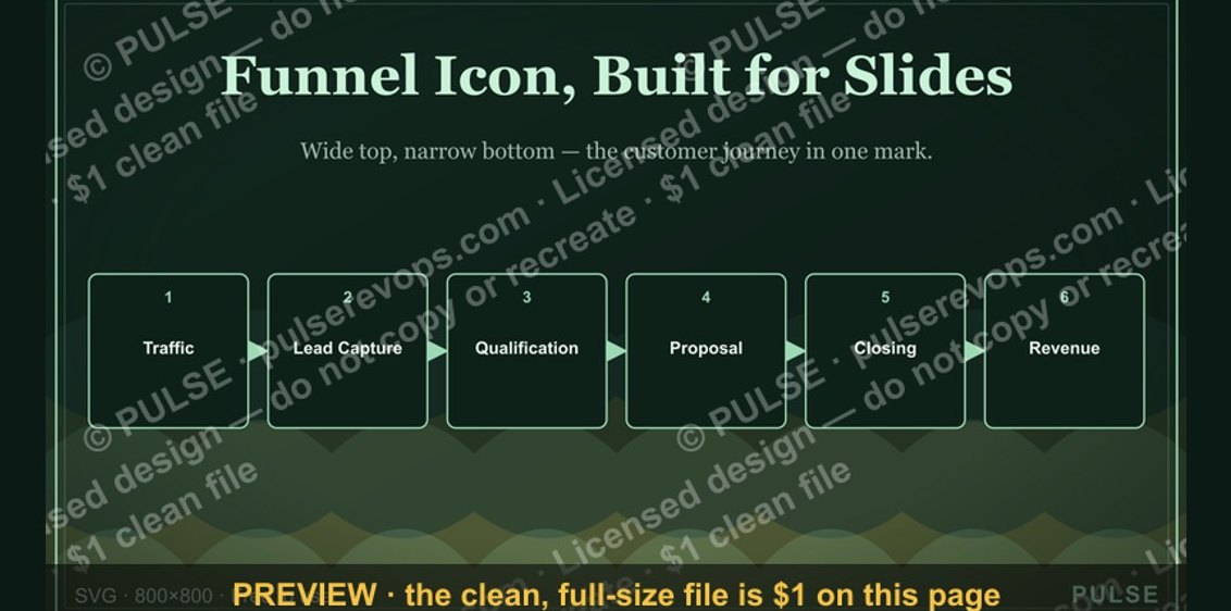 graphicSales Funnel — Icon / Clip Art
 graphicRevenue / Money Icon — Icon / Clip Art
 graphicRevOps / Process Icon — Icon / Clip Art
 graphicCold Call / Dialer Icon — Icon / Clip Art
 graphicPipeline Growth Arrow Icon — Icon / Clip Art
 graphicLead Magnet Icon — Icon / Clip Art