
“Great reps wanted.” — LinkedIn Banner
 Curated byKory White · Fractional CRO · Maryland
 PULSEKNOWLEDGE LIBRARY
Quality
Certified
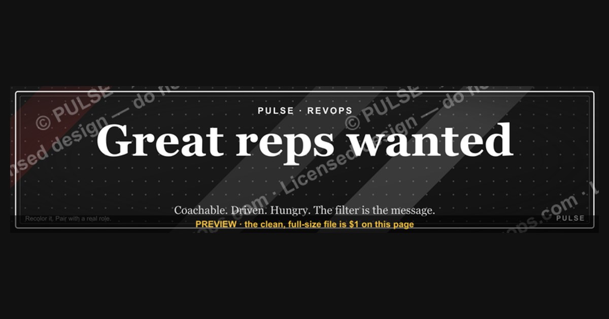
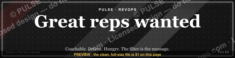
This is a LinkedIn profile banner, 1584x396 px, that reads “Great reps wanted.” in bold type on a dark field. It is a free PNG you download from this page and drop into your profile’s cover-image slot. It signals that you are hiring sales talent, so the right reps self-identify before you ever post a job.
The outcome you should expect
The honest answer is that a recruiting banner on a personal LinkedIn profile is a slow, compounding asset, not a lead-gen campaign. It does not behave like a paid job posting, and anyone who tells you it will fill a pipeline in a week is selling something. What it actually does is convert a small slice of the people who already land on your profile — people who searched your name, clicked your comment, or got referred to you — into inbound signals. Those signals arrive as connection requests with a note, direct messages, profile views that linger, and occasionally a comment on a post that says “saw your banner, are you still hiring?”
The volume depends almost entirely on how much traffic your profile already gets. A rep with 500 connections who posts twice a month might see two or three recruiting-related inbound messages per quarter. A sales leader with 15,000 followers who posts daily and gets tagged in threads might see that many in a month. The banner does not create traffic; it harvests the traffic you already have and makes the intent explicit at the exact moment someone is evaluating you. That is the whole mechanism, and it is worth understanding before you spend five minutes on the upload.
There is a second, quieter outcome that practitioners often miss: the banner changes how *you* behave. Once your cover image says you are hiring, you start noticing candidates in your feed, you start replying to “looking for a new role” posts, and you start treating your profile as a recruiting surface rather than a résumé. That behavioral shift frequently produces more hires than the banner impressions do. The graphic is a commitment device as much as an advertisement.
A third outcome, and the one that surprises people, is internal. When your own team sees the banner, it tells them the org is growing, which affects retention and referral behavior. Reps refer people when they believe the team is expanding and the bar is high. A banner that says “Great reps wanted.” communicates both — the “Great” sets the bar, the “wanted” signals demand. That is a lot of signal packed into four words, and it is why the phrasing matters more than the design.
What you should *not* expect: qualified enterprise AE candidates arriving fully formed with comp expectations aligned. Inbound from a banner skews toward earlier-career reps, career switchers, and people who are curious rather than decided. That is fine — it is top-of-funnel — but you must have a triage process ready, because an unmanaged inbox of “are you hiring?” messages becomes noise within two weeks and you will quietly stop reading it.

What drives that outcome
Several levers determine whether the banner produces anything at all. The first is profile traffic, which is a function of posting cadence, comment activity, and how searchable your headline is. The second is placement: the cover image sits behind your photo and headline, so the banner is seen by anyone who opens your profile, but it is *not* seen in the feed. Nobody scrolling past your comment sees the banner. This is the single most misunderstood fact about cover-image recruiting graphics — they are a profile-page asset, not a feed asset.
The third lever is message specificity. “Great reps wanted.” works because it is short enough to read at thumbnail size and broad enough to apply to any sales role. But if you are hiring only SDRs in a specific metro, a generic banner wastes the click. Specificity trades reach for conversion. A banner that says “Hiring SDRs — Austin” will get fewer messages and a higher percentage of relevant ones.
The fourth lever is what sits directly beneath the banner. Your headline and the first line of your About section do the qualification work the banner cannot. If the banner says you are hiring and the headline says “VP Sales at [Company],” the reader has to guess what roles are open. If the headline says “VP Sales at [Company] — hiring 3 AEs, link below,” the banner and headline work as a pair.
The fifth lever is repetition and consistency. A banner that appears for three weeks and then gets swapped for a conference promo loses the compounding effect. Candidates who saw it once and meant to reach out later will find a different image and assume the window closed. If you are genuinely hiring for a quarter, leave it up for the quarter.
Finally, the sixth lever is your response time. Inbound from a banner has a short half-life. A rep who messages you on Tuesday and hears nothing by the following Tuesday has usually applied elsewhere. The banner creates the intent; your reply speed converts it. Teams that treat banner inbound as a real channel — with an owner and a service-level expectation — get dramatically more from the same graphic than teams that let it sit in a general inbox.
What is on the graphic, element by element
The banner is deliberately spare, because a cover image is viewed at roughly the size of a business card on desktop and considerably smaller on a phone. Every element earns its place or it gets cut.
The headline text is the phrase itself: “Great reps wanted.” It is set in a heavy, high-contrast face so it survives downscaling. Note the period at the end — it turns a fragment into a statement. Without punctuation, “Great reps wanted” reads like a classified ad header; with it, it reads like a declaration. Small typographic choices like this are the difference between a banner that looks designed and one that looks typed.
The quotation marks around the phrase are part of the graphic’s voice. They frame it as something said — a line lifted from a conversation, a hiring manager’s aside, a rallying cry. That framing is warmer than a plain imperative and it is why the phrase reads as an invitation rather than a demand. If you strip the quotes, you lose that.
The color treatment is a dark background with light, high-contrast type. Dark fields are the pragmatic choice for LinkedIn cover images for three reasons: they do not compete with the blue LinkedIn chrome around them, they make light type pop at small sizes, and they read as premium rather than promotional. Bright, busy backgrounds tend to look like event flyers, which is the wrong association for a hiring message.
The composition leaves negative space. The phrase does not run edge to edge. That whitespace is functional — it keeps the text legible when LinkedIn crops the image differently across desktop, mobile, and the various card layouts the platform uses. A banner with text jammed into every corner will lose words to cropping on at least one surface.
There is no logo, no headshot, no QR code, and no URL. This is intentional. Your profile photo already sits directly on top of the lower-left portion of the cover image on desktop, so any logo placed there gets obscured. And a URL in a cover image is not clickable — it is decoration. If you want a link, it belongs in your headline, your featured section, or your About section, where it actually works.
The graphic carries no statistics, no dates, and no role counts. That is a feature. A banner with “Hiring 12 AEs by Q3” becomes a lie the moment you fill the roles, and an out-of-date banner actively damages credibility. A banner that says only that you want great reps stays true as long as you are willing to talk to great reps.
Where and how to use it
The primary placement is your LinkedIn profile cover image — the wide rectangle behind your profile photo. LinkedIn’s recommended dimensions for that slot are 1584x396 pixels, a 4:1 ratio. Upload at exactly that size and you avoid the platform’s automatic cropping. If you upload something smaller, LinkedIn upscales it and the type goes soft. If you upload the wrong aspect ratio, you lose the edges.
On desktop, the cover image renders at roughly 1584x396. On mobile, LinkedIn crops it to a narrower band, roughly the center 3:1 or tighter depending on the device and app version. This is why the safe zone for text is the middle horizontal third of the image. Anything within about 250 pixels of the left or right edge risks being cropped on some surface. The graphic is composed with this in mind, which is why the phrase sits centered rather than spanning the full width.
The headline beneath your name is the second half of the unit. Treat banner and headline as a single message read top to bottom. If the banner says you want great reps, the headline should say what you do and what you are hiring for. Something like “VP Sales, [Company] | Building a team of AEs who hunt” gives the banner context. A headline that just says “Sales Leader” wastes the pairing.
The About section’s first two lines are the third element. LinkedIn truncates the About section after roughly two lines on desktop and even less on mobile, with a “see more” link. Whatever you write in those first two lines is what a banner-motivated visitor reads before deciding whether to message you. Put the hiring message and a clear next step there, not buried at the bottom.
Beyond your own profile, the banner has secondary uses that are worth knowing. Sales leaders sometimes share the same graphic as a post image when announcing an opening, which works because the phrase is already familiar to anyone who has seen their profile. Recruiters occasionally use a variant as a cover image on a company page, though company page cover dimensions differ and the text needs to be re-laid-out. And hiring managers in adjacent functions — customer success, solutions engineering, partnerships — adapt the same phrase with their own role noun.
What you should not do is use it as a feed post image with no context, or as an email signature graphic, or as a slide in a deck. The banner works because it is encountered in a specific place at a specific moment: someone is looking at your profile, deciding whether you are worth talking to. Move it out of that context and it becomes a slogan, and slogans do not hire anyone.
The message behind it and when it works
“Great reps wanted.” is doing something more interesting than it first appears. It is a quality filter disguised as a job ad. The word “Great” is the operative term — it tells the reader that the bar is high, which is flattering to the reader who believes they clear it, and quietly discouraging to the reader who suspects they do not. That is the opposite of the usual recruiting message, which tries to maximize applicant volume by sounding welcoming to everyone.
This is why the banner tends to attract a different mix than a standard job posting. Postings attract volume; a quality-signaling banner attracts self-selected confidence. You will get fewer messages, and a higher proportion of them will come from people who think of themselves as strong performers. Some of them will be wrong about that, but the base rate is better than an open call.
It works best in three situations. First, when you are hiring continuously or frequently — the banner becomes a permanent fixture rather than a campaign. Second, when your profile already gets meaningful traffic, because the banner is a multiplier on attention you already have. Third, when the roles you hire are ones where self-confidence and initiative are job-relevant, which describes most sales roles. A rep who messages a VP because they saw a banner is demonstrating exactly the proactive behavior you want in a pipeline.
It backfires in three situations. First, when you are not actually hiring and the banner stays up — the messages pile up, you stop responding, and the signal inverts. Second, when your company has a reputation problem that the banner does not address; a candidate who has heard your quota attainment is brutal will not be reassured by a cover image. Third, when the phrase is used by someone with no hiring authority. If you are an IC rep with a banner that says great reps are wanted, the reader reasonably assumes you are speaking for your team, and when it turns out you are not, you have burned a contact.
There is also a subtler failure mode: the banner attracting people who are looking for *any* sales job rather than *your* sales job. The phrase is role-agnostic by design, which is a strength when you hire across segments and a weakness when you need a very specific profile. If you need enterprise AEs with ten years of complex-sale experience, a generic banner generates conversations you have to disqualify. That is not fatal — disqualification is cheap — but it is work, and you should budget for it.
How to customize the wording, colors, or roles
The graphic is a template, and the fastest way to make it yours is to change the noun. Swap “reps” for the role you actually hire: “Great SDRs wanted.”, “Great AEs wanted.”, “Great CSMs wanted.”, “Great SEs wanted.” The structure holds. If you hire across several roles, keep the generic version and put the specifics in your headline and About section where there is room to explain.
You can also change the verb. “Wanted” is direct and slightly old-fashioned in a way that reads as confident. Alternatives that work: “Great reps needed.” (slightly more urgent), “Great reps apply.” (more imperative, better for a post than a banner), “Great reps welcome.” (warmer, less selective-sounding). The word “wanted” is doing real work — it implies a search is underway, which is more credible than a generic invitation.
Color changes are the easiest customization and the one most likely to go wrong. The safest approach is to keep the dark background and change the accent color of the type to your company’s primary brand color. Light type on dark is legible at thumbnail size; dark type on light is also fine but reads as more corporate and less premium. Avoid gradients, photos behind the text, and more than two colors. If you cannot read the phrase in a 200-pixel-wide thumbnail on your phone, the design has failed regardless of how it looks at full size.
Typography matters more than most people expect. Use a single typeface, and use a weight heavy enough to survive downscaling. Thin or light weights disappear at small sizes. Serif faces read as established and slightly formal; sans-serif faces read as modern and direct. Either works — mixing them does not.
If you are customizing for a team rather than yourself, the calculus changes. A team banner should carry the company name or a recognizable mark somewhere, because the reader may not know who you are. But remember that your profile photo overlays the lower-left, so any mark goes in the upper-right or the far-left edge, and it must survive the mobile crop. Test it on your phone before you commit.
One more customization worth considering: a subtle secondary line of much smaller type beneath the headline, giving a location or a segment. Something like “Americas Enterprise” or “EMEA — Remote.” At small sizes this line becomes a texture rather than readable text, which is fine — it adds information density without competing with the headline. Just do not let it grow large enough to fight the main phrase.
Benchmarks and realistic ranges
Because the banner’s output depends on profile traffic, there is no universal conversion rate. But you can build a reasonable expectation from the inputs you can measure. Start with your profile view count — LinkedIn shows this on your dashboard, typically over a rolling 90-day window. That number is the total addressable audience for your banner.
A profile with 200 views per 90 days is a low-traffic profile. Expect the banner to generate a small number of identifiable recruiting conversations — think in the range of one to three per quarter, and treat anything above that as a bonus. A profile with 2,000 views per 90 days is a high-traffic profile for an individual contributor or front-line manager, and the same banner might produce a dozen or more conversations in the same window. A sales leader with a strong content presence and 10,000-plus views per quarter can see weekly inbound.
The conversion from profile view to message is low, and that is normal. Most profile views are passive — someone checking who you are after a comment, a recruiter researching you, a candidate doing diligence. Only a fraction of viewers are candidates, and only a fraction of those are actively looking, and only a fraction of those will message a stranger. The banner’s job is to capture the overlap, not to expand it.
Response rate on the messages you do get is the metric that actually matters, and it should be near 100% for a channel this small. If you are getting ten messages a quarter and responding to four, the bottleneck is not the banner. Set a personal rule: every banner-sourced message gets a reply within two business days, even if the reply is “not a fit right now, here is what we look for.”
Quality mix is the other number to track, and it is subjective but worth writing down. Of the conversations the banner generates, roughly how many pass a first-screen? For most teams the answer is somewhere between one in five and one in three. If it is lower than that, the banner is too generic for your actual needs, or your headline and About section are not doing their qualification job. If it is much higher, you may be under-using the banner and should consider a more prominent placement or a post announcing it.
Time-to-hire from banner inbound is typically longer than from outbound sourcing, because inbound candidates arrive at their own pace. A candidate who messages you in January may not be ready to move until March. That lag is normal and it is why the banner needs to stay up. A three-week experiment tells you almost nothing.
Risks, edge cases, and failure modes
The most common failure is the stale banner. You fill the role, you forget the cover image, and six months later candidates are still messaging you about a job that closed. This is worse than never having the banner, because it signals that your operation is disorganized. Calendar a review — every quarter, check whether the banner still tells the truth.
The second failure is the credibility mismatch. If your company has a well-known reputation for high turnover or missed quotas, a banner that says you want great reps invites the obvious question: why did the last great rep leave? You cannot answer that in a cover image. If your employer brand is weak, fix the underlying issue or expect the banner to generate cynical DMs rather than applications.
The third is the authority problem. If you are not the hiring manager and you do not have a recruiter partner lined up, inbound from the banner goes nowhere. Candidates who message you and get no process will remember it, and they will tell other candidates. Before you put the banner up, know exactly where a message should route and who owns the reply.
The fourth is the mobile crop. A banner that looks perfect on your laptop may cut the phrase in half on a phone. LinkedIn’s mobile crop is aggressive. Always preview on an actual phone before you finalize.
The fifth is the over-designed banner. Adding a headshot, a logo, a QR code, three colors, and a tagline turns a clean signal into visual noise. At the size the banner is actually viewed, all of that collapses into mush. Restraint is the design principle.
The sixth edge case is the internal one. If you post the banner and your existing team has not been told you are hiring, they find out from your LinkedIn cover image. That is a bad way for a team to learn about headcount. Announce internally first, then change the banner.
Finally, there is the case of the banner used by someone who is not hiring at all but wants to build a pipeline for later. This can work — “always happy to talk to great reps” is a legitimate stance — but the banner’s wording implies an active search. If you are not actively hiring, change the wording rather than the honesty.
A practical rollout plan
The rollout is short, but doing it in order prevents most of the failure modes above. The sequence matters because each step depends on the one before it.
Start by confirming the hiring reality: which roles, which level, who owns the process, what the reply will say. Then write your headline and the first two lines of your About section so the banner has somewhere to land. Then download the PNG, upload it as your cover image, and check the mobile preview. Then tell your team. Then, and only then, consider a post announcing that you are hiring — the post drives traffic to the profile, where the banner does its work.
Assign an owner for inbound. In a small team that is you. In a larger org it should be the recruiter or recruiting coordinator who supports the role. Give them the banner context so they know why a candidate is referencing a cover image — otherwise the candidate’s first message (“saw your banner”) confuses whoever receives it.
Set a service level. Two business days is achievable and fast enough to keep candidates warm. Track the source in your applicant tracking system with a tag like “LinkedIn banner” so you can see, after two quarters, whether the channel is worth the maintenance. Most teams find it is — not because the volume is high, but because the cost is essentially zero after the initial setup.
Review on a schedule. Once a quarter, ask three questions: are we still hiring for what the banner implies, is the phrase still accurate, and has anyone actually been hired from this channel? If the answer to the third is no after two quarters, either the banner is not getting traffic or the downstream process is dropping candidates. Diagnose which before you change the graphic.
Related questions
Do I need a recruiter to use this banner?
No. The banner works on any profile. What you need is a clear process for what happens when someone messages you — a reply, a screen, and a handoff. Without that, the banner generates unmanaged inbound, which is worse than silence.
Does the banner work on a company page?
Company page cover images use different dimensions and a different crop, so this exact PNG is not a drop-in fit. The phrase works there, but you would need to re-lay-out the type for that canvas. Most teams use it on personal profiles instead.
Will this replace job postings?
No. A job posting is where candidates go when they are already searching. The banner catches candidates who were not searching but are open. The two channels feed different parts of the funnel and both are worth running.
How often should I change the banner?
Only when the message stops being true. If you are continuously hiring, leave it up indefinitely. If you fill the roles, take it down the same week. Changing it for variety’s sake resets the familiarity you have built.
Can I use this if I am hiring for non-sales roles?
Yes, with a noun swap. The phrase’s logic — high bar, active search — applies to engineering, customer success, and design just as well. Change “reps” to the role and keep everything else.
FAQ
What exactly is this graphic?
It is a LinkedIn profile banner, sized 1584x396 pixels, that reads “Great reps wanted.” in bold type on a dark background. It is a free PNG download from this page, designed to be uploaded as the cover image on a personal LinkedIn profile.
Why does the banner say “Great” instead of just “Reps wanted”?
The word “Great” is a filter. It raises the perceived bar, which attracts candidates who see themselves as strong performers and discourages those who do not. It is a quality signal, not a volume play, and that is the point.
Where does the banner appear to other people?
Only on your profile page, behind your photo and headline. It does not appear in the feed, so nobody sees it while scrolling past your posts. Anyone who sees it has already clicked into your profile, which means they were already interested.
What should my headline say if I use this banner?
Your headline should name your role, your company, and what you are hiring for. The banner says you want great reps; the headline says great reps for what. Read together, they should answer the reader’s first two questions without a click.
How do I know if the banner is working?
Track three things: how many messages reference the banner, how many of those pass a first screen, and how many turn into interviews. If messages are arriving but none convert, the problem is downstream of the graphic, not the graphic itself.
Can I change the colors to match my brand?
Yes, and you should if your brand color is distinctive. Keep the dark background and light type for legibility, and swap the accent color. Avoid gradients and photos behind the text — they destroy readability at thumbnail size.
Sources
- LinkedIn Help — Profile cover image specifications and dimensions: https://www.linkedin.com/help/linkedin/answer/a563319
- LinkedIn Talent Solutions blog — employer branding and recruitment marketing guidance: https://business.linkedin.com/talent-solutions/blog
- Society for Human Resource Management (SHRM) — recruitment and talent acquisition resources: https://www.shrm.org
- Harvard Business Review — research and articles on hiring and talent strategy: https://hbr.org
- U.S. Bureau of Labor Statistics — occupational outlook for sales occupations: https://www.bls.gov/ooh/sales/
- Nielsen Norman Group — research on visual hierarchy and legibility in digital interfaces: https://www.nngroup.com
- Web Content Accessibility Guidelines (W3C) — contrast and text legibility standards: https://www.w3.org/WAI/standards-guidelines/wcag/
Related on PULSE
- Writing a LinkedIn headline that supports a recruiting banner
- Employer branding basics for small sales teams
- Building an inbound candidate triage process
- Cover image specs and safe zones across social platforms
- Turning profile traffic into pipeline: a practical guide
This page will be disappearing soon. Save it to your device for $1 — or read it free while it is here.
@Kory-White- · if Venmo asks, the last 4 of my number are 2012
 graphicRight market, right motion. — LinkedIn Wallpaper
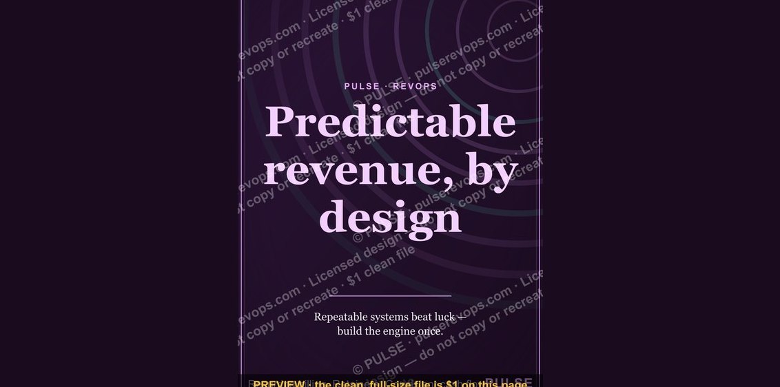 graphicPredictable revenue, by design. — LinkedIn Wallpaper
 graphic“Data beats opinions.” — LinkedIn Banner
 graphicComputer Vision Engineer — LinkedIn Banner
 graphic“Sell with the buyer, not at them.” — LinkedIn Banner
 graphicYour pipeline is your paycheck. — LinkedIn Wallpaper
 graphic“Trusted advisor, never a vendor.” — LinkedIn Banner
 graphicCalm closers win. — LinkedIn Wallpaper
 graphicSales Enablement — LinkedIn Banner
 graphicSell outcomes, not features. — LinkedIn Wallpaper