
“Great reps are coached, not born.” — LinkedIn Banner
 Curated byKory White · Fractional CRO · Maryland
 PULSEKNOWLEDGE LIBRARY
Quality
Certified
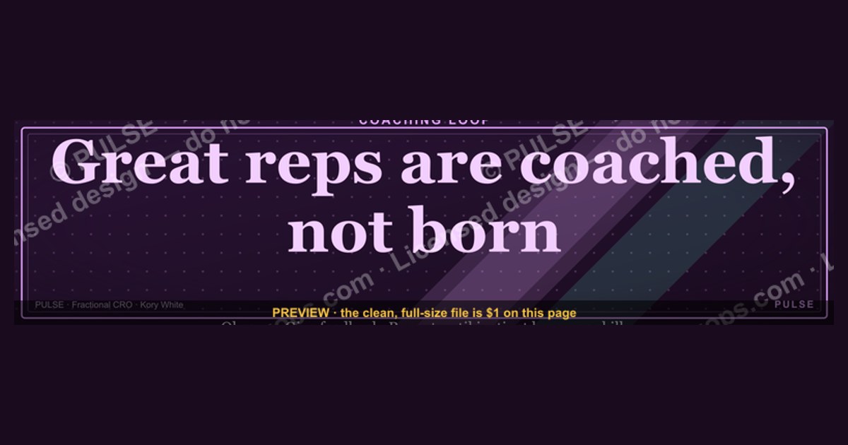
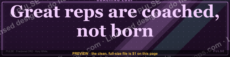
This is a LinkedIn profile banner (1584×396px) reading "Great reps are coached, not born." in bold serif type, set against a dark field so the line reads instantly at thumbnail size. It's built for sales managers, enablement leads, and coaches whose profile should open on a coaching philosophy, not a logo. Download the PNG, swap it in behind your headshot, and the message does the talking before anyone scrolls further.
The banner as written, versus the banner as a template
There are really two ways to put this graphic to work, and they aren't the same decision. Option one is to use it verbatim — the quote, the layout, the dark field, exactly as designed. Option two is to treat the file as a starting template: same 1584×396 canvas, same gold-on-black contrast, but your own line of text, your own team's name, or your own role instead of the generic "reps."
Using it verbatim is the faster path and it's the right call for an individual contributor or a first-line manager who wants a philosophy statement on their profile without opening a design tool. The line "Great reps are coached, not born." works as a stand-alone belief statement — it doesn't name a company, a product, or a quota, so it reads the same whether you're in SaaS, insurance, or industrial distribution. That portability is the entire point of a quote banner: it survives a job change, a title change, a territory reassignment. Swap the headshot underneath it and the banner still means exactly what it meant on day one.

Customizing it is the better call the moment you're representing a team rather than yourself. A VP of Sales putting this behind their name is making a statement about how their whole org operates — and if that's true, the banner should probably carry the team's name or a line that's specific to the coaching program actually running underneath it, like "Every rep here gets a coach, not a script." A recruiting or enablement lead posting this same generic banner on five different team members' profiles in the same week reads as coordinated messaging, which is good, but only if the underlying wording is doing more than repeating a well-known sales aphorism people have already seen a dozen times on LinkedIn. The fix isn't complicated: open the source file, keep the layout and type treatment exactly as designed (that's the part that was tested for legibility at banner scale), and change only the words inside the quote block.
There's a third, quieter option worth naming even though it's not really a fork in the road: pairing the unmodified banner with a customized headline underneath your name. LinkedIn's headline field is the text people actually read first in a feed or search result — the banner is what they see once they click through to your full profile. Keeping the banner generic and putting your specific pitch ("I coach 12 AEs at [Company] to quota") in the headline gets you both the portability of the stock quote and the specificity a viewer needs to know who you are. This is the option most experienced LinkedIn users land on once they've tried both of the others.

How to decide between them
The decision mostly comes down to whose name is attached to the profile and what the banner needs to survive.
If you're an individual rep, coach, or first-line manager, default to the unmodified file. The value of the stock line is that it's a settled, widely-recognized belief about how sales development works, and pairing it with your name signals you subscribe to that philosophy without you needing to prove anything with the graphic itself — your profile content does the proving. Editing it at this stage usually just introduces risk: a longer line breaks the type scale, a personal name in the quote reads as boastful rather than aspirational, and testing legibility at 1584×396 with a new line of text is more work than it looks like from a design tool's zoomed-in canvas view.

If you're speaking for a team, run the second check: does the team already have language that's more specific than "reps are coached, not born"? If yes, that specific language belongs on the banner, because a generic quote under a leadership title reads as filler rather than as a position. If no distinct language exists yet, don't invent one under deadline pressure just to justify editing the file — ship the stock version with a subline (team name, or "How we build reps at [Team]") rather than forcing a rewrite of the core quote.
Concrete numbers behind each option
LinkedIn's cover/banner slot is a fixed 1584×396px canvas — a 4:1 aspect ratio — and that ratio is unusually wide relative to almost every other social platform's cover image, which is why banners designed for Twitter/X or Facebook rarely transfer cleanly without cropping. The safe zone for text sits roughly in the horizontal band that isn't overlapped by the profile photo circle: LinkedIn's profile photo sits in the bottom-left corner of the banner and overlaps roughly the bottom 100–120px and left 200px of the canvas on desktop. Any headline text placed there gets clipped by the photo itself, which is why this banner's type block is weighted toward the center-right of the canvas rather than centered on the full width.

Mobile changes the math again. LinkedIn's mobile app crops the banner more aggressively than the desktop view — mobile viewers typically see a narrower vertical slice centered on the canvas, which means text placed near the far left or far right edge on desktop can disappear entirely on a phone. The practical number to design around: keep primary text inside the middle 60–70% of the horizontal canvas (roughly the center 950–1100px of the 1584px width) so it survives both the desktop and mobile crop.
File-weight numbers matter too, particularly if you're customizing rather than using the stock PNG. LinkedIn accepts JPG, PNG, and GIF for the banner slot, with a documented file-size ceiling in the low single-digit megabytes — comfortably larger than a compressed 1584×396 PNG needs to be, since a banner at that resolution with a limited color palette (a dark field, one or two accent colors, one serif type block) typically compresses to well under a megabyte without visible quality loss. There's no benefit to uploading a large, uncompressed file here; it only slows page load on your own profile view, and LinkedIn will re-compress it on their end regardless.

Contrast is the last number worth being precise about. Gold or warm-white serif type on a matte black or near-black field (something in the very dark gray range rather than pure #000000, which can look flat and low-effort on some phone screens) clears standard legibility contrast ratios comfortably at banner scale, even when LinkedIn's own UI elements — the small edit-pencil icon, and on some views a subtle gradient overlay near the bottom edge — sit on top of it. Lower-contrast combinations (light gray on white, or two mid-tone colors) are the most common reason a banner reads clearly in a design tool's full-screen preview but goes illegible once shrunk to the size LinkedIn actually renders it in a feed thumbnail.
Implementation details and sequencing
Getting this banner live, or live in a customized form, is a short, ordered sequence — but the order matters more than it looks like it should, because doing the steps out of sequence is the single most common reason people end up re-uploading three or four times.
Start with the download, not with the LinkedIn upload screen — trying to design or edit a banner inside LinkedIn's own cropping tool is the wrong order of operations, because that tool only repositions an existing image within the frame; it doesn't let you change type, color, or wording. Get the file onto your machine first.
Make the as-is-versus-customize decision before you open any editing software. This sounds obvious, but the most common failure mode here is opening the file, deciding to "just fix one word," and ending up redesigning the whole layout because the new word doesn't fit the existing type block — at which point you're doing full customization anyway, just without having planned for it. Decide up front which of the two paths you're on.
If you are customizing, change the words and nothing else. Keep the same font, the same weight, the same color values, the same margins. The layout was built and checked against LinkedIn's crop and contrast behavior at this exact resolution; changing the type size or repositioning the text block reintroduces the exact legibility risks the original design already solved. Swapping in your own line of text inside the existing text frame is a five-minute edit in any layout tool; rebuilding the frame is not.
Before uploading anywhere, preview the file two ways: at true size (1584×396, the way it'll appear if someone opens your profile in a wide browser window) and shrunk down to roughly thumbnail size (a few hundred pixels wide, the way it might appear in a smaller viewport or a slow-loading preview). Text that's crisp at full size can turn into a gray smear at thumbnail size if the stroke weight was too thin — catching that now is free; catching it after a dozen people have already seen the blurry version is not.
Upload through LinkedIn's own profile-edit flow (the pencil icon on your existing banner, or "Add background photo" if you don't have one yet), then use LinkedIn's built-in repositioning tool to confirm the crop lands where you expect — this is the point where the profile-photo overlap and the mobile crop band actually get tested against your specific file, not just estimated from the numbers above. Check the result on both a desktop browser and the mobile app before considering it done; they are genuinely different crops, not just different screen sizes.
Last, pair the banner with a headline that matches its register. A philosophy-statement banner under a headline that's purely a job title ("Account Executive at [Company]") is a missed opportunity — a headline like "Building reps who get coached, not just quota-checked" or something specific to how you actually work extends the banner's message instead of sitting next to it disconnected. The banner opens the thought; the headline and the rest of the profile should finish it.
Related questions
What size should a LinkedIn banner be if I'm not using this template?
1584×396px is LinkedIn's standard cover-photo dimension regardless of content — any custom banner, quote-based or otherwise, should be built to that canvas to avoid LinkedIn's automatic cropping distorting the design.
Does the profile photo really cover part of the banner?
Yes — the circular profile photo sits in the bottom-left corner and overlaps roughly the bottom-left 100–120px vertically and 200px horizontally, which is why text and key visual elements are usually kept out of that corner.
Can I use a photo of my team instead of a text quote?
Yes, and it's a common alternative — a team photo carries a different signal (this is who we are) than a quote banner (this is what we believe), and either can work depending on whether you want to lead with people or philosophy.
How often should a LinkedIn banner be updated?
There's no fixed rule, but refreshing it when your role, team, or message materially changes keeps it accurate — a banner that still says "coached, not born" long after you've left a coaching-focused role can read as stale.
Will a dark banner clash with LinkedIn's own interface?
Generally no — LinkedIn's profile chrome is light by default, and a dark banner with light or gold text tends to stand out cleanly against it rather than blending in or clashing.
FAQ
Is this banner free to use as-is? Yes — it's designed to be downloaded and used directly, no attribution or purchase required, since it's a generic philosophy statement rather than branded material tied to a specific company.
What file format should I download — PNG or JPG? PNG is the better choice here because the design uses flat color fields and crisp type edges, which PNG compresses without introducing the soft artifacting JPG can add around sharp text edges at this resolution.
Can I put my company logo on this banner? You can, but keep it small and placed away from the profile-photo corner and the main text block — the banner's legibility depends on there being one clear focal point (the quote), and a prominent logo competes with that.
Why is the text positioned right-of-center instead of centered? Centering text on a 1584×396 canvas puts a meaningful portion of it directly behind or near the profile photo overlap zone; shifting the block right of center keeps it fully clear of that corner on both desktop and mobile crops.
Does this banner work for a company page as well as a personal profile? Company pages use a different cover-photo dimension than personal profiles, so this file should be re-exported at the company page's specified size rather than uploaded directly — the wording and color treatment transfer fine, but the canvas doesn't.
What if "Great reps are coached, not born" doesn't match how my team actually operates? Then it's the wrong quote for your profile — swap the words for something that's actually true of how you or your team works rather than keeping a line that sounds good but doesn't hold up, since a mismatched philosophy statement undercuts credibility faster than having no banner at all.
Sources
- https://www.linkedin.com/help
- https://www.hootsuite.com/social-media-glossary/linkedin-banner-size
- https://www.canva.com/create/linkedin-banners/
- https://blog.hubspot.com/sales/sales-coaching
- https://www.gallup.com/workplace/231602/strengths-based-coaching-improves-performance.aspx
- https://www.gong.io/blog/sales-coaching/
- https://www.salesforce.com/resources/articles/sales-coaching/
Related on PULSE
- What makes a sales coaching program actually change rep behavior?
- How should a sales manager structure weekly 1:1 coaching sessions?
- What belongs in a rep's LinkedIn headline versus their About section?
- How do you measure whether sales coaching is working?
- What's the difference between sales coaching and sales training?
- How often should a manager review call recordings with a rep?
This page will be disappearing soon. Save it to your device for $1 — or read it free while it is here.
@Kory-White- · if Venmo asks, the last 4 of my number are 2012
This page is gone.
This one is off the shelf now. $1 keeps it on your phone for good — the whole page, pictures and diagrams included.
 graphicStartup Founder — LinkedIn Banner
 graphicAccount Executive — LinkedIn Banner
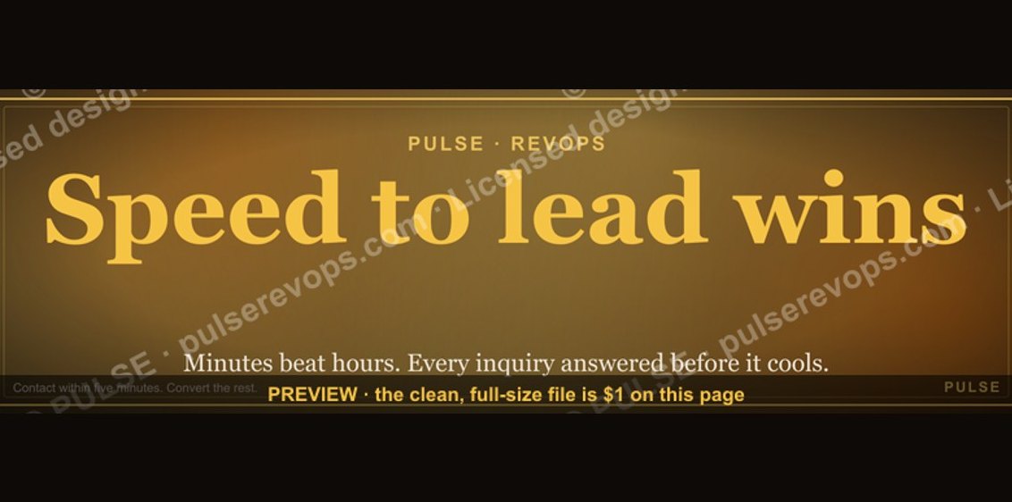 graphicSpeed to lead wins. — LinkedIn Wallpaper
 graphicLLM Builder AI Engineer — LinkedIn Banner
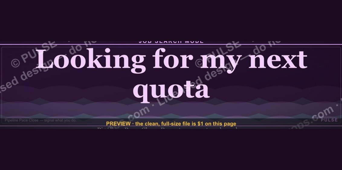 graphic“Looking for my next quota.” — LinkedIn Banner
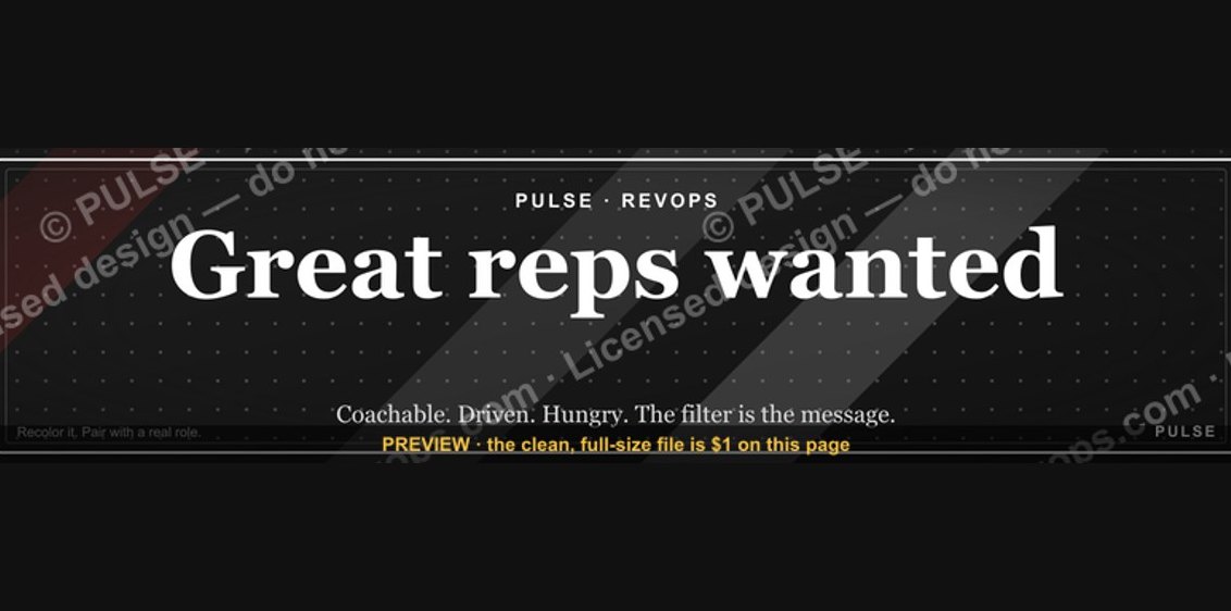 graphic“Great reps wanted.” — LinkedIn Banner
 graphicField Sales Rep — LinkedIn Banner
 graphic“Revenue that delights.” — LinkedIn Banner
 graphic“Revenue for marketing tech.” — LinkedIn Banner
 graphicTrust compounds. — LinkedIn Wallpaper