
“Sell something people love.” — LinkedIn Banner
 Curated byKory White · Fractional CRO · Maryland
 PULSEKNOWLEDGE LIBRARY
Quality
Certified
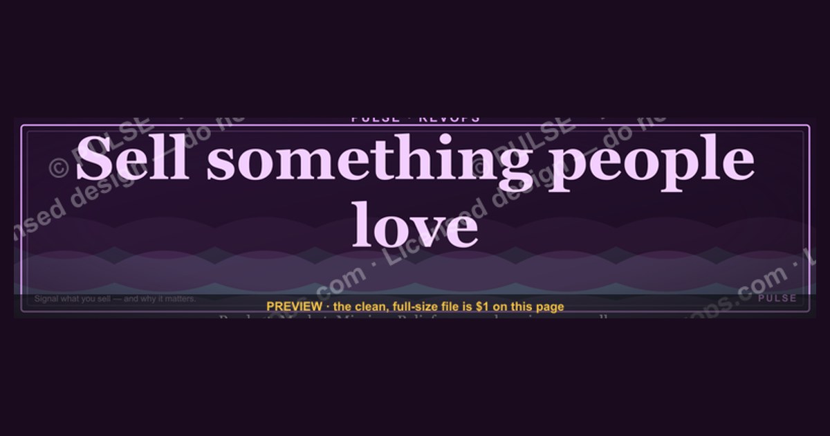
This is a LinkedIn profile banner — 1584×396 pixels — that reads "Sell something people love." in gold serif type centered on a matte black field. It's built to sit behind a sales rep's or founder's profile photo as the cover image, signaling a customer-first identity instead of a quota-driven one. Download the PNG below and upload it directly to your LinkedIn profile's background-photo slot.
The two options compared
There are really two ways to run this Banner, and the choice depends on whether the account behind it is a person or a page. The first option is the personal-profile version — the one pictured on this page, a single centered line of the quote in warm gold serif on solid black, with generous negative space on both sides so it survives LinkedIn's circular profile-photo crop without losing a word. This version carries no logo, no handle, and no company mark. It's meant for an individual — an account executive, a founder, a customer success lead — who wants their profile to open with a philosophy rather than a job title. The second option is the company-page variant, which keeps the same quote and typography but adds a small wordmark or logo lockup in one corner (typically bottom-right, staying inside the safe zone described below) so the banner still reads as brand-owned when it appears on a company page rather than a person's profile.
The trade-off between them is about signal, not aesthetics. A personal banner with no branding reads as a statement of values — it says "this is how I sell," and it travels with the person if they change employers, which is exactly why individual reps favor it. A company banner with a logo reads as brand messaging — it reinforces who's saying it, which matters more on a page that dozens of employees might link to, where an unbranded quote could get attributed to whichever competitor a viewer saw it from last. Sales leaders who manage a team's LinkedIn presence generally standardize on the personal (unbranded) version for individual reps' profiles and reserve the logo variant for the company page itself, so the two never compete for attention in the same feed.

There's a secondary choice inside each option: static PNG versus a wording swap. The banner ships as a flat PNG, which is the simplest and most compatible path — every device and browser renders a flat image identically, and there's no dependency on a font being installed on the viewer's machine. The alternative, covered in the implementation section below, is to open the source layout and swap the quote for a different line while keeping the same black-and-gold system, which lets a sales team run the same visual identity across ten different reps with ten different personal mottos.
How to decide between them
Choosing between the personal and company versions comes down to three questions, in order: who owns the account, does the message need brand attribution, and will other employees link to the same page. If the account is an individual's personal profile, the answer is almost always the unbranded version — LinkedIn profile banners are already tied to a named person by the profile photo and headline sitting on top of them, so a logo in the corner is redundant at best and visually competing at worst. If the account is a company page, the branded variant is the only one that makes sense, because a company page with no visual ownership marker looks like it was set up by someone outside the organization.
The one exception worth planning for is a "founder-led" account — a solo founder or a very small team where the personal profile functionally is the company's public face. In that case, some teams run the branded variant even on the personal profile, accepting the redundancy because the founder's LinkedIn *is* the primary brand surface. This is a judgment call best made once and then applied consistently across every rep on the team, rather than decided banner-by-banner, since a feed with some reps branded and others not reads as inconsistent internally before any external viewer even notices.
Once the decision is made, it rarely needs revisiting. The only trigger for switching versions is a role change — a rep who becomes the named spokesperson for the company, or a company page that rebrands and needs the logo lockup refreshed to match. Everything else about the banner — the quote, the black field, the gold serif — stays fixed regardless of which of the two paths was chosen.
Concrete numbers behind each option
LinkedIn's banner slot is fixed at 1584 pixels wide by 396 pixels tall, an 4:1 aspect ratio, and the platform accepts JPG, PNG, or GIF up to 8MB — this file ships as a PNG because PNG preserves the flat gold-on-black edges without the compression artifacting that JPG introduces around sharp serif type at LinkedIn's automatic re-compression step. The practical constraint that matters more than the outer canvas size is the safe zone: on desktop, the circular profile photo overlaps roughly the left third of the banner, and on the mobile app the banner is cropped tighter — roughly the center 1584×304 px band survives on most phone screens, with additional pixels lost at the very top and bottom edges. That's why the quote in this design sits dead-center and never touches the outer 15% of the frame on any side; text placed near the edges is the single most common reason a LinkedIn banner looks broken on mobile even though it looked fine in the desktop preview.
Font size on the source file is set so the quote renders at roughly 60-72pt at native resolution, which translates to type that's still legibly readable when LinkedIn compresses the upload (LinkedIn re-encodes every banner upload, which is a second reason to avoid thin hairline serifs — anything under about 3px of stroke width at native resolution tends to soften or disappear after their compression pass). The gold used sits in the amber-to-old-gold range rather than a bright yellow-gold, both because it holds contrast better against black after compression and because bright yellow-gold reads as more "award trophy" than "considered brand choice" at banner scale.
For the branded variant, the logo lockup is sized to no more than about 12-15% of the banner's total width, placed with roughly 40-50px of padding from the corner edges at native resolution — large enough to be recognizable at thumbnail size in a LinkedIn search result, small enough that it never competes with the quote for the viewer's first read. Teams that have tested both a larger and a smaller lockup generally find the smaller one ages better, since a banner is viewed at full size only rarely; most impressions happen at the small thumbnail scale in feeds, search, and comment threads, where an oversized logo just looks cramped.
File weight for the exported PNG typically lands well under LinkedIn's 8MB ceiling — a flat two-color-plus-gradient composition at 1584×396 compresses to a small file, usually a few hundred kilobytes, which also means the upload and the in-app preview render fast with no visible loading lag, unlike a photo-heavy banner that can take a visible second or two to populate on a slow connection.
Implementation details and sequencing
Swapping this banner onto a profile is a three-step sequence: download the PNG from this page, open LinkedIn's profile edit view, and replace the existing background photo. On desktop, that means going to your profile, clicking the pencil/camera icon that appears over the current banner (or the existing background photo itself), and choosing "Change photo" or "Upload photo" from the panel that opens — LinkedIn will show a crop preview at upload time, and because this file is already sized to the exact 1584×396 canvas, the crop tool should show it filling the frame with no adjustment needed. On mobile, the same edit icon sits in the same place on the profile screen, though some phone camera rolls compress images on save/share; if the downloaded PNG passed through a messaging app or a cloud photo sync before reaching the phone, re-download it directly to avoid a second, unintended compression pass stacking on top of LinkedIn's own.
For a team rolling this out to multiple reps, the sequencing matters more than it looks. The recommended order is: finalize which of the two versions (branded or unbranded) applies to which role first, distribute the correct file to each person individually rather than a single shared link everyone pulls from (so there's no ambiguity about which person got which version), and stagger the actual uploads over a day or two rather than having the whole team change banners in the same hour — a sudden, simultaneous, identical visual change across a dozen profiles in one afternoon reads to outside viewers as an obviously coordinated campaign rather than individual expression, which undercuts the "this is how I personally sell" message the unbranded version is going for.
Customizing the wording for a different quote follows the same underlying system rather than starting from scratch: keep the black field, keep the gold serif family and weight, keep the centered placement inside the safe zone, and swap only the quote text itself. Because the layout is proportion-based rather than fixed to this specific sentence's character count, a shorter or longer line generally just needs the font size nudged up or down a few points to keep the line from feeling lost in the frame or crowding the edges — the safe-zone rule (nothing within roughly 15% of any edge) stays constant regardless of how the wording changes. Color swaps for a company that doesn't use black-and-gold as a brand palette should keep the same *contrast relationship* — a light, warm accent color on a dark, neutral field — since that's what keeps the quote readable after LinkedIn's compression pass, even if the specific hues change to match a different brand system.
Related questions
What size should a LinkedIn banner be?
1584×396 pixels, an 4:1 aspect ratio, uploaded as JPG, PNG, or GIF up to 8MB. Keep key text and logos inside the center band, since the desktop profile photo and the mobile crop both eat into the outer edges differently.
Should a personal LinkedIn banner include my company logo?
Usually no, unless you're the primary public face of the brand (a solo founder, for example). For most individual reps, an unbranded banner reads as personal philosophy; a logo makes it read as brand messaging instead.
Does a LinkedIn banner affect profile views or engagement?
LinkedIn doesn't publish banner-specific analytics, so there's no verifiable number to cite. What's observable is that a distinctive banner is one of the first things a visitor sees, alongside the photo and headline, before they decide to keep reading.
Can I use the same banner across my whole sales team?
Yes, using the unbranded version so it doesn't compete with the company page's branding, but stagger the upload timing across individuals so the rollout doesn't read as an obviously synchronized campaign.
FAQ
What does this LinkedIn Banner actually say? It reads "Sell something people love." in a single centered line, set in a gold serif typeface on a solid black 1584×396 background, sized to survive LinkedIn's automatic compression and mobile cropping.
Where do I put this once I download it? Upload it as your LinkedIn profile's background/cover photo — click the pencil or camera icon over your current banner on the profile edit screen and replace it with this PNG.
Is this the personal version or the company-branded version? The version shown and available for download on this page is the unbranded, personal-profile version — no logo, quote only, meant for an individual profile rather than a company page.
Can I change the wording to a different phrase? Yes. Keep the black field, gold serif type, and centered placement inside the safe zone, and swap only the quote text; adjust font size slightly if the new line is much longer or shorter.
Will this look right on mobile, not just desktop? It's built to. The quote sits inside the safe center band that survives LinkedIn's tighter mobile crop, so nothing important sits within about 15% of any edge where mobile trims the frame.
What file format and size does LinkedIn actually accept? JPG, PNG, or GIF, up to 8MB, at the 1584×396 canvas. This banner ships as a PNG because it holds the flat black field and sharp serif edges cleanly through LinkedIn's re-compression step.
Sources
- https://www.linkedin.com/help/linkedin/answer/a566331
- https://www.hootsuite.com/social-media-image-sizes-guide
- https://sproutsocial.com/insights/social-media-image-sizes-guide/
- https://buffer.com/library/ideal-image-sizes-social-media-posts/
- https://blog.hubspot.com/marketing/linkedin-business-page-checklist
- https://www.canva.com/create/linkedin-banners/
- https://www.adobe.com/express/create/banner/linkedin
Related on PULSE
- How to write a LinkedIn headline that gets replies
- What makes a sales rep's personal brand actually convert
- Customer-first messaging examples for B2B sales teams
- How to build a downloadable brand-asset library for your sales team
- LinkedIn profile optimization checklist for account executives
This page will be disappearing soon. Save it to your device for $1 — or read it free while it is here.
@Kory-White- · if Venmo asks, the last 4 of my number are 2012
 graphicLLM Builder AI Engineer — LinkedIn Banner
 graphic"Win the quarter." — LinkedIn Banner
 graphicCustomer Success — LinkedIn Banner
 graphic“Trusted advisor, never a vendor.” — LinkedIn Banner
 graphicKeep what you win. — LinkedIn Wallpaper
 graphicHow to build a champion champion plan in 2027?
 graphicCalm closers win. — LinkedIn Wallpaper
 graphic“Sell with the buyer, not at them.” — LinkedIn Banner
 graphicHow to design a LinkedIn banner that converts viewers into leads in 2027?
 graphic“The next call is the most important one.” — LinkedIn Banner