
Calm closers win. — LinkedIn Wallpaper
 Curated byKory White · Fractional CRO · Maryland
 PULSEKNOWLEDGE LIBRARY
Quality
Certified
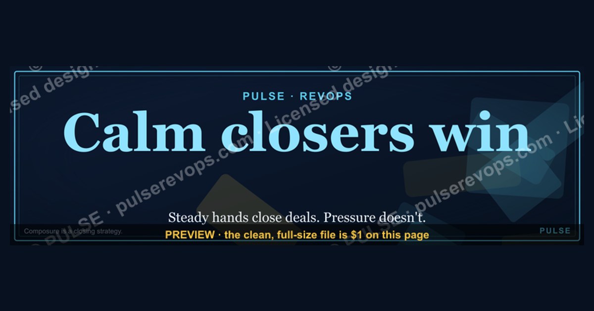
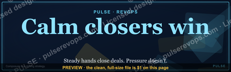
This is a downloadable LinkedIn banner graphic — a 1600x500 pixel PNG — that reads "Calm closers win." in restrained type on a dark field. It is a wallpaper-style image you place at the top of your LinkedIn profile, in a post, or in a team channel to signal that composure, not pressure, closes deals.
The two options compared: text-only banner versus designed graphic
There are two practical ways to put the phrase "Calm closers win." in front of an audience on LinkedIn, and they behave very differently. The first is a plain text post or a text-only banner — just the words, typed into the LinkedIn composer or dropped into a simple image with a solid background. The second is a designed graphic: this banner, at 1600x500 pixels, with deliberate typography, spacing, and a color field behind the words. Both carry the same sentence. They do not carry the same weight.
A text-only post is fast and cheap. You type "Calm closers win." into the composer, add a line of context, hit post, and it lives in the feed for a day or two before the algorithm buries it. It costs nothing, it requires no design skill, and it is easy to A/B test because you can post five variants in a week. The weakness is that it looks like every other text post. It scrolls past. It does not become an asset. If a rep on your team wants to reference it three months later, they are scrolling back through their own history to find it.

A designed graphic — this banner — is slower to produce but it becomes a durable object. It sits at the top of a profile as a header image, where every visitor sees it before they read a single post. It can be pinned to a team channel. It can be dropped into a slide deck. It can be printed and taped above a desk. The 1600x500 aspect ratio is the standard LinkedIn profile header size, which means it slots into the most-viewed real estate on the platform without cropping. That is the trade: the text post wins on speed and volume; the banner wins on permanence and placement.
The practical difference shows up in how the message lands. A text post saying "Calm closers win" reads as an opinion — one person's take, floating in a feed. A banner with the same words, set deliberately and placed as a header, reads as an identity. It says: this is how we operate here. That shift from opinion to identity is the entire reason to bother designing the graphic at all. If you only want to make a point once, type it. If you want the point to sit in the background of every conversation, make the banner.
There is also a middle option worth naming: a designed graphic posted as a feed image rather than used as a header. This gets the visual polish of the banner but the ephemeral life of a post. It is useful for a launch — you post the banner once to announce a sales culture initiative — but it does not persist the way a header does. Most teams end up doing both: post it once for the announcement, then set it as the header for the long haul.
The comparison is not really "which is better." It is "which job are you hiring the graphic to do." Announcement, identity, or reference. The text post does announcement. The banner does identity and reference. Pick based on which one you actually need this quarter.

How to decide between them (mermaid)
The decision tree above is deliberately simple because the real constraint is not strategy — it is placement. Most people who download a wallpaper-style banner already know they want it somewhere visible. The question is which surface. A profile header is the highest-traffic surface on LinkedIn: anyone who clicks your name sees it, whether they came from a search, a comment, or a connection request. A pinned channel message is the highest-frequency surface inside a team: it is the first thing a new rep sees when they join. A slide deck is the highest-context surface: it appears exactly when someone is thinking about how to run a call.
The trap to avoid is treating the banner as a social post and nothing else. If you only ever post it, you get the weakest version of the asset — a one-day impression. The banner's value comes from repetition and placement, not from a single viral moment. Set it as a header. Pin it. Put it in the onboarding deck. Let people see it in the background of every interaction until the phrase becomes shorthand.

There is a second decision hiding inside the first: do you customize the wording, or keep it exactly as written? "Calm closers win." is short, memorable, and slightly provocative — it implies that loud closers lose, which some reps will read as a challenge. If your team culture rewards aggression, the unmodified banner may read as a rebuke. If your culture is already calm, it reads as affirmation. The customization section below covers how to adjust the wording, colors, and role labels without losing the core message.
Concrete numbers behind each option
The numbers matter because they determine whether the banner actually fits where you want to put it. LinkedIn profile header images render at 1584x396 pixels on desktop, which is a 4:1 ratio. This banner is 1600x500, a 3.2:1 ratio. That is close but not identical. In practice, LinkedIn crops header images to fit its display frame, and a 1600x500 image will lose roughly 10-15% of its vertical height at the top and bottom edges when displayed on desktop. On mobile, the crop is more aggressive — mobile headers are shorter and wider relative to their height, so a 1600x500 banner may lose closer to 25% of its vertical content. The practical implication: keep the words "Calm closers win." in the vertical center of the 500-pixel height, roughly between y=150 and y=350, so the crop never eats the message.

For feed posts, LinkedIn displays images at a maximum width of 1200 pixels in the feed, scaled down from whatever you upload. A 1600x500 image will render at 1200x375 in the feed, which is still legible on desktop but small on mobile — the text needs to be large enough in the source file that it survives the downscale. As a rule of thumb, the main phrase should occupy at least 40% of the image height in the source file so that it remains readable at 375 pixels tall on a phone. If you shrink the text to fit more words, you lose the mobile reader, and mobile is where the majority of LinkedIn scrolling happens.
File size is the third number. LinkedIn's upload limit for header images is 8 MB, and for feed images it is 5 MB. A 1600x500 PNG with flat color and text will typically land between 80 KB and 400 KB depending on compression — well under both limits. If you export at 2x resolution for retina displays (3200x1000), you are still under 1.5 MB in most cases. There is no reason to export a JPEG for this kind of graphic; PNG keeps the text edges crisp and the flat color fields clean. JPEG compression creates visible artifacts around high-contrast text, which makes the banner look amateurish on a retina screen.
The fourth number is the one people forget: contrast ratio. If the banner uses light text on a dark field, the contrast ratio between the text color and the background should be at least 4.5:1 to meet WCAG AA readability standards, and ideally 7:1 for maximum legibility. A white or near-white text on a near-black background easily clears 15:1, which is why dark banners with light text read so well at small sizes. If you customize the colors and end up with mid-gray text on a dark-gray field, you may drop below 4.5:1 and the banner becomes hard to read on a phone in daylight. Check the ratio before you upload.
Finally, the download itself. This page offers the banner as a free PNG download. That means you get the file, not a template you have to rebuild. The trade-off is that the wording and colors are fixed unless you have the source file or a design tool. If you need a customized version — different phrase, different palette, your company logo in a corner — you either edit the PNG in an image editor or rebuild it from scratch at 1600x500. The download is the starting point, not the ceiling.
Implementation details and sequencing (mermaid)
The sequence above is the order that avoids rework. Download first, then decide placement, because the placement determines whether you need to worry about the mobile crop. If the banner is going into a slide deck or a printed one-pager, the LinkedIn crop rules do not apply and you can use the full 1600x500 frame. If it is going on a profile header, do the crop-safe check before you upload — open the PNG, draw a mental box from y=150 to y=350, and confirm the phrase sits inside it.
Step four is the one people skip and regret. LinkedIn lets you preview your header before you save it, and the preview shows both desktop and mobile crops. Upload the banner, look at the mobile preview, and if the words are clipped or crowded, adjust the image — either by adding padding above and below the text or by scaling the whole graphic down within a larger canvas. A 1600x500 banner placed inside a 1600x600 canvas with 50 pixels of padding top and bottom gives you a safety margin that survives almost any crop.
Step five is where the banner becomes a team asset rather than a personal one. If you are a sales leader, post the banner in the team channel with a short note explaining why you chose it — not just "here's a graphic" but "this is the standard we're holding ourselves to this quarter." A graphic without a sentence of context is decoration. A graphic with a sentence of context is a directive. The same applies to the onboarding deck: put the banner on a slide, and add one line underneath it that translates the phrase into a behavior, such as "We ask questions before we pitch" or "We let silence do the work."
Step six is the long tail. The banner is most valuable when it shows up in more than one place. A rep who sees it on their manager's header, then in the team channel, then on slide two of onboarding, has now encountered the same message three times in three contexts. That repetition is what turns a slogan into a norm. One impression is a post. Three impressions across three surfaces is culture.
Step seven is the review. Thirty days after you deploy the banner, ask whether it is still doing work. If the team has internalized the message and the banner has become invisible wallpaper — literally background — you can retire it or swap it for a new phrase. If it is still generating comments and questions, keep it. The worst outcome is a banner that nobody notices and nobody removes; it becomes visual noise. Set a calendar reminder to review it, and treat the review as a real decision, not a formality.
One more sequencing note: if you are rolling this out to a team, do not ask everyone to change their header on the same day. Stagger it. Have the sales leader set it first, then the managers, then the reps over the following week. A staggered rollout creates a visible wave — people notice the banner appearing across their network and ask about it — whereas a simultaneous switch looks like a corporate mandate and gets ignored. The wave is the point.
Related questions
What size is the banner?
1600x500 pixels, a 3.2:1 ratio. LinkedIn profile headers display at roughly 1584x396, so the banner is close but will crop slightly on desktop and more on mobile. Keep the main phrase in the vertical center.
Can I change the wording?
Yes, if you edit the PNG in an image tool or rebuild it at 1600x500. The download gives you the fixed phrase "Calm closers win." Custom wording requires your own design pass.
Where should I put it?
Three high-value placements: your LinkedIn profile header, a pinned message in your team channel, and slide two of your sales onboarding deck. Each surface reaches a different audience at a different moment.
Does it work for non-sales roles?
The phrase is sales-specific, but the underlying idea — composure beats pressure — applies to any role where you persuade. Customer success, recruiting, and fundraising all reward calm. Swap the wording if "closers" does not fit.
Is it free to use?
Yes. This page offers the PNG as a free download. There is no license fee and no attribution requirement. Use it on your profile, in your team, or in your deck.
FAQ
What exactly is this banner?
It is a 1600x500 pixel PNG graphic that reads "Calm closers win." on a dark field with restrained typography. It is designed as a LinkedIn wallpaper — a header image, a feed post, or a pinned team graphic — and it is available as a free download from this page.
Why "calm closers" and not "aggressive closers"?
Because pressure-based closing has a short shelf life. A rep who pushes a prospect into a decision may win the deal and lose the relationship, the referral, and the renewal. Calm closing means asking better questions, tolerating silence, and letting the prospect arrive at the decision themselves. The phrase is a positioning statement about method, not a comment on personality.
Will this banner offend aggressive reps on my team?
It might, if they read "calm" as a criticism of their style. The mitigation is context: when you share the banner, explain that calm is about the prospect's experience, not the rep's personality. A rep can be intense and prepared and still create a calm experience for the buyer. Frame it that way and the resistance drops.
Can I use it as a LinkedIn post image instead of a header?
Yes. It will render at roughly 1200x375 in the feed, which is legible on desktop but small on mobile. If you post it, make sure the text is large enough in the source file to survive the downscale, and add a caption that gives the phrase a concrete behavior.
How do I customize the colors for my company brand?
Edit the PNG in an image editor — Photoshop, Figma, Canva, or any tool that handles layers — and replace the background and text colors with your brand palette. Keep the contrast ratio above 4.5:1 so the text stays readable on mobile. If you do not have design tools, rebuild the banner at 1600x500 in Canva using your brand kit.
Does the banner actually change behavior, or is it just decoration?
A graphic alone changes nothing. The banner works when it is paired with a repeated behavior — a manager who models calm on calls, a team channel where people share examples of silence working, an onboarding deck that teaches the method. The banner is a reminder of a practice, not a substitute for one. Used alone, it is decoration. Used as the visible anchor of a real practice, it is a norm.
Sources
- LinkedIn Help: Profile header image guidelines — https://www.linkedin.com/help/linkedin/answer/a563659
- LinkedIn Help: Image size and file type requirements — https://www.linkedin.com/help/linkedin/answer/a563659
- W3C Web Content Accessibility Guidelines: Contrast minimum — https://www.w3.org/WAI/WCAG21/Understanding/contrast-minimum.html
- Nielsen Norman Group: Legibility and readability on screens — https://www.nngroup.com/articles/legibility-readability/
- HubSpot Sales Blog: Consultative selling and discovery questions — https://blog.hubspot.com/sales/consultative-selling
- Harvard Business Review: The power of silence in negotiation — https://hbr.org/2019/05/the-power-of-silence-in-negotiation
- Canva Design School: Social media image sizes and safe zones — https://www.canva.com/learn/social-media-image-sizes/
- Adobe: Understanding image resolution and export formats — https://www.adobe.com/creativecloud/photography/discover/image-resolution.html
Related on PULSE
- Sales slogans that actually change behavior
- How to build a calm discovery call framework
- LinkedIn profile optimization for sales leaders
- Turning team values into visible artifacts
- Onboarding decks that teach method, not just product
- When pressure selling backfires: renewal and referral risk
This page will be disappearing soon. Save it to your device for $1 — or read it free while it is here.
@Kory-White- · if Venmo asks, the last 4 of my number are 2012
 graphicHow to find champions before the first call in 2027
 graphicHead of Sales — LinkedIn Banner
 graphicSIEM and Data Lake CRO — LinkedIn Banner
 graphicInspect. Qualify. Commit. — LinkedIn Wallpaper
 graphicComputer Vision Engineer — LinkedIn Banner
 graphic"Win the quarter." — LinkedIn Banner
 graphicSell outcomes, not features. — LinkedIn Wallpaper
 graphic“Stay in the deal.” — LinkedIn Banner
 graphic“Don’t pitch. Diagnose.” — LinkedIn Banner
 graphicLLM Builder AI Engineer — LinkedIn Banner