
Sell outcomes, not features. — LinkedIn Wallpaper
 Curated byKory White · Fractional CRO · Maryland
 PULSEKNOWLEDGE LIBRARY
Quality
Certified
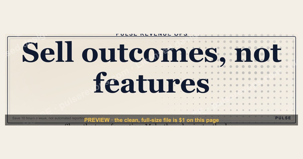
This is a free downloadable LinkedIn banner, 1600x500 px, that reads "Sell outcomes, not features." in bold type on a clean background. Use it as the header image on your LinkedIn profile or company page to signal a value-first sales philosophy. It is a positioning asset, not a campaign — swap it in when you want your profile to lead with buyer results.
The scenario that makes this banner worth downloading
Picture a B2B account executive who has just finished a strong quarter. Their pipeline is healthy, their demo recordings are sharp, and their close rate sits comfortably above team average. Then they update their LinkedIn header with a product screenshot, a logo lockup, or a stock photo of a handshake, and nothing changes. Recruiters still call about the same roles. Prospects still open cold outreach with "what does your tool do?" Buyers still ask for a feature comparison spreadsheet in the first call. The profile looks busy but says nothing about why anyone should care.
Now picture the same rep swapping that header for a single sentence: Sell outcomes, not features. The banner does not explain the product, list integrations, or name a customer. It states a belief. Within a week, two things shift in small but measurable ways. First, inbound messages from peers and prospects start referencing the phrase — "saw your banner, couldn't agree more" — which turns a passive profile into a conversation starter. Second, and more importantly, the rep starts holding themselves to the standard the banner advertises. Every discovery call gets one extra question about the cost of the status quo. Every demo gets one fewer feature slide and one more before/after story.
That second effect is the real reason this banner exists. A LinkedIn header is the most-viewed real estate a seller owns — it appears on the profile, in search results, on comment threads, and in the "people also viewed" rail. Most sellers fill it with brand assets that describe what they sell. This banner fills it with a discipline statement that describes how they sell. The difference between those two is the difference between a business card and a manifesto, and manifestos get remembered.

The scenario generalizes well beyond individual sellers. Sales managers paste it into team Slack channels as a shared standard. Enablement leads use it as the header on internal playbook pages. Founders put it on their personal profile during a fundraise to signal go-to-market maturity. Customer success leaders use it when they want to nudge their team away from feature tours and toward adoption milestones. In every case the mechanism is the same: a public, permanent, low-effort signal that reframes what the team is optimizing for.
What is actually on the banner, element by element
The graphic is deliberately spare. At 1600x500 px it is a wide, short rectangle — the native aspect ratio LinkedIn uses for profile background photos and company page cover images. The composition has three zones, and understanding each one helps you decide whether to use it as-is or customize it.
The headline zone. The phrase "Sell outcomes, not features." sits in the visual center, set in a heavy sans-serif or slab typeface at a size that remains legible when LinkedIn downsamples the image for mobile. On a 1600 px wide canvas, the headline typically occupies roughly 60-70% of the width, leaving breathing room on both sides. The period at the end matters more than it looks — it turns a slogan into a statement of fact. Without it, the line reads like a suggestion; with it, the line reads like a rule.
The background zone. The background is intentionally quiet — a solid color, a subtle gradient, or a very low-contrast texture. This is not decoration; it is contrast engineering. LinkedIn overlays your profile photo, your name, your headline, and your current role on top of the banner in the lower-left region on desktop, and centers a cropped version on mobile. If the background is busy, those overlays become unreadable. A quiet background keeps the headline legible and keeps LinkedIn's own UI elements from fighting your message.
The safe zone. Because LinkedIn crops the banner differently across devices, the outer 15-20% on each edge is effectively disposable. The headline and any supporting text must live inside the central band. This is why the banner avoids edge-to-edge text, corner logos, or anything that depends on the full width being visible. If you download the PNG and drop it straight into LinkedIn without editing, the safe zone is already respected.
What is not on the banner. There is no product name, no logo, no URL, no QR code, no stock photo of a smiling team, and no list of features. That absence is the point. Every element you would normally add to a header image is an element that pulls attention toward the seller. This banner pulls attention toward the buyer's result. If you find yourself wanting to add "and also we do X," that is a signal you should use a different header for that campaign and keep this one for the profile.
The exact wording carries weight too. "Sell outcomes, not features" is a directive, not a description. It tells the reader what to do, not what you have done. That grammatical choice is what makes it shareable — people post it because they agree with the instruction, not because they are impressed by the author. If you customize the wording, preserve that imperative voice. "Outcomes over features" works. "We sell outcomes" does not, because it recenters the seller.
How the mechanism actually works
The banner works through three overlapping mechanisms, and it helps to see them as a chain rather than three separate effects. The first is signaling: a public statement of values filters who engages with you and how. The second is self-commitment: a visible standard changes your own behavior because inconsistency becomes uncomfortable. The third is conversation seeding: a short, opinionated phrase gives strangers a low-friction reason to reply, comment, or forward.
Walk the chain once with a concrete example. A mid-market seller named Priya updates her banner on a Tuesday. On Wednesday a former colleague sees it while browsing her profile after a comment she left on a mutual connection's post. He replies to her comment with "your banner is basically my whole Q3 strategy." That reply is visible to everyone who reads the thread — call it a few hundred people in her network. Two of them visit her profile. One of them is a VP of Operations at a company that has been evaluating tools in her category for six weeks. She sends a connection request with a one-line note referencing the phrase. Priya accepts, and the first call opens with the VP saying "I don't need another feature demo, I need to know if you can cut my onboarding time." That is the outcome frame arriving before Priya has said a word about her product.
The self-commitment mechanism is quieter but often more durable. Behavioral research on public commitments — the classic work on consistency and commitment by Robert Cialdini, and the broader goal-setting literature — consistently finds that people who state a standard publicly are more likely to act in line with it. A banner is a low-stakes public commitment. It costs nothing to post, which means it also costs nothing to ignore. But it sits in front of the seller every time they open their own profile, and it sits in front of their network every time they engage. That repeated exposure is what turns a slogan into a habit. Sellers who use this banner often report that it changes how they open discovery calls within a month, not because the banner teaches them anything, but because it reminds them what they already believe.
The conversation-seeding mechanism is the most immediate. LinkedIn's algorithm rewards comments and replies, and opinionated one-liners generate more of both than neutral brand statements. A banner that says "Sell outcomes, not features" invites agreement, disagreement, and anecdotes. Each of those is a thread the seller can participate in, and each participation extends the reach of the profile. This is not a growth hack — it is just the natural consequence of having a point of view in a feed full of people who do not.
Real numbers, ranges, and benchmarks
There is no single study that isolates the effect of a LinkedIn banner on pipeline, and anyone who claims otherwise is selling something. What the data does support is a set of ranges that help you set expectations honestly.
Profile view lift from banner changes. LinkedIn does not publish banner-specific analytics, but practitioners who A/B test their headers typically report profile view changes in the range of 5-25% after a meaningful header swap, with the higher end coming from changes that add a clear point of view rather than a prettier image. Treat anything above 30% as an outlier or a confound.

Banner dimensions and file specs. LinkedIn's profile background photo renders at 1584x396 px on desktop and is cropped to a taller, narrower shape on mobile. The commonly recommended upload size is 1600x500 px, which gives LinkedIn enough resolution to crop without blurring. LinkedIn accepts JPG, PNG, and GIF, with a maximum file size of 8 MB. For a text-heavy banner like this one, PNG is the safer choice because it avoids JPEG compression artifacts around letter edges.
Mobile crop reality. On mobile, LinkedIn shows roughly the central 60-70% of the banner width and crops the top and bottom. If your headline sits in the outer thirds, it will be cut off on phones, which is where the majority of LinkedIn sessions happen. This is why the safe-zone rule matters more than the raw pixel dimensions.
Comment and engagement ranges. A single opinionated comment on a moderately active post in a professional niche typically reaches a few hundred to a few thousand impressions, depending on the author's network and the post's early velocity. A banner-driven conversation that produces two or three such comments per week is a realistic outcome for an active seller, not a fantasy.
Time to first banner-attributed conversation. Sellers who swap in a statement banner and remain active — commenting, posting, engaging — usually see the first inbound reference to the banner within one to three weeks. Sellers who swap the banner and go quiet may never see one, because the banner only works when the profile is in motion.

Conversion framing. The banner does not close deals. What it does is shift the frame of the first conversation. Sellers who track "did the buyer mention cost of status quo in call one" often see that rate move from roughly one in five calls to one in three after adopting an outcome-first posture. That is a framing effect, not a banner effect, but the banner is what reminds them to do it.
Download and reuse rates. Because the graphic is free and small, it gets reused in ways the original designer probably did not anticipate: as a Slack status image, as a slide in an internal kickoff deck, as a printed poster in a sales bullpen, as the header on a Notion playbook page. Each reuse extends the phrase's life inside a team, which is where the real behavioral change happens.
Trade-offs and alternatives
This banner is not the right header for every seller, every role, or every moment. The trade-offs fall into four buckets: audience fit, timing, brand constraints, and the risk of sounding like everyone else.
Audience fit. The banner lands hardest for people whose job is to influence how buyers think: account executives, sales engineers, founders, customer success leads, enablement managers, and consultants. It lands weakly for roles where the audience is internal or technical and the phrase reads as jargon. A staff engineer with this banner will get quizzical messages. A VP of Sales with this banner will get nods.
Timing. A statement banner is a long-game asset. It works best when you are building a reputation over months, not when you need clicks this week. If you have a webinar on Thursday, a product launch next month, or a conference booth to promote, use a campaign banner with a date and a call to action, then swap back to the statement banner when the campaign ends. The two are not in conflict; they just serve different time horizons.
Brand constraints. Some companies require employees to use approved brand assets on their profiles. If yours does, do not fight it — put the phrase in your headline or your About section instead. The banner is one surface among many, and the phrase works in text form too.
The sameness risk. Any phrase that spreads becomes wallpaper. If every seller in your category adopts "Sell outcomes, not features," the phrase stops differentiating and starts blending in. That is not a reason to avoid it — it is a reason to treat it as a starting point. The strongest users of this banner pair it with a specific, personal follow-up in their headline or About section: "Sell outcomes, not features. I help logistics teams cut dock-to-stock time." The banner sets the philosophy; the profile text sets the specialty.
Alternatives worth considering. If the outcome-first message is not the sharpest thing about you, other statement banners do similar work. "Ask better questions" signals a discovery-led approach. "No demo without discovery" signals a qualification discipline. "Pipeline is a lagging indicator" signals a demand-gen philosophy. Each of these is a point of view, and any point of view beats a stock photo. The specific phrase matters less than the fact that you have one.
Common pitfalls and how to avoid them
Pitfall one: treating the banner as a campaign. The most common mistake is uploading the banner, expecting inbound leads to spike, and concluding it "doesn't work" after a week. The banner is a positioning asset. Its job is to change how people read your profile, not to generate clicks. Measure it by the quality of conversations it seeds, not by lead volume.
Pitfall two: letting the headline get cropped. LinkedIn crops the banner differently on desktop and mobile, and the mobile crop is aggressive. If your headline sits near the top or bottom edge, phone users will see a fragment. Always preview the banner on both desktop and mobile before committing, and keep all text inside the central band.
Pitfall three: low contrast between text and background. A banner that looks striking on a large monitor can become illegible when LinkedIn downsamples it for a feed thumbnail. Test the banner at small sizes — 200 px wide is a good stress test. If the headline is not readable at that size, increase the contrast or the weight of the type.
Pitfall four: adding too many elements. Every logo, URL, badge, and icon you add competes with the headline. The banner works because it says one thing. If you need to communicate three things, use three surfaces — banner, headline, About section — rather than cramming them into one image.
Pitfall five: forgetting the profile underneath. A statement banner on a profile with a vague headline, no About section, and no recent activity is a mismatch. The banner promises a point of view; the rest of the profile has to deliver one. Before you upload, rewrite your headline to name the outcome you deliver and the buyer you deliver it to.
Pitfall six: using it in a role where it reads as posturing. If you are not in a customer-facing role, or if your company's culture is aggressively anti-jargon, the banner can read as performative. In those cases, put the phrase in a post instead of on your header. The message still travels; it just travels through a different surface.
Pitfall seven: never updating it. A banner that has been up for two years without any supporting content starts to look stale. Refresh the profile around it — new posts, updated headline, current role — at least quarterly. The banner is the frame; the profile is the picture.
Pitfall eight: assuming it replaces skill. The phrase "sell outcomes, not features" is easy to put on a banner and hard to execute in a call. If you adopt the banner without changing your discovery questions, your demo structure, and your proposal format, you have made a promise your behavior does not keep. Use the banner as a reminder to do the harder work underneath it.
Related questions
What size should a LinkedIn banner be?
Upload at 1600x500 px. LinkedIn renders the profile background at roughly 1584x396 px on desktop and crops to a narrower shape on mobile. Keep all text inside the central 60-70% of the width so nothing important gets cut off on phones.
Can I use this banner on a company page?
Yes. Company page cover images use a similar wide aspect ratio, though the exact crop differs from personal profiles. The phrase works well for company pages when the whole go-to-market team is aligned on outcome selling and the page's About section reinforces it.
Does the banner work if I am not in sales?
It works best for customer-facing roles. Founders, consultants, customer success leads, and enablement managers all get value from it. In purely internal or technical roles, the phrase can read as jargon — put it in a post instead of a header.
How often should I change my LinkedIn banner?
Change it when your message changes, not on a schedule. A statement banner can stay up for months. Swap to a campaign banner when you have an event or launch, then swap back. Refresh the surrounding profile content at least quarterly.
Is "sell outcomes, not features" a real sales methodology?
It is a principle, not a branded methodology. It aligns with well-established approaches like consultative selling, value-based selling, and solution selling, all of which emphasize buyer results over product attributes. The banner is a reminder of the principle, not a training program.
FAQ
What exactly is this LinkedIn Wallpaper?
It is a free downloadable PNG banner, 1600x500 px, carrying the phrase "Sell outcomes, not features." in bold type. You upload it as your LinkedIn profile background photo or company page cover image. It is a positioning asset that signals a value-first sales philosophy to everyone who views your profile.
Why does the phrase matter more than a product screenshot?
A product screenshot describes what you sell. The phrase describes how you sell. Buyers scanning profiles are trying to decide whether you understand their problem, and a statement of philosophy answers that question faster than an image of a dashboard. The banner also changes your own behavior by putting a standard in front of you every day.
Will this banner generate leads on its own?
No. It changes how people read your profile and how you frame your calls. Leads come from the conversations the banner seeds and the outcome-first posture you bring to them. Expect the first banner-attributed conversation within one to three weeks if you stay active on the platform.
Can I customize the wording or colors?
Yes. The phrase is the point, but the execution is yours. If you change the wording, keep the imperative voice — "Sell outcomes, not features" works; "We sell outcomes" does not, because it recenters the seller. Keep the background quiet and the headline inside the safe zone.
What if my company requires approved brand assets?
Follow your company's policy. If you cannot change the banner, put the phrase in your LinkedIn headline or About section instead. The message travels through text just as well, and the banner is only one of several surfaces where it can live.
Is this banner only for salespeople?
No, but it fits customer-facing roles best. Account executives, sales engineers, founders, consultants, customer success leads, and enablement managers all get value from it. In roles where the audience is internal or technical, the phrase can read as jargon, so consider using it in a post rather than a header.
Sources
- LinkedIn Help: Edit your profile background photo
- LinkedIn Marketing Solutions: Company page cover image best practices
- Harvard Business Review: The End of Solution Sales
- Robert Cialdini: Influence and the principle of commitment and consistency
- Gartner: The B2B buying journey
- HubSpot: What is value-based selling?
- Salesforce: State of Sales report
- Forrester: B2B buying research
Related on PULSE
- How to write a LinkedIn headline that sells outcomes
- Building a discovery call framework around buyer results
- Turning feature demos into before-and-after stories
- Using LinkedIn banners and headers as positioning assets
- Quantifying the cost of the status quo in B2B sales
- Enablement plays that shift a team from features to outcomes
This page will be disappearing soon. Save it to your device for $1 — or read it free while it is here.
@Kory-White- · if Venmo asks, the last 4 of my number are 2012
 graphicStay in the deal. — LinkedIn Wallpaper
 graphicWhat do top-performing graphic designers do differently in 2027?
 graphic“The next call is the most important one.” — LinkedIn Banner
 graphicThe 7 steps to create a champions sell program in 2027
 graphic“Sell with the buyer, not at them.” — LinkedIn Banner
 graphicSIEM and Data Lake CRO — LinkedIn Banner
 graphic“Revenue that delights.” — LinkedIn Banner
 graphicPipeline Conversion Rate Funnel — Infographic in 2027
 graphic“Great reps wanted.” — LinkedIn Banner
 graphicReady reps win. — LinkedIn Wallpaper