
Bring the energy. — LinkedIn Wallpaper
 Curated byKory White · Fractional CRO · Maryland
 PULSEKNOWLEDGE LIBRARY
Quality
Certified
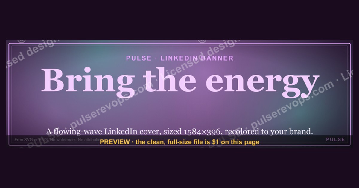
This is a downloadable LinkedIn profile banner (1600×500 px, PNG) that reads "Bring the energy." in the graphic's focal wording, sized to sit behind your headshot on a LinkedIn profile. Use it when you want your profile to open with a short, energetic line instead of a blank cover photo — download it free from this page and swap it into your LinkedIn banner slot in under a minute.
The outcome you should expect
Once this banner is in place, the visible outcome is simple: the top third of your LinkedIn profile stops being empty gray space and becomes a stated point of view. The wording "Bring the energy." sits as the dominant text element, positioned so it survives LinkedIn's automatic desktop and mobile crop (LinkedIn re-crops the same uploaded image differently across breakpoints, so the phrase is kept inside the safe center band rather than pushed to the far left or right edge, where mobile clips it hardest). Around that line, the banner carries supporting structure rather than a cluttered graphic: a solid or gradient background field, generous negative space, and — depending on which variant you export — a thin rule or small mark that anchors the bottom edge near where your profile photo will overlap it.
The practical effect for a viewer is that your profile reads as intentional in the first second, before they reach your headline or About section. A banner with a single confident phrase functions like a subhead for the whole page: it sets tone (energetic, direct) ahead of the content-heavy parts of the profile. That's the entire job of this graphic — it is not meant to carry your résumé, your logo, or contact details. Those belong in your headline and About section, where LinkedIn's search indexing and profile viewers actually read text as data. The banner is a mood-setting instrument, not an information surface.

You should also expect this banner to look identical across sessions and devices because it's a flat PNG, not a live template — there's no dynamic text, no animation, and no personalization baked in beyond what you edit before export. What you download is exactly what displays. That predictability is the point: a banner that renders differently on phone versus desktop, or that a browser extension strips fonts from, defeats the purpose of a wallpaper graphic. Flat PNG avoids all of that.
What drives that outcome
What actually drives whether this banner "works" once it's live is placement discipline, not the slogan itself. LinkedIn's cover photo slot is unusually unforgiving: it displays at different aspect ratios on desktop versus the mobile app, and the platform crops from the edges inward on narrower screens. A banner authored at 1600×500 gives you a wide safety margin over LinkedIn's own minimum guidance, which historically sits closer to 1584×396 — the extra height in this asset means less of the critical text sits right at the crop line. That's why the wording "Bring the energy." is set inside the center 60% of the canvas rather than flush to either edge.

The other driver is contrast against your profile photo. Your headshot overlaps the bottom-left of the banner on both desktop and mobile, so any text or mark placed there gets partially obscured. This banner's layout keeps its primary text above and to the right of that overlap zone, which is why it reads cleanly even after your photo is layered on top. If you customize the file yourself and move the text lower or further left, test it against a real profile photo before publishing — this is the single most common reason a good banner looks broken once live.
Channel matters too: this graphic is built for LinkedIn's cover-photo slot specifically, not for Twitter/X headers (1500×500, different safe zones), not for Facebook cover photos (820×312, a much shorter aspect ratio), and not for a slide deck title card. Reusing a LinkedIn-sized banner on another platform without re-cropping will misplace the text almost every time, because each platform's safe zone is a different shape.

Benchmarks and realistic ranges
The file delivered from this page is a PNG at 1600×500 px, which lands comfortably above LinkedIn's documented minimum for a profile cover image and gives you headroom against future minimum-size changes — platforms have raised their recommended banner dimensions before, and starting oversized protects you from having to re-export later. As a realistic range for LinkedIn banners generally: anything from roughly 1400×350 up to 1600×500 renders acceptably, but going much narrower than a 4:1 width-to-height ratio starts to feel like a strip rather than a banner, and going much taller starts competing visually with your headshot.
File size for a banner like this typically lands in the 150 KB–600 KB range once exported as PNG with a modest color palette (a background field, one or two accent colors, and text) — well under LinkedIn's upload ceiling, which is generous enough that file size is rarely the blocker. If you're customizing colors or adding a photographic background, expect the file to grow toward the higher end of that range or push you toward JPEG instead; a banner heavier than a few megabytes still uploads, but it's unnecessary weight for what is fundamentally a text-forward graphic.

On the customization side, a realistic range for legible text size on a 1600×500 canvas is a primary line set between roughly 60–110 px tall (in canvas pixels), depending on how many words you're carrying — a two-word or three-word line like "Bring the energy." can run larger than a longer tagline would. Push much smaller and the phrase disappears on a mobile screen where the whole banner might render at a few hundred pixels wide; push much larger and the line starts clipping against the crop edges described above.
For teams rolling this out across multiple people's profiles, a realistic timeline is 10–20 minutes per person the first time (download, open LinkedIn settings, upload, preview on both desktop and the mobile app, adjust crop if needed) and closer to 2–3 minutes on repeat once someone has done it once and knows where the LinkedIn upload control lives.

Risks, edge cases, and failure modes
The most common failure mode is uploading the banner without checking the mobile crop. A phrase that sits perfectly centered on a wide desktop browser can shift toward one edge on a phone screen, because LinkedIn's mobile app frequently shows a narrower slice of the same image than desktop does. Always open your own profile in the LinkedIn mobile app after uploading, not just the desktop editor preview, before considering the change final.
A second risk is tone mismatch. "Bring the energy." reads as motivating and confident in contexts like sales, recruiting, events, coaching, or team culture pages — but it can land as tone-deaf on a profile whose surrounding content is technical, academic, legal, or otherwise formal. Before using this banner, check that your headline and About section can sit next to an energetic, informal phrase without feeling inconsistent. A banner and a bio that contradict each other in tone is more damaging than having no banner at all, because it reads as inconsistent rather than intentional.

A third risk is stale personalization. If you customize this banner with a team name, event date, or campaign reference and then forget to swap it out afterward, it becomes evidence of neglect rather than energy — a banner referencing a conference from eight months ago sitting behind a current headshot signals an unmaintained profile. Treat any dated or campaign-specific version of this graphic as temporary and put a calendar reminder on removing or replacing it.
A fourth, more technical edge case: low-contrast exports. If you recolor the background to match brand colors without checking the resulting contrast against the text, the phrase can become unreadable — this is especially common with light-on-light or dark-on-dark brand palettes. Run any recolored version through a basic contrast check (aim for a ratio that keeps text clearly legible against its background) before publishing, and preview at actual banner size rather than zoomed in, since text that looks fine at 100% zoom in an editor can wash out at the smaller rendered size on a profile page.
Finally, there's a duplication risk on teams: if every person on a ten-person sales team uploads the identical unmodified banner, LinkedIn visitors who view several team profiles in a row will notice the repetition, which can undercut the "energy" framing by making it feel like a mandated template rather than a personal choice. The rollout plan below addresses this directly.
A practical rollout plan
For an individual, the rollout is short: download the PNG, open LinkedIn's profile editor, click the cover-photo camera icon, upload the file, and check both the desktop and mobile previews before leaving the editor. That's the entire path for a single profile.
For a team rolling this out together — a sales pod, a customer success group, a recruiting team — the plan should add one deliberate variation per person so the banners don't read as a stamped-out template. The easiest lever is accent color: keep the "Bring the energy." wording and layout identical, but shift the background or accent color per person or per sub-team, the same way a company might color-code departments. A second lever, if you're comfortable editing the source file, is adding a small role or team tag beneath the main line — something like a department name — without touching the primary phrase's size or position, so the crop-safety work already done for the main text still holds.
Sequence the rollout so a small group (three to five people) publishes first, checks how it looks across both desktop and mobile, and confirms the tone lands well against their existing headlines and About sections. Only after that spot-check should the rest of the team upload, because it's far easier to catch a contrast or clipping problem on five profiles than to discover it after fifty people have already published. Once live, set a recurring reminder — every three to six months is a reasonable cadence — to revisit whether the banner still matches current roles, team names, or campaign context, since LinkedIn banners are one of the profile elements people update least often and are therefore most likely to go stale unnoticed.
Related questions
What size should a LinkedIn banner be?
LinkedIn's cover photo displays across different crops on desktop and mobile. This banner is built at 1600×500 px, above LinkedIn's typical minimum guidance, so there's margin before text hits a crop edge on either device.
Can I change the text on this banner myself?
Yes, if you have the source file or recreate the layout in an editor — keep any new wording inside the center band of the canvas and re-check both desktop and mobile previews before publishing.
Why does my LinkedIn banner look different on phone versus desktop?
LinkedIn crops the same uploaded image differently by viewport width. Text or logos placed near the edges are the first elements to get clipped on the narrower mobile crop.
Does a LinkedIn banner affect how I show up in search?
LinkedIn's search indexing runs on text fields like your headline, About section, and experience — not on the wording embedded in an image. This banner sets tone for a human visitor, not for search ranking.
FAQ
What exact wording is on this banner? The primary line is "Bring the energy." set as the dominant text element on a 1600×500 px PNG background, positioned inside the crop-safe center band so it survives both LinkedIn's desktop and mobile display.
What file format do I get when I download it? A flat PNG at 1600×500 pixels. There's no editable layer file bundled with the free download — if you need to change the wording or colors, you'll recreate the layout in your own design tool using this version as a reference.
Where exactly do I upload it on LinkedIn? On your profile page, click the camera or pencil icon that appears over the cover photo area at the top of your profile (above your headshot), then choose "Upload" and select the downloaded PNG.
Will this banner look right on both desktop and mobile? It's built with margin inside LinkedIn's typical crop zones, so it should hold up on both, but you should still check your own profile in the LinkedIn mobile app after uploading, since crop behavior can vary by device and app version.
Can I use this same banner on Twitter/X or Facebook instead of LinkedIn? Not without re-cropping. Twitter/X headers and Facebook cover photos use different dimensions and different safe zones, so a LinkedIn-sized banner will likely misplace the text if reused as-is on another platform.
Is "Bring the energy." the right tone for every profile? No — it fits informal, motivating contexts like sales, recruiting, coaching, or team culture pages well, but can clash with a profile whose headline and About section read as formal, technical, or academic. Check tone consistency before publishing.
Sources
- https://www.linkedin.com/help/linkedin/answer/a542918
- https://www.linkedin.com/business/marketing/blog/linkedin-page-best-practices/linkedin-image-sizes
- https://www.canva.com/create/linkedin-banners/
- https://blog.hootsuite.com/social-media-image-sizes-guide/
- https://sproutsocial.com/insights/social-media-image-sizes-guide/
- https://blog.hubspot.com/marketing/linkedin-banner-image
- https://www.adobe.com/express/create/cover/linkedin
Related on PULSE
- /knowledge/linkedin-profile-optimization-checklist
- /knowledge/best-linkedin-headline-formulas-for-sales-reps
- /knowledge/how-to-brand-a-sales-team-on-linkedin
- /knowledge/linkedin-banner-vs-profile-photo-what-matters-more
- /knowledge/social-selling-index-what-actually-moves-it
This page will be disappearing soon. Save it to your device for $1 — or read it free while it is here.
@Kory-White- · if Venmo asks, the last 4 of my number are 2012
This page is gone.
This one is off the shelf now. $1 keeps it on your phone for good — the whole page, pictures and diagrams included.
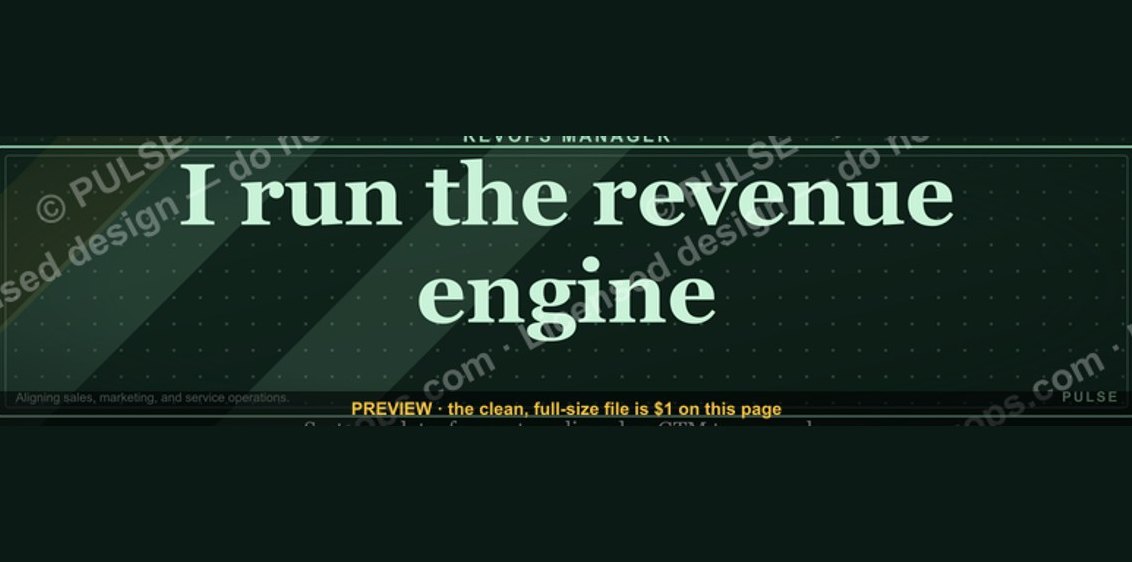 graphicRevOps Manager — LinkedIn Banner
 graphicSales Coach — LinkedIn Banner
 graphicCommercial Director — LinkedIn Banner
 graphicCalm closers win. — LinkedIn Wallpaper
 graphicReady reps win. — LinkedIn Wallpaper
 graphicHow to design a LinkedIn banner that converts viewers into leads in 2027?
 graphicVP of Sales — LinkedIn Banner
 graphicHead of Sales — LinkedIn Banner
 graphicAI Observability Operator — LinkedIn Banner
 graphicSIEM and Data Lake CRO — LinkedIn Banner