
Make it predictable. — LinkedIn Wallpaper
 Curated byKory White · Fractional CRO · Maryland
 PULSEKNOWLEDGE LIBRARY
Quality
Certified
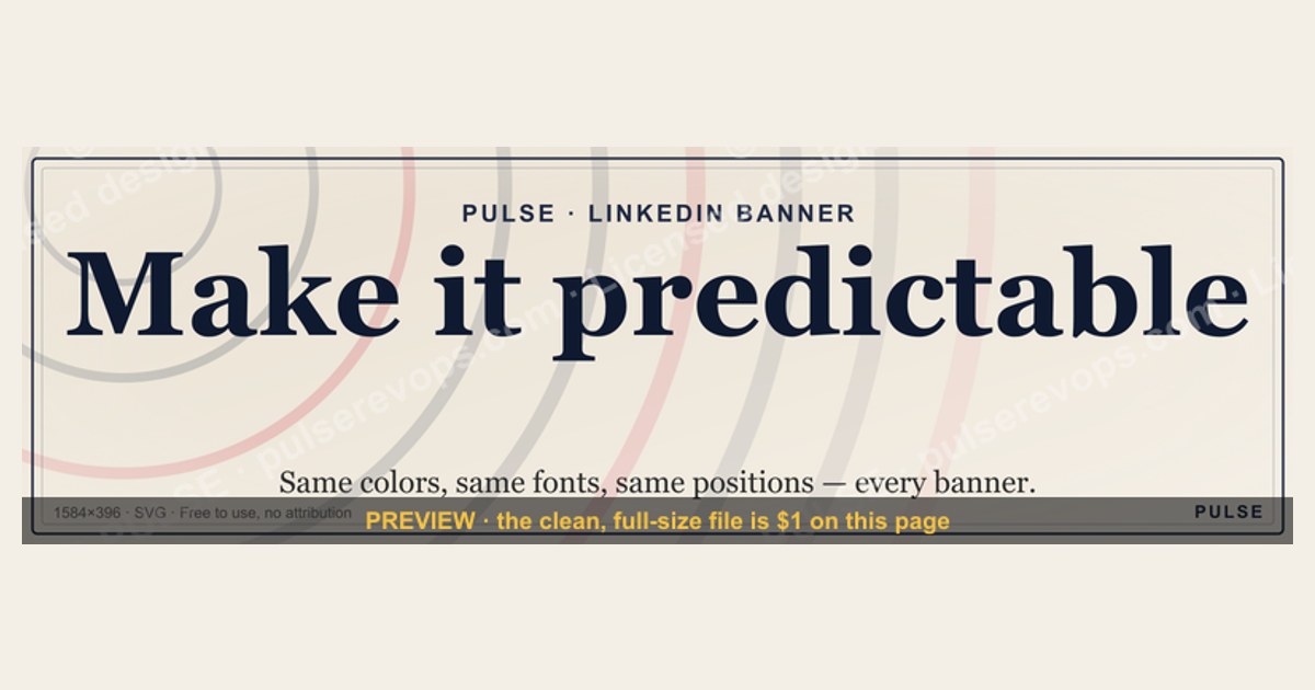
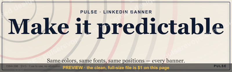
This is a free downloadable LinkedIn banner — 1600x500 pixels, PNG format — that reads "Make it predictable." in bold serif type against a dark charcoal-to-black background, with a single thin gold accent line beneath the words. It's built for RevOps, sales, and operations leaders who want their profile to signal a process-first, forecast-driven identity the instant someone lands on it. Download the PNG below and swap it into your LinkedIn cover photo slot in under two minutes.
A manager updates a profile the night before a board deck
Picture a RevOps director three weeks into a new job, prepping for the first QBR with the executive team. The forecast deck is done, the pipeline math is clean, the win-rate trend line finally points the right direction — but the LinkedIn profile still shows the stock photo banner that came with the account, a stretched skyline nobody chose on purpose. It says nothing. A recruiter, a prospective hire, or a board member who clicks through from the meeting invite sees a generic wallpaper and learns nothing about how this person thinks about the job.
This is the moment this banner exists for. "Make it predictable." isn't a slogan chosen for its poetry — it's a compressed statement of a operating philosophy: that revenue, forecasting, pipeline coverage, and rep output should behave like a system with known inputs and known outputs, not a set of surprises delivered at the end of each quarter. Someone running a RevOps or sales-ops function lives or dies by whether the number that gets forecast in week one of the quarter is the number that closes in week thirteen. Putting that phrase across the top of a profile is a small, low-effort way to broadcast that priority before a single sentence of the About section gets read.

The mechanics of the swap are simple enough that they get skipped in exactly the way the manager above almost skipped it — not because it's hard, but because the default banner is invisible until someone points a camera at it during a screen share, or a hiring manager scrolls past it while sourcing candidates for a director-level RevOps seat. Profile real estate at the very top of the page gets more unconscious dwell time than almost any other single element, because it's the first thing to render and the only thing visible before a viewer starts scrolling or reading. A banner that says something specific, on-brand, and true about how the person operates converts that dead space into a first impression that does actual work — which is the whole argument for treating a LinkedIn Wallpaper as a designed asset rather than an afterthought.
What's actually on the banner
The graphic breaks into four layers, and each one was chosen deliberately rather than defaulted into.
Background. A near-black charcoal field (not pure black, which photographs and screenshots harshly and crushes detail on OLED phone screens) fills the full 1600x500 canvas edge to edge. There's no texture, no gradient mesh, no stock photography behind the text — busy backgrounds are the single most common reason slogan banners fail to read cleanly once LinkedIn compresses and re-encodes the upload, which it does to every image regardless of the source resolution.
Typography. "Make it predictable." sits left-of-center in a bold serif face, chosen specifically because a serif reads as institutional and considered next to the sans-serif fonts LinkedIn uses for the name and headline directly below the banner — the contrast keeps the two from visually competing. The period at the end of the phrase is part of the design, not punctuation added by accident: it turns a phrase into a statement, the same way a mission line ends with a full stop rather than trailing off.
Accent line. A single thin gold-toned rule sits underneath the text block, roughly a third of the text's width, anchoring the phrase without adding a second competing element. It's the only color note against the charcoal field, which is why it reads as intentional rather than decorative clutter.
Safe margin. Everything — text, accent line — sits inside a margin that avoids the bottom-left zone LinkedIn's profile photo circle overlaps on desktop, and avoids the far edges that mobile's tighter crop cuts away. That safe-zone math is the part most homemade banners get wrong, and it's covered in full in the specs section below.
Nothing on the banner names a company, a product, or a metric, which is deliberate: it's designed to be dropped onto an individual's profile — an operator, a manager, a director — without implying an employer endorsement or requiring a legal sign-off. That's also why the customization section further down exists: the same four-layer structure can carry a different phrase for a different function without redesigning anything from scratch.
Sizing it right: specs, crop zones, and real benchmarks
The file behind this banner is exported at 1600x500 pixels, a 3.2:1 aspect ratio, saved as PNG rather than JPG to keep the text edges crisp — JPG's lossy compression tends to introduce visible haloing around sharp text-on-solid-color edges, which is exactly the kind of graphic this is. PNG costs a slightly larger file size for the same visual quality, but LinkedIn's upload limit sits comfortably above what a banner like this ever produces, so file size is not a real constraint here.
LinkedIn's own guidance for personal profile cover photos has long centered on roughly 1584x396 pixels as the space that actually displays edge-to-edge without letterboxing on desktop. Sizing the source file at 1600x500 rather than exactly matching that ratio builds in a small buffer — extra pixels on every edge — so that LinkedIn's automatic center-crop, which varies slightly by device and has changed more than once over the platform's history, never clips the headline text itself. That buffer is the difference between a banner that always reads correctly and one that occasionally loses the final word of the phrase on some screens.
The profile photo circle is the other hard constraint. On desktop, the circular profile photo sits on top of the banner's bottom-left region, generally overlapping somewhere in the neighborhood of the lower 20-25% of the banner height and roughly the first 15-20% of its width. Any text or design element placed in that zone gets partially or fully covered depending on screen width — which is exactly why this banner keeps its type block centered-to-right rather than flush left, and why the accent line never runs the full width of the canvas into that corner.

Mobile is the more aggressive crop. LinkedIn's mobile app shows a noticeably narrower vertical slice of the same banner than desktop does, effectively zooming into the horizontal center band and cutting a meaningful percentage of both the top and bottom edges compared to what a desktop viewer sees. A banner designed only by eyeballing a desktop preview routinely loses its headline entirely on a phone. This file's text block sits inside the vertical center third of the 500px height specifically so it survives that mobile crop intact — a constraint that's easy to state and easy to skip if you're building a banner without checking a phone screen before publishing.
Export weight for a banner like this typically lands well under 1MB as a PNG at this resolution and color simplicity (a near-solid dark field with one text block compresses efficiently), which means upload time is never the bottleneck — review and placement are.

When a slogan banner works — and when it backfires
A words-only banner is a strong choice in a narrow set of circumstances, and a weak one outside them, so it's worth being honest about both sides rather than treating this as universally correct.
It works well when the phrase names something specific and true about how the person actually operates — not an aspiration borrowed from a company values page, but a real operating stance a viewer could ask about in an interview and get a real answer to. "Make it predictable." works for a RevOps, sales-ops, or forecasting-focused operator because predictability is a legitimately central, contested, hard-won property of a revenue function — most companies do NOT have it, which is what makes claiming it as a personal priority meaningful rather than generic. It also works because the audience for a RevOps profile — recruiters, VPs of sales, fellow ops leaders — actually cares about this specific axis of competence, so the phrase pre-qualifies the right kind of profile visitor.
It backfires in a few predictable ways. First, on a profile whose headline and About section don't back up the claim — a slogan banner promising rigor next to a headline with no metrics, no scope, no specifics reads as aspirational marketing rather than earned positioning, and sophisticated viewers notice the gap immediately. Second, in industries or roles where a stark, business-jargon phrase clashes with the expected tone — a creative director's or a teacher's profile with "Make it predictable." across the top would read as tonally mismatched rather than confident. Third, when the same banner gets used company-wide without adaptation, so that six people on the same team show up in a hiring manager's search results with identical banners — at that point it reads as a mandated brand asset rather than a personal statement, which undercuts the exact authenticity the banner is trying to create.
The realistic alternatives worth naming: a photo banner (the person at work, at an event, presenting) trades specificity of message for warmth and recognizability; a customer-quote banner borrows credibility from someone else's words rather than asserting your own; a plain branded-color banner with no text at all is the safest, lowest-risk default but also communicates nothing. A slogan banner sits at the higher-risk, higher-reward end of that spectrum — it says more, which means it can also say the wrong thing if it's mismatched to the person wearing it.
Customizing the wording, colors, and roles — and the mistakes to dodge
The four-layer structure — background, headline, accent line, safe margin — is designed to be edited, not just downloaded and used verbatim. Swapping the phrase for a different function is the most common customization: a customer success leader might run "Make it repeatable." instead of "predictable," a finance or FP&A operator might run "Make it defensible.," and a founder or GTM leader might run "Make it obvious." The grammatical shape — "Make it [single adjective]." — is what makes the family recognizable across roles without forcing everyone into the identical claim.
Color is the second layer worth adjusting deliberately rather than leaving alone by default. The charcoal-and-gold combination reads as serious and slightly premium, which suits a RevOps or ops-leadership context. A go-to-market or sales-development profile might swap the accent color to a brighter tone to read as more energetic; a data or analytics-leaning profile might drop the gold for a cooler blue or teal to signal precision instead. The one rule that shouldn't move regardless of palette choice: keep contrast high between the text and the background. Light gray text on a mid-gray background looks refined on a designer's monitor and disappears almost entirely once LinkedIn compresses the upload and a viewer sees it on a phone in bright daylight — insufficient contrast is one of the most common ways a homemade version of this banner fails silently, because it looks fine at design time and unreadable in the wild.
The pitfalls worth naming explicitly, because they recur across almost every DIY version of this kind of banner:
Text collision with the profile photo is the most frequent failure — a headline or accent element placed dead-center-left gets partially eaten by the circular photo overlay on desktop. Keep the primary text block right of center, or high enough in the vertical space, that the profile photo circle never touches it.
Testing on desktop only is the second-most common miss. Because the mobile crop is meaningfully tighter, a banner that looks perfectly balanced in a desktop preview can lose its final word or its accent line entirely once viewed on a phone — always preview on an actual phone, not just a resized browser window, before treating the upload as final.
Overloading the phrase with more than a handful of words turns a banner into a paragraph nobody reads at banner size; the entire design logic here depends on the phrase being short enough to register in under a second.
Exporting at too low a resolution and letting LinkedIn upscale it introduces visible blur around the text edges — always export at or above the native 1600x500 dimension, never smaller, and let LinkedIn's own compression do the downscaling rather than doing it yourself at a lower starting resolution.
And finally, using a phrase that isn't actually true of how the person works. The entire value of a statement banner is the credibility it borrows from being specific and verifiable — a viewer who reads "Make it predictable." and then sees a forecast history, a case study, or a talk on record backing that claim is left with the accurate impression that the design work aimed for. A viewer who reads the phrase and finds nothing behind it experiences the opposite: a claim without a body of work supporting it, which costs more credibility than a blank banner ever would have.
Related questions
What's the ideal LinkedIn banner size if I'm designing my own from scratch?
Aim for roughly 1584x396 pixels as the visible area LinkedIn displays, but export at 1600x500 or similar with a margin buffer so cropping never clips your text. Always PNG for text-heavy designs, never JPG.
Should my LinkedIn banner match my company's brand colors or my own personal brand?
For individual contributors and managers, personal brand usually wins — a banner tied too tightly to a current employer's palette needs redesigning every time you change jobs. Save strict brand-color matching for official company-page banners.
Does a text-only banner actually get noticed, or is a photo banner better?
Both can work; the difference is what they communicate. A photo signals warmth and human presence, while a short, specific phrase signals a stance or priority. Choose based on whether you want to be remembered as approachable or as positioned around a specific idea.
How often should I change my LinkedIn banner?
There's no fixed cadence — change it when your role, focus, or positioning shifts meaningfully, not on a calendar. A banner that stays accurate for years is better than one refreshed often but disconnected from what you actually do now.
FAQ
Is this banner free to use, and can I edit it? Yes — it's a free PNG download meant to be used as-is or edited. Swap the wording, the accent color, or both to fit your role; nothing about the design requires attribution or a license fee.
What file format and size do I need to upload it to LinkedIn? Upload the PNG directly at its native 1600x500 resolution. LinkedIn accepts PNG and JPG for cover photos; PNG is the better choice here because it preserves crisp text edges that JPG compression tends to blur slightly.
Will the text get cut off when LinkedIn crops it for mobile? No — the text block sits inside the vertical center band of the banner specifically so it survives LinkedIn's tighter mobile crop. If you customize the wording yourself, keep any new text within that same center-weighted safe zone.
Can I use this banner on a company page instead of a personal profile? It's designed for personal profiles; LinkedIn company pages use a different, wider banner ratio (roughly 1128x191 pixels), so this file would need to be re-cropped rather than uploaded directly to a company page.
What if "predictable" isn't the word that fits my role? Swap it — the design's whole point is the "Make it [adjective]." pattern, not the specific word "predictable." Pick a single word that's actually true of how you operate, keep the sentence short, and keep the same layout rules for contrast and safe margins.
Why is the background solid instead of a photo? A solid, near-black field keeps the text legible after LinkedIn's compression and avoids visually competing with your profile photo and name directly below it. A busy photo background is the most common reason homemade slogan banners look cluttered rather than confident.
Sources
- https://www.linkedin.com/help/linkedin
- https://sproutsocial.com/insights/social-media-image-sizes-guide/
- https://blog.hootsuite.com/
- https://buffer.com/library/
- https://www.canva.com/create/linkedin-banners/
- https://www.socialmediaexaminer.com/
Related on PULSE
- How to write a LinkedIn headline that signals RevOps ownership, not just a job title
- Building a personal forecast track record you can point to in an interview
- What "predictable pipeline" actually means when a VP of Sales says it in a QBR
- Choosing between a metrics-driven and a mission-driven personal brand on LinkedIn
- The difference between a company-page banner and a personal profile banner, sized correctly
This page will be disappearing soon. Save it to your device for $1 — or read it free while it is here.
@Kory-White- · if Venmo asks, the last 4 of my number are 2012
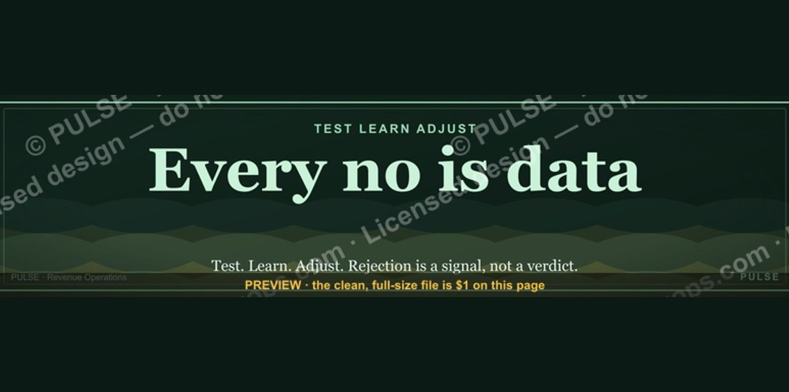 graphic“Every no is data.” — LinkedIn Banner
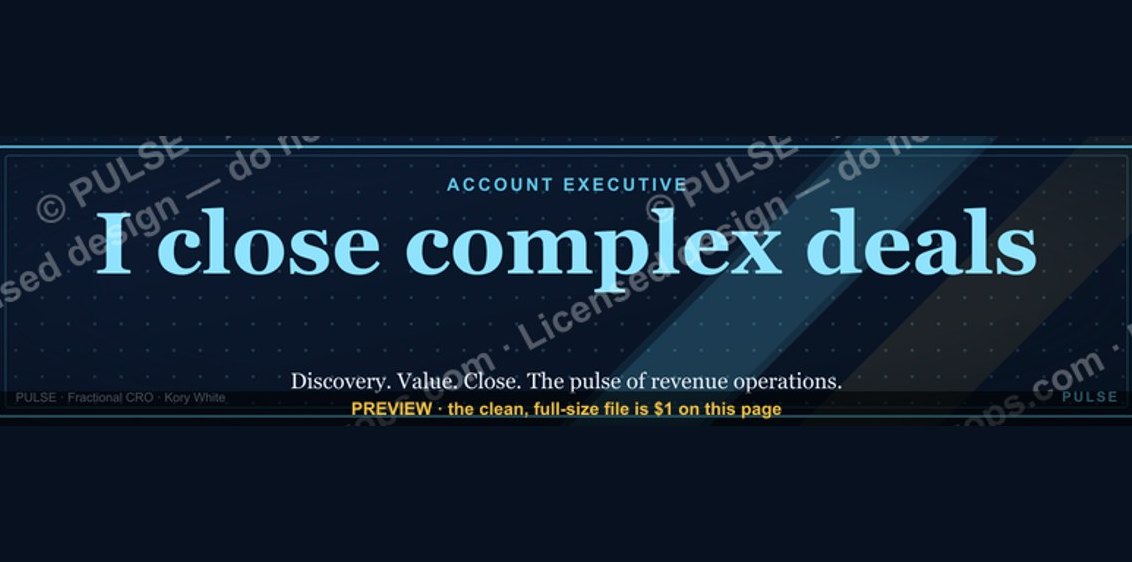 graphicAccount Executive — LinkedIn Banner
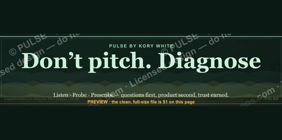 graphic“Don’t pitch. Diagnose.” — LinkedIn Banner
 graphicIdentity and Trust — LinkedIn Banner
 graphicAI Image Engineer — LinkedIn Banner
 graphic“Revenue that delights.” — LinkedIn Banner
 graphic"Build, don't chase." — LinkedIn Banner
 graphicBuild the revenue engine. — LinkedIn Wallpaper
 graphic“Looking for my next quota.” — LinkedIn Banner
 graphicConstruction CRO — LinkedIn Banner