
“Looking for my next quota.” — LinkedIn Banner
 Curated byKory White · Fractional CRO · Maryland
 PULSEKNOWLEDGE LIBRARY
Quality
Certified
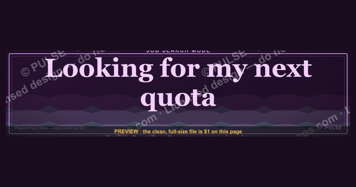
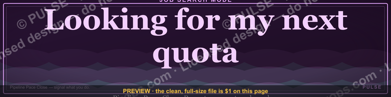
This is a LinkedIn profile banner sized 1584x396 pixels that reads "Looking for my next quota." in bold serif type, designed for sales reps and account executives signaling they are open to new roles. It pairs a punchy headline with clean negative space so a profile photo and headline text stay legible when it sits behind them on a LinkedIn profile.
What it is and why it matters
A LinkedIn banner is the wide horizontal image that stretches across the top of a profile, directly behind the circular profile photo and above the headline and current-position line. Most people never touch it — LinkedIn ships every new profile with a flat gray or light-blue placeholder — which means anyone who swaps it for something intentional stands out instantly in a feed of gray rectangles. This particular banner uses that real estate to do a job a resume can't: broadcast availability without ever saying "unemployed" or "laid off."
The phrase "Looking for my next quota." works because it borrows the vocabulary of the audience it's trying to reach. A quota is a sales-specific term — a number a rep is measured against every month or quarter — so the line reads as an inside joke to anyone in revenue, marketing, or GTM roles, while still being immediately parseable to a recruiter or hiring manager scanning profiles. It reframes a job search as a hunt for a new number to chase, which is a more confident, forward-looking framing than "seeking opportunities" or "open to work."

This matters structurally because of where a banner sits in the profile's visual hierarchy. When someone views a LinkedIn profile, their eyes land on the banner and photo before they read a single word of the headline or About section. A banner that states intent in eight words does more pre-qualifying work than three paragraphs of a summary that a visitor may never scroll to. It also works passively — the banner is visible any time the profile is viewed, commented on, or appears in a feed notification (e.g., "X commented on a post"), so it keeps working even when the person isn't actively posting.
There's a secondary function too: it signals personality and category fluency. A recruiter sourcing account executives who sees a banner referencing "quota" — rather than generic stock art of a skyline or a handshake — reads that as evidence the candidate actually speaks the language of the role, before the resume confirms it.

The step-by-step process
Putting this banner to work follows a short, repeatable sequence: design the graphic at the correct dimensions, download it, upload it to the profile, then pair it with supporting profile changes so the message is consistent everywhere a visitor looks.
Start by confirming the canvas is exactly 1584 pixels wide by 396 pixels tall — LinkedIn will accept other aspect ratios but will crop or letterbox them unpredictably, which is why a purpose-built graphic at the native size avoids surprises. Next, design or download the banner itself; this is the step where the headline text, any accent shapes, and the color palette get locked in.
Before uploading anywhere, preview the design with a circular profile-photo placeholder overlapping the bottom-left corner, since that's exactly how LinkedIn renders it live — text or logos placed in that zone will be partially hidden behind the photo on desktop and even more so on mobile. Once the layout clears that check, export the file as a PNG (best for flat colors and crisp text) or a high-quality JPG, keeping the file under LinkedIn's 8MB upload ceiling.
Uploading happens from the profile edit screen: click the pencil/camera icon on the existing banner, select "Change photo," upload the file, and use LinkedIn's built-in crop tool to nudge positioning — this step is also where a slightly larger source image (e.g., 1920x480) helps, because it gives room to reposition without stretching. After the banner is live, update the headline and, ideally, the top line of the About section so the written text doesn't contradict or duplicate the banner awkwardly; a banner announcing a job search alongside a headline still listing "at [Former Employer]" undercuts the message. Finally, check the mobile app preview specifically, since LinkedIn's mobile banner crop is tighter than desktop and will clip content sitting near the top or bottom edge of the canvas.

Costs, timelines, and typical ranges
The cost range for a banner like this spans from free to a few hundred dollars, depending entirely on who makes it and how customized it needs to be. At the free end, template tools with built-in LinkedIn banner presets let a user drop in text and swap colors in a matter of minutes, with no software cost and no watermark on the export. This is the realistic path for most individual job seekers — the design complexity of a single bold headline on a solid or gradient background doesn't require paid tools or a hired designer.
A mid-tier option — hiring a freelance graphic designer for a one-off banner — typically runs somewhere in the neighborhood of $25 to $150 for a simple, single-message design like this one, with turnaround measured in a day or two rather than weeks, since it's a single static asset rather than a full brand package. At the higher end, a designer producing a full matched set (banner plus a custom-styled profile photo frame, plus maybe a companion carousel post) could run several hundred dollars, but that's well beyond what a single quota-themed banner calls for.

Time investment mirrors cost. Using a template, expect 10 to 20 minutes from opening the tool to having an exported file — most of that is spent nudging font size and checking the profile-photo overlap, not designing from a blank canvas. Briefing a freelancer and waiting for a draft typically adds a day of calendar time even though the actual design work is short, since freelance marketplaces usually build in at least one revision round.
Ongoing cost is effectively zero — a LinkedIn banner doesn't expire, isn't rate-limited, and doesn't need to be repurchased. The only recurring "cost" is remembering to swap it out once the job search ends, since a banner announcing availability that stays up for a year after landing a role reads as stale and can quietly undercut credibility with new colleagues or clients who view the profile later.

Where teams get it wrong
The most common mistake is ignoring the profile-photo overlap zone. Because LinkedIn renders the circular profile photo on top of the bottom-left portion of the banner, any headline text or logo placed in that corner gets partially or fully obscured — a mistake that's invisible in a design tool's flat preview but glaring the moment the banner goes live. The fix is designing with the overlap masked out from the start, keeping primary text centered or weighted toward the right two-thirds of the canvas.
A second frequent error is exporting at the wrong resolution or aspect ratio and letting LinkedIn's auto-crop decide the final composition. Uploading a square or portrait-oriented image, or a banner sized for a different platform (like a 1500x500 Twitter/X header), results in LinkedIn stretching or cropping it in ways that cut off text edges or distort proportions. Designing natively at 1584x396 — or slightly larger to allow for repositioning — avoids this entirely.

Tone missteps are a subtler but real problem specific to a banner like this one. "Looking for my next quota." works because it's confident and industry-fluent, but variations that lean too hard into desperation ("Please hire me," "Unemployed and available now") tend to read as anxious rather than assured, which can undercut a candidate's positioning even though the underlying message — availability — is the same. The wording matters as much as the visual design.
Another common gap is treating the banner as a one-time task disconnected from the rest of the profile. A sharp banner sitting above a headline that still says "Account Executive at [Company That Laid Them Off]," or above an About section that hasn't been touched in two years, creates a jarring inconsistency for anyone who reads past the first glance. The banner should be the opening line of a consistent story the rest of the profile continues.
Finally, teams and individuals alike frequently skip the mobile preview step. A huge share of LinkedIn browsing happens in the mobile app, where the banner crop is noticeably tighter than desktop — text that looks perfectly centered on a laptop screen can end up clipped at the edges on a phone. Checking the mobile render before calling the banner finished catches this before it goes live to the majority of viewers.
Decision framework: when to choose what
Not every job-seeking sales professional should reach for the exact same banner treatment — the right choice depends on how visible the search needs to be, who the target audience is, and how much design effort is worth investing.

If someone isn't actively searching, a banner like this doesn't apply at all — a personal-brand banner, a company or team banner, or simply a clean solid-color background serves better, since announcing openness when none exists creates confusing signals to a current employer or client who happens to view the profile.
For those who are searching, the next fork is audience. A banner built around sales-specific jargon like "quota" lands well when the primary viewers are recruiters, hiring managers, and peers already embedded in sales and RevOps circles — it demonstrates fluency and personality in the same move. But if the target audience is broader (say, a career pivot into a new function, or a search visible to a wide non-sales network), more literal wording like "Open to new opportunities" communicates faster without relying on shared vocabulary the viewer might not have.
The last fork is tone tolerance. Some job seekers, especially those in more conservative industries or senior leadership tracks, prefer understated signaling — a subtle color change or a small "Open to Work" frame around the photo rather than bold banner copy. Others, particularly individual contributors in high-energy sales cultures, benefit from leaning into a confident, slightly cheeky line like "Looking for my next quota." because it matches the tone of the role they're pursuing. Choosing between them comes down to matching the banner's voice to the voice expected in the target role.
Related questions
Does a LinkedIn banner actually affect job-search results?
It doesn't influence LinkedIn's search algorithm directly, but it affects human behavior — recruiters and hiring managers who land on a profile are more likely to read further and reach out when the banner signals clear intent and personality rather than a blank placeholder.
What size should a LinkedIn banner be?
1584x396 pixels is LinkedIn's current standard. Uploading slightly larger (around 1920x480) gives room to reposition using LinkedIn's crop tool without stretching or pixelating the image.
Should I use the "Open to Work" photo frame instead of a banner?
They're not mutually exclusive — the green "Open to Work" frame around the profile photo is a stronger, more literal recruiter signal, while a banner adds tone and personality; many active job seekers use both together.
How often should the banner be updated?
Swap it out whenever the underlying message changes — most importantly, replace or remove a job-search banner as soon as a new role is landed, since leaving it up afterward reads as outdated to anyone viewing the profile later.
Can this banner style work outside of sales roles?
The specific "quota" wording is sales-specific, but the format — a short, role-fluent phrase signaling availability — translates to any function by swapping in vocabulary relevant to that field.
FAQ
What exact text is on this banner? The banner reads "Looking for my next quota." set in a bold serif typeface, designed to read clearly at both full desktop width and the smaller cropped view shown on mobile devices.
What are the exact dimensions I need to upload? LinkedIn's banner slot is 1584 pixels wide by 396 pixels tall. Files outside that ratio get auto-cropped, so matching it exactly avoids unexpected trims.
Will this banner cover my profile photo? No — the design keeps primary text out of the bottom-left zone where the circular profile photo overlaps the banner, so the phrase stays fully legible around it.
Can I change the wording or colors to fit my own situation? Yes. The layout is built as a template: swap "quota" for role-specific vocabulary (a marketer might use "campaign," an engineer "sprint"), and adjust the background color to match personal branding or company palette from a prior role.
What file format should I download for upload? PNG preserves the crispest text edges for a design like this with solid colors and typography; JPG is an acceptable fallback and produces a smaller file size if upload limits are a concern.
Does LinkedIn charge anything to upload a custom banner? No — uploading a custom banner image is a free, standard profile feature available on both free and Premium LinkedIn accounts.
Sources
- https://www.linkedin.com/help/linkedin/answer/a566491
- https://www.linkedin.com/business/talent/blog/talent-acquisition/linkedin-profile-tips
- https://www.canva.com/create/linkedin-banners/
- https://www.adobe.com/express/create/cover/linkedin-profile
- https://sproutsocial.com/insights/linkedin-banner-size/
- https://later.com/blog/linkedin-banner-size/
- https://www.hootsuite.com/social-media-image-sizes-guide
Related on PULSE
- What should my LinkedIn headline say while job searching?
- How do recruiters actually source candidates on LinkedIn?
- What's a realistic quota ramp for a new AE's first 90 days?
- How long should a job search take for a mid-level sales rep?
- What belongs in a LinkedIn About section for a sales professional?
This page will be disappearing soon. Save it to your device for $1 — or read it free while it is here.
@Kory-White- · if Venmo asks, the last 4 of my number are 2012
 graphic“The next call is the most important one.” — LinkedIn Banner
 graphicHow to build a champion champion plan in 2027?
 graphicSell outcomes, not features. — LinkedIn Wallpaper
 graphicReady reps win. — LinkedIn Wallpaper
 graphic“Process over pressure.” — LinkedIn Banner
 graphic“Great reps wanted.” — LinkedIn Banner
 graphicInspect. Qualify. Commit. — LinkedIn Wallpaper
 graphic“Sell with the buyer, not at them.” — LinkedIn Banner
 graphicYour pipeline is your paycheck. — LinkedIn Wallpaper
 graphicSales Enablement — LinkedIn Banner