
“Revenue that delights.” — LinkedIn Banner
 Curated byKory White · Fractional CRO · Maryland
 PULSEKNOWLEDGE LIBRARY
Quality
Certified
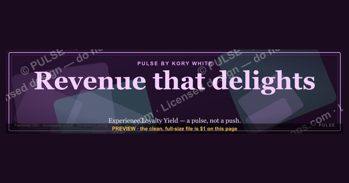
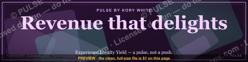
This is a LinkedIn profile banner sized 1584x396 px that carries the line "Revenue that delights." in large type over a clean background. Use it as the cover image behind your headshot and headline to signal that you run revenue operations with a customer-first, experience-led mindset rather than a purely quota-driven one.
The outcome you should expect
A banner like this does not generate pipeline by itself. What it does is change the quality of the conversation that starts when someone clicks your name. The realistic outcome is a small but measurable shift in how prospects, candidates, and peers categorize you before they ever speak to you. They see "Revenue that delights." and they file you under operator who cares about the customer experience, not just the number.
That categorization matters more than most people admit. When a VP of Sales lands on your profile from a comment you left on a mutual connection's post, they are running a fast triage. Is this person a peer? A vendor? Someone worth a reply? The banner answers that in roughly one second. A generic stock photo of a city skyline answers "I did not think about this." A banner with a point of view answers "I have a thesis about how revenue should work."
The second-order outcome is internal. Teams that adopt a shared banner — same line, same palette, different names — start using it as a recruiting and positioning tool. Candidates researching the company find five people with the same banner and infer a coherent culture. That inference is not proof of anything, but it is a signal, and signals compound. The banner is cheap to produce and cheap to change, which means the cost of being wrong is near zero and the cost of being invisible is the real expense.

What you should not expect: inbound leads, demo requests, or a measurable lift in connection acceptance rates that you could attribute to the banner alone. Anyone who tells you a profile banner drives conversion is selling you something. Treat it as a positioning asset, not a demand-generation channel.
What drives that outcome
Three things determine whether "Revenue that delights." lands or falls flat: legibility at thumbnail size, the credibility of the person behind it, and the consistency between the banner and the headline directly beneath it.

Legibility is mechanical. LinkedIn renders the cover image at different sizes depending on context — full width on the profile page, cropped and compressed in search results, tiny in the "people also viewed" rail. Text that reads fine at 1584 px wide can turn to mush at 200 px. The fix is a short line, heavy weight, and high contrast. "Revenue that delights." is eight characters of meaning spread across four words, which is about the maximum you can get away with before the thumbnail becomes unreadable.
Credibility is contextual. The same banner on a 22-year-old SDR's profile reads as aspirational. On a CRO with three exits behind them, it reads as a stated philosophy. Neither is wrong, but the banner does different work in each case. If your headline says "Enterprise Account Executive" and your banner says "Revenue that delights.", a skeptical buyer may read the gap as marketing fluff. If your headline says "VP Revenue Operations, building systems that make customers want to renew," the banner reinforces rather than contradicts.
Consistency is the third lever. The banner, the headline, the About section, and the featured links should tell one story. When they conflict — banner says delight, About section is a wall of quota percentages — the banner loses. Readers trust the longer text over the shorter one because longer text costs more to fake.

The diagram is deliberately simple because the decision really is that fast. The interesting variable is not the banner itself but the confirmation step. A banner sets an expectation; the headline either pays it off or breaks it. Most profile advice stops at "get a good banner" and never mentions that the banner is only half the unit.
There is a fourth driver that is easy to miss: the banner's relationship to the platform's own visual language. LinkedIn's default covers are blue, abstract, and safe. Anything that departs from that default stands out, but standing out is not automatically good. A banner that looks like a Canva template with three fonts and a gradient will stand out as amateur. A banner that looks like a plain black rectangle with one line of type stands out as intentional. Intentionality is the signal, not novelty.
Benchmarks and realistic ranges
There is no public dataset that isolates banner impact on LinkedIn outcomes, so treat any specific number you see quoted as marketing. What follows are ranges practitioners report from their own profile experiments and from team-wide rollouts, framed as directional rather than precise.
Profile view-to-connection-request rates for active posters typically sit somewhere between 2% and 8%, depending on industry and how much the person publishes. A banner change alone rarely moves that number more than a fraction of a percentage point. Where teams report a visible difference is in reply quality — the percentage of connection requests that get a substantive response rather than silence. Anecdotally, a coherent visual identity across a team can lift reply rates, but the effect is confounded with the fact that teams who bother with banners also tend to write better headlines.
Recruiting is where the effect is easiest to observe. Candidates who research a company before applying often look at three to five employee profiles. If those profiles share a visual signature, the company reads as organized. If they are a random assortment of stock photos and cropped conference badges, the company reads as chaotic. Neither impression is fair, but both are real. The banner is doing work in the candidate's decision even though no one tracks it.

For individual contributors, the honest benchmark is this: expect the banner to affect how people describe you after they have already decided to look, not whether they look. It is a second-impression asset. The first impression is your name, photo, and headline appearing in someone's feed or search results.
On dimensions, the safe zone is the full 1584x396 px canvas with all critical text kept inside a centered safe area of roughly 1100x300 px. LinkedIn crops the cover differently on mobile, where the top and bottom edges are more likely to be clipped, and on the profile page the bottom-left corner is partially covered by your headshot. Text placed in the lower-left quadrant will be obscured. Text placed at the extreme top or bottom may be cropped on some surfaces. The center and center-right are the reliable zones.
File format matters less than people think. LinkedIn accepts JPG, PNG, and GIF under 8 MB. PNG gives cleaner edges on flat-color designs; JPG is fine for photographic backgrounds. Upload at the full 1584x396 and let LinkedIn handle downscaling rather than uploading a smaller file and hoping it upscales cleanly, which it will not.
Risks, edge cases, and failure modes
The most common failure mode is a banner that says something the profile does not support. "Revenue that delights." on a profile with no revenue-related experience reads as borrowed language. The fix is either to earn the line through the headline and About section or to pick a line that matches where you actually are. Aspirational is fine; incoherent is not.
A second failure mode is over-design. Banners that pack in a logo, a tagline, a website, a QR code, and three brand colors fail at every size. The reader cannot process five elements in one second. One idea per banner. If you need to say more, say it in the About section where people are already reading.
A third is the contrast trap. Light text on a light background, or thin fonts on a busy photo, look fine on a large monitor and vanish on a phone. Test the banner by shrinking it to roughly 200 px wide and looking at it on a phone screen in daylight. If you cannot read it, neither can anyone else.
Team rollouts introduce a fourth risk: uniformity that erases individuality. If every employee uses the identical banner, the profiles start to blur together, and the person's own positioning gets buried under the company's. The usual compromise is a shared visual system — same palette, same type, same corner treatment — with the central line varying by role or by person. Sales might use "Revenue that delights."; support might use "Customers who stay."; product might use "Built to be renewed." Same family, different sentences.
There is also a platform risk that people forget: LinkedIn changes its cover image rendering periodically, and a design that depends on precise pixel placement can break overnight. Keep the source file, keep the text inside the safe area, and re-export when the platform shifts. Do not treat the banner as a one-time asset.

Finally, there is the reputational edge case. A line about delighting customers, posted by someone whose company has a poor support reputation, invites exactly the wrong kind of comment. If your public review scores are weak, either fix that first or choose a banner that promises something you can actually deliver. The banner is a claim, and claims get tested.
A practical rollout plan
The plan below assumes you are doing this for yourself or for a small team. It takes about two hours of actual work spread across a week, most of it waiting for feedback.
Start by writing the line before you open any design tool. The line is the hard part. "Revenue that delights." works because it is short, it has a subject and a verb, and it makes a claim that is slightly unexpected in a field that usually talks about acceleration, velocity, and pipeline. Write ten candidates. Read them out loud. Cut the ones that sound like a keynote title.
Next, pick the visual system. Two colors maximum, one typeface, no gradients unless you have a reason. Decide where the text sits — center, left-of-center, or right-of-center — and keep it there across every banner your team produces. Consistency across profiles is what creates the compound effect.
Then build the file at 1584x396 px with the text inside the safe area. Export as PNG. Check it at full size, at half size, and at thumbnail size. If the thumbnail is unreadable, the design is wrong regardless of how good it looks full size.
Upload it and then rewrite the headline directly beneath it so the two agree. This is the step most people skip. The banner sets the frame; the headline delivers the proof. If your banner says delight and your headline says "Quota-crushing sales leader," you have created a contradiction that costs you credibility.
Finally, review after thirty days. Look at whether the profile feels coherent, ask two trusted peers for a blunt read, and change one thing if something is off. Do not A/B test a banner. The sample size is too small and the effect is too soft to measure. Use judgment instead.
The loop back from the readability check to the build step is the part people skip. It is also the only quality gate that matters, because everything else is taste and taste is arguable.
Related questions
What size should a LinkedIn banner be?
1584 by 396 pixels. Keep all text inside a centered safe area of roughly 1100 by 300 pixels, because the lower-left corner sits behind your headshot and the top and bottom edges can be cropped on mobile.
Does a LinkedIn banner affect search ranking?
No. LinkedIn's search ranking weighs profile completeness, keywords in your headline and experience, activity, and connection proximity. The banner is a visual asset and does not feed the ranking model in any documented way.
Can a team share the same banner design?
Yes, and it usually helps. Use one palette and one typeface across profiles, but vary the central line by role so individual positioning is not erased. Identical banners on every profile blur people together.
Should the banner include a logo or website?
Usually no. At thumbnail size a logo becomes an unreadable smudge and a URL becomes noise. Put the logo in your experience section and the website in your contact info, where people look for them.
How often should I change my banner?
Rarely. Change it when your role changes, when the company rebrands, or when the current banner no longer matches what you do. Frequent changes signal restlessness rather than evolution.
FAQ
What does "Revenue that delights." actually mean as a positioning line? It reframes revenue as an outcome of customer experience rather than a purely internal sales target. The implication is that the person using it cares about renewal, expansion, and referral — the downstream effects of doing right by customers — not just closing the quarter.
Is this banner only for revenue operations people? No, but it fits them best. Anyone in go-to-market — sales, customer success, partnerships, RevOps — can use it credibly. Finance or engineering profiles would need a different line to stay coherent with their headline.
Can I use this banner if I am job searching? Yes, and it can help. A banner with a point of view makes a candidate memorable in a stack of similar profiles. Pair it with a headline that states what you are looking for so the banner and the ask do not compete.
What colors work best for a banner with this line? High contrast beats fashion. Dark background with light text, or light background with dark text, both work. Avoid mid-tone on mid-tone, and avoid pairing more than two colors unless you have a brand reason.
Does the banner show up on mobile the same way? Not exactly. Mobile crops the cover more aggressively and the headshot overlaps a larger portion of the lower-left area. Always check the mobile preview before you commit, and keep critical text centered.
What if my company has a mandatory brand banner? Follow the brand system and put your own line inside the space it allows. Most corporate templates leave a text zone. If yours does not, ask whether a personal line can be added — the request is usually granted once someone explains why.
Sources
- https://www.linkedin.com/help/linkedin/answer/a563589
- https://www.linkedin.com/help/linkedin/answer/a507508
- https://business.linkedin.com/marketing-solutions/blog
- https://www.linkedin.com/business/talent/blog
- https://www.shrm.org/topics-tools/news
- https://hbr.org/topic/subject/sales
- https://www.gartner.com/en/sales
- https://www.forrester.com/research/
Related on PULSE
- How to write a LinkedIn headline that matches your banner
- Building a shared visual identity for a revenue team
- Positioning lines that survive a skeptical buyer
- Profile coherence: banner, headline, and About section
- When personal branding conflicts with corporate brand
- RevOps hiring signals: what candidates look for on your profile
This page will be disappearing soon. Save it to your device for $1 — or read it free while it is here.
@Kory-White- · if Venmo asks, the last 4 of my number are 2012
 graphicSIEM and Data Lake CRO — LinkedIn Banner
 graphicYour pipeline is your paycheck. — LinkedIn Wallpaper
 graphic“The next call is the most important one.” — LinkedIn Banner
 graphic“Selling expertise and outcomes.” — LinkedIn Banner
 graphicComputer Vision Engineer — LinkedIn Banner
 graphicPredictable revenue, by design. — LinkedIn Wallpaper
 graphicHow do you build a Champions sell motion from scratch in 2027?
 graphicReady reps win. — LinkedIn Wallpaper
 graphic“Don’t pitch. Diagnose.” — LinkedIn Banner
 graphicHead of Sales — LinkedIn Banner