
“Every no is data.” — LinkedIn Banner
 Curated byKory White · Fractional CRO · Maryland
 PULSEKNOWLEDGE LIBRARY
Quality
Certified
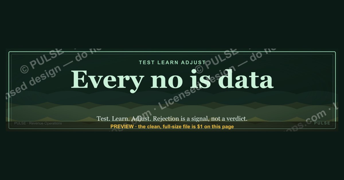
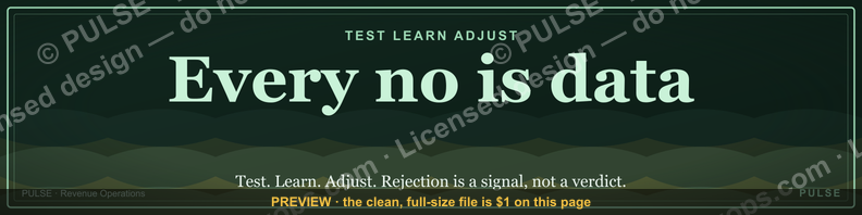
This is a LinkedIn profile banner (1584×396 px) that reads "Every no is data." in clean, high-contrast type — typically a bold serif or condensed sans in white or gold set against a dark charcoal, navy, or black field, with a thin rule and generous negative space around the line. Use it as your LinkedIn cover photo when your headline is built around sales, prospecting, fundraising, recruiting, or any role where rejection is routine, so the visual reframes "no" as fuel before a viewer reads a word of your profile.
What lands on your profile the moment this banner goes live
The banner occupies the full-width strip at the top of a LinkedIn profile, sitting directly behind and above the round profile photo. Every visitor sees it before they see your headline, your About section, or your most recent post — it is, functionally, the first sentence of your personal brand. On this specific graphic, the composition is deliberately spare: the phrase "Every no is data." sits left- or center-weighted in the safe zone that survives both desktop and mobile cropping, rendered in one or two font weights maximum so it reads instantly at thumbnail size in a LinkedIn search result or a comment-section avatar hover. There is no clutter — no logo soup, no five-line mission statement, no stock photo of a handshake. The dark background does double duty: it makes white or gold text pop without needing a bounding box, and it reads as "confident and considered" rather than "default template," which is the visual cue viewers associate with generative-filler banners.
Practically, what changes on your profile is tone before content. A recruiter, a prospect, or a hiring manager who lands on your page gets an immediate signal about how you talk about failure and iteration — which matters enormously in sales, business development, and founder-facing roles where the ability to metabolize rejection without flinching is itself a qualification. The banner also gives your headline something to react against: a headline like "Turning rejection into pipeline" or "Sales leader — I count the no's" pairs with the banner instead of repeating it, so the visitor gets a two-beat message (image, then text) rather than one flat statement. That two-beat structure is what makes a banner-plus-headline combination memorable instead of decorative.

The psychology this banner is designed to trigger
The line "Every no is data" is doing a specific piece of cognitive reframing, and the banner is built to carry that reframing silently, without a caption explaining it. In sales psychology, rejection triggers a threat response — the same neural circuitry that reacts to social exclusion — which is why reps who take every no personally burn out faster and slow down their own outreach cadence after a string of losses. The phrase interrupts that loop by relabeling the event: a "no" stops being a verdict on the rep's worth and becomes a labeled data point that belongs to a pattern, the same way a scientist logs a failed trial instead of grieving it.
That reframe only works if it is backed by an actual habit, and the banner implicitly points at one: tagging *why* a prospect said no — price, timing, wrong contact, no budget authority, competitor already selected — rather than just logging that they did. A rep who tracks the reason can spot when one objection is clustering (say, six of the last ten no's cite "timing") and adjust the qualifying questions asked earlier in the call, rather than repeating the same pitch into the same wall. Sales leaders who put a phrase like this on their public profile are usually signaling that this is the operating culture on their team — not "toughen up and take more no's," but "instrument the no's and let the pattern tell you what to fix." Job seekers, coaches, and consultants use the same line to advertise resilience as a competency rather than a personality trait, which is a subtly different — and more hireable — claim.

Sizing, placement, and realistic expectations
LinkedIn's own guidance sets the profile background photo at 1584 by 396 pixels, and this graphic is built to that exact canvas so it drops in without LinkedIn's uploader stretching, squeezing, or re-cropping it. A few placement mechanics matter more than most people realize before they publish:
- The profile photo overlap. On desktop, your circular profile photo sits on top of the bottom-left portion of the banner, covering roughly the left fifth of the image. Any text or logo mark placed there will be partially hidden. This banner keeps its headline text clear of that zone by weighting the phrase center-right or dead-center with margin to spare.
- The mobile crop. LinkedIn's mobile app shows a narrower vertical slice of the same banner than desktop does, effectively cropping in from both sides. Text set too close to the left or right edge on desktop can vanish entirely on a phone. Keep any custom text within the middle 60-70% of the canvas — this graphic already respects that safe zone, but if you re-edit the wording, preserve the margin.
- File weight and format. LinkedIn accepts JPG, PNG, and GIF up to roughly 8MB; PNG is the better choice here because the flat dark background and crisp typography compress cleanly without JPEG banding artifacts showing up around the letterforms.
- What actually changes when you swap this in. There's no verified public benchmark for "profile views per banner change," and any number claiming otherwise should be treated skeptically — LinkedIn does not publish that data and no third party has access to it. What's observable instead is qualitative: profiles with a considered, on-brand banner get noticeably more comments like "love the banner" or get referenced in intro messages ("saw your banner, love the mindset") compared to profiles running LinkedIn's default gray-blue placeholder. Treat the banner as a credibility and memorability lever, not a measurable traffic driver.
Where this banner backfires
The same directness that makes "Every no is data" land well in a sales, founder, or BD context can read as tone-deaf or try-hard in others, and it's worth naming the failure modes before you publish it broadly.
In conservative or highly regulated industries — banking compliance, legal, healthcare administration, government contracting — a bold declarative slogan banner can read as unprofessional or performative, out of step with the understated visual norms recruiters expect in those fields. If your audience skews toward that kind of institutional buyer, a subtler banner (a clean brand-color field with your name and title, no slogan) usually outperforms a statement piece.

The line itself can also curdle into toxic-positivity territory if it's the *only* signal on your profile — "every no is data" without any visible evidence of what you actually do with that data (case studies, a track record, specifics in your About section) reads as a motivational-poster platitude rather than a real operating principle. Pair the banner with at least one piece of proof elsewhere on the profile: a post about a specific pivot you made after a string of losses, a number in your About section, something concrete.
There's also a saturation risk. Sales Twitter and Sales LinkedIn have cycled through variations of "objections are data," "no is just not yet," and similar reframes for years; if your target audience is deep inside that community, the phrase may read as familiar rather than distinctive. In that case, consider whether your differentiation should come from *how* you visually execute the banner — typography, color, restraint — rather than from the words alone, since the words are no longer novel to a sales-fluent reader.

Finally, watch brand-color mismatch: if your company or personal brand uses a light, airy palette elsewhere (website, deck, email signature), a stark black-and-gold banner can feel like a jump cut rather than a continuation. Match the palette to your other public surfaces, or deliberately treat the banner as the one place you allow a bolder departure — but make that a choice, not an accident.
Rolling it out: customizing and publishing the graphic
If the default wording, color, or framing doesn't fit your role, the graphic is meant to be edited, not used verbatim. A few practical customization paths:

- Swap the phrase, keep the structure. The layout — short declarative line, dark field, generous margin, single accent color — works for adjacent lines like "Every objection is a data point," "Rejection is just unfiled feedback," or a phrase specific to your own sales philosophy. Keep it under roughly six words so it stays legible at thumbnail size.
- Swap the palette to match your brand. If your company uses a specific brand blue, green, or a warmer palette than black-and-gold, recreate the same layout in those colors rather than keeping the default scheme — consistency across your LinkedIn banner, website, and deck reads as more deliberate than a mismatched one-off.
- Swap the role framing for a team. Sales leaders often roll a version of this banner out across a whole team, swapping "Every no is data" for role-specific variants — an SDR team might run "Every no gets logged," an AE team "Every no sharpens the next pitch," a customer success team "Every churn is a lesson" — so the visual identity stays consistent across the team's collective LinkedIn presence while the wording matches each function's reality.
- Download and swap in under two minutes. Once you're happy with the wording and palette, download the PNG at the full 1584×396 resolution from this page, open your LinkedIn profile, click the pencil/camera icon on your existing banner (or the "+" if you don't have one), and upload the file directly — LinkedIn will not ask you to crop it further if you've kept it at the exact recommended dimensions.
Re-check the desktop and mobile previews after any edit — a wording change that pushes even a few characters wider can shift text into the profile-photo overlap zone or the mobile-crop edges you avoided the first time.
Related questions
What size should a LinkedIn banner be?
1584×396 pixels is LinkedIn's recommended profile background photo size, exported as PNG or JPG under roughly 8MB. Staying at this exact size avoids LinkedIn's automatic cropping or stretching, which can distort text and logos in a custom banner.
Does changing your LinkedIn banner actually increase profile views?
There's no published, verified benchmark tying banner changes to profile-view lift — LinkedIn doesn't release that data. What's consistently observable is qualitative: a considered banner increases comments, shares, and mentions in intro messages compared to LinkedIn's default placeholder.
Should my LinkedIn banner match my company's brand colors?
Generally yes, especially if your profile is a prospecting or recruiting surface — mismatched palettes between your banner, website, and deck read as unplanned. The exception is when you're deliberately using the banner as your one bolder, more personal brand statement.
How often should I update my LinkedIn banner?
There's no fixed cadence; most professionals refresh it when their role, message, or company changes, or seasonally around a major campaign or launch. A banner that's gone stale relative to your current headline or title is a more useful trigger than a calendar date.
FAQ
Is "Every no is data" a real LinkedIn feature or just a custom image? It's a custom banner image, not a built-in LinkedIn feature or template. LinkedIn provides the blank canvas at 1584×396 pixels and lets any member upload their own image; this graphic is one such image, designed to that exact spec, that you download and upload yourself.
Can I use this banner if I'm not in sales? Yes, though it lands most naturally in sales, business development, recruiting, and fundraising, where rejection is a daily, expected part of the job. In other fields the sentiment still applies to iteration and feedback loops generally, but consider whether the tone matches the visual norms of your specific industry first.
Will this banner look right on both desktop and mobile LinkedIn? It's composed within the safe zone that survives LinkedIn's tighter mobile crop and clears the profile-photo overlap on desktop, so the text stays fully visible on both. If you edit the wording yourself, re-check both previews before publishing, since longer text can push past those margins.
What file format and size should I upload? Download and upload the banner as a PNG at the full 1584×396 pixel resolution. PNG holds crisp text edges better than JPEG at this kind of high-contrast, flat-background design, and stays comfortably under LinkedIn's roughly 8MB upload limit.
Can I put my logo or a QR code on this banner too? You can, but keep it out of the bottom-left profile-photo overlap zone and be sparing — the reason this design reads as confident rather than cluttered is the restraint of a single line of text on a clean field. Adding a logo, a QR code, and a slogan in one banner usually reduces legibility rather than adding information.
Does the slogan risk sounding like toxic positivity? It can, if it's the only signal on your profile. Pair it with concrete proof elsewhere — a specific story in your About section, a post describing an actual pivot, a track record — so the line reads as an operating principle you can back up rather than a standalone platitude.
Sources
- https://www.linkedin.com/help/linkedin
- https://business.linkedin.com/marketing-solutions/blog
- https://www.canva.com/create/linkedin-banners/
- https://blog.hootsuite.com/
- https://sproutsocial.com/insights/
- https://blog.hubspot.com/marketing
- https://buffer.com/resources/
- https://later.com/blog/
Related on PULSE
- [How to write a LinkedIn headline that pairs with your banner](/library/linkedin-headline-that-pairs-with-banner)
- [What size should a LinkedIn banner be?](/library/linkedin-banner-size)
- [How top sales leaders talk about rejection publicly](/library/sales-leaders-rejection-branding)
- [Building a personal brand as an SDR or AE](/library/personal-brand-sdr-ae)
- [Objection handling frameworks that actually change close rates](/library/objection-handling-frameworks)
- [Designing a LinkedIn profile that converts prospects into replies](/library/linkedin-profile-that-converts)
This page will be disappearing soon. Save it to your device for $1 — or read it free while it is here.
@Kory-White- · if Venmo asks, the last 4 of my number are 2012
 graphicSIEM and Data Lake CRO — LinkedIn Banner
 graphicHow to build a champion champion plan in 2027?
 graphic“Clarity closes.” — LinkedIn Banner
 graphicComputer Vision Engineer — LinkedIn Banner
 graphicPredictable revenue, by design. — LinkedIn Wallpaper
 graphic“Join a team that runs on pipeline.” — LinkedIn Banner
 graphic“Data beats opinions.” — LinkedIn Banner
 graphicRenewals Manager — LinkedIn Banner
 graphicRight market, right motion. — LinkedIn Wallpaper
 graphic“Sell something people love.” — LinkedIn Banner