
Renewal is the New Sale — Banner
 Curated byKory White · Fractional CRO · Maryland
 PULSEKNOWLEDGE LIBRARY
Quality
Certified
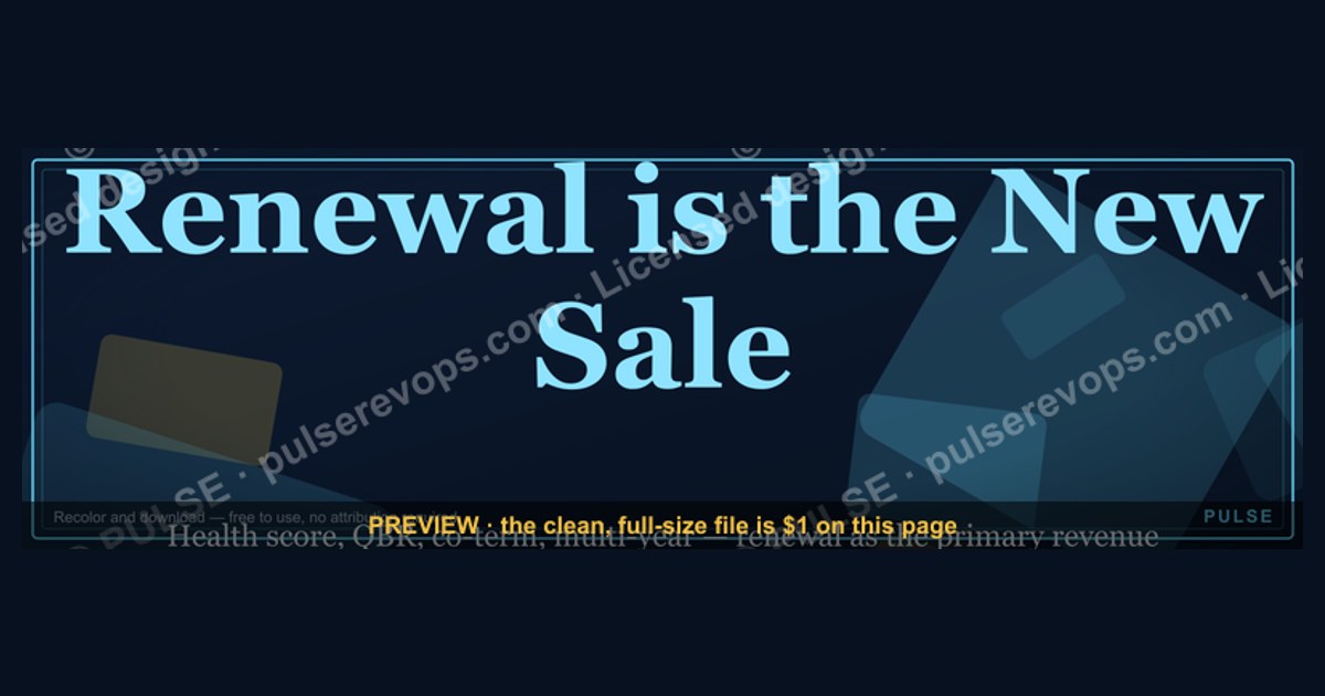
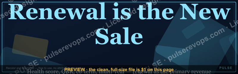
This is a 1600×500 px banner that reads "Renewal is the New Sale," rendered in bold serif type over a dark, single-color field with a thin accent rule beneath the headline. It signals that a renewal conversation deserves the same prep, ownership, and urgency as a net-new deal — use it on team Slack headers, LinkedIn profiles, deck covers, or a CS team's shared wiki space.
What it is and why it matters
The banner is a flat, high-contrast graphic built for reuse across digital surfaces rather than print. The composition is simple on purpose: a dark background (near-black or deep navy, depending on the export you download), the headline "Renewal is the New Sale" set in a bold serif face across the center-left third of the frame, and a short accent line or divider beneath it that gives the text a horizontal anchor point. There is no logo baked into the file and no photography — that's deliberate, since teams place this over their own brand colors, add a logo mark separately, or drop it into a template that already carries their identity. The empty visual space on the right two-thirds of the frame exists so a name, a title, or a secondary line ("Customer Success" or "Renewals Desk") can sit beside the headline without crowding it.
The message itself is a positioning statement, not a slogan for slogan's sake. It pushes back on a common structural mistake: treating renewal as an operational task — a contract that "just needs to get re-signed" — instead of a Sale that has to be earned again. In practice, a renewal that's handled passively (a reminder email, a signature request, a quiet auto-renew) loses to a competitor's proactive outreach, or it renews at the same price with no expansion, or it silently churns because nobody re-established value before the term ended. The banner exists to put that idea in front of a team constantly — on a Slack channel header people see every day, on a CS leader's LinkedIn profile where prospects and peers see it, on the first slide of a QBR deck where it frames the whole conversation that follows.

Where this banner earns its place is anywhere a renewal-facing team needs a constant, low-friction reminder that the account team's job isn't done when the deal closes — it restarts every renewal cycle. Where it doesn't earn its place is as a one-off decoration with no accompanying process; a graphic alone doesn't change behavior, it just labels an intention. The sections below cover exactly how to deploy it so the message and the workflow reinforce each other instead of the banner becoming wallpaper nobody reads after week one.
The step-by-step process
Rolling this banner into a team's day-to-day motion follows a short, repeatable sequence rather than a single "post it and move on" action. Skipping steps is exactly how a good banner turns into ignored wallpaper within a month.

Start with the download itself — a single PNG export at the full 1600×500 resolution, sized to be cropped rather than stretched for whichever surface it lands on. Next, pick the surface deliberately instead of defaulting to "everywhere." A Slack channel header is the right call for a renewals or CS team that lives in Slack all day; a LinkedIn banner works for an individual account manager or CS leader who wants the framing visible to prospects, peers, and their own reports; a deck cover slide works when the banner needs to set the tone for a specific meeting, like an internal renewal-forecast review or an external QBR.
Customization comes next, and it matters more than the graphic itself. A banner that just says "Renewal is the New Sale" with nothing else is a slogan. A banner customized with "Renewal is the New Sale — Q4 Renewals Desk" or "Renewal is the New Sale — [Account Owner Name]" turns into an accountability marker: it names who owns the renewal motion and when. Placement follows — put it somewhere the target team actually looks multiple times a day, not a page that gets opened once. Then pair the visual with an actual operating cadence: most renewal-as-sale programs run on a 90/60/30-day check-in rhythm ahead of the contract date, where 90 days out triggers a value-realization review, 60 days out triggers a proposal or expansion conversation, and 30 days out triggers final commercial terms. The banner is the constant reminder; the cadence is the actual mechanism that prevents late-stage scrambles. Finally, revisit the banner quarterly — if the renewal motion has changed (new pricing model, new ownership structure, a shift from land-and-expand to net-revenue-retention targets), the banner's supporting text should change with it, or it starts contradicting the process it's supposed to represent.

Costs, timelines, and typical ranges
The banner itself is free to download and reuse — there's no licensing cost tied to the graphic, and no paid tool is required to place it. The only real "cost" is design time if a team wants to adapt it further (swapping the background color to match brand guidelines, adding a logo mark, or producing a print-safe version for an in-office display), and that customization typically takes a designer 15–30 minutes in any standard image editor, since the source is a flat PNG rather than a locked template.
Sizing is where teams most often trip up, so it's worth being specific about the export and how it maps to common destinations. The source file is 1600×500 px, a roughly 3.2:1 wide aspect ratio. That maps cleanly onto most horizontal banner slots but needs adjusting for a few common surfaces:

- LinkedIn personal profile banner — LinkedIn's recommended cover-photo size is 1584×396 px, close enough to this file's ratio that a straight center-crop works without visible distortion.
- Slack channel or workspace header image — Slack accepts wide images for channel headers and canvas covers; a direct upload of the 1600×500 file displays cleanly without cropping on most screen widths.
- Notion or Confluence page cover — these tools typically render page covers around 1500×600 px, so expect a slight top/bottom crop unless the file is re-exported at that ratio.
- Deck cover slide (16:9) — a 1600×500 banner sits as a horizontal band across a 16:9 slide rather than filling it; most teams place it in the upper third with the meeting title below.
On the process side, rolling out the banner and its accompanying renewal cadence is not a same-day change. Expect roughly one to two weeks to get the graphic placed everywhere a renewal team touches (profile, Slack, shared docs) and to get the first 90-day check-in scheduled against upcoming contract dates. The larger shift — actually getting a team to treat renewal conversations with sales-level rigor, including forecasting renewal risk, running competitive checks, and re-pitching value rather than just processing paperwork — is a quarter-plus initiative, not a banner-deep change. Teams that expect the graphic alone to shift behavior within days are setting the wrong expectation from the start.
Where teams get it wrong
The most common failure is treating the banner as the initiative instead of a marker of one. A team posts it to a Slack channel, feels like they've "done the renewal push," and nothing about how renewals are actually staffed, forecasted, or reviewed changes. Three months later the banner is still there, renewal outcomes look identical to the quarter before, and the graphic itself gets blamed for "not working" — when the real gap was that no cadence, ownership model, or forecasting discipline was ever attached to it.
A second mistake is over-customizing the graphic until the core message gets buried. Adding a logo, a tagline, three supporting bullet points, and a call-to-action button onto a 1600×500 frame turns a clean, quotable statement into a cluttered slide nobody actually reads. The banner works because it says one thing clearly. If a team needs to communicate more than that, the right move is a companion one-pager or deck, not a denser banner.

A third failure mode is applying the "renewal is a sale" framing to the wrong accounts uniformly. Not every renewal needs a full re-sell motion — a small, low-risk, auto-renewing account with a flat 12-month history doesn't need the same proactive push as a large strategic account facing a champion change or a competitive evaluation. Teams that apply maximum renewal-as-sale effort everywhere burn capacity on accounts that were never at risk, while under-resourcing the handful of renewals that actually need a rebuilt business case. The banner's message should trigger a triage step — which accounts genuinely need to be "re-sold" versus which are healthy enough to renew on autopilot — rather than a blanket mandate.
A fourth, quieter mistake is placing the banner somewhere the account team sees it but the account itself never does. If the goal includes signaling proactive value to the customer, the banner's message needs an external-facing equivalent — a renewal kickoff email, a QBR agenda item, a shared success plan — because an internal Slack header alone changes nothing about what the customer experiences.

Decision framework: when to choose what
Not every renewal-facing surface needs this banner, and not every renewal needs the full re-sell treatment implied by its message. The framework below covers both: where to place the graphic, and which accounts the "renewal is a sale" mindset should actually be applied to with full rigor.
Start every cycle with a risk read, not a calendar trigger. An account with flat or growing usage, no champion turnover, and no visible competitive activity can run a light-touch renewal — an automated reminder plus a short check-in call is proportionate, and pushing a full re-sell motion onto it wastes account-team bandwidth that's better spent elsewhere. An account showing usage decline, a champion change, budget scrutiny, or any sign a competitor has been in the room needs the full motion: the 90/60/30 cadence, a rebuilt value narrative, and — critically — the same forecasting rigor a new-logo opportunity gets, including a realistic win/loss probability rather than an assumed renewal.
Once the motion is set, the banner's placement follows the audience it's meant to influence. If the goal is keeping the internal renewals desk focused and accountable day to day, it belongs on the team's shared workspace header. If the goal is personal or team-level visibility — signaling to peers, leadership, or even prospects that renewal is treated with sales discipline — a LinkedIn banner reaches that audience directly. If the goal is framing a specific conversation, like a quarterly business review where the customer needs to feel the account team is actively re-earning the relationship, the deck cover slide is the right surface, since it sets tone before a word is spoken. All three aren't mutually exclusive — many teams run the banner on all three surfaces at once, since the accountability, visibility, and framing goals reinforce each other rather than compete.
Related questions
Is renewal actually harder to win than a new-logo sale?
Often yes, in a different way — the buyer has real usage data to judge you on, and a bad renewal experience damages the relationship permanently, not just one deal.
Who should own the renewal motion — sales or customer success?
Varies by org, but the account should have one clear, named owner for the renewal cycle regardless of title, with sales looped in for commercial terms.
How early should a renewal-at-risk be flagged?
At minimum 90 days before the contract date — later flags rarely leave enough time to rebuild a business case or address the root cause of risk.
Does this banner replace a renewal playbook?
No — it's a visibility and framing tool. The playbook (cadence, ownership, forecasting) is the actual mechanism; the banner just keeps it top of mind.
FAQ
What file format does the banner come in? A standard PNG export at 1600×500 px, suitable for direct upload to most platforms without additional conversion.
Can I change the background color to match my brand? Yes — since there's no locked template, any standard image editor can recolor the background while keeping the headline type intact.
Does the banner include a customer-facing version? The base file is written for internal team use. For a customer-facing renewal kickoff, most teams pair it with a separate email or one-pager rather than sending the raw graphic externally.
Is "Renewal is the New Sale" accurate for every business model? It fits contract-based, recurring-revenue models best — subscription software, managed services, membership programs. A one-time-purchase business doesn't have a renewal motion to reframe.
How often should the wording on the banner be updated? Only when the underlying label changes — a new quarter, a new owner, or a new team name. The core headline doesn't need to change; it's the supporting text that should stay current.
What's the single biggest reason this kind of banner fails to change behavior? No cadence attached to it. A graphic without a recurring check-in process is a poster, not a process.
Sources
- https://www.linkedin.com/help/linkedin/answer/a541245 (LinkedIn profile banner image specifications)
- https://www.gainsight.com/guides/the-essential-guide-to-customer-renewals/
- https://www.salesforce.com/resources/articles/customer-renewal/
- https://www.hubspot.com/customer-success
- https://slack.com/help/articles/360043207674-Customize-your-workspace
- https://www.notion.so/help/page-covers-and-icons
- https://www.gartner.com/en/sales/topics/customer-retention
- https://www.forrester.com/blogs/category/customer-experience/
Related on PULSE
- What a 90/60/30-day renewal cadence should actually include
- How to forecast renewal risk the same way you forecast new pipeline
- Building a customer health score that flags renewal risk early
- When to hand a renewal from customer success back to sales
- Net revenue retention vs. gross renewal rate — what each metric hides
- Writing a QBR agenda that frames renewal as a re-sell, not a status update
This page will be disappearing soon. Save it to your device for $1 — or read it free while it is here.
@Kory-White- · if Venmo asks, the last 4 of my number are 2012
This page is gone.
This one is off the shelf now. $1 keeps it on your phone for good — the whole page, pictures and diagrams included.
 graphicSales Cycles Shrink With Trust — Banner
 graphicDiscovery is the Whole Job — Banner
 graphicInspect with rigor — Sales Management Banner
 graphicChampions Close Deals — Banner
 graphicPipeline is oxygen — RevOps Mindset Banner
 graphicForecast First, Pipeline Second — Banner
 graphicICP Discipline: Say No to Win More — Banner
 graphicDeals Do Not Stall, People Do — Banner
 graphicMEDDPICC Qualification Framework — Banner
 graphicBANT is Dead — Banner