
Vector Database CTO — LinkedIn Banner
 Curated byKory White · Fractional CRO · Maryland
 PULSEKNOWLEDGE LIBRARY
Quality
Certified
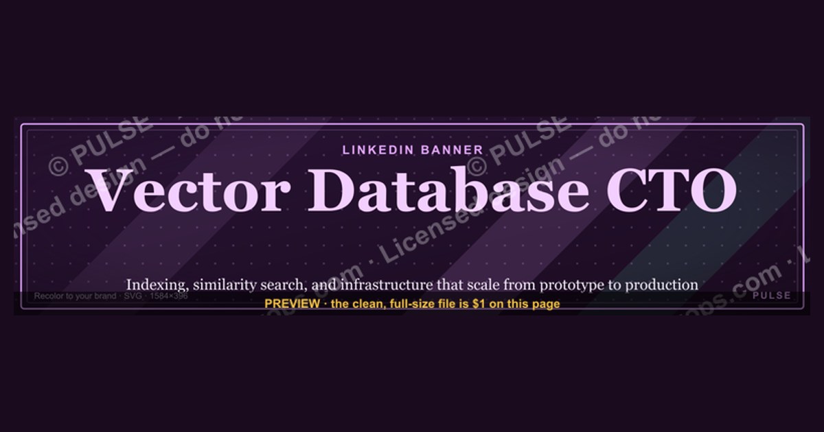
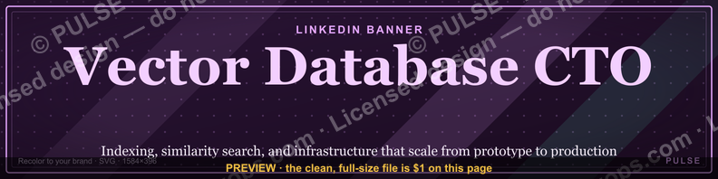
This is a LinkedIn profile banner — a 1584x396 px PNG — that reads “Vector Database CTO” in clean type on a dark technical background. Use it on your LinkedIn profile cover to signal the exact role you hold or want, and pair it with a headline that names your Vector Database specialty, so recruiters and peers read the title and specialty together.
The scenario: two seconds on a crowded feed
Picture the moment. A recruiter at an AI infrastructure company is scanning profiles for a founding engineer or a technical lead who can own a vector search platform. They land on your LinkedIn page. The avatar registers first, then the headline, then the wide strip behind the avatar — the cover image. That strip is roughly four times wider than it is tall, and it is the only piece of profile real estate you fully control: no algorithm crops it, no connection’s comment sits on top of it, no feed noise competes with it.
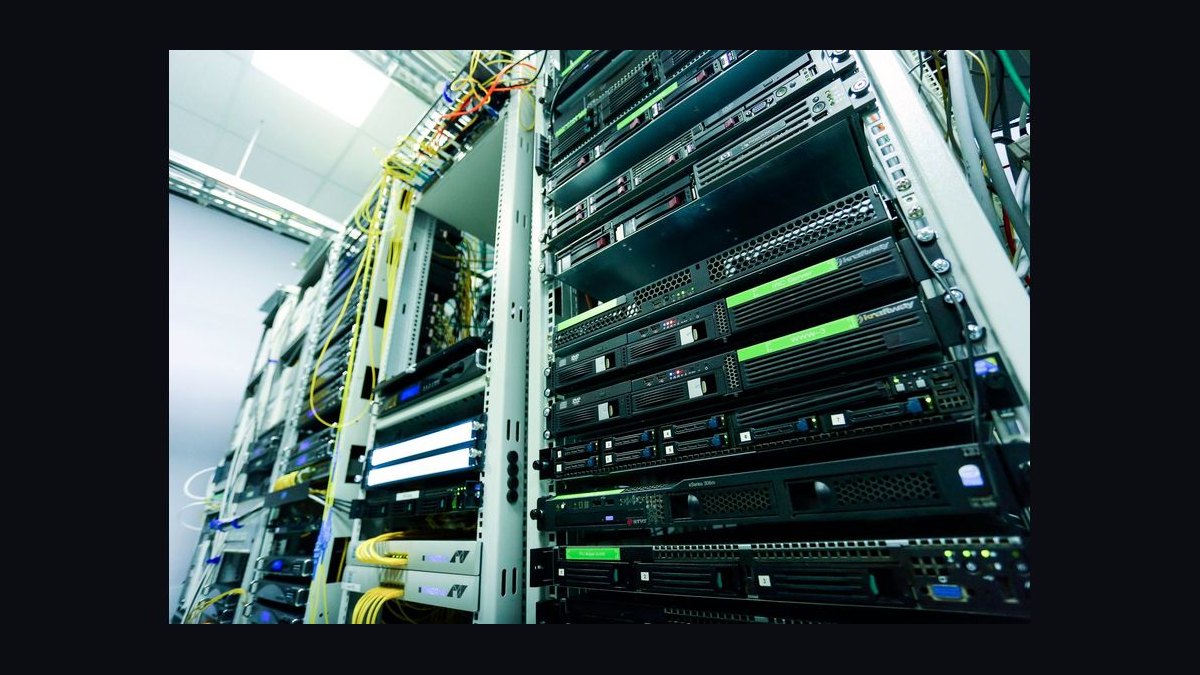
Most people fill that strip with a stock photo of a server rack, a generic circuit-board render, or a landscape shot from a conference. It reads as filler. A reader’s brain spends a fraction of a second deciding whether the cover is signal or decoration, and decoration gets skipped. The result is that the one visual asset you can fully art-direct does nothing.
Now picture the alternative. The same profile, but the cover strip carries four words in a clean sans-serif: “Vector Database CTO.” The reader does not have to parse a headline, click “About,” or scroll experience to know what you are. The title and the specialty arrive together, in the largest text on the page. That is the entire job of this banner: compress role and domain into one glance.

This matters more in the vector database space than in most. The field is young, the titles are unstable, and the same person might be called “Head of Search Infrastructure,” “Staff Engineer, Retrieval,” or “CTO” at three different companies for roughly the same work. A recruiter who does not already know your employer’s naming convention cannot map your headline to the role they are filling. A banner that states the role plainly removes that translation step. It is not decoration; it is a label.
The scenario also has a second half. The banner is not only for people looking at your profile cold. It shows up when you comment on a post, when you appear in “People also viewed,” and when someone opens your profile from a LinkedIn search result. In each of those contexts the reader has even less context than the recruiter above — often just a name and a thumbnail. The banner is the fastest way to tell them what you do before they decide whether to keep reading.
How the mechanism actually works
A LinkedIn profile banner is a fixed-aspect-ratio image slot. LinkedIn renders the profile cover at a wide landscape ratio, and the commonly used export size is 1584 x 396 pixels — a 4:1 ratio. That ratio is the single most important constraint on the design, because anything composed for a square or a normal photo crop will look wrong.
Here is the chain from file to screen, and where each step can go wrong.
Two mechanics drive whether the banner works.
First, the avatar overlap. On desktop, your circular profile photo sits over the lower-left portion of the cover. Any text or logo placed there gets partially or fully hidden. The safe move is to keep all meaningful content in the horizontal center and the upper two-thirds, and to treat the lower-left as dead space. Designers who ignore this ship a banner whose first word is behind their own face.
Second, the mobile crop. LinkedIn does not show the full 4:1 strip on every surface. On phones the cover is rendered in a shorter, narrower window, so the extreme left and right edges can fall outside the visible area. Text that runs edge to edge on desktop can get clipped on mobile. The fix is generous margins: keep the words “Vector Database CTO” inside roughly the central 60 percent of the width, and let the outer edges carry only background texture or a subtle gradient.
A third mechanic is legibility at thumbnail scale. The cover is often seen small — in search results, in sidebars, in a hover card. A four-word phrase set at a readable size survives that scale-down; a paragraph of small text, a detailed diagram, or a logo with fine lines does not. The banner is a billboard, not a business card. One idea, large.
Finally, there is the relationship between the banner and the headline directly beneath it. LinkedIn shows your headline as text under your name, and the headline is what search and most previews actually index. The banner is an image, so it is not machine-readable the way the headline is. That means the banner and the headline should say the same thing in different registers: the headline carries the parseable keywords (“CTO | Vector Database | AI Infrastructure”), and the banner carries the same message as a visual anchor. If they disagree — banner says “Vector Database CTO,” headline says “Angel Investor & Advisor” — the reader gets a mixed signal and trusts neither.
Real numbers, ranges, and benchmarks
The numbers here are mostly about dimensions, file behavior, and time, not performance metrics. Getting them right is the difference between a banner that renders cleanly and one that looks broken.

Dimensions. The export size to design for is 1584 x 396 pixels. That is the widely used LinkedIn cover dimension and matches the 4:1 ratio the slot renders at. If you only remember one number, remember this one. Designing at a larger multiple of the same ratio — say 3168 x 792 — and exporting down also works and gives you a sharper source file.
Safe zones. Treat the outer 10 percent on each side as expendable, and treat the lower-left quadrant as occupied by the avatar. In practice that means: keep the main text within roughly the central 60 to 70 percent of the width, vertically centered or slightly above center. A four-word phrase at a size that occupies about 40 to 50 percent of the banner height will read clearly on desktop and survive the mobile crop.
File format and size. PNG is the right format when the banner has flat color, text, or sharp edges, because it avoids the compression artifacts JPEG introduces around letterforms. Keep the file well under LinkedIn’s upload ceiling — a few hundred kilobytes is plenty for a flat-color banner, and there is no reason to approach the limit. Export in sRGB so colors match what you designed.
Color contrast. For text to stay readable at thumbnail scale, aim for a strong contrast ratio between the words and the background — dark text on a light field or light text on a dark field. Mid-tone text on a mid-tone background looks fine at full size and turns to mush when the image is scaled down in a sidebar.
Time budget. A banner like this is a 30-to-90-minute job if you start from a template: pick the background, type the four words, set the safe margins, export. It is a half-day job if you insist on custom illustration. The return on the extra hours is small, because the reader is not studying the banner — they are glancing at it. The marginal value is in the words being legible, not in the background being clever.
Where it sits in the funnel. Think of the banner as a top-of-funnel asset with a very short exposure. A reader gives the cover roughly the same attention they give a headline — a second or two. Compare that to the “About” section, where a motivated reader might spend 30 seconds, or the experience section, where a recruiter might spend a minute. The banner’s job is to earn that next click, not to close the reader. Measured against that job, the benchmark is simple: can a stranger state your role and domain after one glance? If yes, the banner is doing its work.
Comparable assets. The same logic applies to other fixed-ratio profile slots: a conference badge, a GitHub profile README header, a personal site hero strip, a speaker card. Each has a canonical dimension and a safe zone, and each fails the same way — too much text, content in the crop zone, low contrast. If you have designed one of these well, you already know the constraints that govern this banner.
Trade-offs and alternatives
The banner is one option among several for signaling role and specialty. Each has a cost.
Banner versus headline-only. The headline is text, so LinkedIn search and previews can read it. It is the higher-leverage asset for discoverability. The banner is an image, so it is invisible to search but far more visually prominent. The sensible combination is to put the keywords in the headline and echo them in the banner, not to choose one over the other.
Banner versus Featured section. The Featured section sits lower on the profile and can hold links, documents, and posts. It is more flexible and clickable, but a reader has to scroll to reach it. The banner is seen without scrolling. Use the banner to state the role and the Featured section to prove it — a talk, a repo, a written piece.
Banner versus About section. The About section can carry nuance: what you have built, what scale, what team. The banner cannot. Attempting to cram nuance into the banner produces a wall of small text that reads as noise. Keep the banner to the role and the domain; let the About section carry the story.
Custom design versus template. A custom banner can be distinctive, but distinctiveness is not the goal — legibility is. A template that gets the ratio, safe zone, and contrast right will outperform a hand-drawn banner that misses those basics. Start from the template, then adjust colors and wording to match your personal or company palette.
One banner versus many. You can swap the banner for different campaigns — a conference, a launch, a hiring push. Each swap costs a few minutes and resets the visual. The trade-off is consistency: a banner that changes every month never becomes recognizable. Pick a stable core (the role and domain) and vary only the accent if you want seasonal relevance.
Common pitfalls and how to avoid them
The failure modes here are predictable, and each has a cheap fix.
Text hidden behind the avatar. The most common mistake. The fix is to keep all words out of the lower-left quadrant and center the phrase horizontally. Check by overlaying a circle in the lower-left before you export.
Edge clipping on mobile. Text that runs to the left or right edge looks fine on desktop and gets cut on phones. Keep the phrase inside the central 60 to 70 percent of the width and let the edges be background.
Too much text. A banner that tries to list your stack, your employers, and your contact info becomes unreadable at thumbnail scale. Reduce to the role and domain — four to six words. Everything else belongs in the headline or About section.
Low contrast. Mid-tone text on a mid-tone background looks acceptable at full size and disappears when scaled. Push the contrast: near-black on white, white on near-black, or a single saturated accent on a neutral field.
JPEG artifacts around text. Sharp letterforms and flat color compress badly in JPEG, producing halos and blur. Export as PNG.
Banner and headline disagreeing. If the banner says one thing and the headline another, the reader trusts neither. Write the headline first, then make the banner echo it.
Wrong aspect ratio. A banner designed at 16:9 or square gets cropped by the slot and loses its composition. Design at 4:1, export at 1584 x 396.
Ignoring the small-size view. Always preview the banner at thumbnail size before uploading. If the words are not readable at that scale, enlarge them and cut everything else.
Over-branding with a company logo. A large logo can crowd out the words. If you include a logo, keep it small and secondary to the text, and place it away from the avatar zone.
Never updating it. A banner that still says “Senior Engineer” two years after you became a CTO undersells you. Treat the banner as a living label and update it when the role changes.
Related questions
What size should a LinkedIn profile banner be?
Design at 1584 x 396 pixels, a 4:1 ratio. Keep the main text within the central 60 to 70 percent of the width, avoid the lower-left quadrant where the avatar overlaps, and export as a PNG in sRGB. That combination renders cleanly on desktop and survives the narrower mobile crop.
Can I use this banner if I am not a CTO yet?
Yes, with care. A banner that claims a title you do not hold reads as aspirational at best and misleading at worst. If you are targeting the role, pair the banner with a headline that states your current level and the direction you are moving, so the two agree.
Does the banner help with LinkedIn search?
Not directly — the banner is an image and search indexes text, not pixels. The headline and About section carry the searchable keywords. The banner reinforces the same message visually for human readers who arrive from search or a feed.
What should the headline under the banner say?
Echo the banner in keywords: role, domain, and one differentiator, for example “CTO | Vector Database & Retrieval Infrastructure | Building low-latency search at scale.” Keep it under the headline character limit and make sure it does not contradict the banner.
Can I reuse the same banner across platforms?
The 4:1 ratio is specific to LinkedIn’s cover slot. Other platforms use different ratios — X, GitHub, and personal sites each differ — so a banner built for LinkedIn will crop awkwardly elsewhere. Rebuild per platform rather than stretching one file.
FAQ
What exactly is this LinkedIn profile banner?
It is a 1584 x 396 px PNG designed for the LinkedIn profile cover slot. It reads “Vector Database CTO” in large, legible type on a dark technical background, with the wording kept inside the center-safe zone so the avatar and mobile crops do not hide it. Download it from this page and upload it to your profile cover.
Who is this banner for?
It suits anyone whose work centers on vector search, embeddings, or retrieval infrastructure and who holds or is targeting a technical leadership title — CTO, VP Engineering, Head of Infrastructure, or founding engineer on a vector database team. It is also useful for consultants and advisors who want their specialty visible at a glance.
How do I upload it to LinkedIn?
Open your profile, click the cover image area, choose “Edit cover image” or the pencil icon, and upload the PNG. Reposition if LinkedIn offers the control, then save. Verify the result on both desktop and mobile, because the two surfaces crop the cover differently.
Can I change the colors or wording?
Yes. The template is a starting point. Swap the background field, the accent color, and the typeface to match your personal or company palette, and adjust the wording if your role differs — for example “Vector Search Lead” or “Head of Retrieval Infrastructure.” Keep the text short and the contrast high.
Why does my banner look cropped or blurry?
Cropping usually means content was placed outside the safe zone — near the edges or under the avatar. Blur usually means a JPEG export or an undersized source file. Re-export at 1584 x 396 as a PNG with the text centered and away from the lower-left quadrant.
Is the banner a substitute for a good headline and About section?
No. The banner is a visual anchor, not a profile. It states the role and domain in one glance, but search, previews, and detail all come from your headline and About section. Write those first, then make the banner echo them so the whole profile says one coherent thing.
Sources
- LinkedIn Help — Edit your profile cover image: https://www.linkedin.com/help/linkedin/answer/a546357
- LinkedIn Help — Profile headline overview: https://www.linkedin.com/help/linkedin/answer/a546371
- LinkedIn — Official news and product updates: https://news.linkedin.com/
- W3C — Web Content Accessibility Guidelines (contrast guidance): https://www.w3.org/WAI/WCAG21/quickref/
- W3C — PNG specification: https://www.w3.org/TR/png/
- Nielsen Norman Group — Visual hierarchy and scanning behavior: https://www.nngroup.com/articles/visual-hierarchy-ux-definition/
- Harvard Business Review — Personal branding and professional presence: https://hbr.org/
- U.S. Bureau of Labor Statistics — Computer and information technology occupations: https://www.bls.gov/ooh/computer-and-information-technology/
Related on PULSE
- LinkedIn headline formulas for infrastructure leaders
- How to write an About section that matches your banner
- Personal branding for technical founders and CTOs
- Designing conference badges and speaker cards at fixed ratios
- Vector database interview prep: what hiring managers screen for
- Building a public portfolio for retrieval and search engineers
This page will be disappearing soon. Save it to your device for $1 — or read it free while it is here.
@Kory-White- · if Venmo asks, the last 4 of my number are 2012
 graphicKeep what you win. — LinkedIn Wallpaper
 graphic“Process over pressure.” — LinkedIn Banner
 graphicCustomer Success — LinkedIn Banner
 graphicFaster deals, fewer leaks. — LinkedIn Wallpaper
 graphic"Win the quarter." — LinkedIn Banner
 graphic“Sell something people love.” — LinkedIn Banner
 graphicHead of Sales — LinkedIn Banner
 graphicWin the day. — LinkedIn Wallpaper
 graphicRight market, right motion. — LinkedIn Wallpaper
 graphicPredictable revenue, by design. — LinkedIn Wallpaper