 Pulse Reviews and Analysis
How Do I Build a Board-Ready GTM Efficiency Dashboard in 2027?
 Curated by Kory White · Fractional CRO, CRO Syndicate
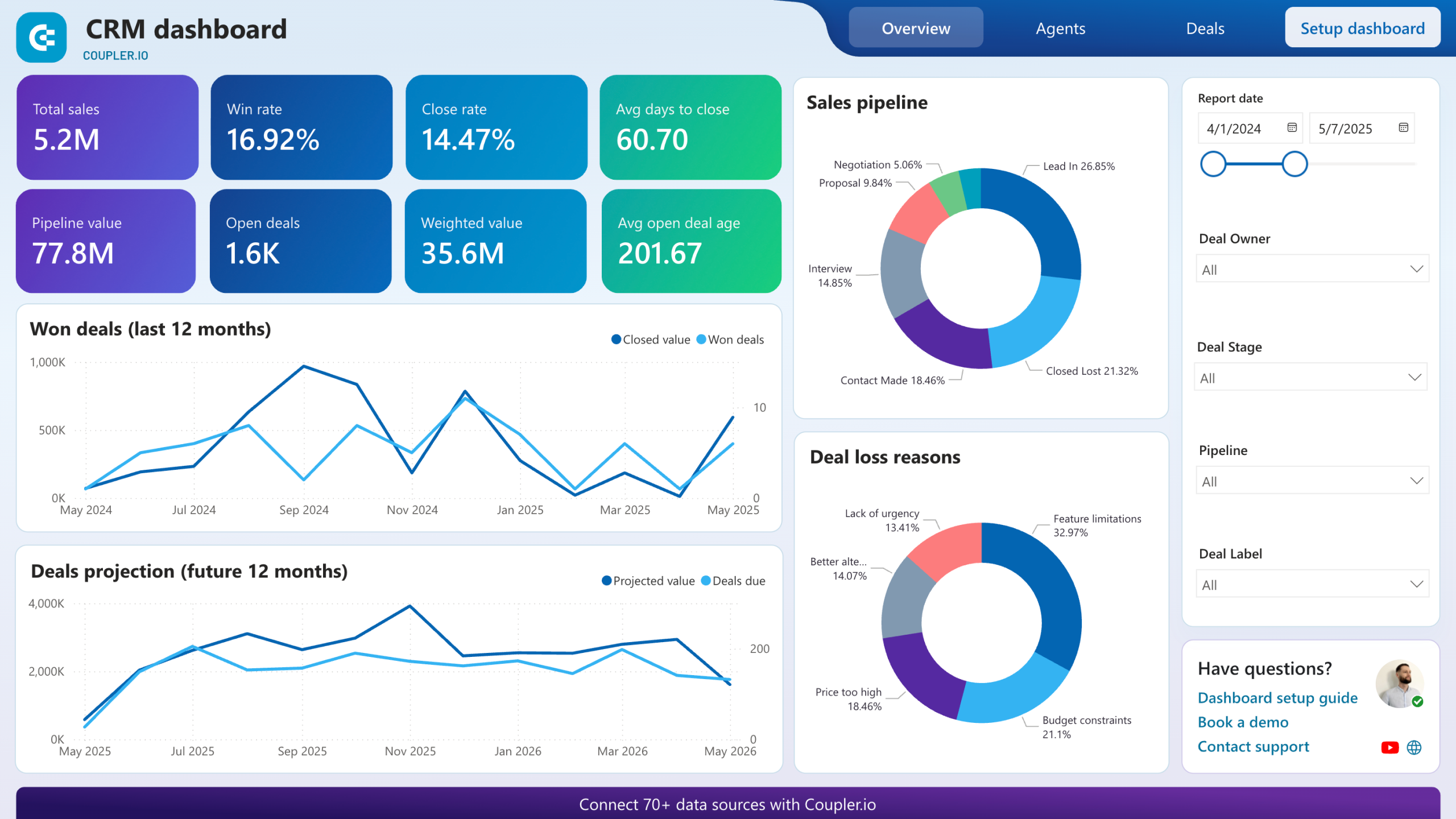
Direct Answer
To build a board-ready GTM efficiency dashboard in 2027, present a tight set of efficiency and durability metrics the board already benchmarks — net dollar retention, CAC payback, the Magic Number, the Rule of 40, gross margin, and pipeline coverage — each shown as a trend with context and a target, not a raw snapshot. Boards do not want a wall of every sales metric; they want to answer three questions: are we growing efficiently, is that growth durable, and is the pipeline there to keep it going?
A board-ready dashboard answers those with a small number of trusted, consistently defined metrics, ties every number to a single source of truth so it survives scrutiny, and pairs each metric with a brief narrative on what changed and what you are doing about it. The discipline is fewer metrics, defined precisely, trended over time, reconciled to finance — so the board spends the meeting on decisions, not on debating whether the numbers are right.
What a Board Actually Wants to See
A board evaluates whether capital is converting into efficient, durable growth. That maps to three lenses:
- Efficiency — how much growth you get per dollar spent (CAC payback period, the Magic Number, the Rule of 40).
- Durability — whether the revenue you win stays and grows (net dollar retention, gross/logo retention, gross margin).
- Forward visibility — whether future growth is covered (pipeline coverage ratio, win-rate and sales-velocity trends).
Pick a small number from each lens. A dashboard with eight to twelve well-chosen metrics beats one with fifty, because the board can only act on what it can absorb.
The Core Metrics and Why They Belong
- Net dollar retention (NDR). The single most-watched durability metric; shows whether the existing base expands or leaks.
- CAC payback period. How many months to recover the cost of acquiring a customer — a direct efficiency read, especially in hybrid PLG-plus-sales motions.
- Magic Number. New recurring revenue generated per dollar of sales-and-marketing spend; a clean efficiency signal for the board.
- Rule of 40. Growth rate plus profit margin; the headline balance of growth versus profitability boards now expect.
- Gross margin. Underpins every efficiency ratio; falling margin quietly undermines the rest.
- Pipeline coverage ratio. Forward-looking proof that the number is reachable, not just hoped for.
Define Every Metric Precisely
The fastest way to lose a board's trust is inconsistent definitions. Write down the exact formula for each metric — what counts in CAC, how NDR handles contraction, which spend is in the Magic Number — and apply it the same way every quarter. If a definition changes, footnote it.
Reconcile revenue and margin numbers to the finance system of record so the dashboard cannot be undermined by a "that does not match the financials" challenge.
Trend, Target, and Narrate
A board number means little as a snapshot. Show each metric as a trend over several quarters with a target line, so the direction and the gap-to-goal are obvious at a glance. Then add a short narrative: what moved, why, and the action you are taking.
Boards reward operators who explain a dip and show a plan more than ones who only present green numbers.
Build It on a Trusted Stack
Sources the dashboard should draw from: Salesforce or HubSpot for pipeline, win rate, and coverage; the billing system (e.g., Stripe or Zuora) for recurring revenue and retention; the finance/ERP system (e.g., NetSuite) for margin and spend; and a BI layer (e.g., Looker, Tableau, or Power BI) to compute and render the metrics from a governed data model.
Clari or similar can supply forecast and pipeline trends. The key architectural rule is one governed data model feeding the dashboard, so every metric traces to the same source.
Common Pitfalls
- Too many metrics. A fifty-tile dashboard buries the three questions the board cares about.
- Inconsistent definitions. Quarter-to-quarter formula drift destroys trust.
- Snapshots without trends or targets. A single number has no direction; boards need the trajectory.
- Numbers that do not tie to finance. Any mismatch with the financials discredits the whole deck.
- No narrative. Numbers without "what changed and what we are doing" leave the board guessing.
FAQ
Which GTM metrics matter most to a board in 2027? Net dollar retention, CAC payback, the Magic Number, the Rule of 40, gross margin, and pipeline coverage — a small set covering efficiency, durability, and forward visibility.
How many metrics should a board dashboard have? Roughly eight to twelve well-chosen ones. Boards act on what they can absorb, so fewer precise metrics beat a large dump of every sales stat.
Why do board dashboards lose credibility? Usually inconsistent metric definitions or numbers that do not reconcile to the finance system. Fixed formulas and a single source of truth prevent both.
Should I show snapshots or trends? Trends, with a target line and several quarters of history, so the board sees direction and gap-to-goal rather than an isolated number.
What turns a good number into a good board story? A short narrative with every metric — what changed, why, and the action you are taking — which builds more confidence than presenting only favorable figures.
Sources
- Bessemer Venture Partners — Rule of 40, NDR, and cloud efficiency metric research.
- KeyBanc Capital Markets and OpenView — SaaS metrics and benchmark surveys.
- David Skok (For Entrepreneurs) — CAC payback and Magic Number definitions.
- Salesforce and Clari — pipeline, forecast, and coverage reporting documentation.
- Looker, Tableau, and Power BI — BI modeling and dashboard governance documentation.
Related on PULSE
- How do you operationalize the Rule of 40 inside a RevOps dashboard in 2027?
- How do you calculate and present the Magic Number to a board in 2027?
- How do you build NDR cohort reporting that a board will trust in 2027?
- What Pipeline Coverage Ratio Should I Target in 2027?
- Explore the Pulse Tools library for a board-dashboard template.