

What to Wear for Family Photos in 2027
For family photos in 2027, dress everyone from one three-color palette — a neutral base, a mid-tone, and a single accent — then let texture do the work instead of pattern. Coordinate, never match. Favor solids in warm neutrals and muted earth tones, well-fitted and comfortable enough that nobody is tugging at a collar between frames.
The two ways families actually approach this: matched sets versus a coordinated palette
Nearly every family that books a session lands in one of two camps, and the choice you make here determines almost everything downstream — how long shopping takes, what the photos look like in ten years, and how much of the session gets burned on wardrobe fiddling.
The matched set. Everybody wears the same color, often the same garment: five people in white button-downs and jeans, or four in identical navy. It is the older approach and it survives because it is genuinely easy to execute. One decision, one shopping trip, zero coordination anxiety. It reads as unified in a thumbnail. Grandparents love it. It also photographs consistently — no one person's outfit fights another's, because there is functionally only one outfit.
The costs are real, though. Matched sets flatten individuality; in a wide group shot, five identical torsos become one visual mass and the eye has nothing to travel along. They date hard — every era's matched set becomes shorthand for that era, which is why the white-shirt-and-jeans beach photo reads instantly as a specific decade. And they are unforgiving of body diversity: a garment that flatters a 6'2" adult rarely flatters a 5'1" adult or a seven-year-old, so somebody in the frame is always wearing a compromise.
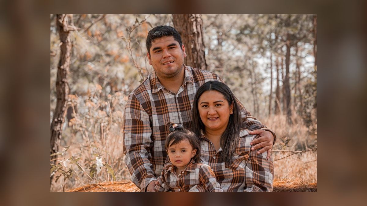
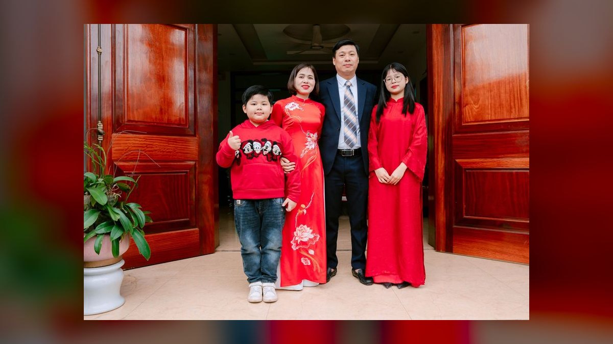
The coordinated palette. Everyone pulls from a shared three-color range but wears different garments, cuts, and textures. A mother in a cream ribbed knit, a father in an olive linen shirt, a teenager in taupe wide-leg trousers, a child in a rust sweater. Nothing repeats exactly; everything belongs.

This is the harder path and the better one for most families. It costs more planning — you have to lay everything out together before session day, and you will almost certainly send someone back to swap a piece. But it lets each person wear a silhouette that actually fits their body, it gives the eye a path through the frame, and it ages far better because the unifying element is color harmony rather than a specific trend garment.
There is a third position worth naming: the anchored mix, where one or two people wear the accent color and everyone else stays in neutrals. It is the coordinated palette with training wheels, and it is what I would recommend to a family doing this for the first time. Pick cream and taupe for four people, put the youngest child in muted mustard, and you have a photo with a natural focal point and almost no way to get it wrong.
How to decide which approach fits your family
The decision is not about taste — it is about constraints. Run through these in order and the answer usually falls out.
Group size. Under five people, a matched set can still work; the frame is not crowded enough for the flattening problem to bite. Above eight — extended family, three generations, cousins — a matched set becomes a wall of identical fabric and the coordinated palette is close to mandatory. At twelve or more, go further: assign each nuclear family unit a slightly different weighting of the same three colors so the groupings read visually even in a single wide shot.

Time available. A coordinated palette realistically needs two to three weeks: one week to pick the palette and inventory what people already own, one week to fill gaps, and a few days of buffer for returns and exchanges. If your session is in four days, buy a matched set or, better, do the anchored mix using clothes people already have.
Budget. Coordinating from scratch across five people can run $600–$1,500 depending on where you shop; a matched set is often half that because you are buying one item type in bulk sizes. The cheapest path of all is the palette approach executed entirely from existing closets, which frequently works better than either — worn-in clothes photograph more naturally than stiff new ones.
Location and season. A beach at 5pm and a pine forest in November are not the same assignment. Light bouncing off sand blows out white and pale pastels; dense green foliage swallows olive and forest tones so the family disappears into the background. Let the location veto colors before you commit to a palette.
Who is hardest to dress. Every family has one — a teenager with strong opinions, a toddler who will not wear anything with a collar, an adult who owns exactly three shirts. Build the palette around that person's actual, existing wardrobe and work outward. Deciding the palette first and then trying to force the difficult case into it is how families end up at the session with someone sulking in an outfit they hate, which shows in every single frame.

Two practical tests close the loop. First, the flat-lay test: put every garment on a bed or floor in the arrangement people will stand in and photograph it with your phone. Problems that are invisible when you hold items up individually — two people in nearly-but-not-quite the same beige, a pattern that vibrates next to a solid — jump out immediately in a flat photo. Second, the squint test: step back and squint at that flat-lay until detail blurs. What remains should be three color masses in pleasing proportion, roughly 60% neutral base, 30% mid-tone, 10% accent. If one color dominates or the accent has spread to three people, adjust.
The concrete numbers behind palette, texture, and fit
Vague advice like "wear earth tones" fails because it does not tell you how much of what. Here are the working ratios and specifics.
The 60-30-10 split. Across the whole group, aim for roughly 60% of visible fabric in the neutral base (cream, oatmeal, stone, taupe, warm bone), 30% in the mid-tone (olive, rust, slate, camel, muted teal), and 10% in the accent (dusty rose, muted mustard, deep navy, cranberry). In a family of five, that translates to about three people mostly in the base, one and a half in the mid-tone, and one accent piece — a sweater, a scarf, a dress. Accent is a garnish, not a course.
Value contrast, not color contrast. The mistake that ruins more photos than any color choice is putting a very light garment next to a very dark one. Black absorbs light and turns a torso into a void; pure white reflects it and blows out, particularly in bright outdoor light where the camera has to expose for faces. Keep everyone within a middle range of lightness — think mid-tones and soft lights — and the photographer can expose for skin instead of splitting the difference between a black sweater and a white shirt. If someone insists on black, put it on the person standing at the edge of the frame, not the center.

Texture as the substitute for pattern. Since you are staying mostly in solids, texture is what keeps the frame from going flat. Linen has a visible slub and creases in a way that reads as relaxed. Cable and chunky knits create shadow lines that give a torso dimension. Corduroy has a directional wale that catches light. Soft, worn denim reads warmer than raw dark denim. Suede has depth that smooth leather lacks. Mix at least three distinct textures across the group and the photo gains depth no pattern could supply.
Where patterns are allowed. Limit to one patterned garment per group of four to five people, and keep the scale small and low-contrast — a thin pinstripe, a small floral, a muted plaid where the colors sit within a narrow value range. High-contrast stripes are the specific killer: narrow black-and-white stripes can produce moiré, a shimmering artifact from interference between the fabric pattern and the sensor grid, which is difficult to fully remove in editing.
Fit tolerances. Photographs exaggerate fit problems. A shirt that feels "a little loose" in the mirror reads as sloppy in a print. Sleeves should end at the wrist bone; trousers should break once, lightly, on the shoe; a sweater's shoulder seam should sit at the actual shoulder. Budget for a tailor if the session matters — hemming trousers and taking in a shirt costs a fraction of what the session does and changes the images more than a new garment would.
Logos and graphics. Zero, across the board. A visible logo dates a photo to within about two years of its release and pulls the eye off faces. This includes small chest logos, which are more distracting than people expect because they sit right in the sightline.
Footwear. Shoes appear in every full-length frame and are the most commonly neglected item. They should match the formality of the outfit and be broken in. Brand-new white sneakers look plasticky; scuffed heels look careless. Check soles too — a seated pose on a hillside points everyone's shoe bottoms directly at the lens.
Cost anchors. Executing a palette across a family of five from scratch tends to land between $600 and $1,500 at mainstream mall and direct-to-consumer price points, and considerably less if you are willing to shop secondhand. Filling gaps only — using what people already own and buying two or three connective pieces — typically runs $150 to $400 and is the approach most families should take.
Adapting the palette across ages, bodies, and generations
A three-generation photo is really three separate styling problems that have to resolve into one image.
Young children and toddlers. Comfort beats everything. A child in a scratchy collar or stiff new shoes will be visibly miserable within ten minutes, and no wardrobe plan survives that. Choose soft, washed fabrics, and dress them in a single solid from the palette — this is often the best place to put the accent color, since a small child in muted mustard becomes a natural focal point. Skip character prints, neon, and anything with a slogan. Bring a full change of clothes; something will get spilled, and it will happen in the parking lot.
Older kids and teenagers. The failure mode here is not aesthetic, it is emotional. A teenager forced into an outfit they find embarrassing reads as sullen in every frame, and that expression is what you will actually remember. Give them real choice inside the constraint: "pick anything you like in cream, olive, or rust" is a negotiation they can win. Their instinct for current silhouettes is usually better than yours anyway.
Twenties and thirties. This is where trend-forward cuts are appropriate and look natural rather than costume-like — wide-leg trousers, relaxed linen shirts, softer unstructured tailoring. Keep the fabrics casual and the fit relaxed. Ten years from now these will read as of-their-moment in a way that is charming rather than embarrassing, provided the colors stayed neutral.
Forties and fifties. Shift toward tailored classics that photograph cleanly: dark straight-leg denim, a silk or fine-cotton blouse, a structured cardigan, a good crewneck in merino or cashmere. Structure matters more here because the camera reads drape as either intentional or accidental, and tailoring makes it intentional. A well-cut knit over a collared shirt is close to foolproof.
Sixties and beyond. Prioritize elegance with genuine ease — pieces you can stand, sit, and rise from without adjusting. Midi dresses, cashmere wraps, flat-front chinos, low block heels or leather loafers. Fabrics with body rather than cling. If the session involves uneven ground or long stretches of standing, say so in advance; a photographer who knows can build in seated groupings.
Bodies of every shape. Vertical lines, monochromatic column dressing within your palette, and mid-weight fabrics with structure are flattering across the widest range. Avoid clingy synthetics, which show every contour and shine under flash. Anyone uncomfortable with arms has a straightforward fix in a three-quarter sleeve or a light layer — no one should spend a session self-conscious about a sleeveless choice they were talked into.
Pregnancy and postpartum. Fitted knits that follow the bump photograph better than tents, which add bulk everywhere. Wrap dresses and elastic or drawstring waists handle the last-minute size uncertainty that comes with both. Buy in the week of the session, not a month before.
Season and location: the constraint most families discover too late
Spring. Lean into lighter textures and airier silhouettes — linen blends, fine cotton, an unstructured blazer over a chambray shirt. Blooming backgrounds are already busy and colorful, so the wardrobe should get quieter, not louder. Pale terracotta, dusty lavender, and warm bone hold up against blossom without competing. Skip stark white; spring light is brighter than it feels and white clips easily.
Summer. Breathability is a styling decision, not just a comfort one, because visible sweat and heat flush are hard to edit out. Linen, cotton, and light silk over anything synthetic. Sandy beige, faded denim blue, and a burnt-orange accent hold up in strong light. If you are near water or sand, the reflected light is roughly a stop brighter than you expect, so shift the whole palette a touch deeper. Straw hats add texture and sun protection but cast a hard shadow across the eyes — test them, and be willing to hold them rather than wear them.
Autumn. The most forgiving season and the most popular for good reason. Rust, forest green, and warm camel photograph beautifully in low golden light, and layering is genuinely useful rather than decorative: a chunky cardigan over a cotton dress, a denim jacket over a turtleneck, a wool vest over a flannel. Corduroy earns its place here. Watch for the foliage-matching trap — if the trees behind you are peak orange, an all-rust family disappears into them.
Winter. The challenge is warmth without bulk. Wool-blend coats in matte finishes photograph sleekly; shiny puffers bounce light and create unflattering highlights. Move away from black and charcoal toward winter white, slate blue, and cranberry, which keep faces lit in flat overcast conditions. Beanies and gloves add texture and buy you real minutes outdoors, but a hat pulled low costs you eyebrows and half the expression. Bring layers everyone can shed for the two minutes a shot actually takes.
Location overrides season. A studio session with a neutral backdrop lets you be bolder with the accent color because nothing competes. An urban session with brick and concrete supports cooler tones — slate, denim, ivory — that would look cold outdoors. A home session, increasingly popular for newborn and multigenerational work, should lean toward what people genuinely wear at home; formal clothes in a living room read as a costume.
Grooming, timing, and the sequencing that makes the plan hold
The wardrobe is the visible half. The sequencing around it is what determines whether the plan survives contact with session day.
Haircuts land five to seven days out, not the day before. A fresh cut sits stiffly and looks like a fresh cut; a week of growth softens the line. Same logic for beard shaping and for color, which needs a few days to settle. This is the single most commonly mistimed step.

Skin gets nothing new in the final two weeks. No first-time facials, no new actives, no experimental products. Reactions surface on exactly the wrong timeline. If someone wants a treatment, it happens a month out or not at all.
Makeup should read as skin. Tinted moisturizer or light-coverage base over heavy foundation, cream blush rather than powder, waterproof mascara because outdoor sessions involve wind and small children, and a lip stain or balm rather than a full matte lip that will need constant touch-up. Avoid glitter-particle highlighter — it catches light and creates hot spots the retoucher has to remove one by one. A mattifying primer on the T-zone is worth it for anyone who shines.
Nails count more than people expect because hands appear in nearly every posed grouping. Sheer nudes and clear glosses stay invisible; bright or dark polish becomes a focal point in any shot involving a hand on a shoulder. Trimmed and clean is the whole requirement for anyone who does not want polish.
Lay everything out 48 hours ahead. Not the night before — 48 hours, so there is a business day to fix what you find. Do the flat-lay and squint tests then. Check for missing buttons, stains, and the shoes nobody thought about.
Pack a session kit: wet wipes, a stain pen, safety pins, a lint roller, hair ties, snacks that are not sticky or brightly colored, and a full change of clothes for anyone under six. Photographers will tell you the lint roller earns its place more often than anything else in the bag.
Session-day timing. Feed everyone beforehand. Arrive fifteen minutes early so nobody starts the session rushed and red-faced. Keep the tightest clothes off until you arrive — waistband marks and collar creases from a car ride are real and visible.
Communicate with the photographer. Send them the flat-lay photo. Most will happily flag a problem — a color that fights their planned location, a fabric that will not work in their lighting setup — and that five-minute exchange prevents the expensive kind of mistake. Ask what time of day they are shooting and whether they use flash; the answer changes what fabrics behave well.
Think in sets, not outfits. If you have booked a longer session with a wardrobe change, plan the second look as a variation on the same palette — swap layers rather than starting over. A cardigan removed, a jacket added, a scarf introduced. It reads as two distinct looks in the gallery while cutting your shopping and your on-site change time roughly in half.
Related questions
Can we take family photos without coordinating at all?
You can, and candid documentary sessions often work better uncoordinated. But for posed portraits meant for a wall, some color discipline helps — even just "no logos, no black, no neon" gets you most of the benefit with almost no planning.
How many outfits should we bring to a session?
One well-planned look for a standard 30–45 minute session. Two if you have booked 90 minutes or more. Changes eat session time and energy, especially with small children, and a second mediocre outfit is worth less than more frames in the good one.
What should the photographer be told in advance?
Location and time of day, whether flash will be used, the terrain, and your palette. Send the flat-lay photo. Also flag anyone with mobility limits so seated groupings can be planned rather than improvised on uneven ground.
Do the same rules apply to extended-family and reunion photos?
Mostly, but scale the palette down to two colors plus one accent — coordination gets harder with every additional household. Give each family a lane within the shared range and expect to enforce "no black, no white, no logos" more than once.
Does any of this change for indoor studio sessions?
Yes. A controlled neutral backdrop removes the location constraint, so you can be bolder with the accent and use deeper tones that would read heavy outdoors. Studio lighting is also less forgiving of shine, so favor matte fabrics and skip anything synthetic.
FAQ
What colors look best in family photos?
Warm neutrals — cream, oatmeal, taupe, camel — as the base, muted earth tones like olive, rust, and slate as the mid-tone, and one soft accent such as dusty rose or muted mustard. These flatter a wide range of skin tones, hold up in variable natural light, and keep attention on faces rather than clothing.
Should everyone in the family wear the same color?
No — coordinate rather than match. Pick a three-color palette and distribute it across different garments: one person in a cream top, another in olive trousers, a third in a rust knit. That creates harmony without turning the group into a uniform, and it lets each person wear a cut that actually fits their body.
Can we wear jeans to family photos?
Yes, and they are often the best choice. Use dark or medium indigo washes without rips or heavy whiskering, in a straight or relaxed leg. Avoid very light washes and distressing, which pull focus and date quickly. Denim's texture is an asset in an otherwise smooth palette.
How do we dress kids so they do not clash with the adults?
Put each child in one solid from the palette and keep accessories to nothing. Children are also the best place for the accent color — a small person in the one bright note becomes a natural focal point. Skip character prints, slogans, and neon, and prioritize comfort over everything, because a miserable child shows in every frame.
What if the weather turns cold or wet?
Layer with wool, cashmere, and matte outerwear in neutral tones rather than adding bulk under clothes. Bring hats and gloves for between-shot warmth even if they never appear in a photo. For rain, a solid-colored umbrella in your palette becomes a prop rather than a problem, and most photographers will happily shoot with it.
Is it worth buying new clothes for a session?
Usually only to fill gaps. Clothes people already own and wear well look natural; head-to-toe new outfits often read stiff and slightly costumed. Buy the two or three connective pieces the palette needs and spend the rest of the budget on tailoring what you have.
Sources
- https://www.vogue.com — seasonal fashion direction, silhouette and color trend reporting
- https://www.harpersbazaar.com — styling guidance and color coordination editorial
- https://www.realsimple.com — practical guides for dressing multiple family members cohesively
- https://www.theknot.com — portrait and milestone-session styling advice
- https://www.thespruce.com — home and family photo preparation guides
- https://www.bhg.com — seasonal family portrait and holiday card planning
- https://www.goodhousekeeping.com — wardrobe fit, fabric care, and grooming basics
- https://www.marthastewart.com — palette building and family event styling
- https://www.nytimes.com/wirecutter — fabric, garment care, and steamer/lint tool guidance
Related on PULSE
- [What to Wear to a Family Reunion in 2027](/knowledge/sy0186)
- [What to Wear to a Cocktail Party if You Have an Athletic Build in 2027](/knowledge/sy0837)
- [What to Wear to a Phone-Screen Follow-Up Real Estate Job Interview in 2027](/knowledge/sy0836)
 pulse-styleHow to Style a Midi Skirt for a First Date in 2027
 pulse-styleHow to Style a Trench Coat for an Engagement Party in 2027
 pulse-styleWhat to Wear to a Marketing Job Interview in 2027
 pulse-styleWhat to Wear to the Gym in 2027
 pulse-styleWhat to Wear to a Cocktail Party in 2027
 pulse-styleWhat to Wear to a Housewarming Party in 2027
 pulse-styleWhat to Wear to a Rooftop Party in 2027
 pulse-styleWhat to Wear to a Dinner Party in 2027
 pulse-styleWhat to Wear to a Golf Outing in 2027
 pulse-styleWhat to Wear to a Jazz Club in 2027