


Sales Enablement Lead — LinkedIn Banner
Quality
Certified
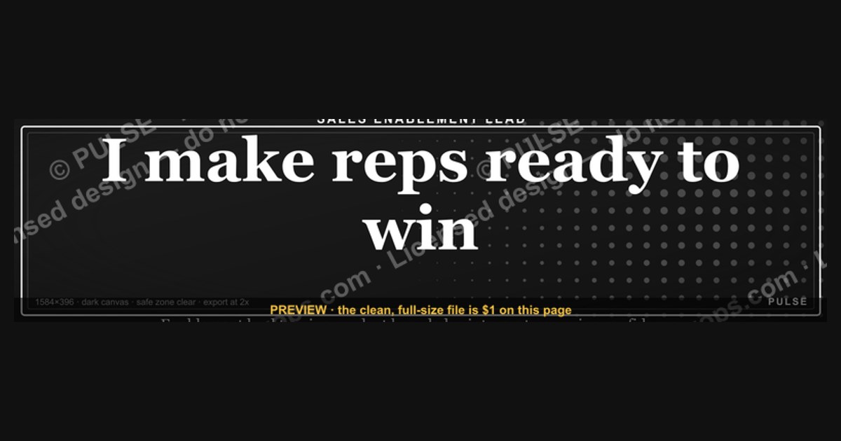
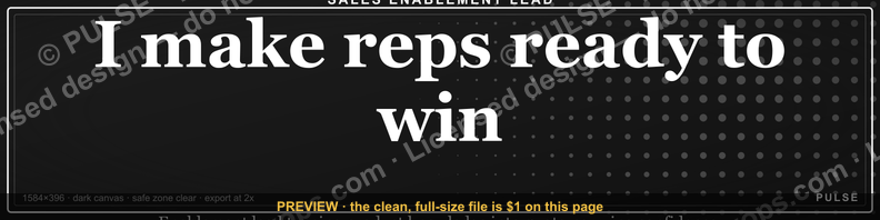
A Sales Enablement Lead LinkedIn banner should sell an outcome, not a job title. Use the full 1584×396 canvas, a dark high-contrast background, and one 8–12 word value line like "I make reps ready to win." Keep the safe zone clear of the profile photo, and export at 2x for retina screens.
Two paths: the template banner versus the custom-built banner
Every Sales Enablement Lead who decides to fix their LinkedIn banner lands on the same fork in the road. Path one is the template route: grab a pre-made SVG or a Canva LinkedIn cover template, swap the text for your own line, recolor it to your palette, and upload it in fifteen minutes. Path two is the custom build: open Figma or hire a designer, construct the layout from an empty 1584×396 frame, and treat the banner as a small brand asset you own outright.
The template path wins on speed and on floor quality. A well-made template already solves the hard geometry problems — where the profile photo overlaps, where mobile crops, how much left margin to leave. You inherit that work for free. The cost is ceiling: a template that thousands of people can download will show up in someone else's feed eventually, and a recruiter who scans forty enablement profiles a week may register the shape without registering you. Templates also tend to be built for generic professionals, so the visual language leans toward abstract gradients and stock geometry rather than anything that reads as *sales enablement* specifically.
The custom path inverts that. Ceiling is unlimited — you can encode a certification ladder, an onboarding funnel motif, or a pulse-line graphic that visually maps to "ramp velocity." You also get a source file you can version, reuse on a slide deck cover, and hand to a designer later. The cost is floor risk. Most people building from scratch without design training produce something worse than a template: too much text, poor contrast, a headshot fighting the value line, elements crossing into the crop zone. Custom also costs real time — a first pass usually takes two to four hours, and a hired designer for a single LinkedIn banner typically quotes in the low hundreds of dollars.

There's a third position worth naming, because most people who succeed actually end up there: the modified template. Start from a template that already has correct geometry and typography, then replace the copy, recolor to your brand, and swap one element for something specific to enablement — a certification badge, a small ramp-time metric, a methodology mark. You keep the template's floor and buy back most of the custom path's ceiling for about thirty minutes of extra work. If you are not a designer and you are not hiring one, this is the default recommendation.
The deciding variable is usually not taste — it's how load-bearing the banner is. If you are actively interviewing for a Director of Enablement role, the banner is doing real work and deserves the custom or modified path. If you're employed, not looking, and just want your profile to stop looking abandoned, a recolored template is a completely rational stopping point.
How to decide between them
Run the decision as a short sequence of gates rather than an aesthetic debate. The first gate is purpose. Ask what the banner is for right now: an active job search, inbound consulting leads, internal credibility with a new sales org, or simple profile hygiene. Job search and consulting both justify the custom or modified path because a measurable outcome hangs on the impression. Hygiene does not.

The second gate is asset inventory. Do you already have a brand? If your company gives you an approved color palette and a headshot from a professional shoot, a template plus recolor gets you 90% of the way. If you have nothing — no headshot, no palette, no logo — the custom path is premature. Solve the headshot first; a great banner behind a webcam selfie reads worse than a plain banner behind a good photo.
The third gate is skill honesty. If you cannot name a sans-serif font you like, cannot explain what kerning is, and have never exported an SVG, the custom path will cost you a full day and produce a worse result than a fifteen-minute template swap. That's not a knock — it's the same logic you'd apply to a rep who wants to build their own sequence from scratch instead of using the enablement-approved template.
The fourth gate is refresh cadence. A custom banner you'll update quarterly with a new metric needs an editable source file, which pushes you toward Figma or an SVG you can open. A banner you'll set once and leave for two years can be a flattened PNG from a template with no source file at all.
Work the gates top to bottom and the answer usually falls out in under two minutes. The failure mode is skipping straight to "what looks cool," which is how people end up with a beautiful abstract gradient that says nothing about enablement.
Concrete numbers behind each option

Start with the numbers that don't change regardless of path. The LinkedIn personal profile cover image is 1584×396 pixels, a 4:1 ratio. Export at 2x — 3168×792 — and let LinkedIn downscale; the text edges stay crisp on retina displays instead of going mushy. PNG is the safer export for text-heavy banners because JPEG compression puts visible artifacts around high-contrast letterforms. If your banner is pure vector shapes and type, an SVG source with a PNG export is the ideal pairing: SVG for editing, PNG for upload.
Safe-zone math matters more than most people expect. On desktop, your profile photo sits over the lower-left of the banner and the name block sits below it, but on narrow mobile viewports LinkedIn crops the banner horizontally toward the center. The practical rule: keep every critical element — your value line, any badge, any metric — inside the middle roughly 60% of the width and above the bottom third. That means treating the left ~340 pixels and the bottom ~130 pixels as expendable. Anything you put there may survive on desktop and vanish on a phone.
Typography numbers: for the primary value line, 28–36 px at the native 1584-wide canvas is the workable band. Below 24 px the line becomes unreadable on a phone; above 44 px you can't fit a meaningful sentence. Word count is the harder constraint — 8 to 12 words is the ceiling for a line someone reads while scrolling. "Building enablement programs that shorten ramp and raise win rates" is eleven words and reads in about two seconds. Anything past fifteen words gets skipped entirely. Use a weight of 600–700 for the value line and 400–500 for any secondary line, so the hierarchy is obvious at thumbnail size.

Contrast is a hard number, not a feeling. Aim for a contrast ratio of at least 4.5:1 between your text and the background behind it, which is the WCAG AA threshold for normal text; at 28 px and up you can technically drop to 3:1 (the large-text threshold), but 4.5:1 is the safer target because LinkedIn renders your banner small. White text on a deep navy or charcoal clears this comfortably. Mid-gray text on a light gradient usually fails. Any free contrast checker will give you the number in seconds — check it before you export, not after someone tells you they can't read it.
Time and cost, honestly stated. A template recolor is 15–30 minutes and free. A modified template — new copy, new palette, one swapped element — is 45–90 minutes and free. A custom Figma build by a non-designer is 2–4 hours for a first version, plus another hour of iteration after you see it live on mobile. Commissioning a designer for a single banner typically lands in the low hundreds of dollars and one to two rounds of revision; exact pricing varies widely by market and designer, so treat that as a range to verify rather than a quote.
Element budget is the number people ignore. Cap yourself at four visual elements total: background, value line, one secondary element (badge, metric, or secondary line), and optionally a headshot or mark. A fifth element almost always reduces impact rather than adding it. If your headshot occupies more than about 20% of the banner area, it competes with your profile photo directly below it and the whole composition reads as duplicated.
Finally, the copy inventory. Write six candidate value lines before choosing one — the first is almost never the best. Score each on three criteria: does it name an outcome (not an activity), could a VP of Sales repeat it back, and does it avoid the words *synergy*, *leverage*, *passionate*, and *thought leader*. Lines that survive all three are usually the ones with a verb and a number: "Scaling onboarding from 10 to 100 reps without losing velocity."
Implementation details and sequencing

Sequence matters because a lot of banner work gets thrown away when done in the wrong order. Copy comes first, always. Write the value line before you open any design tool, because the line determines the layout — a six-word line wants a large centered treatment, a twelve-word line wants left-aligned type with a secondary line beneath it. People who design first and write second end up bending the copy to fit a box, which is how "Driving Revenue Through Enablement" happens.
Second, lock the palette. Two colors plus one neutral is the entire budget: a dark background, a light text color, and one accent for a rule, badge, or underline. If your employer has brand guidelines and you want to signal alignment, use their palette but do not use their logo prominently — unless you're a founder or C-suite, a large company logo on your personal banner subordinates you to the company rather than the reverse. A small mark in a corner is fine; a centered logo is not.
Third, build the layout at the native 1584×396 frame with visible guides for the crop zone. Draw a rectangle over the left 340 px and the bottom 130 px, set it to 30% red, and treat it as a no-fly zone while you compose. Delete the guide before export. This single habit prevents the most common banner failure — a perfectly good metric line that gets sliced off on mobile.

Fourth, test before you commit. Export a PNG, upload it to LinkedIn, and then look at your own profile on an actual phone, not a browser window resized to look like a phone. Also check it in dark mode if your background is light, and check the thumbnail rendering. If the value line is not legible on the phone at arm's length, the font is too small or the contrast is too low — those are the only two causes.
Fifth, keep the source. Whether it's a Figma file or an SVG on disk, keep an editable version somewhere you'll find it in six months. The whole point of an editable banner is that you can swap one metric when a program ships, rather than rebuilding.
On refresh cadence: a quarterly check is enough. The trigger isn't the calendar, it's a shipped result. When an onboarding revamp lands, when a certification program completes its first cohort, when you take a new title — those are the moments to swap the secondary line. Do not update the value line every quarter; the value line is your positioning and it should be stable for a year or more. Only the proof point rotates.
One sequencing trap specific to enablement leads: do not put "Sales Enablement Lead" in large type on the banner. Your headline already says it, and repeating it burns the one line of attention you get. The banner's job is to explain what the title *means* to a sales org, because enablement is a function that many VPs still read as "training." Use the space to convert the title into an outcome — ramp time, win rate, content adoption, methodology rollout — and let the headline carry the label.
What each option signals to the people scanning your profile

The audience for a Sales Enablement Lead banner is narrow and identifiable: recruiters filling enablement roles, VPs of Sales evaluating whether you'll be credible in front of their reps, CROs deciding whether enablement is a cost center or a revenue lever, and peers deciding whether to follow you. Each reads the banner differently, and the template-versus-custom choice sends different signals to each.
A clean recolored template signals competence and low ego. Nobody is impressed, but nobody is put off. For an employed lead not actively looking, that's the correct outcome — the banner does its job by not being a distraction. The risk is only in aggregate: if a recruiter opens six profiles and three use the same template, you become interchangeable in a moment when differentiation is the whole point.
A custom banner with a specific metric signals operator credibility. "Reduced ramp from 90 to 60 days" tells a VP of Sales that you measure your own work the way they measure theirs. This is the single highest-leverage element you can add, and it's also the one most people leave out because it feels like bragging. It isn't — it's the same evidence standard you'd hold a rep to in a QBR.
A methodology stack — MEDDIC, Challenger, Sandler, SPIN, or whatever you're actually certified in — signals fluency in the language your buyers speak. This works best as small secondary text or discrete badges, not as the main line. It's most valuable early in an enablement career, when you're proving you know the field, and least valuable at director level, where the expectation is that you can evaluate methodologies rather than just deploy them.
An over-designed banner — three fonts, a stock photo of a handshake, a gradient with a drop shadow — signals the opposite of what's intended. It reads as someone compensating. The enablement-specific version of this failure is the cluttered "capability wheel" showing eight functions in a circle; it's accurate and completely unreadable at banner size.
The honest summary: a good banner rarely wins you an opportunity on its own, but a bad one quietly costs you consideration. Treat it as a floor-raising investment, put the effort where the numbers say it matters (contrast, safe zone, one strong line), and stop. The time you'd spend on a fifth iteration is better spent on the featured section directly below it, which is where a curious viewer actually goes next.
Related questions
What size should a LinkedIn banner be in 2026?
The personal profile cover is 1584×396 pixels, a 4:1 ratio. Export at 2x (3168×792) so text stays sharp on retina screens, and use PNG rather than JPEG to avoid compression artifacts around letterforms.
Should I put my headshot on the banner?
Usually no. Your profile photo already sits directly below it, so a second face duplicates the same signal and crowds the composition. If you do include one, keep it under 20% of the banner area and place it opposite your value line.
Does the banner affect LinkedIn search ranking?

No. LinkedIn's search and recommendation systems index text fields — headline, about, experience, skills — not image content. The banner affects conversion once someone lands on your profile, not whether they find it.
How often should I change my banner?
Check quarterly, change on events. Swap the proof point when a program ships or a metric improves; keep the core value line stable for a year or more so your positioning doesn't wobble in front of people who see your profile repeatedly.
Is SVG or PNG better for a LinkedIn banner?
Keep an SVG as your editable source and upload a PNG. LinkedIn does not accept SVG uploads, and PNG preserves crisp text edges. The SVG lets you reopen the file in Figma, Canva, or Illustrator to swap a metric without rebuilding.
FAQ
Can I just leave the default LinkedIn banner?
You can, but it's the weakest option available. The default gradient occupies premium visual real estate and communicates nothing. For a Sales Enablement Lead specifically — a role many people misunderstand as "training" — that's a wasted chance to define what you actually do in a sentence someone will read.
What should the value line actually say?

Name an outcome your work produces for a sales org, in 8–12 words, with a verb. "Turning new hires into quota-carrying reps faster" works. "Passionate about enablement excellence" does not. The test: could a VP of Sales repeat it back to their boss without editing it?
Should I include my company's logo?
Only small, and only in a corner. A prominent company logo on a personal banner makes the profile read as corporate collateral rather than a person. The exception is founders and C-suite, where the company and the personal brand are genuinely the same asset.
Do I need a designer for this?
No. A modified template — correct geometry inherited from the template, your copy, your palette, one swapped element — closes most of the gap for under ninety minutes of work. Hire a designer only if the banner is part of a broader personal brand build with a deck and a site.
Why does my banner look fine on desktop but cut off on mobile?
LinkedIn crops the 4:1 banner horizontally on narrow viewports and overlays the profile photo on the lower-left. Anything in the left ~340 pixels or the bottom ~130 pixels is at risk. Move critical elements into the middle 60% of the width and the top two-thirds of the height.
Does a better banner actually generate revenue or leads?
Indirectly. It doesn't drive traffic — your posts, comments, and outbound do that. It raises the conversion rate of the visits you already get by making your positioning legible in three seconds. Treat it as a floor-raiser on existing profile traffic, not as a demand-generation channel.
Sources
- https://www.linkedin.com/help/linkedin/answer/a570397 — LinkedIn Help: adding and editing a profile background photo
- https://brand.linkedin.com/ — LinkedIn Brand Guidelines, official usage rules for LinkedIn marks and assets
- https://www.w3.org/WAI/WCAG21/Understanding/contrast-minimum.html — W3C WCAG 2.1 minimum contrast (1.4.3) success criterion
- https://www.canva.com/create/linkedin-banners/ — Canva LinkedIn banner templates and canvas presets
- https://help.figma.com/hc/en-us/articles/360040028034-Export-from-Figma — Figma documentation on exporting assets at scale factors
- https://developer.mozilla.org/en-US/docs/Web/SVG — MDN Web Docs reference on SVG, the vector format for editable source files
- https://www.gartner.com/en/sales/topics/sales-enablement — Gartner overview of the sales enablement function
- https://blog.hubspot.com/sales/sales-enablement — HubSpot Sales Blog primer on sales enablement scope and responsibilities
Related on PULSE
This page will be disappearing soon. Save it to your device for $1 — or read it free while it is here.
@Kory-White- · if Venmo asks, the last 4 of my number are 2012
This page is gone.
This one is off the shelf now. $1 keeps it on your phone for good — the whole page, pictures and diagrams included.
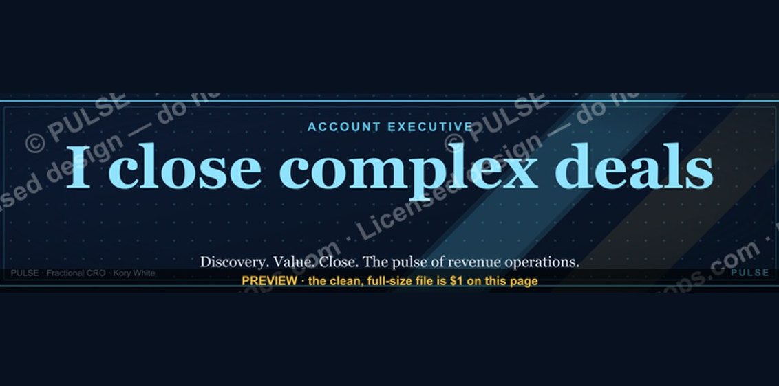 graphicAccount Executive — LinkedIn Banner
 graphic"Pipeline is the product." — LinkedIn Banner
 graphicSpeech-to-Text Operator — LinkedIn Banner
 graphicOffensive Security Pentest CRO — LinkedIn Banner
 graphicVector Database CTO — LinkedIn Banner
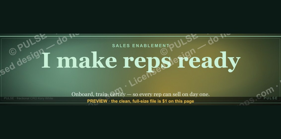 graphicSales Enablement — LinkedIn Banner
 graphicVP of Sales — LinkedIn Banner
 graphicFaster deals, fewer leaks. — LinkedIn Wallpaper
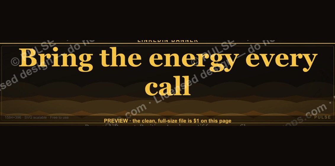 graphic“Bring the energy every call.” — LinkedIn Banner
 graphicStartup Founder — LinkedIn Banner