


Turn interest into revenue. — LinkedIn Wallpaper
Quality
Certified

A LinkedIn wallpaper turns interest into revenue only as a conversion surface: it catches the attention your posts and outreach already earned, states who you help and what happens next, and hands the visitor a single action. Treat it as the banner above your funnel — clarity there raises profile-to-conversation rates measurably.
The outcome you should expect
Set expectations honestly before you design anything. A banner is not a demand-generation channel. It generates zero impressions on its own. Every view it receives is borrowed from something else — a post that circulated, a comment someone noticed, a cold message that made a prospect curious enough to click your name, a recruiter working a search string, a conference attendee checking you out before a meeting. The wallpaper sits at the end of those journeys, not the start.
What changes when the banner is good is the *conversion rate of profile visits into conversations*. That is the entire mechanism. If 400 people land on your profile this month and 6 of them message you, your profile-to-inbound rate is 1.5%. A banner that clearly names the audience and the outcome, and points at one next step, tends to move that number rather than move traffic. Practitioners who instrument this properly usually report a lift in the fractional-percentage-point range on inbound rate — meaningful when your traffic is already substantial, invisible when it isn't. Ten profile views a month times any conversion rate is still approximately zero conversations.
So the outcome to expect is leverage, not lift. If your posting cadence, comment activity, or outbound motion already drives a few hundred profile views monthly, the banner compounds them. If it doesn't, fixing the banner is optimizing a landing page nobody visits. This is the same logic RevOps applies to website CRO: you don't A/B test button colors on a page with 40 sessions a quarter, because you'll never reach significance and the effort is better spent upstream.
There's a second outcome worth naming, and it's underrated: qualification. A vague banner attracts undifferentiated interest — students, vendors, job seekers, people who liked one post. A specific banner ("Revenue operations for 20–200-person B2B SaaS") repels people outside that description and pre-frames the ones inside it. Your inbound volume may stay flat or even dip while the *quality* climbs. If you measure only message count, you'll misread that as failure. Measure booked calls with in-profile prospects instead, or better, measure sourced pipeline.
The third outcome is compounding trust across touchpoints. Your banner shows up in search result previews, in some notification surfaces, and above every visitor's first impression of your headline and About section. Consistency between the banner promise, the headline, the featured section, and your actual posts creates coherence. Incoherence — a banner promising "scale your outbound" over a feed of vacation photos — creates a small friction cost on every visit. Nobody bounces because of it explicitly; they just don't reach out.
What drives that outcome
Four variables do nearly all the work, and they interact.

Specificity of audience. The single highest-leverage line on any professional banner names who it's for. "I help revenue teams grow" is noise. "Pipeline forecasting for Series B sales orgs" is a filter. The visitor should be able to determine in under two seconds whether the page is about them. Specificity feels like it shrinks your market; in practice it's what makes strangers self-identify. A generalist banner requires the reader to do the mapping work, and readers don't do work for strangers.
A stated outcome, not a stated service. "Salesforce implementation" describes labor. "Clean pipeline data your CFO will actually trust" describes a result. Buyers shop for results and only tolerate labor. The tagline "Turn interest into revenue" works precisely because it's an outcome — it names the gap between attention and money, which is a gap almost every commercial operator feels. If you adopt an outcome line, make sure your profile can substantiate it below the fold, or the banner writes a check the rest of the page can't cash.
One next step. The most common failure is offering three. A website, a newsletter, a calendar link, a lead magnet, and a phone number crammed into 396 pixels of vertical space produces paralysis and, worse, illegibility on mobile. Pick the single action that matters most for your current goal. Job hunting? Point at your featured case-study PDF. Consulting? Point at a booking link. Building an audience? Point at the newsletter. One arrow.
Legibility under real conditions. LinkedIn's cover slot is 1584 × 396 pixels at 4:1, but that's the desktop canvas, not the visible area. Your profile photo overlaps the lower-left region, the mobile crop is dramatically tighter than the desktop view, and LinkedIn applies its own scaling. Anything critical placed in the outer thirds or the bottom-left is at risk. Design inside a conservative center band, keep headline type large — think 48px-plus at native size — and check the render on an actual phone before you accept it. High contrast matters here for the same reason it matters in email design: you don't control the viewing environment.
Underneath all four sits a fifth variable that isn't visual at all: proof. A banner claim is only as strong as the evidence directly below it. Featured section with a case study, recommendations from named clients, posts that demonstrate the thinking — these convert the banner's promise into credibility. Treat the banner as the headline of a landing page and the rest of the profile as the body copy. Headlines don't sell alone.
Benchmarks and realistic ranges
Be skeptical of any precise multiplier attached to banner design, including in the source material for this page. LinkedIn doesn't expose banner-level analytics, so no one can isolate the banner's effect from headline changes, posting cadence, or seasonality. What you *can* do is build your own baseline and read the deltas honestly.
Start with the metrics LinkedIn actually gives you. Profile views over a rolling 90-day window are your denominator. Search appearances tell you how often you surfaced in results — a proxy for headline and keyword quality, not banner quality. Connection acceptance rate you compute yourself: requests sent versus accepted, tracked in a spreadsheet, because the platform won't do it for you. Inbound message volume you count manually, filtering out recruiters and vendors if those aren't your target.
Reasonable ranges to anchor against, understanding these vary enormously by role, network size, and industry:
- Profile-to-inbound conversion for an active operator with a defined niche generally lands in the low single-digit percentages. Anything above 5% usually means your traffic is highly pre-qualified — warm referrals, not cold discovery.
- Connection acceptance rate for a personalized request to a relevant persona commonly sits somewhere between a third and half. Generic mass requests fall far below that. A credible banner is one of several trust signals that nudges this, alongside a real photo and a coherent headline.
- Time from profile view to first message, when it happens at all, is usually same-session or never. People don't bookmark you and come back. This is why the next step must be visible immediately.
- Cycle length from LinkedIn-sourced conversation to closed revenue mirrors your normal sales cycle, plus the trust-building lag of an unreferred relationship. If your average deal takes 60 days from qualified conversation, expect LinkedIn-sourced deals to take at least that, often longer.
For measurement, put UTM parameters on every link the banner references — you can't link from the banner image itself, so this means the link in your featured section, your website field, or your contact info. Something like ?utm_source=linkedin&utm_medium=profile&utm_campaign=banner-cta lets your analytics separate profile-driven clicks from post-driven ones. Then attribute in your CRM: a lead source picklist value for "LinkedIn — inbound" distinct from "LinkedIn — outbound" is the difference between knowing your banner works and guessing.
The A/B test most people want to run is not really available. You can't split-test a LinkedIn banner the way you'd test a landing page — there's one version live at a time, no traffic splitting, no significance calculation. What you can run is a sequential test: hold everything else constant for 30 days on version A, log the numbers, switch to version B for 30 days, log again. This is a weak experimental design contaminated by seasonality and your own posting behavior, and you should treat the result as directional at best. If the difference is dramatic — inbound doubles — believe it. If it's 8%, that's noise.
A realistic financial frame: if your average deal is $15,000 and a banner improvement adds one qualified conversation a month that converts at your normal rate, the annual value is a few deals. That's a strong return on an afternoon of design work. It is not a business model, and anyone selling banner design as a revenue channel is overselling it.
Risks, edge cases, and failure modes
Over-promising. The fastest way to burn a profile visit is a banner claim your content contradicts. "3x your pipeline in 90 days" above an empty activity feed reads as a stock phrase someone bought. Sophisticated buyers — the ones with budget — are the most sensitive to this. Under-promise in the banner and over-deliver in the featured section.

Mobile destruction. The most common technical failure. A design that looks balanced at 1584 × 396 on a laptop gets center-cropped and scaled on a phone, and roughly half your visitors are on mobile. Text placed near the edges vanishes. Small type becomes unreadable. Always preview on a device before committing. If you can only make one design decision well, make it "large type, dead center, huge contrast."
Profile photo collision. Your avatar overlays the banner's lower-left. Anything you place there — a logo, a phone number, a tagline — will be partially or fully obscured, and the exact overlap shifts between desktop and mobile layouts. Leave that quadrant empty by design, not by accident.
Template smell. Free banner templates circulate widely. If your banner looks like the same gradient-plus-cityscape everyone else in your industry is running, it signals "I did the LinkedIn optimization checklist" rather than "I'm good at my job." Distinctiveness is cheap: one unusual color, one honest photograph, one line of copy nobody else would write.
Compliance and employer conflict. If you work for a company, a banner that promotes your side consulting practice can create real friction with your employer, particularly in regulated industries where personal social profiles fall under supervisory review. Financial services, healthcare, legal, and government-adjacent roles frequently have policies on this. Check before you publish. The revenue from a side gig rarely justifies an HR conversation.
Claims that create legal exposure. Naming client logos without permission, quoting testimonials you don't have written consent for, or displaying certifications you no longer hold are each avoidable problems. Logo permission in particular is routinely assumed and rarely granted — most master service agreements have a clause about it.
Optimizing the wrong layer. The deepest failure mode is spending three weeks on a banner while your actual constraint is that you post twice a year. Interest has to exist before you can convert it. If profile views are flat and low, the banner is not your bottleneck; visibility is. Diagnose in order: are people seeing you at all → are they visiting your profile → are they taking action. Fix the earliest broken stage.
Stale offers. A banner advertising a webinar that happened last spring, or a role you left, does active damage — it says nobody's home. Put a recurring calendar reminder to review it quarterly, and always update it the same day your positioning changes.
Ambiguous audience creep. As your work broadens, there's a pull toward broader banner copy so you don't exclude anyone. Resist it. If you genuinely serve two distinct audiences, choose the one with the higher-value pipeline for the banner and serve the other through content and direct outreach.
A practical rollout plan
Treat this like any other conversion-surface change: baseline, ship, measure, iterate. The whole cycle takes about ten weeks, most of which is waiting.
Week 0 — baseline. Before touching the design, record your current numbers: 90-day profile views, search appearances, inbound messages in the last 30 days (categorized: prospect, recruiter, vendor, other), and booked calls sourced from LinkedIn. Write them in a spreadsheet with the date. Without this you will have opinions instead of evidence.

Week 1 — positioning. Write the copy before opening a design tool. Three lines: who it's for, what outcome you produce, what to do next. Say them out loud. If any line could appear on a competitor's profile unchanged, rewrite it. Then check that the rest of your profile substantiates all three — headline, About, featured section, recent posts. Fix incoherence here rather than papering over it with graphics.
Week 2 — design and technical check. Build at 1584 × 396. Keep critical content in a conservative center band, well inside the safe area. Avoid the lower-left avatar zone. Headline type large and high-contrast; test the design in both light and dark interface modes, since LinkedIn supports both and a design tuned for one can lose legibility in the other. Export as PNG when the design is text-heavy — text edges stay crisp — or JPEG at high quality when it's photographic. Compress before uploading; there's no reason to ship a multi-megabyte file. Preview on a real phone. Then preview it again after upload, because the platform's own processing can shift things.
Weeks 3–6 — hold everything else constant. This is the discipline that makes the measurement mean anything. Don't simultaneously change your headline, start a new posting cadence, or launch an outbound campaign. Log the same metrics weekly.
Weeks 7–10 — read and decide. Compare against baseline. Look specifically at the ratio of inbound messages to profile views, not the raw count, and segment by whether the sender matches your target persona. If quality rose and volume fell, that's usually a win. If nothing moved and your profile view count is low, your constraint is upstream — go fix visibility and stop tuning the banner.
Once the banner is settled, the adjacent work is where the compounding actually happens. The banner converts profile visits; posts and comments create them; your featured section and recommendations close the trust gap; your CRM captures the result. Each layer has its own bottleneck, and the banner is usually the smallest of them. Run the same baseline-ship-measure discipline on the layer that's actually constraining you, and the wallpaper quietly does its job in the background.
Related questions
Can I put a clickable link in my LinkedIn banner?
No. The cover image is not a hyperlink, and typed URLs in the image aren't clickable. Route people to the website field, your featured section, or the contact card instead, and reference that destination visually in the banner so the path is obvious.
What size should a LinkedIn banner be?
1584 × 396 pixels, a 4:1 ratio, is the desktop canvas. The visible area is smaller and varies by device — mobile crops considerably tighter, and your profile photo overlaps the lower-left. Keep everything essential centered and well inside the edges.
How often should I change my banner?

Review it quarterly, and always update it the day your positioning, role, or offer changes. Stale content — a past event, a former title — costs credibility. Frequent cosmetic churn accomplishes nothing; changes tied to a real shift in what you sell do.
Does a custom banner help with LinkedIn search ranking?
No. Search visibility is driven by text: headline, About section, skills, job titles, and activity. Images aren't indexed for relevance. The banner affects what happens after someone finds you, not whether they find you.
Should a company page banner follow the same rules?
Same principles, different dimensions and audience. Company pages skew toward employer brand and product positioning rather than a personal offer. The one-clear-next-step rule holds, but the next step is usually a careers page or product tour rather than a booking link.
FAQ
Does a LinkedIn wallpaper directly generate revenue?
Not directly. It converts existing attention into conversations, and conversations into opportunities. Revenue attribution runs through your CRM, not through the image. If nobody is visiting your profile, an excellent banner produces exactly nothing — visibility is the upstream constraint and it has to be solved first.
Do I need a designer, or will a template work?
A template is fine if you customize the copy, colors, and layout enough that it doesn't read as stock. The copy matters more than the craft. A plainly designed banner with a sharp, specific line about who you help outperforms a beautiful one that says "Passionate about growth."
Should I include a photo of myself in the banner?
Only if it adds context your headshot doesn't — speaking on stage, working on-site, presenting to a room. A second portrait next to your avatar is redundant. When in doubt, use the space for words. Words are what make a stranger self-identify as your buyer.
What if I serve several different audiences?
Pick one for the banner — the segment with the highest deal value or the clearest path to close — and serve the others through posts, articles, and direct outreach. Trying to address multiple audiences in 396 pixels of height produces copy so hedged that none of them recognize themselves in it.
How do I know whether the banner is actually working?
Baseline your inbound-per-profile-view ratio before the change, then hold every other variable constant for a month and compare. Segment inbound by whether the sender matches your target persona. Improved quality with flat volume is a win, not a failure, and it's the most common good outcome.
Is there any risk to putting a commercial offer in my banner?
Two real ones. If you're employed, check your company's policy on personal branding and outside work, particularly in regulated industries with supervisory review of social profiles. And avoid client logos or testimonials you lack written permission to use — that permission is usually governed by a clause in the contract.
Sources
- https://www.linkedin.com/help/linkedin/answer/a570397 — LinkedIn Help Center, profile background photo requirements
- https://business.linkedin.com/marketing-solutions/blog — LinkedIn Marketing Solutions Blog
- https://hbr.org/topic/subject/personal-branding — Harvard Business Review, personal branding coverage
- https://www.nngroup.com/articles/how-users-read-on-the-web/ — Nielsen Norman Group on scanning behavior and reading patterns
- https://www.w3.org/WAI/WCAG21/Understanding/contrast-minimum.html — W3C WCAG contrast requirements
- https://support.google.com/analytics/answer/10917952 — Google Analytics UTM campaign parameter reference
- https://www.pewresearch.org/internet/fact-sheet/social-media/ — Pew Research Center, social media usage data
- https://contentmarketinginstitute.com/ — Content Marketing Institute, research and guidance
Related on PULSE
This page will be disappearing soon. Save it to your device for $1 — or read it free while it is here.
@Kory-White- · if Venmo asks, the last 4 of my number are 2012
This page is gone.
This one is off the shelf now. $1 keeps it on your phone for good — the whole page, pictures and diagrams included.
 graphicSales Coach — LinkedIn Banner
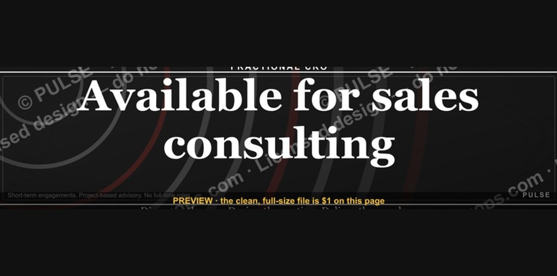 graphic“Available for sales consulting.” — LinkedIn Banner
 graphicCommercial Director — LinkedIn Banner
 graphic“More pipeline, less panic.” — LinkedIn Banner
 graphic“Open to sales leadership roles.” — LinkedIn Banner
 graphicFaster deals, fewer leaks. — LinkedIn Wallpaper
 graphic“Never give without a get.” — LinkedIn Banner
 graphicSpeech-to-Text Operator — LinkedIn Banner
 graphicSales Ops Analyst — LinkedIn Banner
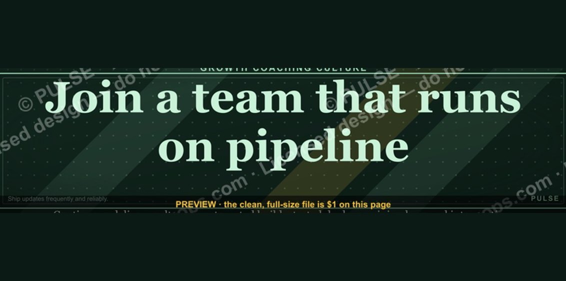 graphic“Join a team that runs on pipeline.” — LinkedIn Banner