


Build the revenue engine. — LinkedIn Wallpaper
Quality
Certified
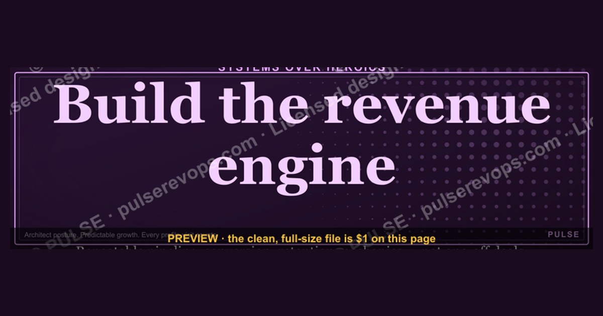
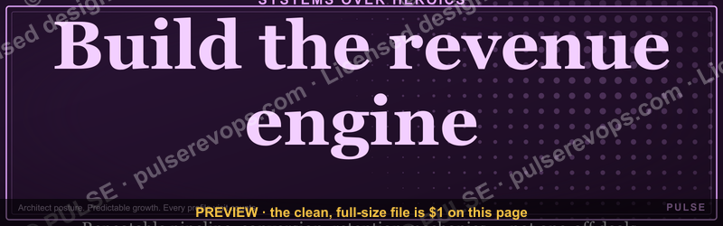
"Build the revenue engine." as a LinkedIn Wallpaper is a 1584×396 cover banner that broadcasts a systems-first identity. It signals that you design repeatable pipeline, conversion, and retention mechanics rather than chasing one-off deals — framing every profile visit around predictable growth for buyers, candidates, and investors.
What it is and why it matters
A LinkedIn cover image occupies the widest uninterrupted piece of visual real estate on your profile. It sits above the fold on desktop, renders on mobile at a cropped ratio, and appears every single time someone checks you out before a first call. That means it is not decoration — it is a positioning statement that gets impressions you never paid for. A Wallpaper carrying the line "Build the revenue engine." does one specific job: it tells the visitor, in under a second, that you think in systems.
The distinction matters more than it sounds. There are roughly two postures a revenue professional can project. The first is the hunter posture — quota crusher, closer, deal-maker. The second is the architect posture — someone who builds the machine that produces deals whether or not any individual is in the room. Both are legitimate, but they attract different opportunities. The hunter posture attracts AE and enterprise-seller conversations. The architect posture attracts RevOps, Head of Growth, CRO, and fractional-advisory conversations, plus founders who are past the "we need one more rep" stage and into "why is our pipeline unpredictable."
The mechanics of the format shape what you can say. At 1584×396 you have a 4:1 letterbox — nearly cinematic. That aspect ratio punishes paragraphs and rewards a single short line with generous negative space. "Build the revenue engine." is four words and fits comfortably at large type even after LinkedIn's mobile crop trims the left and right edges. Anything longer than about six or seven words starts to shrink below comfortable mobile legibility, and anything positioned near the far edges risks being cut. A safe practice is to keep all critical text and marks inside the middle ~60% of the canvas horizontally, and away from the bottom-left corner where the profile photo overlaps on desktop layouts.

Format choice matters downstream. An SVG is a vector file: infinitely scalable, tiny in file size, and editable — you can open it in Figma, Illustrator, Canva, or even PowerPoint and change the colors, swap the wordmark, or retype the line. A PNG is a fixed raster, which is what LinkedIn actually wants for upload. The practical workflow is keep the SVG as your master, export a PNG at exactly 1584×396 (or 3168×792 for a 2× retina render that downsamples cleanly), and upload the PNG. This gives you a reusable source you can re-skin for a rebrand, a new role, or a seasonal campaign without starting over.
Why does any of this connect to actual revenue? Because profile views are a top-of-funnel surface that most sellers waste. If you run outbound, every prospect who gets your connection request or InMail checks your profile before responding — that's a documented behavioral pattern in social selling. The cover image is the largest thing they see. If it reinforces the same message as your headline, your featured section, and your outbound copy, you get message consistency across three touchpoints in one glance. If it's the default blue gradient, you get nothing. The Wallpaper is cheap leverage: one asset, made once, working on every impression thereafter.
There's a second, quieter function — the reminder function. Founders and revenue leaders spend most of their week inside tactical noise: a stalled deal, a broken sequence, a rep who missed. A banner that says "Build the revenue engine." is a standing prompt to zoom out. Every time you open your own profile, you get asked whether today's work was engine-building or wheel-spinning. That's a small nudge, but small nudges applied daily are how operating disciplines actually stick.
The step-by-step process
Getting from "I want this banner" to "it's live and doing work" is a short, concrete sequence. Here is the full path, including the parts people skip.
Step one — decide the message before the design. Do not start in a design tool. Write the one sentence you want a stranger to believe about you after two seconds. "Build the revenue engine." works when you actually do systems work. If you're a quota-carrying AE in a transactional motion, a line about pipeline discipline or territory ownership may land better. Mismatched banners read as borrowed language, and buyers are unusually good at spotting that.
Step two — grab the source file. Take the SVG rather than the PNG if you intend to change anything at all. The SVG carries the text as editable elements and the shapes as paths, so recoloring is a matter of changing fill values rather than repainting pixels.
Step three — recolor to your brand. If a color picker is available on the asset, use it: set the accent to your primary brand color and the background to your dark neutral. If you're editing manually, open the SVG in a text editor and find the fill= attributes — they're plain hex values. Swapping #0F1115 for your own near-black and the accent hex for your brand color takes about ninety seconds and produces a banner nobody else on LinkedIn has. Keep contrast high: light text on a dark field is the safest bet because LinkedIn renders profile chrome in white and your banner needs to hold its own against it.
Step four — add your identity, sparingly. One optional line — your name, your company, or a URL — placed in the safe zone. Resist the urge to add a phone number, three certifications, and a QR code. The 4:1 ratio makes clutter look like clutter immediately.
Step five — export correctly. PNG, exactly 1584×396, under 8 MB. If your export tool offers it, render at 2× and let the downsample sharpen the type. Check the file on a phone before you upload — mobile crop is where most banners fall apart.
Step six — upload and inspect. On LinkedIn: profile → camera icon on the cover area → upload → adjust the crop frame → apply. Then immediately view your own profile on mobile, on desktop, and in the small preview that appears in search results. Three surfaces, three different crops.
Step seven — align the surrounding copy. A banner that says "Build the revenue engine." next to a headline that says "Sales Professional | Open to Work" fights itself. Rewrite the headline to match the posture: something like "RevOps — building predictable pipeline systems for B2B teams." Then make your featured section carry one artifact that proves it — a framework, a teardown, a short post about a system you fixed.
Step eight — extend it past the profile. The same source file becomes an email signature strip, a Slack banner, a deck cover slide, a Zoom background, or a Notion header. One design decision, six surfaces. That's the actual return on spending an afternoon getting it right, and it's the part almost nobody does.
Costs, timelines, and typical ranges

The banner itself is close to free. A pre-made SVG downloaded from a free graphics library costs nothing and takes under five minutes to upload as-is. Recoloring it to your brand and exporting a PNG is a fifteen-to-thirty-minute job in Canva or Figma, both of which have free tiers sufficient for this. If you commission a custom banner from a freelance designer, typical marketplace pricing for a single social cover sits in the low tens to low hundreds of dollars depending on the designer's tier and whether you want source files and revisions included. A full brand-kit engagement covering banners across every team member's profile plus deck templates lands well north of that and is usually only worth it once you have a team large enough for consistency to matter — call it ten or more customer-facing people.
The timeline for the *asset* is measured in minutes. The timeline for the *thing the asset points at* — an actual revenue engine — is measured in quarters. This is the gap where people get frustrated. Putting "Build the revenue engine." on your profile takes an afternoon. Building one that survives your absence takes considerably longer, and the honest ranges look roughly like this.
Months zero to three: instrumentation. You are getting clean data before you optimize anything. That means CRM hygiene, a defined stage model where each stage has an exit criterion rather than a vibe, and consistent activity logging. Most teams discover in this window that their historical conversion data is unusable because reps were skipping stages or backdating closes. Expect the first month to feel like archaeology rather than engineering.
Months three to six: first repeatable motion. One channel, documented end to end, producing a predictable enough number that you can forecast within a reasonable band. Not every channel — one. Trying to stand up outbound, inbound, partner, and community simultaneously at this stage is the single most common way to end up with four half-built pipes and no measurable one.
Months six to twelve: handoff and ramp compression. The test is whether a new hire can reach productivity meaningfully faster than the previous cohort because the process is written down. If your ramp time hasn't moved, your "engine" is still tribal knowledge in a senior rep's head.

Months twelve to eighteen: retention and expansion mechanics. Onboarding sequences with defined value milestones, health scoring, renewal motions that start well before the renewal date, and expansion plays that a CSM can run without escalating. For most subscription businesses this is where the compounding actually lives, because acquiring a new customer costs meaningfully more than expanding an existing one.
On tooling spend: a CRM at the low end runs tens of dollars per seat per month; mid-market suites run into the low hundreds per seat. Conversation intelligence, sales engagement, and enrichment tools each add their own per-seat line. A reasonable discipline is that tooling should follow process, not precede it — buying a conversation-intelligence platform before you have a documented call structure just gives you recordings of an undefined process. If you can't say what decision a tool will change, you're not ready to buy it.
On headcount: a dedicated revenue operations hire typically becomes defensible once you have enough sellers and enough systems that the coordination tax exceeds what a part-time owner can carry. Before that, fractional or contract RevOps support is common and considerably cheaper than a full-time senior hire. The signal to watch is not revenue size in isolation — it's how many hours per week your best closer spends on reporting, routing, and data cleanup instead of selling.
Where teams get it wrong
The most frequent failure is treating the banner as the accomplishment. A Wallpaper announcing a revenue engine while your forecast is a spreadsheet updated the night before the board call is a credibility liability, not an asset. Buyers and candidates who talk to you will find the gap in one conversation. Make the claim you can defend.

The second failure is design-side and purely mechanical: ignoring the mobile crop. LinkedIn does not render the cover identically across surfaces. Desktop shows a wider slice with the profile photo overlapping the lower-left. Mobile crops tighter. If your line is centered and your logo sits at the far right edge, there is a real chance mobile visitors see a headless banner with half a wordmark. Always preview on a phone. Always keep critical elements inside the middle band.
Third: low contrast. Dark-gray text on a mid-gray gradient looks sophisticated on a calibrated monitor and disappears on a phone in daylight. High contrast is not unrefined — it is functional. If you squint at a thumbnail of your banner and can't read the line, the design failed regardless of how it looks at full size.
Fourth, and this is the strategic one: message fragmentation across the profile. The banner says systems, the headline says closer, the About section is three paragraphs of career history in chronological order, and the Featured section is empty. Each element is fine alone; together they say nothing. The fix is boring and effective — pick one posture and make all four surfaces state it. Consistency across a profile does more for how you're perceived than any single element's polish.
Fifth: the same trap applied to the engine itself — building four channels at once. Founders see a competitor's podcast and start one, hear about outbound and hire three SDRs, read about community and open a Slack. Six months later there are four channels, none instrumented well enough to know which is working, and a budget spread so thin that no channel gets the iteration cycles it needs to mature. The discipline is uncomfortable: pick the channel that best fits your deal size and buying motion, drive it until it produces the clear majority of your pipeline, and only then add a second.

Sixth: optimizing the top of the funnel while the bottom leaks. It is enormously more satisfying to generate more leads than to fix a demo that doesn't convert or an onboarding that loses customers in month two. But pouring volume into a leaky process just increases the absolute number of losses while flattering your activity metrics. If win rate is falling, more leads make the chart look busier and the business no healthier. Diagnose from the bottom up: retention first, then close rate, then conversion, then volume.
Seventh: no cadence. A revenue engine that gets reviewed quarterly is not an engine, it's a report. The rhythm — a weekly pipeline review, a midweek look at a single conversion stage, a short Friday retrospective on what was lost and why, a monthly channel audit, a quarterly rethink of the ideal customer profile — is what turns a diagram into an operating system. The banner is the reminder; the calendar is the enforcement.
Eighth, a smaller one: never updating the asset. If you switched from outbound-led to product-led six months ago and your banner still says something else, it's now a lagging indicator of your own strategy. Treat the cover image as versioned. When the focus changes, re-export.
Decision framework: when to choose what
Choosing a banner line is a smaller version of choosing a positioning, so the decision runs on the same inputs: who you want to attract, what you can defend, and what stage your motion is actually in.
Start with audience. If your profile's main visitors are prospects in an active buying cycle, the banner should reduce their risk — signal competence and credibility, not personality. If your visitors are mostly recruiters and hiring managers, the banner should compress your value into a role-shaped claim. If your visitors are founders and peers because you publish, the banner can carry a point of view, because a point of view is what earns follows.
Then check defensibility. Any claim on a cover image is an invitation to be asked about it on a call. "Build the revenue engine." invites "so how would you build ours?" If you have a crisp forty-five-second answer with a diagnostic sequence behind it, the banner is doing exactly its job — pre-loading the conversation you want. If you'd fumble that question, choose a line closer to what you've genuinely done.

Then match your stage. Pre-product-market-fit, founder-led selling is the motion and the banner should probably reflect the product or the problem, not the operating system, because there isn't one yet. Post-fit with an early team, "build the revenue engine" is precisely right — it's the work in front of you. At scale, the interesting line moves from *build* to something about efficiency, retention, or unit economics, because building is behind you.
Format and reuse are the last input. If you want one banner for yourself, download, recolor, ship. If you want a consistent team look, keep an SVG master with clearly named layers, define a two-color palette, and give everyone the same file with a slot for their name. Consistency across a team's profiles is a surprisingly strong signal to buyers who research more than one person before a meeting — it reads as an organized company.
One more decision worth naming: whether to use a stock banner at all versus commissioning something custom. A recolored free asset is genuinely fine for the vast majority of individual profiles — nobody has ever lost a deal because a cover image came from a template library. Custom becomes worth it when the banner is doing brand work rather than personal-positioning work: a whole go-to-market team, a conference push, a funding announcement. Below that threshold, spend the afternoon on the headline and the Featured section instead. Those are read more carefully than any image.
Related questions
What size should a LinkedIn cover image be?
1584 × 396 pixels, a 4:1 ratio, under 8 MB. Export at 2× (3168 × 792) if your tool supports it for sharper type after downsampling. PNG uploads most reliably; keep an SVG master for future edits.
Will a custom banner actually get me more inbound?

Not on its own. It raises conversion on traffic you already generate — profile views from outbound, content, and search. Pair it with a matching headline and one proof artifact in Featured; the combination moves reply rates, not the image alone.
Should the banner mention my company or just me?
If you're building personal reach that outlasts one employer, lead with your positioning and keep the company reference small. If you're actively selling and the company brand carries weight with your buyers, feature it. Either way, one identity element, not three.
Can I use the same wallpaper across my whole team?
Yes, and it's a strong signal. Keep one SVG master, lock the palette, and give each person a name slot. Buyers who research several people before a meeting read the visual consistency as organizational discipline.
How often should I change it?
When your strategy changes, not on a schedule. A banner that still describes last year's motion is a lagging indicator of your own thinking. Re-export when your focus, role, or market posture genuinely shifts.
FAQ
What does "Build the revenue engine" actually mean in practice?
It means designing a connected system — demand generation, qualification, a documented sales process, onboarding, retention, and expansion — where each stage has a defined input, a defined exit criterion, and a measurable output. The test is not whether revenue grows this quarter; it's whether growth continues predictably when any single person steps away.

Who is this wallpaper for?
Founders past founder-led selling, revenue leaders standing up process, RevOps practitioners, and fractional advisors. It fits people whose value is the system rather than individual deal heroics. A transactional closer will usually get more out of a line about pipeline ownership or territory results.
SVG or PNG — which do I actually upload?
Upload the PNG; LinkedIn's cover slot expects a raster image. Keep the SVG as your editable master so you can recolor, retype, or re-export for a rebrand without redoing the design. Vector master, raster delivery, is the standard workflow for any social asset.
Do I need a full-time RevOps hire to build a real engine?
Not at the start. Fractional or contract support is common and far cheaper early on. The signal that you need a dedicated hire is coordination tax — when your best sellers are spending significant weekly hours on reporting, routing, and data cleanup rather than selling, the role pays for itself.
What's the single biggest mistake in building a revenue engine?
Buying tools before defining process, or scaling volume into a funnel that leaks at the bottom. Both feel like progress and produce activity metrics that look healthy. Fix retention and close rate before you increase lead flow; otherwise more volume just multiplies losses.
Does this apply outside B2B software?
The principle does; the tactics don't transfer cleanly. Longer, committee-driven B2B cycles reward account-based plays and rigorous qualification. High-volume consumer motions reward automation, rapid testing, and cohort analysis. Both need a repeatable, instrumented system — they just instrument different stages.
Sources
- https://www.linkedin.com/help/linkedin/answer/a570397 — LinkedIn Help: adding and editing a profile background photo
- https://business.linkedin.com/marketing-solutions/blog — LinkedIn Marketing Solutions blog on profile and brand presence
- https://hbr.org/topic/subject/sales — Harvard Business Review sales and revenue strategy coverage
- https://www.gartner.com/en/sales — Gartner research on sales operations and revenue technology
- https://www.salesforce.com/blog/ — Salesforce blog on CRM practice, pipeline, and revenue management
- https://www.mckinsey.com/capabilities/growth-marketing-and-sales/our-insights — McKinsey growth, marketing, and sales insights
- https://www.forrester.com/blogs/category/b2b-marketing/ — Forrester B2B marketing and revenue process research
- https://www.figma.com/resource-library/ — Figma resource library on vector editing and export workflows
- https://developer.mozilla.org/en-US/docs/Web/SVG — MDN reference on SVG structure and fill attributes
Related on PULSE
- "Help us build the revenue engine." — LinkedIn Banner
- Build the system — RevOps Mindset Banner
- "Build, don't chase." — LinkedIn Banner
- "Build your sales career with us." — LinkedIn Banner
- "Ready to build pipeline for you." — LinkedIn Banner
- "Build, don't chase." — LinkedIn Banner
This page will be disappearing soon. Save it to your device for $1 — or read it free while it is here.
@Kory-White- · if Venmo asks, the last 4 of my number are 2012
This page is gone.
This one is off the shelf now. $1 keeps it on your phone for good — the whole page, pictures and diagrams included.
 graphic“Clarity closes.” — LinkedIn Banner
 graphicSell outcomes, not features. — LinkedIn Wallpaper
 graphicWhat do top-performing graphic designers do differently in 2027?
 graphicRevOps Manager — LinkedIn Banner
 graphic“Great reps are coached, not born.” — LinkedIn Banner
 graphic“Stay in the deal.” — LinkedIn Banner
 graphicInspect. Qualify. Commit. — LinkedIn Wallpaper
 graphicVector Database CTO — LinkedIn Banner
 graphic“Revenue for marketing tech.” — LinkedIn Banner
 graphic“Bring the energy every call.” — LinkedIn Banner