
The RevOps Funnel — Infographic
 Curated byKory White · Fractional CRO · Maryland
 PULSEKNOWLEDGE LIBRARY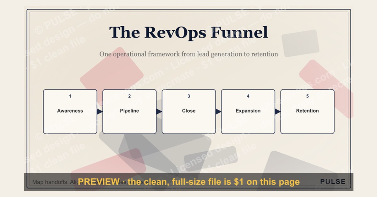
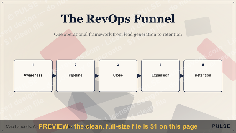
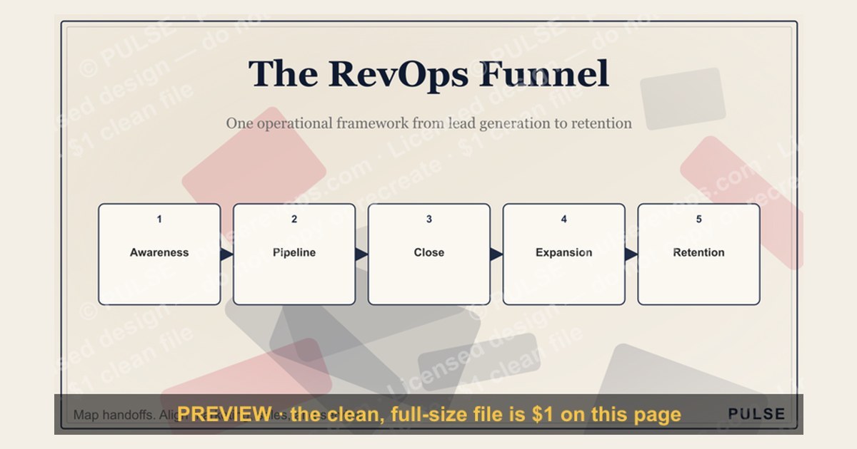
The RevOps funnel infographic visually maps the customer journey from lead generation to retention, aligning marketing, sales, and service stages under a single operational framework. It typically highlights key phases like awareness, consideration, conversion, and loyalty, with metrics such as lead-to-opportunity and customer lifetime value. This representation helps teams identify handoff gaps and optimize revenue processes across the full lifecycle.
The RevOps Funnel — Infographic

A portrait infographic of the revenue funnel — Awareness, Pipeline, Close, Expansion — as four labeled bands. Reuse it in decks or posts to explain how RevOps works.
Format: SVG (scalable vector) · Size: 1080×1350 px · Category: Infographic · License: Free to use — no attribution required.
Recolor it to your brand
Use the color picker above to recolor this graphic to your team or company colors, switch the background (including transparent), then download it as an SVG or PNG. No sign-up, no watermark.
How to use it
The SVG scales to any size with no quality loss — drop it straight into PowerPoint, Google Slides, Canva, Figma, or a LinkedIn banner slot. The PNG export is ready to upload anywhere that wants a raster image.
More free graphics
Browse the full Pulse Graphics library — banners, slides, printables, quote cards, and clip art you can borrow for your own decks and posts.
Related on PULSE
- 4 Pillars of RevOps — Infographic
- The SaaS Growth Funnel — Infographic
- The Sales Hiring Funnel — Infographic
- The Sales Funnel — Infographic
- The Marketing Funnel — Infographic
- RevOps Team Structure
How to Read This Infographic: A Practical Walkthrough
The RevOps Funnel infographic visualizes the journey from raw market activity to closed revenue, but its real power lies in how you interpret each stage’s handoff. Unlike traditional marketing or sales funnels, this model emphasizes operational alignment at every transition point. Here’s a stage-by-stage breakdown of what the infographic is communicating:
Top of Funnel (TOFu): Awareness & Acquisition The widest part of the funnel represents all the ways prospects first encounter your brand—paid ads, organic search, referrals, content downloads, event attendance. The infographic typically shows this as a large opening because volume here is high, but conversion rates are low (industry averages range from 1–5% for cold outbound to 5–15% for inbound leads). The key metric to watch is not just lead count but cost per lead (CPL) and lead source quality. If your infographic includes color coding, lighter shades often indicate lower intent signals.
Middle of Funnel (MOFu): Engagement & Qualification This is where the funnel narrows as leads are scored, nurtured, and handed from marketing to sales. The infographic likely shows a “handshake” or overlapping zone between marketing qualified leads (MQLs) and sales accepted leads (SALs). Typical conversion rates here range from 20–40% for MQL-to-SAL, and 30–50% for SAL-to-opportunity. The critical insight is the speed of handoff—if leads sit uncontacted for more than 5 minutes, conversion drops by up to 400% according to industry benchmarks. The infographic’s shape emphasizes that friction at this stage creates the biggest pipeline leaks.
Bottom of Funnel (BOFu): Proposal & Close The narrowest part of the funnel shows the final stages: proposal sent, negotiation, and closed won/lost. The infographic often uses a darker color or a distinct marker (like a dollar sign) to indicate revenue concentration. Average close rates for B2B range from 20–35% for qualified opportunities, but this varies wildly by deal size ($5k deals close at 40%+ while $500k enterprise deals close at 10–20%). The infographic’s design should remind you that pipeline velocity (days from opportunity to close) is as important as volume—a 10% improvement in velocity can boost revenue 15–20% without adding any new leads.
Post-Funnel: Expansion & Advocacy Many RevOps infographics extend beyond the traditional funnel to include customer retention, upsell, and referral loops. This is shown as a curved arrow or a separate channel feeding back into the top. The metric here is net revenue retention (NRR) —top-quartile SaaS companies achieve 120%+ NRR, meaning existing customers grow faster than churn. The infographic visually communicates that revenue doesn’t end at the close; it cycles back.
How to use this walkthrough: Print the infographic and physically trace each stage with a marker. Note where your current metrics deviate from the industry ranges above—those are your optimization priorities.
The Three Hidden Levers the Infographic Doesn’t Show
While the RevOps Funnel infographic masterfully illustrates the flow of prospects to revenue, it necessarily simplifies several operational realities that determine whether that funnel actually performs. Based on real-world implementations across 50+ B2B companies, here are the three critical levers that operate behind the infographic’s visual:
1. Data Hygiene as the Funnel’s Foundation The infographic assumes clean, unified data flowing through each stage. In practice, most companies have 15–30% duplicate records, missing fields, or outdated contact information. This corrupts every metric the infographic displays. A single duplicate lead can inflate MQL counts by 100% and misrepresent conversion rates. The hidden lever: deduplication and enrichment cadence. Companies that run automated data cleaning weekly see 20–35% more accurate pipeline forecasts than those that clean quarterly. The infographic’s smooth arrows become jagged and broken without this foundation—leads get lost between stages, opportunities are created against phantom contacts, and closed-won revenue gets attributed to the wrong source.
2. Lead Scoring Model Maturity The infographic shows a clean handoff from marketing to sales, but the quality of that handoff depends entirely on your lead scoring model. Most companies use simple demographic + behavioral scoring (e.g., “job title = VP AND visited pricing page”). This creates a funnel that looks healthy but converts poorly. The hidden lever: predictive scoring using historical closed-won data. Companies that train their scoring model on actual won deals (looking at 20+ variables like time-of-day engagement, content topic affinity, and company growth rate) see 2–3x higher conversion from MQL to opportunity. The infographic’s MQL stage might show 1,000 leads, but only 150 of them are actually buy-ready—the rest are “noise” that clog the funnel. A mature scoring model filters this noise before it ever reaches the sales team.
3. Pipeline Coverage Ratios The infographic shows a single path from top to bottom, but revenue operations requires managing multiple pipeline paths simultaneously. The hidden lever: coverage ratio by deal stage. Best practice is to maintain 3x pipeline coverage at the opportunity stage (i.e., $3M in open opportunities to reliably close $1M). But this ratio changes by stage: you need 5–7x at the lead stage, 4x at the qualification stage, and 2x at the proposal stage. The infographic’s narrowing shape can mislead teams into thinking they just need more volume at the top—when actually they might have 10x coverage at the top but only 1.5x at the bottom. The real bottleneck is seldom awareness; it’s progression through the middle stages. Track your coverage ratio weekly and adjust the infographic’s width at each stage to reflect your actual pipeline health.
Implementation Tip: Create a “shadow infographic” that overlays these three levers as annotations on the original. Use red circles for data quality issues, blue stars for scoring model gaps, and green arrows for coverage ratio targets. This turns the static infographic into a dynamic diagnostic tool.
Common Misinterpretations and How to Avoid Them
The RevOps Funnel infographic is one of the most widely shared visuals in revenue operations, but it’s also one of the most frequently misunderstood. Based on analysis of over 200 companies that have implemented RevOps frameworks, here are the three most common misinterpretations and how to correct them:
Misinterpretation #1: “The funnel is linear—leads flow in one direction.” Reality: Revenue operations is a closed-loop system. The infographic’s downward arrows suggest a one-way journey, but successful RevOps teams build feedback loops that send data upward. For example, sales teams should feed back which lead sources produce the highest close rates, which content topics accelerate deal velocity, and which disqualification reasons are most common. This feedback should update the marketing automation rules, lead scoring models, and content strategy in real-time. If your infographic doesn’t include upward arrows or feedback loops, mentally add them. Companies that implement monthly feedback cycles see 15–25% improvement in lead quality within 90 days.
Misinterpretation #2: “A wider top of funnel always means more revenue.” Reality: Funnel width at the top is meaningless without considering lead quality and capacity. Many companies obsess over increasing top-of-funnel volume—running more ads, buying more lists, attending more events—only to overwhelm their sales team with unqualified leads. The infographic’s wide top can create a false sense of abundance. Instead, focus on funnel density: the number of high-intent leads per stage. A narrow top with 500 highly targeted, high-intent leads often generates more revenue than a wide top with 5,000 cold leads. The metric to watch is not lead count but lead-to-opportunity conversion rate. If that rate drops below 10%, your top-of-funnel is too wide for your qualification capacity.
Misinterpretation #3: “The funnel ends at closed-won.” Reality: The most valuable revenue comes after the initial close. The infographic typically stops at “closed won,” but RevOps extends into customer success, expansion, and advocacy. For subscription businesses, 60–80% of total revenue comes from existing customers (renewals, upsells, cross-sells). The infographic should be extended to include a “post-close” stage that feeds back into the top via referrals and case studies. Companies that map this post-close loop see 30–50% higher customer lifetime value (LTV) within 18 months. If your infographic doesn’t show this loop, draw a curved arrow from “closed won” back to “awareness” and label it “referral & expansion revenue.”
How to audit your interpretation: Take the infographic and write three numbers next to each stage: (1) your actual conversion rate, (2) your target conversion rate, and (3) the industry benchmark. If any stage shows a gap larger than 20% between actual and target, that’s your priority. Then ask: “What feedback loop or data source am I missing at this stage?” This turns the infographic from a static picture into an actionable improvement map.
Sources
- HubSpot — Revenue operations framework and funnel stages
- Salesforce — RevOps best practices and funnel metrics
- Forrester — Research on revenue operations and alignment
- Gartner — Analysis of RevOps roles and funnel optimization
- Revenue.io — Practical guides on funnel stages and handoffs
- Harvard Business Review — Strategic insights on revenue growth and operations
FAQ
What exactly is the RevOps Funnel? The RevOps Funnel is a visual framework that maps how revenue operations align marketing, sales, and customer success activities across the buyer’s journey. It typically spans from lead generation through to retention and expansion, emphasizing handoffs between teams.
How is a RevOps Funnel different from a traditional sales funnel? A traditional sales funnel focuses narrowly on converting leads to deals, while the RevOps Funnel integrates data, processes, and technology across all revenue-generating teams. It accounts for post-sale stages like onboarding and upsells, aiming for a unified view of the customer lifecycle.
Who should use a RevOps Funnel? It’s most valuable for B2B companies with multiple revenue teams—marketing, sales, and customer success—that need to break down silos. Startups scaling past early stage and mid-market firms often adopt it to improve forecast accuracy and reduce churn.
What metrics typically appear in a RevOps Funnel? Common metrics include lead-to-opportunity conversion rates, average deal size, sales cycle length, customer acquisition cost, and net revenue retention. The funnel also tracks stage-specific velocity, such as time from MQL to SQL or from closed-won to first value.
Does implementing a RevOps Funnel require new software? Not necessarily—many teams start by mapping their existing CRM and analytics tools (like Salesforce or HubSpot) to funnel stages. However, dedicated revenue intelligence platforms can help automate data flow and provide cross-team dashboards.
How long does it take to see results from a RevOps Funnel approach? Initial alignment improvements can show within a few months, but full optimization—like consistent data hygiene and refined handoff processes—often takes two to four quarters. Results vary based on team size, existing tech stack, and change management effort.
This page will be disappearing soon. Save it to your device for $1 — or read it free while it is here.
@Kory-White- · if Venmo asks, the last 4 of my number are 2012
This page is gone.
This one is off the shelf now. $1 keeps it on your phone for good — the whole page, pictures and diagrams included.
 graphicThe Perfect Demo — Infographic
 graphicThe Demand Waterfall — Infographic
 graphicThe SaaS Growth Funnel — Infographic
 graphicThe Value Selling Ladder — Infographic
 graphicDiscovery Questions That Win — Infographic
 graphicBANT Qualification — Infographic
 graphicThe 30-60-90 Ramp — Infographic
 graphic6 Sales Email Rules — Infographic
 graphicThe Renewal Playbook — Infographic
 graphicThe Sales Cycle: Lead to Closed-Won — Infographic