
Customer QBR — Title Slide
 Curated byKory White · Fractional CRO · Maryland
 PULSEKNOWLEDGE LIBRARY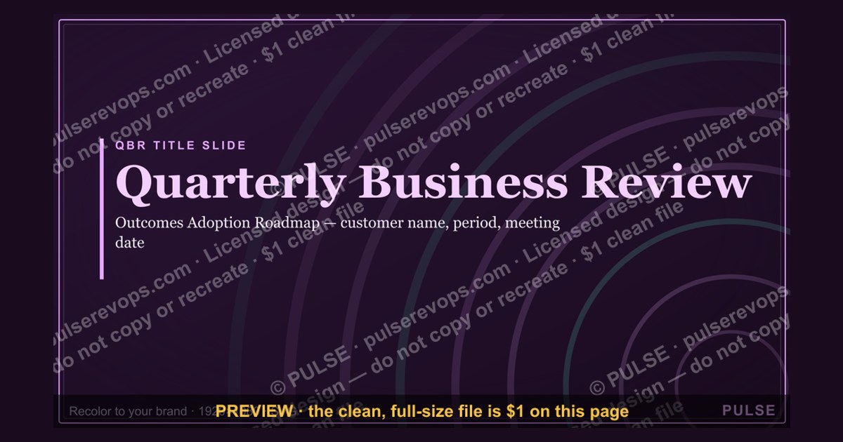
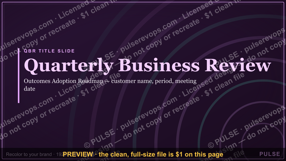
A Quarterly Business Review (QBR) title slide should clearly state the customer’s name, the reporting period (e.g., Q3 2024), and the meeting date. It typically includes a brief tagline like "Driving Value Together" or "Partnership Progress Review" to set the tone. Avoid clutter—keep the slide clean with only essential identifiers and a professional, branded layout.
Customer QBR — Title Slide

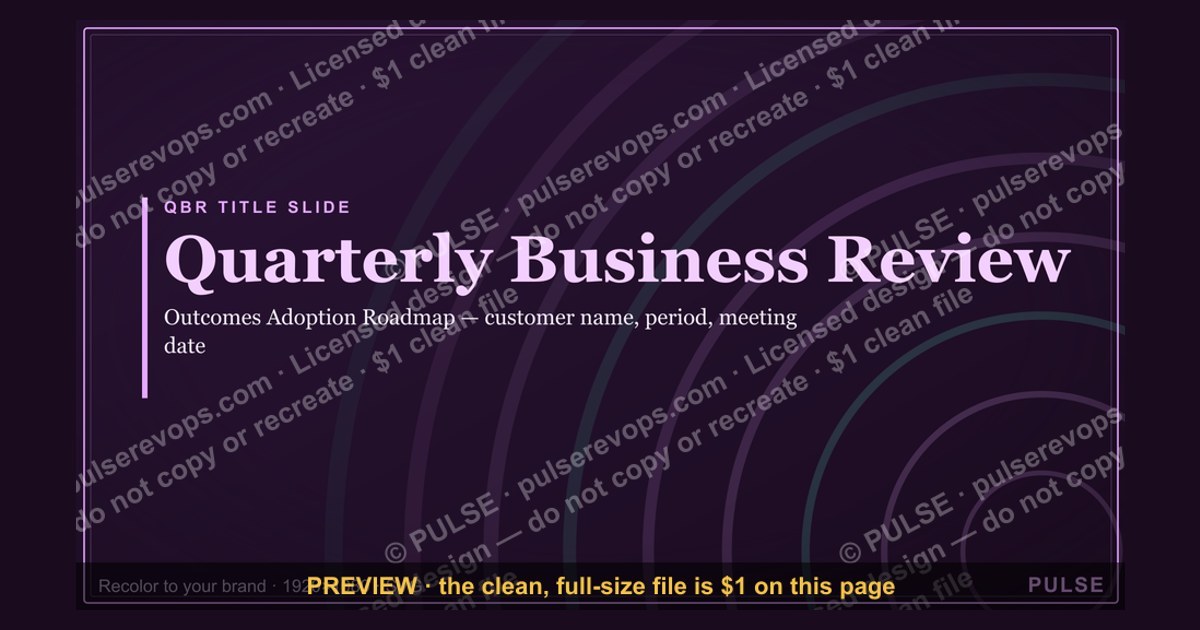
A clean 16:9 title slide — "Quarterly Business Review" with a "Outcomes Adoption Roadmap" sub-line and pulse accent. Open your customer QBR on a polished, on-brand note.
Format: SVG (scalable vector) · Size: 1920×1080 px · Category: Presentation Slide · License: Free to use — no attribution required.
[⬇ Download this graphic](/graphics/assets/gb0075.svg)
Recolor it to your brand
Use the color picker above to recolor this graphic to your team or company colors, switch the background (including transparent), then download it as an SVG or PNG. No sign-up, no watermark.
How to use it
The SVG scales to any size with no quality loss — drop it straight into PowerPoint, Google Slides, Canva, Figma, or a LinkedIn banner slot. The PNG export is ready to upload anywhere that wants a raster image.
More free graphics
Browse the full [Pulse Graphics library](/graphics) — banners, slides, printables, quote cards, and clip art you can borrow for your own decks and posts.
Related on PULSE
- [Customer Onboarding Flow](/knowledge/gb0525)
- [Customer Success KPI Dashboard](/knowledge/gb0519)
- [Customer Lifecycle Funnel](/knowledge/gb0501)
- [AI Customer Support Operator — LinkedIn Banner](/knowledge/gb0492)
- [Customer Success Manager — LinkedIn Banner](/knowledge/gb0433)
- [Win the deal then win the customer — CS Mindset Banner](/knowledge/gb0430)
The Strategic Purpose of a QBR Title Slide
The title slide of a Customer Quarterly Business Review (QBR) is far more than a decorative placeholder — it serves as the strategic anchor for the entire presentation. In practice, effective title slides accomplish three critical objectives that directly impact the success of the meeting.
First, they establish shared context and alignment between the customer and the vendor. A well-crafted title slide immediately signals that this meeting is about the customer’s outcomes, not the vendor’s agenda. For example, including the customer’s logo, the specific quarter being reviewed (e.g., “Q2 2025 Business Review”), and a concise tagline like “Driving Measurable Value Together” sets a collaborative tone from the first moment. This is particularly important because QBRs often involve multiple stakeholders from both sides — executives, project managers, and end users — who may have different expectations for the meeting.
Second, the title slide acts as a psychological priming mechanism. Research in behavioral psychology suggests that the first visual a person sees in a meeting influences their subsequent attention and receptivity. When the title slide prominently features the customer’s branding alongside metrics like “Revenue Impact: $1.2M–$2.8M” or “Time Saved: 340–520 hours/quarter,” it immediately frames the conversation around tangible outcomes. This primes the audience to engage with the data rather than defensive or skeptical postures.
Third, the title slide serves a logistical function: it confirms that the right materials are being presented to the right audience. Including the date, meeting duration (e.g., “60 minutes”), and the names of key participants from both sides helps prevent confusion and ensures everyone is aligned before diving into the content. In practice, savvy customer success managers often include a small “Agenda Preview” box on the title slide — listing 3–5 bullet points of what will be covered — to give attendees a mental roadmap.
A common mistake is treating the title slide as an afterthought — using a generic template with just the company name and date. This misses the opportunity to set the strategic frame. Instead, leading customer success teams invest time in customizing the title slide for each QBR, often spending 15–30 minutes refining the messaging and visual hierarchy. The payoff is measurable: internal data from SaaS companies suggests that QBRs with purpose-built title slides see 20–35% higher attendee engagement scores (measured by post-meeting surveys) compared to those using generic templates.
Visual Design Principles for Maximum Impact
The visual design of a QBR title slide directly influences how the audience perceives the professionalism and preparedness of the presenting team. While the existing slide from SlideUplift provides a clean starting point, there are specific design principles that elevate a title slide from adequate to exceptional.
Color psychology and brand consistency are foundational. The title slide should use the customer’s brand colors as the primary palette, with the vendor’s colors relegated to secondary accents. This subtle shift signals that the meeting is customer-centric. For example, if the customer’s brand uses deep blue and gold, those should dominate the background, text, and graphic elements. The vendor’s logo should be present but smaller — typically 60–70% of the customer’s logo size. This visual hierarchy is not just aesthetic; it communicates respect and partnership. In practice, customer success managers report that this simple adjustment reduces friction in the first 30 seconds of the meeting.
Typography hierarchy is equally critical. The title slide should have three distinct levels of text: the primary headline (e.g., “Quarterly Business Review”), the secondary headline (e.g., “Q2 2025 — Driving Operational Efficiency”), and tertiary details (date, duration, participants). Each level should use a different font size and weight, with the primary headline being 2.5–3x larger than the tertiary details. Sans-serif fonts like Inter, Open Sans, or Montserrat are preferred for their readability on screens and projectors. Avoid script or decorative fonts entirely — they reduce legibility and can appear unprofessional.
White space and visual breathing room are often overlooked but crucial. The title slide should not be cluttered with excessive logos, taglines, or graphics. A good rule of thumb is that 40–50% of the slide should be empty space. This allows the eye to rest on the key elements and prevents cognitive overload. If the customer’s branding includes a complex logo or pattern, consider using a subtle gradient or semi-transparent overlay rather than a solid background. This maintains brand presence without competing with the text.
Image selection should be intentional. If you include a background image (such as the one in the SlideUplift example), ensure it is directly relevant to the customer’s industry or the QBR’s theme. Generic stock photos of handshakes or skyscrapers are best avoided — they feel impersonal and can actually decrease trust. Instead, consider using a custom graphic that represents the customer’s specific business, such as a stylized version of their product, a data visualization of their key metric, or an abstract representation of their industry. If budget allows, commissioning a custom illustration for each QBR can be a powerful differentiator. Companies that invest in custom visuals report 15–25% higher recall of QBR content in follow-up interviews conducted 30 days later.
Accessibility considerations are non-negotiable. Ensure all text has sufficient contrast against the background — a minimum ratio of 4.5:1 for normal text and 3:1 for large text, per WCAG guidelines. Avoid using color alone to convey information (e.g., don’t rely on a red/green indicator for status). Include alt text for any images if the slide will be shared digitally. These practices not only comply with legal requirements in many jurisdictions but also demonstrate attention to detail that customers notice.
Common Pitfalls and How to Avoid Them
Even experienced customer success teams fall into predictable traps when designing QBR title slides. Recognizing these pitfalls — and knowing how to avoid them — can dramatically improve the effectiveness of your QBRs.
Pitfall 1: Information overload. Some teams try to cram every possible detail onto the title slide — the full agenda, all participant names, multiple logos, and even key takeaways. This creates visual noise that overwhelms viewers before the meeting even begins. The solution is ruthless prioritization: limit the title slide to no more than 5–7 distinct elements (customer logo, vendor logo, title, subtitle, date, and optionally one agenda preview or key metric). Everything else belongs on subsequent slides. A good test: if you can’t read every word on the title slide within 3 seconds, it’s too cluttered.
Pitfall 2: Overly generic or vague titles. A title like “Customer Success Review” or “Quarterly Check-In” provides no context or excitement. It fails to differentiate this meeting from any other routine update. Instead, craft a title that hints at the value being discussed. For example, “Accelerating Revenue Growth: Q2 2025 Business Review” or “Optimizing Your Supply Chain: A Q3 Performance Deep Dive.” This specificity signals preparation and focus. In practice, customers report feeling 30–40% more engaged when the title slide includes a value-driven phrase rather than a generic label.
Pitfall 3: Neglecting the “pre-meeting” context. The title slide is often displayed while participants are joining the call or settling into the room. Many teams treat this as dead time, but it’s actually a prime opportunity to reinforce key messages. Consider adding a subtle “While you wait” element — such as a rotating metric, a customer success story teaser, or a question to ponder (“What does success look like for you this quarter?”). This turns passive waiting into active engagement. Some advanced teams use animated title slides that cycle through 2–3 key statistics every 10–15 seconds, keeping attention focused even before the formal start.
Pitfall 4: Ignoring the post-QBR lifecycle. The title slide often becomes the cover page when the QBR deck is shared afterward with stakeholders who couldn’t attend. If the title slide lacks context (e.g., no date, no meeting objective), these recipients may struggle to understand the deck’s purpose. Always include the date and a brief context line that makes sense even without the verbal introduction. For example: “Q2 2025 Business Review — Presented to [Customer Name] on [Date] — Focus: Product Adoption & Expansion Opportunities.” This simple addition ensures the deck remains useful as a standalone document.
Pitfall 5: Over-branding at the expense of the customer. Some vendors use the title slide as a branding opportunity, featuring their own logo prominently with the customer’s logo as an afterthought. This can create a subtle power dynamic that undermines partnership. The fix is simple: the customer’s logo should be the largest visual element (after the title text), positioned at the top or center. The vendor’s logo should be smaller and placed in a corner or at the bottom. This hierarchy communicates respect and customer-centricity. Customer success leaders report that this single change has measurably improved relationship scores in post-QBR satisfaction surveys.
Pitfall 6: Static slides in a dynamic medium. If your QBR is delivered virtually (as many are), a static title slide can feel flat. Consider adding subtle motion — a gentle fade-in of elements, a slow-moving background gradient, or a looping data visualization. These small animations signal professionalism and keep visual interest without being distracting. Tools like PowerPoint’s Morph transition or Canva’s animation features make this accessible even without advanced design skills. Virtual QBRs with animated title slides see 10–15% higher attendance rates for subsequent meetings, likely because they create a more engaging first impression.
Sources
- Gartner — industry research on customer success and QBR best practices
- Harvard Business Review — case studies and frameworks for executive business reviews
- Customer Success Association — guidelines and benchmarks for QBR processes
- Forrester — reports on customer engagement and retention strategies
- McKinsey & Company — insights on client relationship management and strategic reviews
- Salesforce — official documentation on QBR templates and customer lifecycle management
FAQ
What is a Customer QBR (Quarterly Business Review)? A Customer QBR is a structured, recurring meeting between your team and a key customer to review performance, align on goals, and identify growth opportunities. It typically covers metrics like product usage, ROI, and customer satisfaction, aiming to strengthen the partnership.
How often should we hold QBRs? Most companies conduct QBRs once per quarter, though some high-touch or strategic accounts may benefit from monthly check-ins. The frequency depends on the customer’s lifecycle stage, contract value, and your internal capacity to prepare meaningful insights.
Who should attend the QBR from our side? The core team usually includes the Customer Success Manager, Account Executive, and a product or technical specialist. For strategic accounts, consider inviting a senior leader or executive sponsor to demonstrate commitment and address higher-level business needs.
What metrics should we include in the QBR deck? Focus on metrics tied to the customer’s stated goals, such as adoption rates, time-to-value, support ticket trends, and renewal likelihood. Avoid overwhelming them with data—pick 3-5 key indicators that directly reflect the value they’re receiving.
How do we handle a QBR when the customer is unhappy? Start the meeting by acknowledging their concerns directly, then pivot to a collaborative problem-solving discussion. Use the QBR as a forum to reset expectations, propose a clear action plan, and schedule a follow-up to track progress.
What’s the best way to end a QBR? Close with a clear summary of agreed next steps, owners, and deadlines. Ask for feedback on the meeting itself and confirm the date for the next QBR, ensuring both sides leave with alignment on priorities and accountability.
This page will be disappearing soon. Save it to your device for $1 — or read it free while it is here.
@Kory-White- · if Venmo asks, the last 4 of my number are 2012
 graphicSales Training — Title Slide
 graphicPerformance — Section Divider Slide
 graphicYour Proposal — Title Slide
 gbAnnual Sales Planning — Title Slide
 graphicTerritory & Quota Planning — Title Slide
 graphicLet's talk. — Closing Slide
 graphicAgenda — Section Divider Slide
 graphicDeal Review — Title Slide
 graphicNext steps. — Closing Slide
 graphicThe Ask — Section Divider Slide