
“Data beats opinions.” — LinkedIn Banner
 Curated byKory White · Fractional CRO · Maryland
 PULSEKNOWLEDGE LIBRARY
Quality
Certified
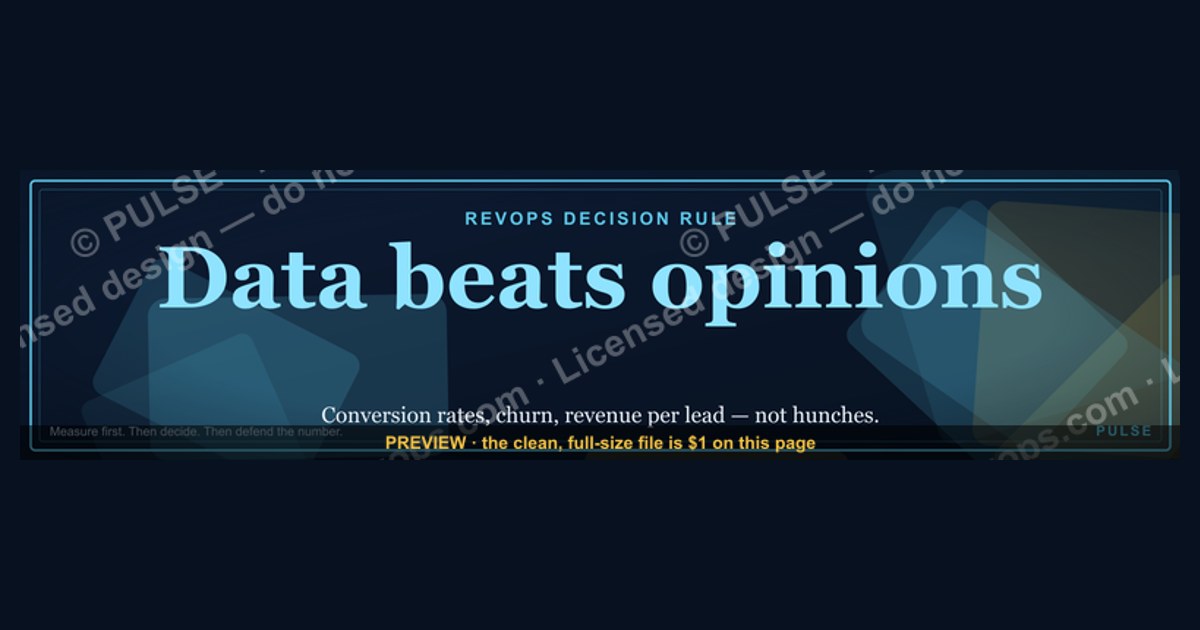
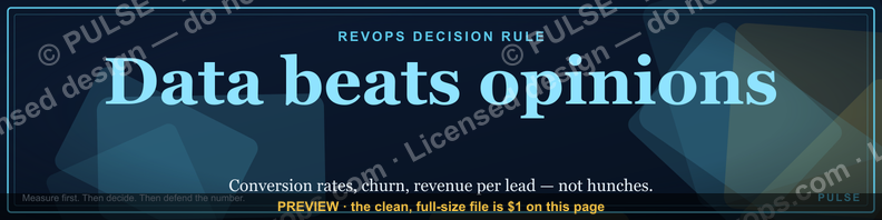
This is a LinkedIn profile banner, sized 1584×396 px, that carries the line "Data beats opinions." set in bold sans-serif type over a dark, low-contrast background, with a single accent rule anchoring the phrase. It's built for RevOps, analytics, and sales-ops professionals who want their profile to signal an evidence-first stance before a viewer reads a single post.
The two banner approaches worth comparing
There are really two workable ways to turn a short, punchy line like "Data beats opinions." into a LinkedIn cover image, and the choice matters more than most profile owners assume, because a banner lives behind your headline and photo for months at a time. The first approach is the minimalist, text-only banner: one phrase, one typeface, one background color, and nothing else competing for attention. The second is a data-motif banner, where the same phrase sits in front of a supporting visual element — a faint chart line, a scatter of dots suggesting a dashboard, or a thin grid pattern — that reinforces the message without illustrating anything literal.
The minimalist route wins on longevity and safety. A flat dark background with clean type never looks dated, never clashes with a profile photo, and renders identically whether the viewer is on a 27-inch monitor or a phone screen where LinkedIn crops the banner aggressively. It also loads fast, compresses cleanly, and never risks looking like a stock-photo cliché. The trade-off is that it can feel generic if the typography isn't distinctive — thousands of LinkedIn banners use white-text-on-navy, and a minimalist banner has to earn its plainness through a deliberate typeface choice, spacing, and a genuinely well-placed accent mark (an underline, a small dash, or a colon-and-quote treatment) rather than defaulting to whatever the design tool suggests first.

The data-motif route wins on personality and topical signal. If your audience is analysts, RevOps leads, or anyone who lives inside dashboards, a subtle chart-line or dot-grid texture behind the phrase does real work: it tells the viewer, in under a second, "this person's identity is built around measurement" before they've read the headline underneath. It's riskier for two reasons. First, any illustrative element has to stay genuinely subtle — low opacity, muted color, positioned so it never crosses the zone where LinkedIn's UI overlays your profile photo and name — or it turns the banner into visual noise. Second, a data motif ages less gracefully than flat color; chart styles that feel current now (thin-line area charts, dot-matrix textures) will eventually look like a specific design era the way skeuomorphic icons now look like 2012.
A third, hybrid option is worth naming even though it isn't one of the two primary paths: a minimalist background with one small, deliberate icon (a single upward arrow, a small bar-chart glyph) placed off to one side rather than behind the text. It captures some of the data-motif's topical signal while keeping the minimalist version's cleanliness and longevity, and it's the safest default for someone who isn't sure which of the first two options fits their personal brand.
How to decide between them
The decision mostly comes down to three questions: how technical is your audience, how often do you plan to refresh the banner, and how much visual restraint can you enforce on yourself once you start adding elements. Someone posting primarily to a RevOps, data, or analytics audience benefits more from the data-motif treatment because it reinforces the same theme their content already carries. Someone whose LinkedIn audience is broader — recruiters, cross-functional leaders, clients outside a technical function — is usually better served by the minimalist version, because "Data beats opinions." reads as a personal philosophy on its own, without needing a chart to prove the point.
Refresh cadence matters because a data-motif banner is more work to keep current; if you're the kind of profile owner who swaps banners seasonally or around campaigns, the flat minimalist version is cheaper to iterate on and re-color without redesigning a chart texture each time. And the restraint question is really a self-audit: if your instinct, once you start adding a chart line, is to also add a logo, a QR code, and a call-to-action, you're better off defaulting to minimalist and letting your headline text do the persuading instead.

Concrete numbers behind each option
LinkedIn's banner canvas is fixed at 1584×396 px, a 4:1 aspect ratio, and the platform accepts PNG or JPG files up to 8MB. Both the minimalist and data-motif approaches need to respect the same physical constraints, because the crop and overlay behavior is identical regardless of what's printed on the canvas.
The profile photo and name block sit on top of the bottom-left portion of the banner on desktop — roughly the leftmost 200–220px and bottom 120–140px of the canvas get partially covered, so any text or focal element placed there will be obscured for most viewers. On mobile, LinkedIn crops the banner more aggressively, generally showing only the vertical center band of the image, which means text centered too far left or right on the full 1584px width risks being cut off entirely for mobile viewers, who make up the majority of LinkedIn traffic. The safe zone practitioners typically use is roughly the middle 1000–1100px horizontally and the top two-thirds vertically — keeping your phrase inside that band means it survives both the desktop overlay and the mobile crop.
For a minimalist banner, a working spec looks like: background at a near-black charcoal (roughly #0B0D12 to #14161C) rather than pure black, which reads as more designed and shows less banding on compression; primary text in a bold sans-serif (weights in the 600–800 range read best at banner scale) sized around 64–84px for a six-word phrase like "Data beats opinions.", set with generous letter-spacing (roughly 1–2px extra tracking) so it doesn't feel cramped at banner width; and a single accent element — an underline rule 2–4px thick spanning 30–50% of the text width, or a small dash/quote mark — in one accent color (a muted gold, roughly #C9A227, or a single bright color that also appears elsewhere in your personal brand).
For a data-motif banner, the chart or dot texture should sit at 8–15% opacity relative to the background so it reads as texture rather than illustration, confined to the area behind or to the side of the text rather than overlapping it directly, and rendered in a color no more than one or two shades lighter than the background itself. Anything brighter competes with the text for attention and defeats the purpose of a supporting motif.

File weight matters more than people expect: a banner exported as PNG-24 at these dimensions typically lands between 150KB and 600KB depending on how much gradient or texture is present, comfortably under LinkedIn's 8MB ceiling, but a heavier file with unnecessary alpha channels or an embedded color profile can bloat past 2MB for no visual gain — flattening the image and exporting without an embedded ICC profile keeps it lean and avoids color-shift on upload.
Implementation details and sequencing
Building and shipping either version follows the same order of operations, and skipping steps is what causes the most common failure mode: a banner that looks perfect in the design tool but gets cropped or covered once it's live. Start by setting up the canvas at the full 1584×396px, not a scaled-down version — designing small and scaling up is what causes soft, blurry text once LinkedIn compresses the upload. Next, block in the safe zone visually (a light guide rectangle roughly matching the middle 1000px horizontally and top two-thirds vertically) before placing any text, so the phrase is composed inside the zone from the first draft rather than nudged into place afterward.
Place the phrase "Data beats opinions." next, choosing left-aligned or centered composition based on where your profile photo sits — since the photo overlaps the bottom-left, text that's centered or weighted toward the right two-thirds of the canvas avoids the overlap without needing to be pushed all the way to the edge. Add the accent mark (underline, dash, or single icon) after the text is finalized, not before, since accent placement should react to however the text line-wraps or kerns at final size.
Once composition is locked, flatten the file, strip any embedded color profile that isn't sRGB, and export as PNG for text-heavy banners (PNG preserves sharp type edges better than JPG's lossy compression, which can introduce visible artifacting around letterforms) — reserve JPG only for photo-heavy motif versions where file size is a bigger concern than edge sharpness. Upload it to the banner slot on your LinkedIn profile, then check it in two places before considering the job done: the desktop web view and the mobile app, since they crop and overlay differently and a banner that's correct on one can be wrong on the other. If either preview clips the text or buries it under the profile photo, go back to the composition step rather than trying to patch it with a crop after export — patch-cropping a finished file tends to reintroduce the same off-center problem in a new spot.
Finally, treat the banner as a living asset tied to your headline rather than a one-time upload: when the headline below it changes (new role, new focus area), revisit whether the banner's message — the same "Data beats opinions." positioning that beats a vague headline on its own — still matches, since a banner and headline that contradict each other read as inconsistent personal branding.
Related questions
What size should a LinkedIn banner be?
1584×396 px, a 4:1 ratio, exported as PNG or JPG under 8MB. Anything uploaded at a different ratio gets auto-cropped by LinkedIn, so designing at the native size avoids surprises.
Why does my LinkedIn banner look cropped on mobile?
LinkedIn's mobile app shows a narrower vertical band of the banner than desktop does. Text or logos placed near the top or bottom edges, or far left/right, often get cut off on phones even though they look fine on a laptop preview.
Should a LinkedIn banner match my headline?
Yes — a banner slogan like "Data beats opinions." works best when it reinforces, not contradicts, the headline directly below it. If the headline changes focus, revisit whether the banner still fits.
Can I use a chart or graph image as a LinkedIn banner background?
Yes, as a low-opacity motif behind text rather than a literal illustrated chart. Keep it muted (roughly 8–15% opacity) so it reads as texture and doesn't compete with the readability of the phrase on top of it.
FAQ
Is "Data beats opinions." a real LinkedIn banner I can download here? Yes — this page hosts a downloadable 1584×396 px PNG version of this exact banner, ready to upload directly to a LinkedIn profile's cover image slot.
What file format does LinkedIn require for banners? LinkedIn accepts PNG or JPG files for the profile banner, up to 8MB, and the canvas is fixed at 1584×396 px regardless of format.
Will the profile photo cover part of the banner text? On desktop, the profile photo and name overlap roughly the bottom-left corner of the banner, so text and accent marks are safest composed in the center-right two-thirds of the canvas.
Can I change the wording or colors on this banner for my own team? Yes — swap the phrase for your own team's slogan, adjust the accent color to match your brand, and re-export at the same 1584×396 px canvas so the proportions stay correct.
Does a text-only banner look less professional than one with graphics? Not necessarily — a minimalist banner with strong typography and one accent mark often reads as more deliberate than a busy banner, and it ages better since it isn't tied to a specific chart style or visual trend.
How often should a LinkedIn banner be updated? There's no fixed schedule, but it's worth revisiting whenever your headline, role, or focus area changes, since a banner and headline that send different messages undercut each other.
Sources
- https://www.linkedin.com/help/linkedin/answer/a541747
- https://www.linkedin.com/business/marketing/blog
- https://www.canva.com/create/linkedin-banners/
- https://sproutsocial.com/insights/linkedin-cover-photo/
- https://buffer.com/library/linkedin-cover-photo-size/
- https://www.adobe.com/express/create/banner/linkedin
- https://www.socialpilot.co/blog/social-media-image-sizes
Related on PULSE
- How to write a LinkedIn headline that signals a data-first mindset
- Choosing an accent color for personal-brand graphics
- Safe-zone design rules for social media cover images
- Turning a personal philosophy into a shareable graphic
- Sizing and exporting images for LinkedIn, Twitter/X, and other platforms
This page will be disappearing soon. Save it to your device for $1 — or read it free while it is here.
@Kory-White- · if Venmo asks, the last 4 of my number are 2012
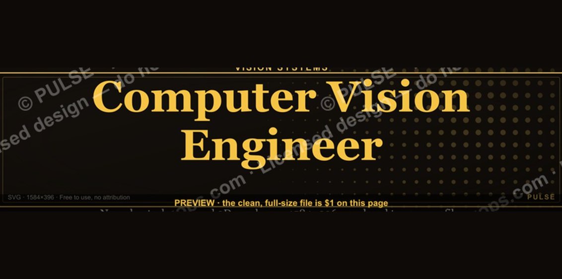 graphicComputer Vision Engineer — LinkedIn Banner
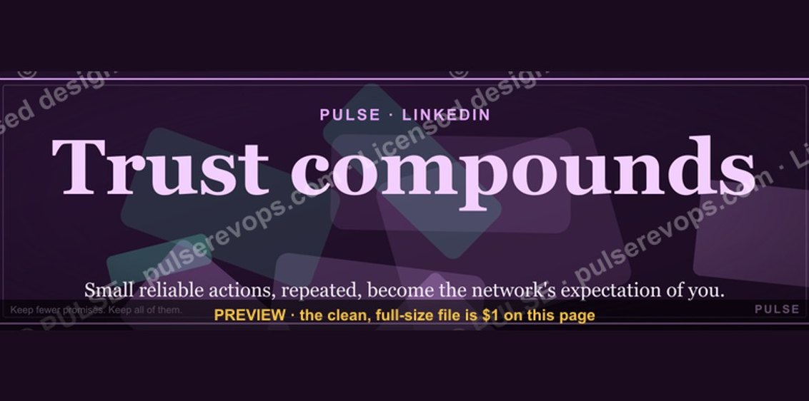 graphicTrust compounds. — LinkedIn Wallpaper
 graphic"Win the quarter." — LinkedIn Banner
 graphicPipeline Conversion Rate Funnel — Infographic in 2027
 graphic“Stay in the deal.” — LinkedIn Banner
 graphicLLM Builder AI Engineer — LinkedIn Banner
 graphicPredictable revenue, by design. — LinkedIn Wallpaper
 graphic“The next call is the most important one.” — LinkedIn Banner
 graphicHow to build a champion champion plan in 2027?
 graphic“Motion creates momentum.” — LinkedIn Banner