
Computer Vision Engineer — LinkedIn Banner
 Curated byKory White · Fractional CRO · Maryland
 PULSEKNOWLEDGE LIBRARY
Quality
Certified
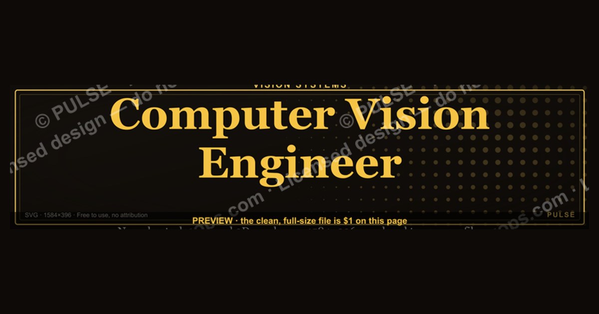
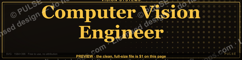
This is a 1584×396 pixel LinkedIn profile banner built for a Computer Vision Engineer: a dark, near-black backdrop carrying a lens-aperture and scan-line motif, with "COMPUTER VISION ENGINEER" set in a bold gold-on-charcoal serif across the right two-thirds and a short specialization tagline beneath it. Download it, drop it in as your LinkedIn cover image, and pair it with a headline naming your current stack or focus area.
What this banner is designed to do
A LinkedIn banner is not a resume and it is not a portfolio piece — it is a five-second billboard that sits behind your profile photo every time someone opens your page, views your comment, or sees you show up in a recruiter's search results list. For a Computer Vision Engineer, the job of this specific graphic is narrower than most people assume: it exists to answer one silent question before a visitor reads a single line of your About section — "does this person specialize in something I need?" The banner is doing pre-qualification work, not storytelling work.
That means the outcome you should expect from installing this banner is a shift in first impression, not a shift in inbound volume by itself. People who land on your profile from a targeted search (say, a hiring manager searching "computer vision" + "PyTorch" + "edge deployment") will see the title reinforced twice in the first two seconds — once in your headline text, once in the banner behind your photo. That redundancy is what banners are good at: confirming a match the visitor already suspected, not creating interest from nothing. If your headline says "Software Engineer" and the banner says "Computer Vision Engineer," you have created confusion, not clarity, so the two need to agree.

The realistic expected effect is qualitative and cumulative: fewer profile visitors who bounce because they can't tell what you do, a slightly higher rate of connection-request acceptance from people already working in vision/ML/robotics (because the banner reads as in-group signaling), and a small but real bump in how seriously a cold recruiter message lands, because the profile visually backs up the specialization claim in the message. It will not, on its own, generate interview requests, fix a thin About section, or compensate for a portfolio with no shipped projects. Treat it as the frame around the picture, not the picture.
There is also a secondary, quieter outcome worth naming: consistency signaling. A banner that is clearly custom-made for the specific title "Computer Vision Engineer" — rather than a generic LinkedIn default gradient — reads as someone who is deliberate about their professional presentation. Recruiters who review dozens of profiles a day pick up on that signal fast, even if they couldn't articulate why one profile "feels" more put-together than another.
What actually drives the design
The visual choices in this banner are not decorative for their own sake — each one is answering a constraint that comes from how LinkedIn renders the image and how a viewer's eye actually moves across it. Three forces shape the layout: LinkedIn's fixed crop geometry, the profile-photo overlap zone, and basic contrast/legibility rules that hold regardless of platform.
LinkedIn overlays your circular profile photo on top of the bottom-left portion of the banner on desktop, which is why almost no professional banner puts important text in that corner — anything placed there gets partially or fully covered. The safe working canvas is effectively the top strip and the right two-thirds of the image, which is exactly where the "COMPUTER VISION ENGINEER" wordmark sits in this design, clear of the overlap. On mobile, LinkedIn renders a narrower slice of the same image, cropping more aggressively top and bottom, so text and icons are kept close to the vertical center rather than near the top or bottom edge — a design mistake that trips up a lot of self-made banners is centering artwork for the desktop view and then losing the whole headline on a phone.
The visual motif — aperture rings, faint scan-lines, a suggestion of a bounding-box grid — exists to do subject-matter signaling without relying on stock photography of cameras or robots, which tends to look generic and interchangeable across a thousand other profiles. Abstract, technical-feeling geometry reads as "this person builds systems" without literally depicting a specific product, which also means the banner ages well; it won't look tied to one now-outdated camera model or one specific dataset visualization.
Color choice follows the same logic. Gold-on-near-black gives a contrast ratio well above the WCAG AA text minimum, which matters because LinkedIn's own UI chrome (the message button, the "More" button, your name in white or dark gray depending on theme) sits directly on top of parts of the banner on both desktop and mobile — a low-contrast, busy background makes those buttons harder to read and makes your name blend into the image instead of standing apart from it.
Sizing, safe zones, and realistic benchmarks
LinkedIn's documented spec for the cover/banner image is 1584 by 396 pixels, an aspect ratio of exactly 4:1, with a file size ceiling of 8MB and support for JPG, PNG, or GIF (GIF will be flattened to a static frame, so don't rely on animation). This banner is built at that native 1584×396 resolution rather than upscaled from a smaller source, which matters because LinkedIn does not meaningfully compress or resize a correctly-sized upload the way it does a mismatched one — a banner uploaded at, say, 800×200 and stretched will look visibly softer than one delivered at spec.
In practice, treat the canvas in three horizontal bands rather than one flat rectangle. The left band (roughly the first 300–350px) is the danger zone — this is where the circular profile photo sits on desktop, so anything placed there should be background texture only, never text, a logo, or a key visual element. The center band is the primary safe zone for a title or wordmark; it survives both the desktop crop and the tighter mobile crop, which is why the job title in this banner is anchored slightly right-of-center rather than dead center or left-aligned. The right band has room for a secondary element — a tagline, a small icon cluster, or your personal mark — but text placed in the far right 100px can crowd against LinkedIn's own overlay buttons on some screen widths, so a comfortable margin (40–60px) from the true right edge is worth keeping even though it isn't a hard LinkedIn rule.
Font size is the other benchmark worth being concrete about. At 1584×396, a title rendered under roughly 40px effective height tends to read as a thin gray smear once LinkedIn compresses the upload and a viewer sees it at typical browser zoom — this banner sets "COMPUTER VISION ENGINEER" at a weight and size designed to stay legible down to a phone-width render, which is the harshest real-world test case since a large share of LinkedIn browsing now happens in the mobile app rather than desktop.
Contrast is measurable, not a matter of taste: a gold (roughly in the #D4AF37–#E8C567 range) on a near-black background (around #0B0D10–#151515) produces a contrast ratio comfortably above 7:1, which clears even the stricter WCAG AAA threshold for normal text — useful headroom given that LinkedIn's own dark-mode and light-mode chrome shifts what sits behind and around your banner depending on the viewer's settings.
Where a title banner like this backfires
The most common failure mode is title drift: the banner says "Computer Vision Engineer," but the headline, About section, and most recent experience entry describe something adjacent but different — "ML Engineer," "Data Scientist," "Robotics Software Engineer." Visitors read profiles fast and pattern-match on the first inconsistency they notice; a banner that overclaims a specialization the rest of the profile doesn't back up reads as either inflated or confused, and either read costs you credibility with exactly the technical audience most likely to notice.
A second failure mode is over-narrowing during a job search. If you are actively open to roles that span computer vision, general ML, and MLOps, a banner that hard-commits to one narrow title can quietly filter out recruiters searching adjacent titles, or make a hiring manager for a broader ML role assume you're not a fit even when you are. This banner is the right choice when your target roles genuinely cluster around vision work — object detection, segmentation, SLAM, OCR pipelines, video analytics — and the wrong choice if you're deliberately keeping your search wide.
A third, more mechanical failure: uploading a banner that was designed at a different aspect ratio and letting LinkedIn's cropper decide what survives. A 16:9 or square source image cropped down to 4:1 unpredictably clips whatever was near the top or bottom, which is why a banner authored natively at 1584×396 — like this one — behaves predictably across every device, while a repurposed image from a slide deck or a square Instagram-style graphic usually does not.
A fourth failure mode is accessibility and print-through: some viewers use LinkedIn in dark mode, some in light mode, and a banner built with pure white text on a busy midtone photo background can lose contrast against certain overlay states. Sticking to a genuinely dark or genuinely light base — not a middling gray photo — avoids this, which is part of why an intentionally near-black background with a gold accent, rather than a photographic background, was chosen here.
Finally, don't treat the banner as a substitute for keyword optimization elsewhere on the profile. LinkedIn's internal search and Google's indexing of public profiles both weight text — headline, About, skills, experience — far more heavily than image content, since banner text isn't machine-readable the way profile text is. The banner earns you the human glance; the surrounding text earns you the algorithmic match.
Rolling it out on your profile
Installing the banner correctly is a five-minute task, but the sequence matters more than people expect, because LinkedIn caches banner renders across your network's feeds and search results for a period after upload, so getting it right the first time avoids a stretch of days where an outdated or misaligned version is what people actually see.
Start by downloading the PNG at its native 1584×396 resolution rather than a screenshot of the page preview, since a screenshot will be lower resolution and will reintroduce the exact softness the native-size export avoids. On your LinkedIn profile, open the pencil/edit icon on your existing cover image (or the camera icon if you have none set), upload the file, and use LinkedIn's built-in crop tool to confirm the preview — LinkedIn will show you roughly how the desktop crop looks, though it does not preview the tighter mobile crop, so it's worth opening the app on your phone immediately afterward to check that the title is still fully visible there too.
Before you save, cross-check the headline field directly below your name: it should either restate "Computer Vision Engineer" or extend it meaningfully ("Computer Vision Engineer, Robotics & Perception" or "Computer Vision Engineer — Autonomous Systems"), so the banner and the headline read as one coordinated claim rather than two different job titles competing for attention. Do the same gut-check against your most recent "Experience" entry's title field, since that's the third place a visitor's eye lands.
Give the change a day or two before judging it — LinkedIn's CDN and your connections' cached feed views don't always refresh instantly, so a banner that looks slightly off in someone's feed a few hours after upload is usually a caching artifact, not a real problem with the file. If it's still visibly wrong after 48 hours, re-upload rather than troubleshooting the cache further; a fresh upload forces a new cache entry.
Related questions
Should the banner match my LinkedIn headline exactly?
Not word for word, but the core title should agree. If the banner says "Computer Vision Engineer" and your headline says something unrelated, visitors read it as inconsistency rather than nuance, which costs more credibility than a slightly generic headline would.
Can I use this banner while actively job-searching for broader ML roles?
Only if computer vision is genuinely your strongest angle. A narrow title banner can filter out recruiters searching adjacent roles like "Machine Learning Engineer," so widen the banner's language if you want to stay eligible for both.
Does the banner affect LinkedIn or Google search ranking?
No — banner image text isn't indexed the way profile text is. It shapes human impression, not algorithmic matching; keyword placement in your headline, About, and skills sections drives search visibility instead.
What file size and format should I upload?
LinkedIn caps cover images at 8MB and accepts JPG, PNG, or GIF (GIF is flattened to a static image). A native-resolution PNG at 1584×396 gives the sharpest result without hitting that ceiling.
How often should I update a title banner like this?
Update it whenever your specialization or target role shifts meaningfully — for example, moving from general computer vision into a narrower niche like SLAM or video analytics — rather than on a fixed schedule.
FAQ
Is this banner customizable, or is the wording fixed? The layout is built to be edited: swap "COMPUTER VISION ENGINEER" for a more specific variant (for example, "Computer Vision Engineer — Autonomous Vehicles"), adjust the tagline, or restyle the accent color to match your personal brand, as long as you preserve the safe zones around the profile-photo overlap and keep text contrast high.
Why gold text on a near-black background instead of a brighter color scheme? High contrast (roughly 7:1 or better) keeps the title legible across LinkedIn's light and dark viewing modes and after the platform's own image compression, and a restrained palette avoids clashing with your profile photo, which sits directly in front of part of the banner.
Will this banner work if my profile photo is a bright, busy background? Yes, but check the overlap zone specifically — since LinkedIn crops your circular photo over the bottom-left of the banner, a busy photo background won't clash with banner text as long as the banner keeps that corner clear, which this layout does.
Can I add a company logo or certification badge to this banner? You can, but keep it small and place it in the right-third band away from the profile-photo overlap and away from the very edge where LinkedIn's UI buttons sit; a banner crowded with multiple logos and text elements reads as cluttered at the small sizes most viewers actually see it at.
Does LinkedIn support animated or video banners? No — cover images are static; an uploaded GIF is flattened to its first frame, so there's no benefit to sourcing an animated version of this design.
What happens if I upload a banner that isn't exactly 1584×396? LinkedIn will crop or scale it to fit the 4:1 ratio automatically, which is unpredictable and often clips text near the top or bottom — exporting at the native resolution avoids that entirely.
Sources
- https://www.linkedin.com/help/linkedin/answer/a542017
- https://webaim.org/resources/contrastchecker/
- https://www.w3.org/WAI/WCAG21/Understanding/contrast-minimum.html
- https://www.canva.com/create/linkedin-banners/
- https://www.adobe.com/express/create/banner/linkedin
- https://color.adobe.com/
- https://fonts.google.com/
- https://www.nngroup.com/articles/f-shaped-pattern-reading-web-content/
Related on PULSE
- Machine Learning Engineer — LinkedIn Banner
- Data Scientist — LinkedIn Banner
- AI Engineer — LinkedIn Banner
- Robotics Engineer — LinkedIn Banner
- How to write a LinkedIn headline for technical specialists
- LinkedIn profile photo best practices for engineers
This page will be disappearing soon. Save it to your device for $1 — or read it free while it is here.
@Kory-White- · if Venmo asks, the last 4 of my number are 2012
 graphicStay in the deal. — LinkedIn Wallpaper
 graphicReady reps win. — LinkedIn Wallpaper
 graphicCustomer Success — LinkedIn Banner
 graphicHow to find champions before the first call in 2027
 graphicPredictable revenue, by design. — LinkedIn Wallpaper
 graphic“Sell with the buyer, not at them.” — LinkedIn Banner
 graphic“Sell something people love.” — LinkedIn Banner
 graphic“Process over pressure.” — LinkedIn Banner
 graphicVector Database CTO — LinkedIn Banner
 graphicHead of Sales — LinkedIn Banner