
Predictable revenue, by design. — LinkedIn Wallpaper
 Curated byKory White · Fractional CRO · Maryland
 PULSEKNOWLEDGE LIBRARY
Quality
Certified
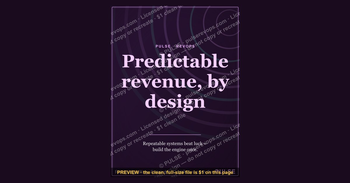
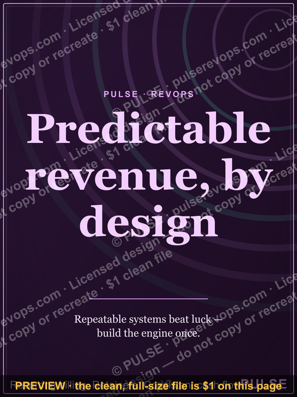
This is a LinkedIn banner that reads "Predictable revenue, by design." in gold serif type on a black field, built as a sales-floor print/poster at 1200x1600 px. It states a single operating belief: that Predictable revenue is engineered through process, not luck, and it is meant to sit where a LinkedIn-sourced pipeline gets built.
Two ways to run this Wallpaper: statement piece vs. working board
The Wallpaper works in one of two modes, and picking the wrong one is the most common reason a team prints it, hangs it, and then ignores it for a year.
Mode one: the statement piece. You print the graphic as-is. Gold serif on black, one sentence, no numbers, no names, no quarter. It goes on the wall behind the sales floor, in the hallway between the SDR pod and the AE desks, or in the room where pipeline reviews happen. Its job is cultural, not operational. Nobody reads it to find out what to do next. They read it walking in at 8:40am and it sets a frame: we are not here to chase spikes, we are here to build something that repeats. This mode costs you one print and about ten minutes of hanging. It survives reorgs, quota changes, and new hires because it never becomes stale — it doesn't reference a number that can be missed.
The trade-off is that a statement piece is easy to stop seeing. After three weeks it becomes wallpaper in the literal sense, which is exactly the risk the name implies. If your team is already aligned and the phrase matches how they actually talk, this mode is cheap and durable. If your team is not aligned, a statement piece does nothing but decorate a room where the real disagreement continues.
Mode two: the working board. You print the graphic and then treat the wall around it as a live surface. The poster stays as the header, and beneath or beside it you mount the actual mechanics: the pipeline coverage number, the stage-conversion rates, the week's sourced meetings, the slipped deals and why. Now the phrase is a title over evidence. The Wallpaper stops being a slogan and becomes the name of a review ritual — "walk the wall" — where a manager and a rep stand in front of it and reconcile what the poster claims against what the board shows.
This mode costs more. Someone has to own updating the board weekly, or it rots into a wall of stale numbers, which is worse than no board at all because it teaches the team that the metrics are theater. You also need a printing approach that lets you swap components: a fixed poster plus a magnetic or dry-erase zone, rather than a single laminated sheet you have to reprint every time a number changes.

The two modes are not mutually exclusive, but they are sequenced. Statement first, board second, and only if you have a manager who will actually run the ritual. A working board with no owner is just clutter with better typography.
How to decide between them
The decision is not about taste. It's about whether you have the operating cadence to keep a live surface honest.
Read the top of that tree honestly. Most teams answer "no" to the first question and should therefore print the statement piece and stop. That is a legitimate outcome, not a failure. A poster that says something true and stays out of the way is a better artifact than a metrics wall nobody trusts.
If you do answer yes to both, the working board has a specific failure mode worth naming up front: the numbers become a scoreboard for blame rather than a diagnostic. The moment a rep feels the wall exists to expose them, they stop putting real information into the CRM, and the board's inputs degrade within a quarter. The poster's phrasing helps here — "by design" points at the system, not the person — but only if the manager running the walk actually behaves that way. If your reviews already have a blame texture, fix that before you build the board.
There is a middle path worth considering: a quarterly board rather than a weekly one. You mount the poster plus four numbers that change once a quarter — sourced pipeline, win rate, average cycle length, coverage ratio. Low maintenance, still live, and it forces a quarterly conversation without demanding weekly discipline you may not have. For teams of five to fifteen reps, this is often the right size.

Concrete numbers behind each option
Print specs first, because getting these wrong is the difference between a poster that looks intentional and one that looks like an office printer accident.
The statement piece. At 1200x1600 px, the native aspect ratio is 3:4. That scales cleanly to a few standard print sizes:
- 12x16 inches — the direct 1:1 scale at 100 ppi. Good for a door, a cabinet, or a small pod wall. Readable from about 6 to 8 feet.
- 18x24 inches — the most common choice. This is a 1.5x scale, so you're printing at roughly 67 ppi from the source file. At that size, viewed from 4 to 6 feet, the gold serif headline reads fine but fine detail softens. If you can, re-export at 1800x2400 px rather than upscaling.
- 24x32 inches — a 2x scale. From 8 to 12 feet this is comfortable. Beyond that, the type starts to feel small relative to the wall.
- 36x48 inches — a 3x scale, and the practical ceiling for a 1200x1600 source. At this size you're at roughly 33 ppi, which is fine for a poster seen from 10 feet or more but will look soft if anyone walks up close. Use this only for a large open floor where the nearest viewer is far away.
The rule of thumb for wall graphics: 1 inch of cap height for every 10 feet of viewing distance, minimum. The headline on this poster is large relative to the canvas, so it holds up well past that minimum. The smaller text, if any, does not — so if you scale to 36x48, expect to lose anything below the headline.
Paper and mounting. For a sales floor, paper alone is a mistake. It wrinkles, it picks up glare under fluorescents, and it gets dinged by chairs. Three better options:

- Foam board, 3/16 inch. Cheap, rigid, light. Roughly the cost of a decent lunch per poster. Downside: it dents, and the edges crush. Good for a one-year lifespan in a low-traffic spot.
- Sintra or PVC board, 3mm. The workhorse. Wipeable, doesn't dent easily, holds up for years. Costs more than foam board but less than acrylic. This is what most sales floors should use.
- Acrylic or framed under glass. Highest cost, highest polish. Only worth it if the poster is in a client-facing area, not a working floor. On a working floor, glass glare under overhead lights is a genuine readability problem.
Matte finish, always. Gloss turns a black poster into a mirror. On a black field with gold type, gloss will reflect every ceiling light and window in the room, and the headline will disappear at exactly the angles people actually view it from. Matte or satin only.
The working board. Budget differently. You need the poster plus a surface. A 24x36 inch magnetic-receptive dry-erase board mounted below a 18x24 inch poster gives you roughly 864 square inches of live space, which is enough for four to six metrics with room for a "why" note under each. Add a magnetic strip set and a pack of fine-tip markers — fine tip, not chisel, because chisel tip on a wall board produces numbers too fat to read at a glance.
Refresh cadence and its cost: a weekly board takes about 15 to 20 minutes to update if the data is already in your CRM and you're just transcribing. If you're pulling numbers manually from three systems, it takes an hour, and that hour is why most boards die. Automate the pull or accept the quarterly cadence instead.
Implementation details and sequencing
Order matters here. Printing before you've decided the mode wastes money; hanging before you've picked the location wastes the poster's first impression, which is the only one it gets.

Step one: pick the location by sightline, not by empty wall. The best spot is wherever people already pause — the path from the door to the desks, the wall facing the pipeline-review table, the spot above the coffee station. A poster in a dead-end hallway is a poster nobody reads. Walk the floor at 8:30am and at 4:30pm and note where eyes actually land.
Step two: measure before you buy. Height matters as much as width. Center the poster at roughly 57 to 60 inches from the floor — eye level for a standing adult — unless it's going above a counter or a bank of monitors, in which case raise it so the headline clears the obstruction. A poster whose headline is hidden behind a monitor is a poster that failed at step one.
Step three: export correctly. If you're printing at 18x24 or larger, don't upscale the 1200x1600 source. Re-render the graphic at 2x or 3x the native dimensions with the same layout and type proportions. Upscaling a raster file softens edges and, on gold-on-black type, produces visible fringing that reads as cheap.
Step four: mount and level. Use a level. A poster that's two degrees off is the first thing anyone notices, and it undercuts the message — a poster about design discipline that's hung crooked is an argument against itself.
Step five, working board only: name the owner in writing. Not "the team." A person. Put their name on the back of the board or in the team doc. Boards without owners die in about six weeks.

Step six: run the first walk and capture a baseline. Before you post any number, write down where it is today. Otherwise you have no way to tell whether the board is showing progress or just showing motion.
Step seven: the 90-day audit. Ask one question: if a new hire looked at this board, would they learn something true about how we sell? If the answer is no — because the numbers are stale, or they've been quietly curated, or nobody looks at them — revert to the statement piece. That's not a downgrade. It's removing a lie from the wall.
What the graphic actually carries, element by element
The poster is deliberately sparse, and every element is doing a job.
The headline. "Predictable revenue, by design." Set in a gold serif, sentence case, with the period included. The period matters — it's a declarative statement, not a question or a tagline that trails off. Sentence case rather than all caps keeps it from reading as a shout; the serif gives it a considered, almost editorial weight rather than the aggressive sans-serif that sales collateral usually reaches for.
The color field. Black background, gold type. This is the highest-contrast pairing available after pure white-on-black, and it reads from across a room. Gold also carries a specific association — it reads as considered and slightly formal, closer to a private-bank or advisory aesthetic than to a SaaS landing page. That's a deliberate choice: it signals that the claim is a standard, not a promotion.

The word "design." This is the load-bearing word in the sentence. "Predictable revenue" alone is a wish. "By design" converts it into a claim about method — that the predictability comes from deliberate structure rather than from a good quarter. Everything about how you use the poster should protect that word. If your team's actual practice is improvisation, the poster is aspirational, and aspirational posters on sales floors have a short half-life.
What's absent. No logo, no quarter, no number, no name, no date. That absence is what makes it reusable. The moment you add "Q3 FY26" to the corner, the poster has an expiry date, and someone has to remember to replace it. Keep it clean and it lasts as long as the belief does.
The format. 1200x1600 px is a 3:4 portrait ratio, which is the same ratio as a standard 18x24 inch poster and a 12x16 inch frame. That's not an accident — it means the file drops into common print sizes without cropping. It also means it works as a vertical digital asset, which is useful if you want to reuse it in a deck or a screen.
The message behind it, and when it backfires
The claim underneath the sentence is a real one: Predictable revenue comes from a system — a defined set of stages, a known conversion rate at each one, a sourcing motion that produces a steady number of qualified conversations per week, and a cycle length you can forecast against. If those four things are stable, revenue becomes a function of input rather than a surprise. If any one of them is unknown, revenue is a guess dressed up as a forecast.
That's the belief the poster states. It's a good belief. It's also the kind of belief that becomes corrosive when it's displayed by a team that doesn't practice it, because the gap between the wall and the work is visible to everyone in the room.

When it works. It works when the phrase matches how leadership actually talks in reviews. It works when the team has been through at least one cycle where the system held and they felt it. It works as a short, repeatable frame that a manager can point at without a speech. And it works especially well in a LinkedIn-sourced motion, where the input is content and outbound conversations rather than paid leads — because in that motion the connection between consistent weekly activity and pipeline is unusually direct, and the poster names that connection.
When it backfires. Three situations:
- The team is missing quota and the cause is external. A poster about design discipline on a floor where the problem is a territory cut or a price change reads as blame. It says "the system is fine, you're not." Pull it or replace it with something that acknowledges the actual constraint.
- Leadership improvises. If priorities change monthly and the forecast is rebuilt from scratch every quarter, the poster is describing a company that doesn't exist. People notice hypocrisy on walls faster than they notice it in decks.
- It's used as a substitute for the work. Hanging a poster is not building a system. If the poster goes up and nothing else changes, you've spent money to make a claim you aren't backing, and the next initiative on that wall starts with less credibility.
The honest test: would you be comfortable if a rep asked, in front of the whole team, "show me where the design is?" If yes, hang it. If you'd have to deflect, fix the system first.
Customizing the wording, colors, and roles for your team
The poster is a template, and the highest-value customization is the one that makes it specific to how your team actually sells.
Wording. The headline is four words plus a period, which leaves little room — but the swap that matters is the noun. "Predictable revenue" is generic. If your motion is outbound-led, "Predictable pipeline, by design." is more honest about what you control. If you're in a long enterprise cycle, "Predictable coverage, by design." points at the metric that actually governs your forecast. If your team's problem is retention rather than acquisition, "Predictable renewals, by design." is the version that will land. Pick the noun that names the thing your team can actually influence week to week.
A subtitle line. If you want the poster to carry more than a slogan, add one line beneath the headline in a lighter weight — something like "Sourced conversations. Defined stages. Known conversion." Three short phrases, no numbers, no dates. This converts the poster from a belief into a checklist without giving it an expiry date. Keep it under eight words or the poster starts to feel busy.
Colors. Gold on black is the default and it's strong. Two alternatives that keep the same register: warm off-white on deep charcoal (softer, less formal, better in a room with warm lighting), or a single accent — deep green or oxblood — on black. Avoid blue-on-black, which is the default palette of every SaaS deck and will make the poster read as generic. Avoid any gradient. The whole point is that it looks like it was designed, not decorated.
Roles. This is the customization most teams skip and shouldn't. If the poster is going in an SDR pod, the noun should be about sourced pipeline. If it's going in an AE area, it should be about coverage or win rate. If it's going in a CS area, renewals or expansion. One poster, one audience. A single generic poster in a shared hallway serves nobody, because the thing each team needs to make predictable is different.
Team name. Optional and risky. Adding a team name personalizes it, which increases buy-in, but it also dates the poster to the current org structure. If your teams get renamed every 18 months, skip it. If your team name is stable and people identify with it, add it small at the bottom.
Language. If your floor operates in more than one language, print two versions rather than one bilingual poster. Bilingual layouts on a four-word headline get cramped, and the serif type loses the breathing room that makes it work.
Specs and download
File. PNG, 1200x1600 px, 3:4 portrait. Transparent-free, full black field, so it prints edge to edge without a white border artifact.
Resolution guidance by print size. Native 1200x1600 is 100 ppi at 12x16 inches. For anything larger, re-export at scale rather than upscaling:
- 12x16 in — 1200x1600 px (native)
- 18x24 in — 1800x2400 px
- 24x32 in — 2400x3200 px
- 36x48 in — 3600x4800 px
Finish. Matte or satin. Never gloss on a black field.
Substrate. 3mm Sintra/PVC for a working sales floor. Foam board for a temporary or low-traffic placement. Acrylic only for client-facing areas.
Mounting. Center at 57 to 60 inches from the floor unless obstructed. Use a level. Command strips or a cleat depending on substrate weight; Sintra at 18x24 is light enough for adhesive strips, but anything 24x32 or larger should be mechanically fastened.
Download. The PNG is available free from this page. Download it, re-export at the scale you need if you're printing above 12x16, and take the file to a local print shop or an online poster service. Turnaround is typically same-day to three days depending on the shop and the substrate.
Swapping it in. If you're replacing an existing wall graphic, take the old one down completely — including adhesive residue — before mounting. Two overlapping posters on one wall reads as indecision. If the old poster had a frame, check whether the frame's aspect ratio matches 3:4; if it's 2:3 or 4:5, you'll need to reprint to fit rather than crop, because cropping a four-word headline breaks the layout.
Digital reuse. The same file works as a vertical asset in a deck cover, a screen saver on a floor monitor, or a printed insert in a onboarding packet. Keep the black field intact in all of them; the poster's identity is the gold-on-black contrast, and it disappears against a white slide.
Related questions
What size should I print this sales-floor print/poster?
18x24 inches is the default for a sales floor — readable from 4 to 8 feet and fits standard frames. Go 12x16 for a door or small pod wall, 24x32 or 36x48 only if the nearest viewer is 8 to 12 feet away. Always matte finish.
Can I change the wording on the poster?
Yes, and you should. Swap the noun to match what your team actually controls — "pipeline," "coverage," or "renewals" instead of "revenue." Keep the headline under six words and keep the period. Add a subtitle only if it stays under eight words.
Where should I hang it?
Wherever people already pause: the path from the door to the desks, the wall facing the pipeline-review table, or above the coffee station. Center it at 57 to 60 inches from the floor. A poster in a dead-end hallway gets read once.
Does this work as a digital asset too?
Yes. The 3:4 portrait ratio works as a vertical deck cover, a floor-monitor screen saver, or an onboarding packet insert. Keep the black field — the gold-on-black contrast is the whole identity, and it vanishes on a white background.
What if my team misses quota and the cause is external?
Pull it. A design-discipline poster on a floor where the constraint is a territory cut or a price change reads as blame. Replace it with something that names the actual constraint, and put the poster back up when the system is genuinely the thing being managed.
FAQ
What exactly is this graphic?
It's a sales-floor print/poster at 1200x1600 px — a 3:4 portrait ratio — with the sentence "Predictable revenue, by design." set in gold serif on a black field. No logo, no quarter, no numbers. It's designed to be printed and hung, and it's available as a free PNG download from this page.
Why is there no number or date on it?
Because a number or a date gives the poster an expiry. The moment "Q3" appears in the corner, someone has to remember to replace it, and the poster starts competing with the metrics it's supposed to frame. Keeping it clean means it stays true until the belief itself changes.
What's the difference between the statement piece and the working board?
The statement piece is the poster alone — cultural, low maintenance, no owner required. The working board mounts the poster above a dry-erase or magnetic zone carrying live metrics, and requires a named owner and a weekly or quarterly walk. The board is more powerful and much easier to let rot.
How long does the poster last on a wall?
On 3mm Sintra with a matte finish, years. On foam board, roughly a year before edges crush and corners dent. Paper alone lasts weeks on a working floor. The print itself doesn't fade quickly indoors away from direct sun.
Can I use this on a LinkedIn page or profile?
The file works as a vertical digital asset, and the phrase is a natural fit for a LinkedIn-sourced sales motion where weekly content and outbound activity map directly to pipeline. Just don't crop it to a horizontal banner — the 3:4 layout breaks and the headline loses its spacing.
What's the biggest mistake teams make with it?
Hanging it and changing nothing else. A poster is a claim, not a system. If the stages, conversion rates, sourcing cadence, and cycle length aren't actually defined and tracked, the wall is describing a company that doesn't exist — and everyone in the room can see the gap.
Sources
- LinkedIn Marketing Solutions — B2B marketing resources
- HubSpot — Sales enablement and pipeline resources
- Salesforce — State of Sales research
- Gartner — Sales research and insights
- Harvard Business Review — Sales and marketing articles
- Forrester — B2B revenue research
- Adobe — Print resolution and color guidance
- Shopify — Print-on-demand and poster sizing reference
Related on PULSE
- Building a pipeline coverage model your team actually trusts
- Stage definitions that survive a reorg
- Sourcing cadence: how many conversations per week is enough
- Forecasting when your cycle length is unknown
- Sales floor rituals that don't become theater
- Turning a wall metric into a weekly review that people show up for
This page will be disappearing soon. Save it to your device for $1 — or read it free while it is here.
@Kory-White- · if Venmo asks, the last 4 of my number are 2012
 graphicFaster deals, fewer leaks. — LinkedIn Wallpaper
 graphicTrust compounds. — LinkedIn Wallpaper
 graphicLead from the front. — LinkedIn Wallpaper
 graphic“Sell something people love.” — LinkedIn Banner
 graphic“Process over pressure.” — LinkedIn Banner
 graphicRevOps Manager — LinkedIn Banner
 graphicKeep what you win. — LinkedIn Wallpaper
 graphicHow do you build a Champions sell motion from scratch in 2027?
 graphic“Trusted advisor, never a vendor.” — LinkedIn Banner
 graphicClarity closes. — LinkedIn Wallpaper