
Trust compounds. — LinkedIn Wallpaper
 Curated byKory White · Fractional CRO · Maryland
 PULSEKNOWLEDGE LIBRARY
Quality
Certified
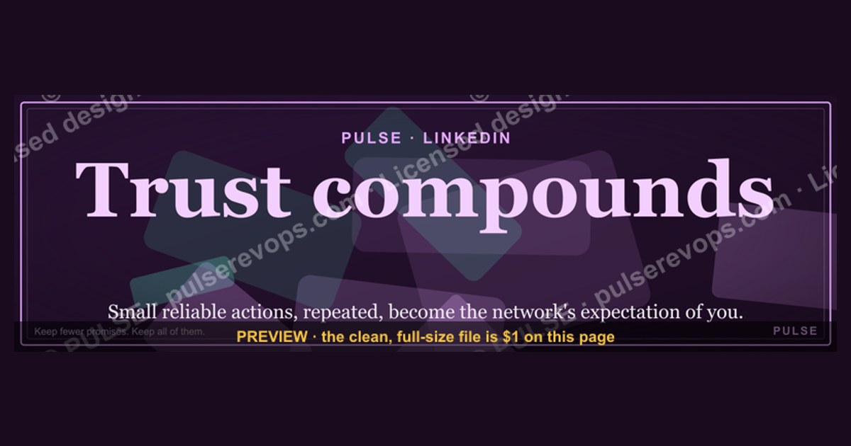
This is a LinkedIn banner — a free downloadable PNG sized 1600x500 px — that reads "Trust compounds." in gold serif type on a black field. It is a quiet, quotable Wallpaper-style graphic for your profile header. Use it when you want your LinkedIn presence to signal that credibility, like capital, compounds over time. Trust is the asset; the banner is the reminder.
The two options compared: a slogan banner versus a credibility banner
When a RevOps leader decides to change their LinkedIn header, they are usually choosing between two very different jobs for that 1600x500 pixel strip. The first option is the motivational slogan banner — "Trust compounds." belongs to this family. It is short, declarative, and reads like a principle rather than a pitch. The second option is the credibility banner: a strip that carries a job title, a company mark, a certification badge, a client logo row, or a metric ("$2.4B pipeline influenced"). Both work. They just work on different visitors at different moments.
The slogan banner's job is to be remembered. A prospect who has seen your comments in five threads, then lands on your profile, gets a single sentence that frames how you think. That framing is cheap to produce and hard to fake. The credibility banner's job is to be believed in the first two seconds. A recruiter or a procurement lead scanning for evidence wants a number, a logo, or a role — not a philosophy. If your profile already carries those proofs in the headline, About section, and Featured row, the banner does not need to repeat them.

There is a third, hybrid pattern worth naming: the banner as a section divider. Some operators rotate the header quarterly — a slogan in Q1, a case-study stat in Q2, an event badge in Q3 — so the profile itself looks maintained. Rotating is a signal in its own right. A header that has not changed since 2019 reads as abandoned, and an abandoned profile quietly undercuts every "Trust compounds" claim printed on it.
The comparison that matters most, though, is not banner versus banner. It is banner versus no banner. LinkedIn's default header is a blue-gray abstract pattern. It is not neutral — it is a vacancy. A vacancy at the top of a profile reads, to many visitors, as "this person does not use the platform," which is a strange thing for someone whose job depends on pipeline to advertise. So the real decision is between a deliberate header and an accidental one.
A practical trade-off table for the two main options:

- Slogan banner — best for founders, consultants, and senior operators whose name already carries weight. Cheapest to produce. Weakest at cold credibility.
- Credibility banner — best for sellers, CS leaders, and anyone whose buyer does not know them yet. Requires real numbers or real logos; a fake badge is worse than no badge.
- Hybrid rotation — best for anyone posting weekly. Costs ten minutes a quarter. Keeps the profile visibly alive.
- No banner — costs nothing, signals nothing, and forfeits the only piece of profile real estate that is 100% yours.
One more distinction practitioners miss: the banner is the only profile element that is not text-searchable. Recruiters search headlines and About sections; they do not search pixels. So if your goal is discovery, spend your words in the headline and use the banner for tone. If your goal is conversion — the visitor already arrived — the banner is the first emotional beat, and a line like "Trust compounds." sets a calm, long-horizon tone that a hard CTA banner cannot.
How to decide between them
The decision collapses to three questions. First: does my buyer already know me? If yes, tone beats proof, and the slogan banner wins. Second: is my profile's Featured section already carrying evidence? If yes, the banner is free to be philosophical. Third: do I post at least twice a week? If yes, rotation is viable and the banner becomes a lightweight content channel of its own.
Walk the chart honestly. Most people who feel drawn to "Trust compounds." are in the warm-audience branch — they have a network, they post, they are known in a niche. The chart confirms the slogan is the right call. But if you are early in a new market, the same chart routes you to a credibility banner first, and you can graduate to the slogan once the proof row exists. That sequencing matters: a philosophy banner on a profile with no evidence reads as aspiration, not authority.
There is also a seasonal read. In a downturn or a tight budget cycle, buyers get skeptical and credibility banners outperform. In a boom, or in a niche where everyone already knows everyone, tone wins because proof is redundant. If you sell into a small, tight community — say, RevOps leaders at Series B SaaS companies — you are almost always in the warm branch, and the slogan banner is the better long-run choice.
Finally, decide who the banner is for. If it is for the casual scroller, make it legible at thumbnail size. If it is for the person who clicked your name from a comment, you have their full attention for a beat, and a short sentence will land. "Trust compounds." is built for the second reader.
Concrete numbers behind each option
Sizing is not a matter of taste. LinkedIn renders profile headers at a 16:5 ratio. The commonly used export is 1584x396 px, and the 1600x500 px version used for this banner is close enough that LinkedIn crops a sliver from the top and bottom without touching the text if the type is centered. Design rules that follow from the math:

- Keep all text inside a safe area of roughly 1600x400 px centered vertically, so nothing important sits in the crop zone.
- Minimum type size for legibility on a phone: about 40 px cap height at 1600 px wide. Below that, the line becomes a smudge in the mobile feed.
- Contrast ratio: gold on near-black typically clears the WCAG AA threshold for large text comfortably. If you recolor, check the pair — mid-gray on black fails.
- File weight: a flat-color PNG at this size usually lands between 40 KB and 300 KB depending on whether you include a gradient or texture. LinkedIn's uploader accepts it easily.
Time and cost, honestly estimated: sourcing a template takes a few minutes, editing the text takes two minutes, exporting takes one. A designer's version costs whatever your designer charges; a self-serve version costs nothing but attention to the safe area. The hidden cost is the mistake — a banner with text clipped by the crop zone, or a logo half-covered by your circular profile photo, which overlaps the lower-left of the header on desktop. Budget one extra export to check both.
Attention math is the number most people never run. A profile header occupies the full width of the card at the top of the page. On desktop, that is roughly a 1584-pixel-wide strip above the fold. On mobile, it is the first thing rendered after the name. If your profile gets 2,000 views a quarter — a modest number for an active poster — the banner is seen 2,000 times for the cost of one afternoon. Compare that to a sponsored post, where the same 2,000 impressions carry a real CPM. The banner is the cheapest owned impression on the platform, which is exactly why leaving it as the default abstract pattern is a wasted asset.

For the credibility variant, the numbers are different and stricter. A metric banner should carry a real figure you can defend in a conversation: pipeline influenced, accounts managed, retention rate, team size, years in seat. Ranges are safer than point estimates when the number moves monthly. If you cannot state the number out loud on a call without flinching, do not print it. A wrong stat on a header is a permanent, public, screenshot-able error.
Implementation details and sequencing
The build sequence is short, and the order matters because each step constrains the next. Do the copy first, then the layout, then the export, then the swap, then the audit.
Step one, write the line. Keep it under eight words. "Trust compounds." is four. Shorter lines survive the mobile crop and read at a glance.
Step two, pick type and color. Serif reads as considered and institutional; sans reads as modern and operational. Gold on black is a high-contrast, premium pairing that suits the compounding metaphor — gold as the thing that accumulates. If your brand palette is different, substitute your primary color on your darkest neutral, then verify contrast.
Step three, lay out at 1600x500. Center the text horizontally and vertically. Leave at least 60 px of margin on every side. Do not put anything in the bottom-left quadrant, where the circular profile photo overlaps on desktop.
Step four, check the crop. Preview the upload before you commit. LinkedIn shows a crop dialog; drag it to the widest setting and confirm the sentence is untouched.
Step five, export. PNG, sRGB, no transparency needed. If the file is over a megabyte, flatten any texture or gradient.
Step six, upload. Profile, edit, background photo. The uploader accepts the file and lets you reposition.
Step seven, preview both surfaces. Open your profile on a phone and on a desktop browser. On mobile the header is short and wide; on desktop it is taller. Confirm the line is legible in both.
Step eight, audit. Put a recurring reminder every 90 days. Ask three questions: does the line still match my positioning, is the color still on-brand, and would a stranger understand it in one second? If any answer is no, re-export. Rotation is cheap; staleness is expensive.
Two implementation details that trip people up. First, the header is not clickable — you cannot link it to a landing page, so do not design it as a CTA. The Featured section is where links live. Second, the header does not appear in search results or in the feed; it only appears on the profile itself. That means its audience is people who already clicked, which is precisely the audience a line about Trust is written for. Also worth noting: the same 1600x500 asset can be reused as a Wallpaper on a desktop, a slide background in a deck, or a section header in a proposal — one export, several surfaces, which is part of why the format persists.
If you maintain a team, standardize the template rather than the message. Give everyone the same dimensions, safe area, type family, and palette, and let each person choose their own line. A sales team of twelve with twelve identical "Trust compounds." headers looks like a franchise; twelve headers in one visual system with twelve different lines looks like a team with a point of view.
Related questions
What size should a LinkedIn banner be?
Export at 1600x500 px, or 1584x396 px if you want to match the classic ratio exactly. Keep all text inside a centered 1600x400 px safe area so LinkedIn's crop never touches it, and preview on both mobile and desktop before you commit.
Can I put a logo on this banner?
Yes, but keep it small and out of the bottom-left quadrant, where your circular profile photo overlaps on desktop. If the banner already carries a sentence, a single small mark in a corner is enough. Two competing focal points weaken both.
Is a quote banner better than a metric banner?
It depends on audience temperature. Warm audiences respond to tone and remember a line like "Trust compounds." Cold audiences need proof — a role, a client, or a defensible number. If your Featured section already carries the proof, the quote banner is the stronger choice.
How often should I change my header?
Every 90 days is a reasonable cadence for an active poster; once a year is fine if you post rarely. The goal is not novelty, it is the signal that the profile is maintained. A header that has not changed in five years reads as neglected.
Does the banner affect search visibility?
No. LinkedIn does not index header pixels, so the banner has no effect on how you appear in search results. It only affects the impression of visitors who reach your profile. Put your keywords in the headline and About section instead.
FAQ
What exactly is this banner?
It is a downloadable 1600x500 px PNG showing the phrase "Trust compounds." in gold serif type on a black background. It is designed to sit as the header photo on a LinkedIn profile. The download is free from this page, and you can swap it in through your profile's edit background photo control in under a minute.
Why does "Trust compounds" work as a profile line?
Because it is a claim about time horizon, not a claim about capability. Anyone can say they are data-driven; saying that Trust compounds signals that you think in quarters and years, which is what buyers want from a long-term partner. It is also short enough to read at thumbnail size, which most profile lines are not.
Will this look unprofessional on a sales profile?
Not if the rest of the profile carries evidence. Pair it with a headline that states your role and a Featured section with a case study or two. The banner supplies the tone; the profile supplies the proof. If the proof is missing, use a credibility banner first and switch to this one later.
Can I change the wording or colors?
Yes, and you probably should. Keep the structure — short line, centered, high contrast, safe margins — and substitute your own sentence and brand colors. If you change the background, recheck the contrast ratio so the text stays legible on a phone in daylight.
Is the phrase a real quote from someone?
Treat it as a design line, not an attributed quotation. If you want to cite a source for the underlying idea, point to published work on trust and compounding relationships rather than putting quotation marks around it. Attribution errors on a public profile are avoidable and costly.
Does it work outside LinkedIn?
The same file works as a desktop Wallpaper, a title slide, a proposal cover strip, or a section divider in a deck. The 16:5 ratio is unusual for slides, so crop or letterbox it there. The line itself travels well anywhere a long-horizon message helps.
Sources
- LinkedIn Help — Profile background photo and header specifications: https://www.linkedin.com/help/linkedin/answer/a548235
- LinkedIn Help — Edit your profile: https://www.linkedin.com/help/linkedin/answer/a546001
- Nielsen Norman Group — F-shaped pattern for reading web content: https://www.nngroup.com/articles/f-shaped-pattern-reading-web-content/
- W3C — Web Content Accessibility Guidelines, contrast minimum: https://www.w3.org/WAI/WCAG21/Understanding/contrast-minimum.html
- Harvard Business Review — Trust and its role in business relationships: https://hbr.org/topic/subject/trust
- Edelman Trust Barometer — annual research on institutional trust: https://www.edelman.com/trust
- Canva — design size guide for social media images: https://www.canva.com/sizes/
- HubSpot — LinkedIn marketing and profile optimization resources: https://blog.hubspot.com/marketing/linkedin-marketing
Related on PULSE
- How to write a LinkedIn headline that survives a mobile crop
- Building a Featured section that carries your proof
- Profile rotation: a quarterly cadence for personal branding assets
- Why owned impressions beat paid impressions for RevOps leaders
- Turning a single graphic into a deck, a wallpaper, and a proposal cover
- The credibility banner: how to print a metric you can defend
This page will be disappearing soon. Save it to your device for $1 — or read it free while it is here.
@Kory-White- · if Venmo asks, the last 4 of my number are 2012
 graphicHow do you build a Champions sell motion from scratch in 2027?
 graphicSales Recruiter — LinkedIn Banner
 graphic“Process over pressure.” — LinkedIn Banner
 graphicLead from the front. — LinkedIn Wallpaper
 graphicWin the day. — LinkedIn Wallpaper
 graphic“Revenue that delights.” — LinkedIn Banner
 graphicSales Cycle Timeline Infographic in 2027
 graphic“Trusted advisor, never a vendor.” — LinkedIn Banner
 graphicRenewals Manager — LinkedIn Banner
 graphic“Sell with the buyer, not at them.” — LinkedIn Banner