
“Motion creates momentum.” — LinkedIn Banner
 Curated byKory White · Fractional CRO · Maryland
 PULSEKNOWLEDGE LIBRARY
Quality
Certified
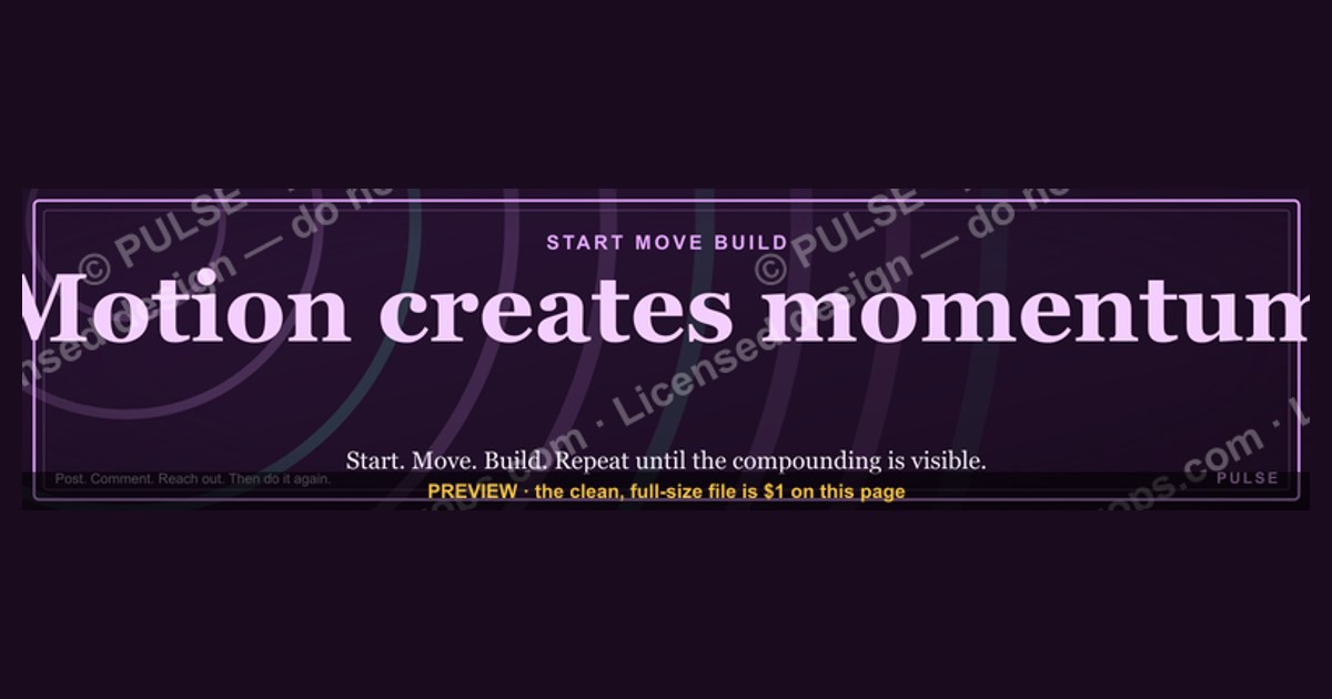
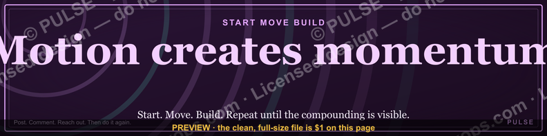
This is a LinkedIn profile banner — 1584×396 px — that reads "Motion creates momentum." in gold serif type set against a black background. It works as a personal-brand cover image for sales reps, founders, or RevOps leaders who want their profile to signal an action-oriented, forward-moving identity the instant someone opens it. Download the PNG and upload it directly as your LinkedIn cover photo.
Two ways to put this banner to work
There are really only two paths once you have this file: run it as-is, or customize it before you publish it. Both are legitimate, and the right call depends on how much your personal brand already overlaps with the phrase itself.
Running it as-is means uploading the gold-on-black design exactly as delivered, with no text changes. This is the right move for an individual contributor — an SDR, an AE, a CS rep — who wants a strong visual statement without spending time in an editor. The phrase "Motion creates momentum" reads as a philosophy rather than a title, so it doesn't need a name, a company, or a role stamped onto it to make sense. It sits well behind a headline like "Enterprise AE | Helping RevOps teams close faster" because the banner supplies the attitude and the headline supplies the specifics. The tradeoff is that as-is means non-unique: colleagues on the same team who grab the same file will show up with identical banners, which is fine for team cohesion but flattens individual distinctiveness if you're trying to stand out in a crowded feed.

Customizing it means opening the underlying file in an editor (Canva, Photoshop, Figma, or even LinkedIn's built-in crop tool if you only need to reposition, not re-letter) and changing the wording, adding a name or title, or shifting the palette to match a company's brand colors. This is the right move for a founder, a manager, or anyone whose LinkedIn profile functions as a mini landing page. A customized version might read "Kory White — Motion creates momentum" or swap the phrase into a company tagline while keeping the visual structure — gold accent, dark ground, serif weight — intact. Customization costs you 10–20 minutes in a design tool and a small amount of ongoing maintenance (you'll need to re-export if you rebrand or change your name), but it buys uniqueness and lets the banner do double duty as a business card.
A third micro-option worth naming: partial customization, where you keep the phrase exactly as written but change only the color story to match a personal or company palette — swapping gold for a brand blue, or black for a deep navy. This preserves the "motion and momentum" message while making the banner visually consistent with a website, email signature, or pitch deck, which matters more than people expect when a prospect clicks from an email into a LinkedIn profile and the colors don't match anything else they've seen from you.

How to decide which version fits your profile
The decision tree is short, but it's worth walking through deliberately rather than defaulting to whichever option feels easiest in the moment, because a banner is one of the few LinkedIn elements a visitor sees before they've made any judgment about you.
Start at the top: if your headline and About section already carry your name and role clearly, the banner doesn't need to repeat that information — visual real estate is scarce at 1584×396 px, and cramming in a name, title, and company logo on top of the existing tagline usually produces a cluttered result that reads worse on mobile, where LinkedIn crops the banner more aggressively than on desktop. In that case, ship the banner unmodified.

If you do want identifying text on the banner — common for consultants, coaches, freelancers, or anyone whose LinkedIn profile is a primary sales channel — the next fork is color. If you don't have an established brand palette, there's no reason to fight the existing gold-on-black scheme; it already reads as premium and confident, and changing colors without a reason to do so is just extra design work with no upside. If you do have brand colors — say your website and email signature use a specific navy and a specific accent color — recoloring the banner to match creates a more cohesive impression across every touchpoint a prospect or recruiter encounters, which compounds over multiple interactions even though no single viewing of the banner "converts" anything by itself.
The specs and numbers behind the banner
LinkedIn's banner slot is fixed at 1584 pixels wide by 396 pixels tall, a 4:1 aspect ratio. That ratio is unusually wide and short compared to most social banners (Twitter/X uses 3:1, Facebook cover photos are closer to 2.7:1), which is why templates built for other platforms often look stretched or cropped oddly when dropped into LinkedIn without resizing. Always start from a 1584×396 canvas rather than resizing a banner built for another network.

File size matters too: LinkedIn caps uploads at 8MB, and accepts JPG, PNG, or GIF (static only — animated GIFs are not supported in this slot). PNG is the better choice for a design like this one with flat color fields and clean typography, because PNG's lossless compression keeps text edges sharp; JPG's compression artifacts show up most visibly around high-contrast edges, which is exactly what gold serif letterforms on a black ground produce. If your exported file lands close to the 8MB ceiling, that's usually a sign the export resolution is higher than needed — 1584×396 at standard screen density doesn't require a multi-megabyte file, and most design tools default to a reasonable PNG-24 export automatically.
The safe-zone constraint is the number that trips people up most. Your profile photo — rendered as a circle roughly 200 pixels in diameter on desktop — overlaps the bottom-left corner of the banner, and on mobile that overlap is proportionally larger relative to the visible banner area. Any critical text or design element placed in the bottom-left quadrant risks being partially hidden behind your headshot. This banner's centered composition already accounts for that by keeping the phrase in the visual middle rather than the corners, but if you customize it and add a name or logo, keep that addition in the center-right or upper band of the canvas, roughly the top 60% and right two-thirds of the frame, to avoid the overlap entirely.
One more number worth knowing: LinkedIn displays the banner at different effective heights depending on device and browser window width, meaning the top and bottom 5–8% of the 396px height can get clipped on some views. Keep any text at least 25–30 pixels clear of the top and bottom edges — this banner's typography already sits well within that margin, but it's the number to remember if you're customizing the layout yourself rather than just swapping colors.
Installing and customizing it on LinkedIn
The path from downloaded file to live banner is short, but the order of steps matters — checking dimensions before uploading saves a re-do, and confirming the safe zone after uploading saves a second re-do.
Start by downloading the banner at its native resolution rather than a scaled preview — a screenshot of the graphic will introduce compression and soft edges that a direct PNG export won't have. If you're using the file as-is, skip straight to LinkedIn; if you're customizing, open the file in whatever editor you're comfortable with. Canva is the fastest option if you don't already have a subscription to Photoshop or Figma, since it has native LinkedIn banner templates at the correct 1584×396 dimension, meaning you won't need to manually set canvas size.
When you export your customized version, double-check three things before you leave the editor: the canvas is still exactly 1584×396 (some tools default to a slightly different ratio and will letterbox or stretch your design on upload), the file format is PNG, and the file size is comfortably under the 8MB cap — most exports of a design this simple land under 1MB, so anything dramatically larger suggests an accidental high-DPI export setting worth turning off.

On LinkedIn, go to your profile, click the pencil/edit icon over the existing banner (or the camera icon if you don't have one set), and upload the new file. LinkedIn will drop you into its own crop tool — use this step to nudge the image so nothing important sits directly behind where your profile photo will overlap. This is also the moment to catch aspect-ratio mismatches: if LinkedIn's crop frame shows visible letterboxing or forces an odd crop, your source file wasn't actually 1584×396 and needs to be re-exported before you save.
Once published, view your own profile in an incognito or logged-out browser window — LinkedIn sometimes renders your own edit view differently than what visitors see — and check both a desktop-width browser and a phone. If any text is clipped by the profile photo or cut off at the top/bottom edge, go back into your editor, adjust, and re-export rather than trying to fix it purely through LinkedIn's crop tool, since the crop tool can reposition but can't un-clip text that was placed too close to an edge in the source file.
Related questions
Does a LinkedIn banner actually affect profile views or connection requests?
There's no public LinkedIn data confirming a direct causal lift, but a banner is one of the first visual elements a visitor sees, so a clear, professional design supports the overall impression your headline and photo are already making — treat it as reinforcement, not a standalone growth lever.
Can I use the same banner across my whole sales team?
Yes — using an identical or lightly-varied (name swapped in) banner across a team is a common way to create visual consistency, similar to matching email signatures, and it's a low-effort way to reinforce a shared team identity across everyone's profiles.
What's the difference between a LinkedIn personal banner and a LinkedIn Company Page banner?
A personal banner sits behind your individual profile photo at 1584×396 px; a Company Page banner uses different placement and is meant to represent the organization broadly rather than one person — the two shouldn't be visually identical, since the personal one should still feel like it belongs to an individual.
Should the banner text match my LinkedIn headline?
They don't need to say the same thing — the banner can carry a broader philosophy or mission statement (as this one does) while the headline stays specific to your role and value proposition; together they should feel consistent in tone rather than redundant in wording.
How often should I update my LinkedIn banner?
There's no fixed cadence, but it's worth revisiting whenever your role, company, or personal brand shifts meaningfully — a banner that references an old job title or an outdated tagline is a small but noticeable inconsistency to anyone who reads your profile closely.
FAQ
What does the phrase "Motion creates momentum" mean on this banner? It's a personal-branding statement suggesting that consistent action — outreach, follow-up, small daily effort — compounds into larger results over time. On a LinkedIn profile it signals an action-oriented mindset to anyone who visits, without needing to spell out specifics about your role or industry.
Can I change the font or is it locked to the gold serif shown here? The delivered PNG is a flat image, so the font isn't editable directly — to change it, you'd rebuild the text layer in an editor like Canva or Figma using the same 1584×396 canvas and choose a different typeface, then re-export. If you just want to reposition or crop the existing text, LinkedIn's built-in tool after upload handles that without needing to touch the font at all.
Will this banner look right on mobile, not just desktop? LinkedIn crops the visible banner area differently across devices, showing less of the top and bottom edges on mobile. Because this design keeps the phrase centered with generous margin above and below, it holds up on both, but always check your own profile on a phone after uploading to confirm nothing feels cramped.
What file format should I download and upload — PNG or JPG? PNG is the better choice here because it preserves sharp text edges without the compression artifacts JPG introduces around high-contrast letterforms. LinkedIn accepts both, along with static GIF, but for a typographic design like this, PNG will look noticeably crisper.
Is it okay to add my company logo to this banner? Yes, but keep it out of the bottom-left quadrant where your profile photo overlaps, and keep it visually secondary to the phrase itself — a small logo mark in a top or side corner works better than a large one competing with the centered text for attention.
Can I use this same design for a Twitter/X or Facebook cover photo too? Not without resizing — Twitter/X banners use roughly a 3:1 ratio and Facebook covers are closer to 2.7:1, both different from LinkedIn's 4:1. Reusing the file as-is on another platform will cause stretching or an awkward crop; re-export a version sized for each platform's specific dimensions instead.
Sources
- https://www.linkedin.com/help/linkedin/answer/a542685
- https://www.canva.com/learn/linkedin-banner/
- https://blog.hootsuite.com/linkedin-banner-size/
- https://sproutsocial.com/insights/linkedin-banner/
- https://www.adobe.com/express/discover/social-media/linkedin/linkedin-banner-size
- https://blog.hubspot.com/marketing/linkedin-banner
- https://later.com/blog/linkedin-banner-size/
Related on PULSE
- Writing a LinkedIn headline that actually converts profile views
- Personal branding checklist for sales reps and account executives
- Choosing a consistent color palette across your sales collateral
- LinkedIn profile photo best practices for B2B sellers
- Company Page vs. personal profile: what belongs on each
- Free downloadable graphics for sales and RevOps teams
This page will be disappearing soon. Save it to your device for $1 — or read it free while it is here.
@Kory-White- · if Venmo asks, the last 4 of my number are 2012
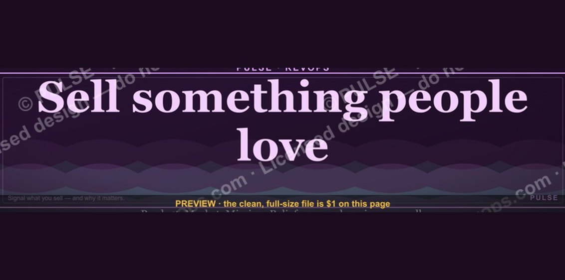 graphic“Sell something people love.” — LinkedIn Banner
 graphic"Win the quarter." — LinkedIn Banner
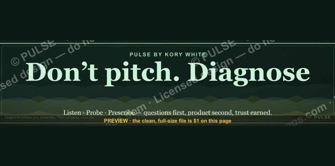 graphic“Don’t pitch. Diagnose.” — LinkedIn Banner
 graphicYour pipeline is your paycheck. — LinkedIn Wallpaper
 graphicSales Cycle Timeline Infographic in 2027
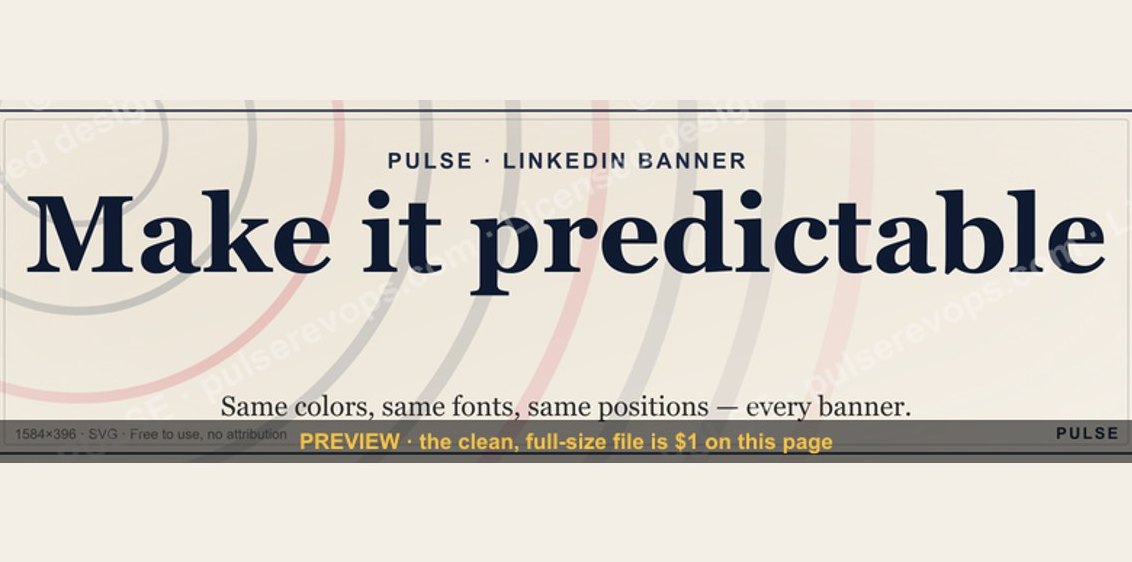 graphicMake it predictable. — LinkedIn Wallpaper
 graphicSales Coach — LinkedIn Banner
 graphicComputer Vision Engineer — LinkedIn Banner
 graphic“Selling expertise and outcomes.” — LinkedIn Banner
 graphicLLM Builder AI Engineer — LinkedIn Banner