
“A confused buyer never buys.” — LinkedIn Banner
 Curated byKory White · Fractional CRO · Maryland
 PULSEKNOWLEDGE LIBRARY
Quality
Certified
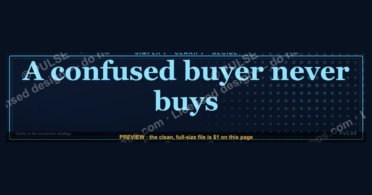
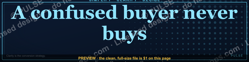
This is a LinkedIn profile banner, sized 1584×396 px, that carries a single line — "A confused buyer never buys" — set in bold serif type against a solid dark background, styled like a pull-quote you'd see on a book jacket. It sits behind your profile photo and headline, so anyone who lands on your LinkedIn page reads your point of view on clarity before they read anything else. Download it as a PNG and drop it straight into your profile's cover-image slot.
The two versions of this banner: quote-only vs. quote-with-diagram
There are two honest ways to build a banner around this line, and they serve different profiles. The first is the quote-only version: the sentence, centered or left-aligned, in a single serif or slab typeface, on a flat dark field (charcoal, ink navy, or true black), with no supporting graphic at all. This is the version shown at the top of this page. It reads instantly, works at any screen size, and never competes with your profile photo or headline for attention. It's the right choice for anyone whose title, headline, or About section already explains what "confused buyer" means in their world — a sales leader, an enablement manager, a demand-gen marketer, a RevOps consultant. The banner becomes a stance, not an explanation.
The second version adds a small supporting element next to or beneath the quote: a simplified before/after motif — a tangled path on one side, a straight line on the other — or a two-word subhead like "Simplify the path." This version does more explaining and less asserting. It's the better fit if your audience is broader than sales/marketing peers — recruiters, generalist HR contacts, or executives outside RevOps who might not immediately connect "confused buyer" to buying-journey friction, sales enablement, or conversion. The diagram gives them the bridge without you having to spell it out in the headline underneath.

The trade-off is legibility versus context. A quote-only banner is bulletproof at small sizes — it still reads cleanly when LinkedIn compresses it on mobile, where the banner shows as a much shorter strip than the full 1584×396 canvas. A quote-with-diagram version risks the supporting graphic shrinking into an unreadable smear on a phone screen, especially since LinkedIn crops the vertical center more aggressively on mobile than on desktop. If you go with the second option, keep the diagram simple enough — two or three shapes, no fine detail — that it survives being reduced to roughly a third of its desktop height.
There's a third, quieter consideration: how often you plan to update it. A quote-only banner in a neutral dark palette is evergreen — you can leave it up for years without it feeling dated. A version with a diagram tied to a specific campaign, event, or quarter (say, referencing a "2026 pipeline" theme) has a shelf life, and you'll need to remember to retire it. If you're not the type to revisit your profile assets often, default to quote-only.

How to decide which version to run
Use your actual audience and update cadence to pick a lane rather than defaulting to whichever looks more "designed." The logic is the same one you'd use for any above-the-fold asset: match the amount of explanation in the graphic to how much explanation your audience needs, and match its lifespan to how often you're willing to maintain it.
Walk the decision in order. First, audience: if the people who land on your profile already work in sales, marketing, customer success, or RevOps, they don't need the metaphor explained — "a confused buyer never buys" is immediately legible as a statement about deal velocity, and the quote-only banner wins on legibility alone. If your profile gets traffic from a mixed crowd — recruiters, cross-functional leaders, conference contacts outside your discipline — the diagram version buys you a beat of extra context that a text-only line can't.
Second, maintenance appetite: even if your audience is mixed, don't pick the diagram version if you know you won't revisit it. An outdated campaign graphic sitting behind your photo for two years reads worse than a plain quote that never goes stale. Be honest with yourself here — most people update their LinkedIn banner far less often than they intend to when they first set it.
Whichever version you land on, the decision that actually moves the needle is the one downstream of the banner: your headline. The banner states the philosophy; your headline should state what you personally do about it — "Helping SaaS buyers get from demo to decision in half the time" reads very differently paired with this banner than a generic title like "Account Executive at Acme."

The numbers behind each version
LinkedIn's banner canvas is fixed at 1584×396 pixels, a 4:1 aspect ratio. That's the export size regardless of which version you choose — the difference between quote-only and quote-with-diagram is what you put inside that canvas, not the canvas itself. A few dimension and spec numbers matter for both:
- Safe zone: keep all text and the diagram inside the central roughly 1200×300 px area. LinkedIn's desktop layout overlaps your profile photo circle (about 200 px wide) across the bottom-left corner of the banner, and the exact crop shifts slightly between desktop and mobile. Anything critical placed in the outer ~190 px on each side or the outer ~50 px top/bottom risks being cropped or covered.
- Mobile crop: on the LinkedIn mobile app, the banner is shown at a shorter effective height than desktop — practically, only the vertical middle third is reliably visible. This is the number that kills over-designed diagram versions: if your supporting graphic sits in the top or bottom third, most mobile viewers never see it.
- Type size: for a serif headline quote at this canvas size, aim for a cap height that reads as roughly 60–90 px tall in the exported file — small enough not to touch the safe-zone edges, large enough to survive LinkedIn's compression and a phone screen. Anything under about 40 px in this canvas tends to blur after compression.
- Contrast: hold text-to-background contrast at or above the WCAG AA threshold of 4.5:1 for normal text. Off-white (not pure white) text on charcoal or ink navy backgrounds comfortably clears this; light gray text on a light background does not, and is a common reason these banners look washed out on some monitors.
- File weight and format: export as PNG for crisp type edges (JPG introduces compression artifacts around sharp serif strokes). LinkedIn accepts files up to 8 MB for the banner slot; a clean 1584×396 PNG with a flat background and one line of type typically lands well under 1 MB, so file size is rarely the constraint — legibility is.
- Diagram element sizing (quote-with-diagram version only): keep any supporting shape to no more than about 15–20% of the canvas width so it doesn't compete with the quote for the eye's first stop. A diagram that's too large reads as the headline instead of the support.
None of these numbers are LinkedIn-specific trivia for its own sake — they're the difference between a banner that reads as a deliberate statement and one that looks like a stretched, blurry afterthought, which is a common and avoidable failure mode for profile cover images.
Installing and sequencing the banner on your profile
Getting the file onto your profile is the easy part; getting it to work with everything else on your profile in the right order is where people skip steps.
Start with the file itself: download the PNG at full 1584×396 resolution rather than a screenshot or a resized copy — resizing after export is where the type edges go soft. On your LinkedIn profile, click your existing banner (or the camera icon if you don't have one) to open the cover-image editor, upload the file, and use LinkedIn's built-in crop tool to confirm the quote sits centered in the visible window rather than trusting the thumbnail preview alone.
Before you publish, update your headline in the same sitting — not after. The banner sets up a claim ("confusion kills the deal"); the headline is where you cash that claim in with what you specifically do about it. Publishing the banner alone, with a stale or generic headline underneath, wastes the setup: a visitor reads the quote, then reads "Sales Professional | Open to opportunities" right below it, and the two don't connect. Ten extra seconds writing a sharper headline is the highest-leverage step in this whole sequence.
Once it's live, check the render in both places it will actually be seen: your own profile on desktop, and — separately — the LinkedIn mobile app, ideally on an actual phone rather than a resized browser window. This step catches the single most common failure: a diagram element or a line of type that looked fine in the desktop editor but gets clipped by the tighter mobile crop. If anything is cut off, go back to the crop step and reposition — don't re-export a new file unless the type itself needs to shrink.
Finally, treat this as a small sequencing decision, not a one-time upload: if you update your headline or job title later, glance back at the banner to confirm the two still agree with each other. A banner that talks about eliminating confused buyers reads oddly under a headline that's since drifted to an unrelated role.
Related questions
What size should a LinkedIn banner be?
1584×396 pixels, a 4:1 ratio, exported as PNG under 8 MB. Keep text and graphics inside the central safe zone — roughly the middle two-thirds — since LinkedIn crops the edges differently on desktop versus the mobile app.
Does my LinkedIn headline need to match my banner's message?
Yes. A banner states a philosophy; the headline should state what you specifically do about it. A quote about confused buyers paired with a generic job title wastes the banner's setup.
Can I use a quote banner if my profile photo overlaps it?
Yes — design around it. LinkedIn's desktop layout overlaps roughly the bottom-left 200 px with your profile photo circle, so keep your quote's text centered or right-weighted, away from that corner.
How often should I update a profile banner like this?
A quote-only, evergreen banner can stay up for years without feeling dated. A version tied to a specific campaign or diagram should be revisited whenever that campaign ends, so your profile doesn't reference a stale initiative.
Will a text-heavy banner hurt profile views on mobile?
Only if the text sits outside the vertical middle third, which is what most mobile crops preserve. A single centered line at a large enough size survives the crop; a small diagram in a top or bottom corner often doesn't.
FAQ
What is this graphic exactly? It's a LinkedIn profile cover banner — the 1584×396 px image that sits behind your profile photo and headline — carrying the line "A confused buyer never buys" in bold serif type on a solid dark background.
Can I change the wording to fit my own team or product? Yes. Swap the quote for your own line, keep the same dark-field, single-serif-line layout, and re-export at 1584×396 px. The layout principle — one short, confident statement, high contrast, centered in the safe zone — carries over regardless of the exact words.
What file format and size should I download? PNG, at full 1584×396 resolution. PNG keeps the type edges sharp; resizing a smaller file up, or exporting as a heavily compressed JPG, is what makes banner text look blurry once it's live.
Why does my banner look fine on desktop but cropped on mobile? LinkedIn's mobile app shows a shorter effective slice of the banner than the desktop view does. Anything placed outside the central vertical third — a subhead, a diagram element — is the first thing to get cut off on a phone.
Does the quote need a supporting graphic, or is text alone enough? Text alone is often the stronger choice if your profile's audience already works in sales, marketing, or RevOps — they don't need the metaphor illustrated. Add a small diagram only if your audience is broader and needs a visual bridge to the idea.
What headline pairs well with this banner? One that names your specific fix for buyer confusion — a workflow, a role, or an outcome you own — rather than a generic title. The banner makes the claim; the headline should back it up with what you actually do.
Sources
- https://www.linkedin.com/help/linkedin
- https://www.canva.com/create/linkedin-banners/
- https://www.adobe.com/express/create/banner/linkedin
- https://sproutsocial.com/insights/social-media-image-sizes-guide/
- https://www.nngroup.com/articles/minimize-cognitive-load/
- https://www.w3.org/WAI/WCAG2AA-Conformance
- https://blog.hootsuite.com/social-media-image-sizes-guide/
Related on PULSE
- LinkedIn banner size and safe-zone guide for sales profiles
- How to write a LinkedIn headline that supports your banner's message
- Why buyer confusion stalls deals in the middle of the funnel
- Free downloadable LinkedIn banners for sales and RevOps leaders
- Designing a profile that reflects your sales philosophy, not just your title
This page will be disappearing soon. Save it to your device for $1 — or read it free while it is here.
@Kory-White- · if Venmo asks, the last 4 of my number are 2012
This page is gone.
This one is off the shelf now. $1 keeps it on your phone for good — the whole page, pictures and diagrams included.
 graphicHow to build a champion champion plan in 2027?
 graphicCustomer Success — LinkedIn Banner
 graphicSell outcomes, not features. — LinkedIn Wallpaper
 graphicHow to design a LinkedIn banner that converts viewers into leads in 2027?
 graphic“Hire slow. Ramp fast.” — LinkedIn Banner
 graphicRenewals Manager — LinkedIn Banner
 graphicHead of Sales — LinkedIn Banner
 graphicOffensive Security Pentest CRO — LinkedIn Banner
 graphicWin the day. — LinkedIn Wallpaper
 graphicInspect. Qualify. Commit. — LinkedIn Wallpaper