


How to design a LinkedIn banner that converts viewers into leads in 2027?
Quality
Certified
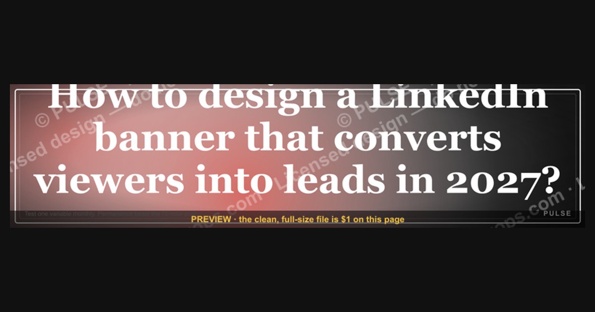
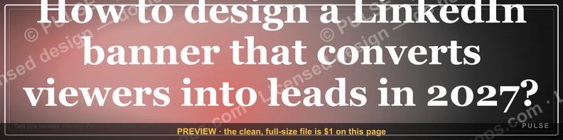
This LinkedIn profile banner is a 1584×396 px PNG: a dark, high-contrast cover graphic that reads as a single promise to your profile visitors. It pairs one bold headline with a short supporting line and a clear call to action, so viewers understand who you help and what to do next within two seconds of landing on your profile.
What the banner is and why it matters for lead generation
A LinkedIn profile banner is the wide rectangle that sits behind your headshot at the top of your profile. On desktop it renders at roughly 1584×396 pixels; on mobile the same asset is cropped and partially covered by your profile photo, your name, and your headline. That cropping behavior is the single most important design constraint most people ignore. If your key promise sits in the left third of the image, your headshot will sit on top of it. If it sits in the bottom strip, your name and headline text will overlap it. The safe zone for critical content is the right two-thirds of the canvas, vertically centered, with generous margins.
Why does this matter for revenue operations and go-to-market teams specifically? Because the profile banner is one of the few pieces of owned real estate on a platform where your buyers already are. Unlike a paid ad, it costs nothing per impression. Unlike a post, it does not disappear down the feed after 48 hours. It is a permanent, always-on billboard attached to every comment you leave, every connection request you send, and every InMail you deliver. When a prospect gets a cold email from you and looks you up, the banner is one of the first three things they see, alongside your photo and headline.
The conversion logic is simple. A viewer arrives with low intent and low attention. Your banner either confirms "this person is relevant to my problem" or it does not. If it confirms relevance, the viewer is more likely to scroll to your featured section, click your website link, or accept your connection request. If it does not, they bounce. The banner does not close deals. It earns the next five seconds of attention, and in outbound and inbound social selling, five seconds is often the difference between a reply and silence.
There is also a compounding effect worth understanding. Every time you comment on someone else's post, your banner travels with you into that thread. A thoughtful comment on a prospect's post can generate profile views from everyone who reads the thread. Each of those views is an impression for your banner. Teams that treat the banner as a one-time branding exercise miss this; teams that treat it as a conversion asset iterate on it the way they iterate on landing page headlines.

The 2027 context matters here too. LinkedIn's algorithm and interface have been steadily shifting toward video, newsletters, and creator-style content, which means organic reach for plain text posts is more competitive than it was a few years ago. That pushes more of the discovery burden onto the profile itself. When reach is harder, the profile becomes the conversion layer, and the banner is the top of that layer. Buyers also arrive more informed and more skeptical; they have seen thousands of generic "Helping X do Y" banners. A banner that says something specific and verifiable outperforms one that says something broad and forgettable.
Finally, consider the asymmetry. Redesigning a banner takes an hour. Testing three variants takes an afternoon. The downside is zero, because the old banner can be restored instantly. The upside is a permanent lift in profile-to-conversation conversion across every channel that touches your profile. Very few marketing assets have that risk-reward profile.
The step-by-step process for designing a converting banner
The process below assumes you are building from scratch, but it works equally well as an audit checklist for an existing banner. Work through it in order; each step constrains the next.
Step 1: Define the single viewer you are converting. Write down one sentence: "This banner is for [role] at [company type] who is struggling with [problem]." If you cannot fill in all three blanks, you are not ready to design. A banner aimed at everyone converts no one. For a RevOps consultant, that might be "Heads of Revenue Operations at Series B SaaS companies who are drowning in CRM data quality issues."
Step 2: Choose the one action you want. A banner can ask for a connection, a profile visit to a link, a newsletter signup, a calendar booking, or a resource download. Pick exactly one. Two calls to action split attention and reduce response on both. The most common high-performing choice for B2B is a soft ask: "Connect" or "See the playbook in Featured." Hard asks like "Book a demo" work better on a landing page than on a profile banner.
Step 3: Draft the headline in the viewer's language, not yours. The headline is the largest text on the banner and should be readable at thumbnail size. Aim for five to nine words. Use the problem or the outcome, not your job title. "Stop losing deals to bad CRM data" beats "Revenue Operations Consultant." If you must include a credential, put it in the smaller supporting line.
Step 4: Add a supporting line that makes the headline credible. This is where specificity lives: a number, a named method, a client type, or a timeframe. "200+ RevOps audits for Series B teams" or "The 5-step pipeline hygiene sprint." One line, twelve words maximum.
Step 5: Add the call to action as a distinct visual element. A short phrase, an arrow, or a button-shaped block. Keep it under five words: "Connect to get the checklist," "See Featured post," "DM 'AUDIT'." The visual treatment should make it obvious this is an instruction, not decoration.
Step 6: Design for the crop. Build the canvas at 1584×396. Place all text in the right two-thirds. Keep a 60-pixel margin on the right edge and 40 pixels top and bottom. Test by viewing your profile on a phone; if any word is clipped or covered, move it.
Step 7: Choose contrast over cleverness. Dark background with light text, or light background with dark text. Avoid busy photography behind text unless you add a heavy overlay. The banner must be legible at 25% zoom, because that is how it appears in feed thumbnails and search results.
Step 8: Ship it, then measure. LinkedIn does not give banner-level analytics, so you need proxies: profile view counts week over week, connection request acceptance rate, InMail reply rate, and clicks on your featured link. Change one variable at a time and hold each variant for at least two weeks before judging.
A realistic timeline for a solo operator: one hour to define the viewer and action, one hour to draft copy, one to two hours in a design tool, thirty minutes to test crops, and then a two-week measurement window. For a team running a coordinated banner across five sales reps, add a review cycle and a shared template file, which typically pushes the project to about a week of calendar time with maybe six to eight hours of actual work.
Costs, timelines, and typical ranges
The good news is that the hard cost of a LinkedIn banner is close to zero. The real cost is time, and the range is wide depending on how you source the design.
DIY with a free tool. Canva, Figma, and similar tools all have LinkedIn banner templates. A competent operator can produce a clean banner in 45 to 90 minutes. Cost: zero dollars. Quality ceiling: high enough for most individual contributors and founders.
DIY with a paid template pack. Template marketplaces sell LinkedIn banner kits for roughly $10 to $40. This buys you better typography and layout discipline, not strategy. Cost: under $50. Time: one hour.
Freelance designer. On freelance marketplaces, a single banner design typically runs $50 to $250 depending on the designer's experience and whether you get source files. A three-variant package often runs $150 to $500. Turnaround is usually two to five days. Cost: $50 to $500. Time: three to seven days including revision rounds.
Agency or brand studio. If the banner is part of a broader personal brand or executive positioning project, agencies may charge $500 to $2,000 or fold it into a larger retainer. This is rarely worth it for a single banner unless the executive's profile is a major demand channel. Cost: $500 to $2,000. Time: one to three weeks.
Team rollout. If you are standardizing banners across a sales team of ten, budget for a master template plus per-rep customization. The template itself might cost $200 to $800 from a designer, and customization is usually 15 to 30 minutes per rep if the template has locked layout zones. Total: roughly $500 to $1,200 plus about five hours of internal coordination.

Ongoing iteration cost. Treat the banner as a living asset. A reasonable cadence is a full review every quarter and a headline test every six to eight weeks. That is maybe two to four hours per quarter for a solo operator, or a standing 30-minute slot in a monthly marketing review for a team.
The hidden cost is the opportunity cost of a bad banner. If your profile gets 300 views a month and your banner converts 2% of viewers into a conversation, that is six conversations. Lifting that to 4% doubles it to twelve. If each conversation is worth even a few hundred dollars in pipeline, the math justifies a few hundred dollars of design spend very quickly. The mistake is spending $2,000 on design before you have validated the headline, which is the part that actually drives conversion.
One more cost consideration: version control. Keep every banner variant in a shared folder with the date and the metric it was tested against. Teams that skip this end up re-testing the same headline a year later because nobody remembers what was tried.
Where teams get it wrong
The failure modes are remarkably consistent. Here are the ones that show up most often, and what to do instead.
Putting the promise in the left third. This is the single most common error. Designers build a beautiful left-aligned composition, and then the profile photo covers the first word. Always preview on mobile before publishing.
Writing a job title instead of a promise. "VP of Sales at Acme" tells the viewer what you are, not what you can do for them. The headline should answer "why should this person's problem matter to me?" Titles belong in the LinkedIn headline field, which sits directly under your name and is separately searchable.
Cramming three messages into one banner. A headline, a subheadline, a list of services, a logo, a website, and a QR code is not a banner; it is a brochure. Every additional element reduces the odds that the viewer reads the one that matters. One message, one action.
Using low-contrast brand colors. Pale gray text on a white background looks elegant on a retina display and disappears in a feed thumbnail. Test your banner at 25% zoom on a phone in daylight. If you squint and cannot read the headline, redo it.
Ignoring the featured section. The banner points somewhere, and that somewhere is usually the featured section directly below the profile header. If the featured section is empty or holds a five-year-old press release, the banner's call to action dies on arrival. The banner and the featured section are one funnel; design them together.
Never testing. Most people design a banner once and leave it for three years. The headline is a hypothesis. Without a test, you are guessing. Even a crude A/B test, alternating two banners monthly and tracking profile views and reply rates, beats no test at all.
Copying a competitor's banner. What works for a Fortune 500 executive with high name recognition does not work for an unknown consultant. Recognition-based banners assume the viewer already knows you. If they do not, you need a value-based banner.
Forgetting the mobile headline overlap. Your LinkedIn headline text sits below your name and can extend across the banner area on mobile. If your banner has a critical line in that zone, it will be obscured. Keep the bottom-center strip clear.
Overdesigning with effects. Drop shadows, gradients, and glow effects are fine in moderation but often reduce legibility. Flat, high-contrast design almost always wins at thumbnail size.
Setting it and forgetting the offer. The offer in your banner should match your current campaign. If you are running a webinar this quarter, the banner should point to the webinar. A generic banner is better than a stale one, but a current one beats both.
Decision framework: when to choose what
Different situations call for different banner strategies. Use the framework below to pick the right one for your context.
If you are an individual contributor in a large company: keep it simple and compliant. Use approved brand colors, state your function and the outcome you deliver, and avoid hard calls to action that might conflict with corporate marketing. Your banner's job is credibility, not lead capture.
If you are a founder or consultant: go value-first. Lead with the problem you solve, add one proof point, and use a soft call to action pointing to a featured resource. You have no brand recognition to lean on, so the banner must do the explaining.
If you are running outbound at scale: align the banner with the campaign. If your sequences mention a specific audit or playbook, the banner should name the same asset. This continuity raises reply rates because the prospect sees the same promise in two places.
If you are building an audience: use the banner to drive a specific behavior, like subscribing to a newsletter or following a topic. Rotate it with your content calendar.
If you are an executive with high recognition: you can afford a minimal banner. Name, role, and one line. Recognition does the rest.
The framework is not rigid. Plenty of operators blend two rows. The point is to make the choice deliberately rather than defaulting to whatever template looked nice.
Related questions
How often should I change my LinkedIn banner?
Review it quarterly and test a new headline every six to eight weeks if your profile is a meaningful lead source. If it is not driving conversations, change it sooner. Keep each variant live at least two weeks so you have enough profile views to compare.
Does the banner actually affect lead generation?
Indirectly, yes. It has no click tracking, but it shapes whether a viewer stays on your profile, clicks your featured link, or accepts your connection request. Treat profile views, connection acceptance rate, and InMail reply rate as your proxies.
Can I use the same banner across my whole sales team?
Yes, with a shared template that locks layout and color while leaving a text zone for each rep's specialty. Identical banners build brand recognition; per-rep text keeps relevance. Budget 15 to 30 minutes of customization per person.
What should the banner say if I am job seeking?
Lead with the role you want and the outcome you deliver, not your last title. Add one proof point and a soft call to action like "Open to RevOps leadership roles." Keep it specific enough that a recruiter knows your lane.
Is a photo background better than a solid color?
Only if the photo is uncluttered and you add a dark or light overlay behind the text. Solid or subtle gradient backgrounds almost always win on legibility at thumbnail size, which is where most viewers first see the banner.
FAQ
What are the exact dimensions for a LinkedIn profile banner in 2027? LinkedIn recommends 1584×396 pixels for the profile cover image, which is a 4:1 aspect ratio. Upload a PNG or JPG under the platform's file size limit, and keep all critical text in the right two-thirds of the canvas to survive mobile cropping and headshot overlap.
Should the banner include my company logo?

A small logo in a corner is fine and adds credibility, but it should never compete with the headline. If the logo takes more than about 10% of the canvas or sits in the prime text zone, move it or remove it. The headline is the asset; the logo is decoration.
How do I know if my banner is working? Track profile views week over week, connection request acceptance rate, InMail reply rate, and clicks on your featured section link. None of these are banner-specific, but a sustained lift after a banner change is a strong signal. Compare two-week windows before drawing conclusions.
Can I put a QR code on my LinkedIn banner? You can, but it rarely performs. Viewers on desktop cannot easily scan it, and viewers on mobile are already on the device. A text call to action like "See Featured post" is almost always a better use of that space.
What colors convert best on a LinkedIn banner? There is no universal winning color. What matters is contrast between text and background, and differentiation from the surrounding LinkedIn interface, which is predominantly white and light blue. Dark backgrounds with light text tend to stand out in feeds, but test against your own audience.
How does the banner connect to my LinkedIn headline? They should reinforce each other, not repeat each other. The headline field is searchable and keyword-indexed, so it should carry your role and specialty terms. The banner is visual and emotional, so it should carry the promise and the call to action. Together they form the top of your profile funnel.
Sources
- LinkedIn Help — Profile cover image specifications: https://www.linkedin.com/help/linkedin/answer/a563389
- LinkedIn Marketing Solutions Blog: https://business.linkedin.com/marketing-solutions/blog
- LinkedIn Sales Solutions Blog: https://business.linkedin.com/sales-solutions/blog
- HubSpot Blog — Social selling and profile optimization: https://blog.hubspot.com
- Hootsuite Blog — LinkedIn marketing guides: https://blog.hootsuite.com
- Sprout Social Insights — LinkedIn statistics and best practices: https://sproutsocial.com/insights
- Nielsen Norman Group — Visual hierarchy and readability research: https://www.nngroup.com
- Canva Design School — Banner and cover design fundamentals: https://www.canva.com/designschool
Related on PULSE
- How to audit a LinkedIn profile as a conversion funnel
- Building a featured section that carries the banner's promise
- Outbound sequence design that mirrors profile messaging
- Measuring social selling without native LinkedIn analytics
- Personal branding systems for revenue operations leaders
- Turning profile views into pipeline: the handoff from social to CRM
This page will be disappearing soon. Save it to your device for $1 — or read it free while it is here.
@Kory-White- · if Venmo asks, the last 4 of my number are 2012
This page is gone.
This one is off the shelf now. $1 keeps it on your phone for good — the whole page, pictures and diagrams included.
 graphicOffensive Security Pentest CRO — LinkedIn Banner
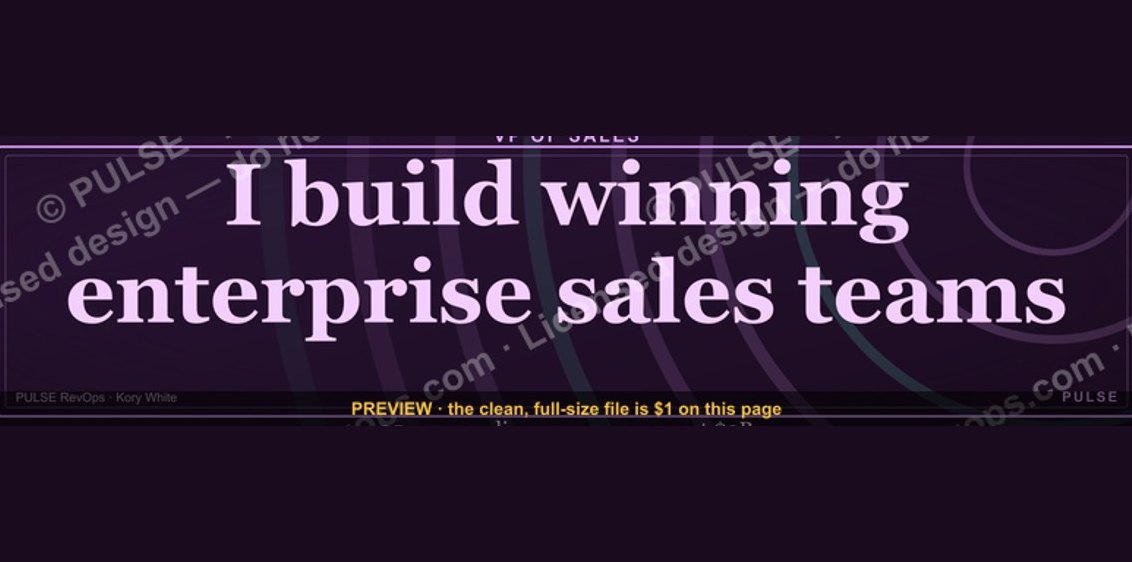 graphicVP of Sales — LinkedIn Banner
 graphicInspect. Qualify. Commit. — LinkedIn Wallpaper
 graphicIndustrial Robotics CRO — LinkedIn Banner
 graphicField Sales Rep — LinkedIn Banner
 graphic“Stay in the deal.” — LinkedIn Banner
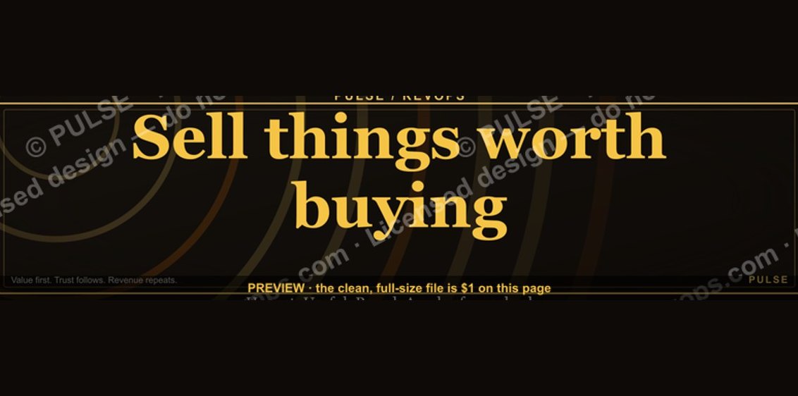 graphic“Sell things worth buying.” — LinkedIn Banner
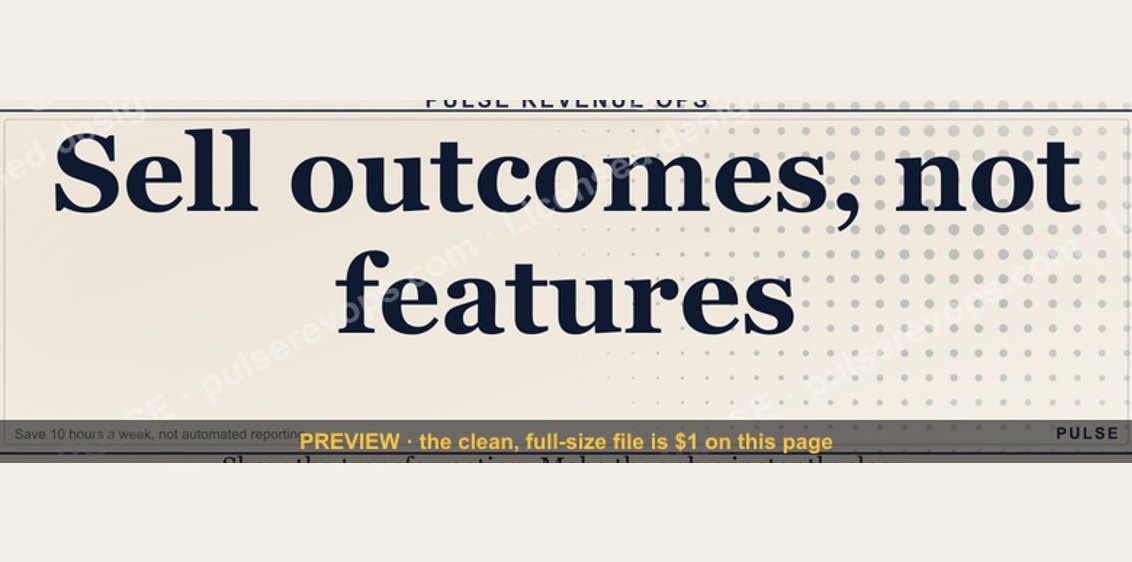 graphicSell outcomes, not features. — LinkedIn Wallpaper
 graphicRenewals Manager — LinkedIn Banner
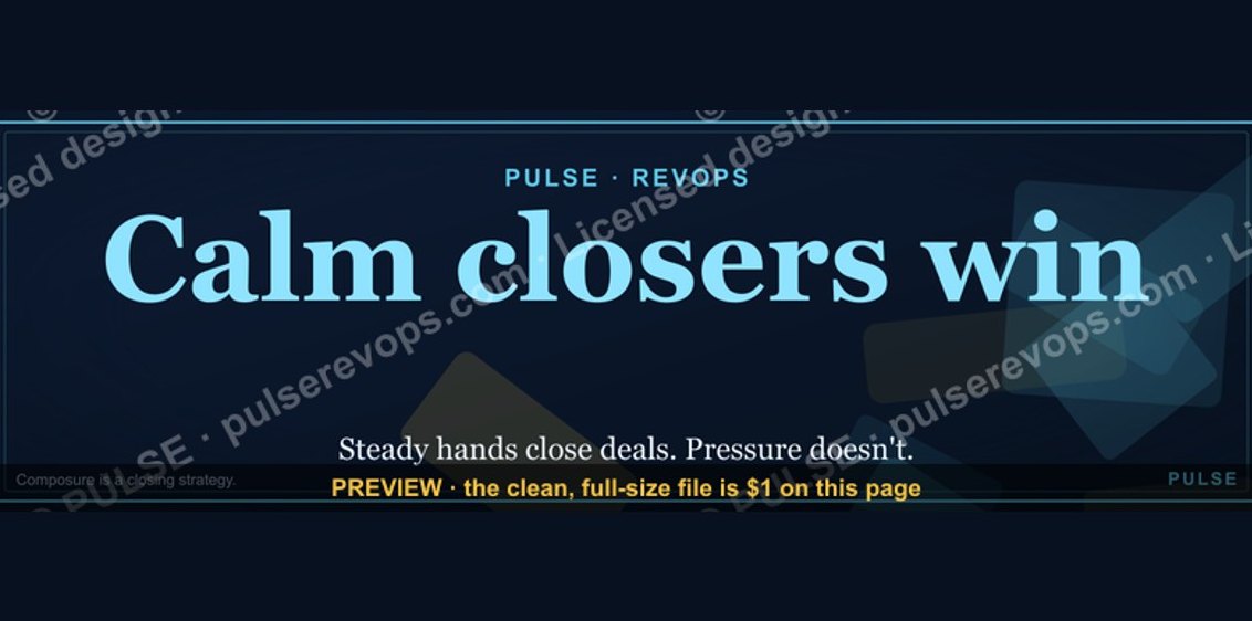 graphicCalm closers win. — LinkedIn Wallpaper