


Pharmaceutical CRO — LinkedIn Banner
Quality
Certified
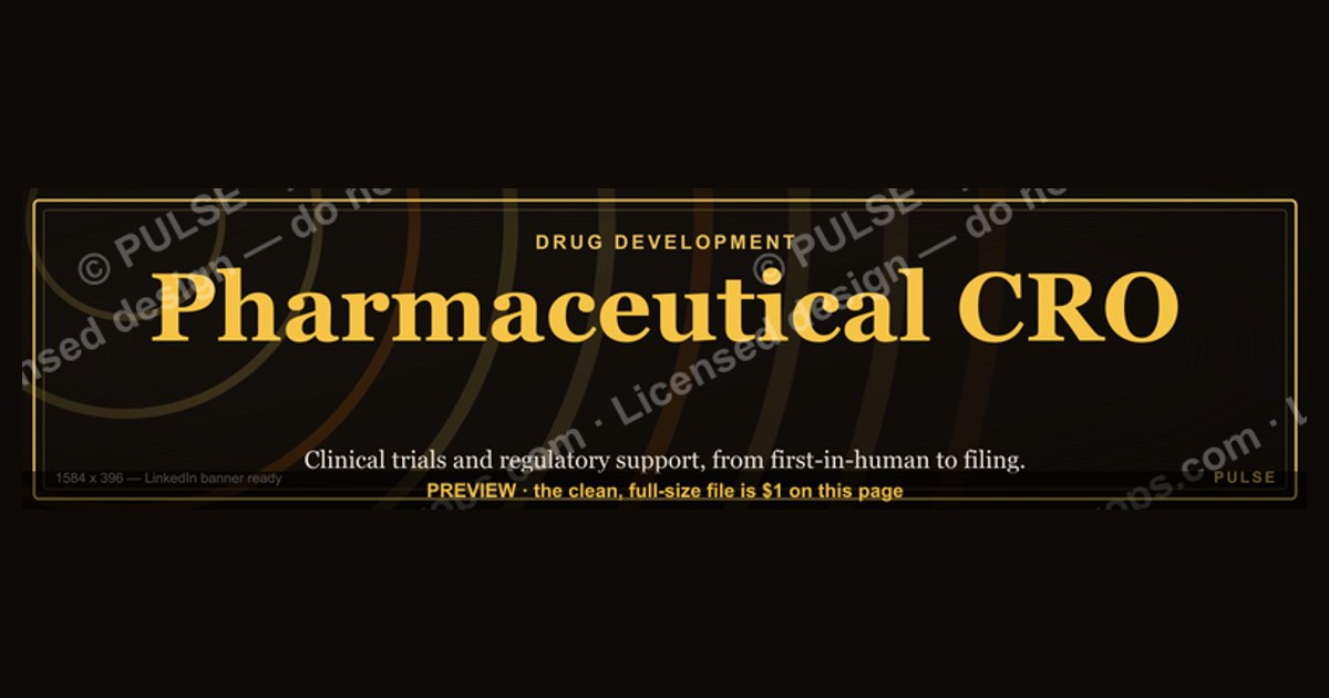
This is a LinkedIn profile banner (1584×396px) titled "Pharmaceutical CRO — LinkedIn Banner." It pairs the words "Pharmaceutical CRO" in bold condensed sans-serif against a clinical, high-contrast background, with a secondary line naming a function — clinical operations, regulatory affairs, or business development. Use it as the cover image on a Contract Research Organization employee's or company page's LinkedIn profile to instantly signal industry and role to recruiters, sponsors, and site visitors.
The two layout options this banner comes in
A LinkedIn cover image for a Pharmaceutical Contract Research Organization has to do two jobs in the three seconds a viewer actually looks at it: say what the organization or person does, and say it in a way that reads correctly on both desktop and mobile crops. This graphic ships in two content arrangements, and the right one depends on who is looking at the profile and what you want them to remember.
The first option is role-first. "Pharmaceutical CRO" sits as the dominant headline, and a smaller line underneath names a specific function — "Clinical Operations," "Regulatory Affairs," "Business Development," or "Site Management." This version is built for individual contributors and hiring managers inside a CRO who want their profile to read like a business card: industry, then function. A clinical research associate scrolling LinkedIn recognizes the format instantly because it mirrors how CRO job titles are already written in postings — "Pharmaceutical CRO | Clinical Operations." Recruiters searching LinkedIn by keyword benefit too, because the banner text reinforces the same terms already sitting in the headline and About section, which strengthens on-platform search relevance without touching any code.

The second option is outcome-first. The headline leads with a value statement — something like "Accelerating Trials. Protecting Data. Delivering Results." — and "Pharmaceutical CRO" becomes the secondary identifier beneath it, smaller but still legible at thumbnail size. This version is built for company pages, business-development leads, and anyone whose profile exists to generate inbound interest from sponsors rather than from recruiters. A sponsor evaluating three CROs for an oncology trial is not reading job titles; they are scanning for a signal of competence and differentiation. Outcome-first copy gives them that signal in the same glance that confirms the industry.
The trade-off between the two is not cosmetic. Role-first banners test better for discoverability — they repeat the exact phrase a hiring manager or recruiter is likely to search, and repetition across headline, banner, and About section is one of the few on-platform signals LinkedIn's own search actually weighs. Outcome-first banners test better for persuasion — they ask the viewer to feel something about capability before they ever reach the profile's work history. Neither is "correct" in the abstract. The choice comes down to whether this particular LinkedIn profile exists primarily to be found (role-first) or primarily to convert a visitor who already found it (outcome-first). Most individual contributors at a CRO should default to role-first. Most company pages and senior BD profiles should default to outcome-first. Hybrid profiles — a director who is both hiring and selling — can split the difference by using role-first on the personal profile and outcome-first on the company page, so the two surfaces reinforce rather than duplicate each other.
How to decide between the two layouts
The decision is really a single question: is this profile's primary audience searching, or is it being shown? Searching audiences — recruiters, hiring managers, other CRO professionals doing a background check before a meeting — reward literal, repeated keywords. Shown audiences — a sponsor who was handed a LinkedIn link in an email, a conference contact following up after a booth visit — reward a clear value statement because they already know they're looking, they just need a reason to keep looking.
If the profile genuinely serves both audiences in roughly equal measure, pick role-first by default — keyword repetition has a measurable floor benefit (it never hurts discoverability), while an outcome-first banner on a profile nobody is actively searching for can simply go unseen. The one exception is a company page itself: company pages are rarely found by keyword search inside LinkedIn the way individual profiles are, so they should run outcome-first almost without exception, reserving role-first banners for the people, not the page.
The concrete numbers behind each layout option
LinkedIn renders the profile cover image at 1584×396px — a 4:1 aspect ratio — but it does not display the full canvas uniformly across devices. On desktop, the visible crop is close to the full 1584×396px. On mobile, LinkedIn crops roughly the center 1584×300px band and, critically, the profile photo overlaps the lower-left 150×150px corner on desktop and a smaller circular overlap on mobile. Any text or logo placed inside that lower-left zone will be partially or fully obscured, so both layout options in this graphic keep primary text inside a safe zone of roughly 1200×250px, horizontally centered-right and vertically centered, leaving a buffer of at least 120px from the left edge and 60px from the top and bottom edges.
Typography follows a two-tier system: the dominant line ("Pharmaceutical CRO" in role-first, or the value statement in outcome-first) sits between 64-80px at the 1584px canvas width, which renders legibly down to roughly 32-40px once LinkedIn's thumbnail compresses the banner for mobile feed previews. The secondary line runs 28-36px, large enough to survive compression without becoming a gray smear. Contrast matters more than color choice: the design holds a minimum 4.5:1 luminance contrast ratio between text and background, the same floor the W3C sets for body text accessibility, because LinkedIn's own JPEG compression on upload softens edges and a borderline contrast ratio at upload time frequently fails after compression.
File specifications: export at 1584×396px exactly (LinkedIn will scale a mismatched file and introduce artifacting), as a JPEG or PNG under 8MB — practically, a well-compressed banner this size lands between 200KB and 1.5MB, well under the ceiling. PNG preserves sharper edges on text and logo work; JPEG is smaller and usually indistinguishable at this resolution once the design is mostly solid color fields rather than fine gradients. Color palette for both options uses a restrained two-to-three color system: one dark or saturated base (a clinical navy or deep teal reads as credible in the pharmaceutical and life-sciences space without borrowing any single company's brand), one high-contrast text color, and an optional accent used sparingly for the function line or a thin rule dividing headline from subline.
Implementation: sequencing the swap on your profile
Swapping this banner in is a five-step sequence, and the order matters because LinkedIn previews the crop differently depending on whether a profile photo is already in place.
Start by confirming the profile photo is already in place before uploading the banner — LinkedIn positions the banner crop relative to where the photo circle sits, and uploading the banner first means re-checking the crop a second time once the photo goes up. Second, upload through the profile edit screen rather than the mobile app when possible; the desktop editor shows a more accurate live preview of what the lower-left overlap will hide, which matters most for the role-first layout since its function line sometimes sits closer to that corner. Third, after uploading, view the profile from a logged-out or incognito browser window — LinkedIn's own editor preview is not always a perfect match for the public render, and the only reliable check is a cold view of the live page.
Fourth, once the banner is live, go back and align the text fields that surround it: the headline field (the one line under your name) and the first sentence of the About section should repeat at least one phrase from the banner — "Pharmaceutical CRO," the named function, or the value statement. This is the step people skip, and it's the one that determines whether the banner's keyword choice does any discoverability work at all; a banner that says "Clinical Operations" next to a headline that only says "Professional at [Company]" wastes the repetition that made role-first worth choosing in the first place. Fifth, for company pages specifically, cross-check that the banner's value statement doesn't contradict the "About" tab's first paragraph — sponsors who read both in the same visit will notice a mismatch between a banner that promises speed and an About section that leads with something else entirely.
Re-check the render after any LinkedIn redesign or app update; cover-image crop ratios have shifted before without notice, and a banner that was safely inside the visible zone a year ago can drift toward the edge after a layout change. A five-minute recheck once a quarter is enough.
Related questions
What's the ideal LinkedIn banner size for a company page versus a personal profile?
Both use the same 1584×396px canvas and the same mobile crop behavior. The only practical difference is that company pages have no profile-photo overlap to design around, freeing up the lower-left corner for a logo mark.
Should a CRO's banner include a logo, or just text?
Either works if contrast and the safe zone are respected. A small logo mark in a corner that isn't obscured by the profile photo adds brand recall without competing with the headline text for attention.
Can the same banner work for both a recruiter-facing and sponsor-facing profile?
Not well. Role-first and outcome-first serve different audiences; running one banner across both profile types means optimizing for neither. Pick per-profile based on who actually views it.
How often should this banner be refreshed?
Only when the underlying claim changes — a new function, a new value proposition, or a LinkedIn layout update that shifts the safe zone. Refreshing for novelty alone adds no discoverability or persuasion benefit.
FAQ
Is "Pharmaceutical CRO" too generic to use as banner text if I work at a specific company? No — it functions as an industry and function identifier, not a company name. Pair it with your actual company name and logo in the headline or About section; the banner's job is to be instantly parsed, and a generic-but-precise industry term parses faster than a company name a stranger doesn't recognize yet.
Will LinkedIn compress the image and ruin the text sharpness? Some compression happens on every upload, which is why the contrast ratio and font-size floors in the specs above are set with that compression already assumed. Exporting slightly larger and sharper than the minimums gives the compression step room without visibly degrading the result.
Does the banner need to match my company's exact brand colors? Not strictly, but it should not clash with them. If the company has a defined palette, substitute it for the base and accent colors described above while keeping the same contrast ratio; the layout and type hierarchy are what carry the design, not the specific hex values.
Can I use this banner on a CRO company page's LinkedIn presence instead of a personal profile? Yes — that's the outcome-first option's intended use case. Swap the function subline for a one-line description of the CRO's specialty (oncology trials, rare disease, Phase I-IV services) if the company serves a defined niche.
What happens if the text gets cut off on mobile? Mobile applies a tighter center crop than desktop, so anything outside the roughly 1200×250px safe zone described above risks truncation. Re-check the mobile preview specifically — desktop looking correct is not sufficient proof the mobile crop is too.
Is there a risk in using an industry-generic banner instead of something fully custom to my role? The main risk is blending in among other CRO profiles using a similar format. Mitigate it with a specific function line, a distinct accent color, or a short tagline unique to your actual work, rather than abandoning the format — the format itself is doing real, measurable work for discoverability.
Sources
- https://www.linkedin.com/help/linkedin/answer/a566416
- https://business.linkedin.com/marketing-solutions/cms/best-practices
- https://www.w3.org/WAI/WCAG21/Understanding/contrast-minimum.html
- https://www.canva.com/create/linkedin-banners/
- https://helpx.adobe.com/photoshop/using/image-size-resolution.html
- https://blog.hubspot.com/marketing/linkedin-banner-image-size
- https://www.iso.org/standard/71691.html
Related on PULSE
This page will be disappearing soon. Save it to your device for $1 — or read it free while it is here.
@Kory-White- · if Venmo asks, the last 4 of my number are 2012
This page is gone.
This one is off the shelf now. $1 keeps it on your phone for good — the whole page, pictures and diagrams included.
 graphicHow to build a champion champion plan in 2027?
 graphicStartup Founder — LinkedIn Banner
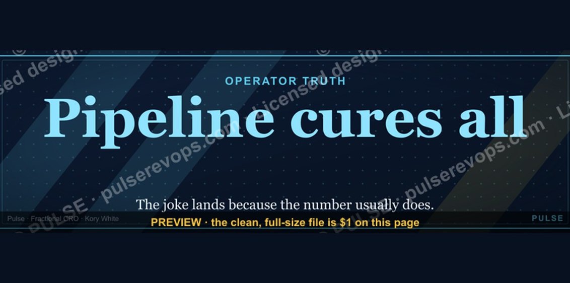 graphicPipeline cures all. — LinkedIn Wallpaper
 graphicHow to design a LinkedIn banner that converts viewers into leads in 2027?
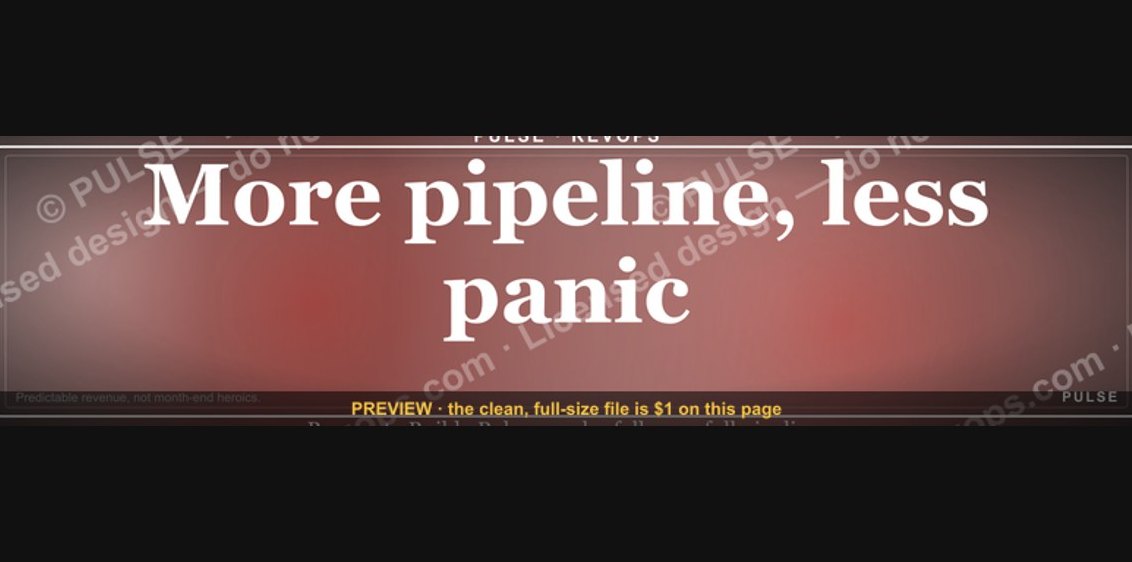 graphic“More pipeline, less panic.” — LinkedIn Banner
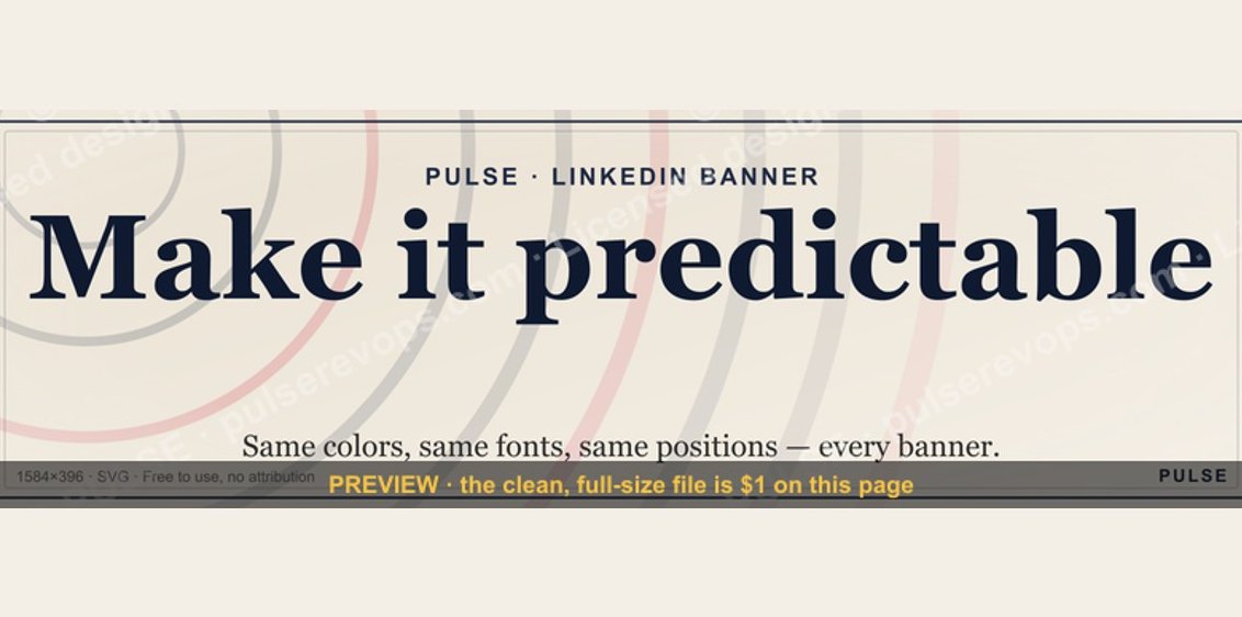 graphicMake it predictable. — LinkedIn Wallpaper
 graphicCalm closers win. — LinkedIn Wallpaper
 graphicHow to build a champion seller playbook in 2027
 graphic“Sell things worth buying.” — LinkedIn Banner
 graphicSales Coach — LinkedIn Banner