
SaaS Sales Cycle Stages
 Curated byKory White · Fractional CRO · Maryland
 PULSEKNOWLEDGE LIBRARY
Quality
Certified
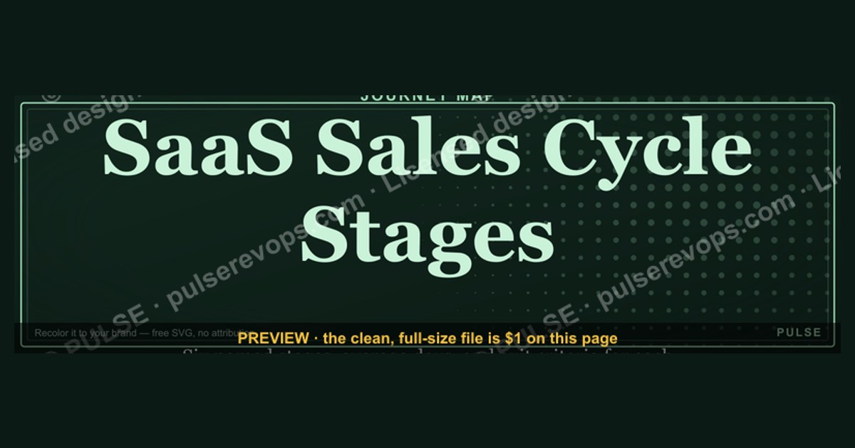
This is a 1600×500px banner titled "SaaS Sales Cycle Stages" — a horizontal timeline in a clean sans-serif on a dark navy background, running Prospecting → Qualification → Demo & Evaluation → Proposal & Negotiation → Closed-Won → Onboarding & Expansion, each stage in its own color-coded panel. Use it as a LinkedIn banner, sales-deck header, or wiki cover image for anything explaining how SaaS deals move.
The outcome you should expect
When this banner sits at the top of a sales enablement doc, a LinkedIn profile, or a deck's title slide, its job is narrow: give a viewer the shape of a SaaS deal in under three seconds, before they read a single sentence of surrounding text. That is the outcome to expect — not persuasion, not branding lift, just instant orientation. A rep scrolling a wiki page sees six labeled panels and immediately knows whether the page below covers early-funnel prospecting or late-stage renewal motion, without opening the document.
The six stages on the banner — Prospecting, Qualification, Demo & Evaluation, Proposal & Negotiation, Closed-Won, and Onboarding & Expansion — are deliberately chosen to be the stage names most SaaS orgs already use in their CRM pipeline settings, so the graphic reads as familiar rather than as a new framework someone has to learn. That familiarity is what drives adoption: nobody has to be trained to understand the banner, they recognize the words from their own Salesforce or HubSpot pipeline view.

Expect the banner to work best as connective tissue between documents rather than as a standalone artifact. On a LinkedIn profile banner, it signals "I work in SaaS sales" to anyone visiting the profile, and doubles as a subtle credibility marker for recruiters or prospects doing due diligence before a call. On a sales-deck title slide, it sets the frame for a training session or QBR before the presenter says a word. On an internal wiki cover, it acts as a visual index — later sections of the page can literally point back at a panel ("see the Proposal & Negotiation stage above") and readers immediately know where they are in the sequence.
What you should not expect: this banner does not replace a real pipeline definition document, a stage-exit-criteria sheet, or a forecasting methodology. It is a map, not the territory. Treat it as the cover image for that deeper material, not a substitute for writing the material. Teams that stop at the graphic and never write the underlying stage-exit criteria end up with reps who can recite the six stage names but disagree wildly on what qualifies a deal to move from one panel to the next — the banner communicates structure, but the operational discipline still has to be documented separately.

What drives that outcome
The banner's effectiveness comes from four deliberate design choices working together: sequence, color, hierarchy, and restraint. Understanding each one is what lets you customize the graphic later without breaking why it works in the first place.
Sequence is the backbone. The six panels run left to right in the same order deals actually move through a SaaS pipeline, so the eye tracks the banner the same way it would read a sentence — no zig-zagging, no need to hunt for stage two before stage one. This matters more than it sounds: a banner that ran top-to-bottom, or that grouped stages by team (marketing stages on the left, sales stages on the right, success stages floating) instead of by chronology, would force the viewer to stop and decode the logic before absorbing the content. Chronological left-to-right order removes that decoding step entirely.

Color does the categorization work that words alone can't do at a glance. The banner assigns a distinct hue to each stage, but the hues themselves are grouped by phase: Prospecting and Qualification sit in cooler blues (pre-pipeline, top-of-funnel), Demo & Evaluation and Proposal & Negotiation sit in warmer ambers (active deal, mid-to-late funnel), and Closed-Won and Onboarding & Expansion shift to green (revenue realized, post-sale). A viewer who has never seen the banner before can guess the rough phase of any panel from color alone, before reading the label.
Hierarchy keeps the banner from turning into a wall of text. The stage name is the only large text element in each panel — no sub-bullets, no percentages, no owner names. Every SaaS org's actual stage-exit criteria differ (some gate Demo & Evaluation on a technical proof-of-concept, others gate it on multi-threading into procurement), and trying to encode those org-specific rules onto the graphic itself would make it stale the moment any team's process changed. The banner intentionally stays at the altitude of "what are the stages," leaving "what qualifies you to advance" to the document underneath it.

Restraint governs everything else: no logos, no photography, no gradient noise behind the text. The 1600×500 canvas is wide and short, which is an unforgiving shape for anything busier than flat color blocks and a title bar — LinkedIn banners and slide headers get glanced at, not studied, so any visual competing with the six stage labels actively works against the banner's job.
Benchmarks and realistic ranges
Because this is a graphic asset rather than a metric, the useful "benchmarks" here are dimensional and placement rules of thumb rather than performance numbers — and it's worth being explicit that no click-through or engagement statistic should be attached to a static banner without your own tracked data behind it.

On dimensions: 1600×500px (a 3.2:1 ratio) is wide enough to read as a banner rather than a square image, and short enough that it doesn't dominate the page it sits on. That ratio is a reasonable middle ground for reuse — it's close enough to most platforms' native banner shapes that cropping loss stays small. For direct reference, LinkedIn's personal profile banner slot is 1584×396px, and X's (formerly Twitter) profile header is 1500×500px — both are close enough to 1600×500 that a center crop loses only a thin strip off the top and bottom rather than cutting into the stage panels themselves. If you're placing the banner as a full-width header image on a wiki page or blog post, most content-management themes render a hero image anywhere between 1200 and 1920px wide, so 1600px sits comfortably in that range without needing to be upscaled.
On text size: the stage labels need to stay legible at thumbnail scale, since that's how most viewers will first encounter the banner — as a small preview in a LinkedIn feed, a Slack link unfurl, or a file browser icon. A label that reads clearly at 1600×500 full-size but turns to mush at a 300px-wide thumbnail has failed the format. If you're customizing the wording (see below), keep stage names to one or two words wherever possible — "Demo & Evaluation" is close to the upper limit of what stays readable at thumbnail size in a six-panel layout.
On file weight: a flat-color, six-panel PNG at this resolution should land well under 500KB, since there's no photography or gradient noise to inflate the file. If your exported version comes back heavier than that, it's usually a sign the export included an unnecessary alpha channel or embedded color profile rather than any property of the design itself — re-export as a standard sRGB PNG-24 without transparency.

On placement frequency: treat the banner as a cover image, meaning it belongs at the top of a document once, not repeated inline as a divider between every section. A graphic built to be absorbed in three seconds loses its impact if a reader scrolls past six copies of it in one sitting.
Risks, edge cases, and failure modes
The most common failure mode is stage-name drift: an org customizes the banner's wording to match its own pipeline naming (fair and expected — see the customization section below) but then never updates the graphic again when the CRM pipeline gets restructured six months later. A banner that still says "Demo & Evaluation" on a wiki page after the team has since split that stage into "Technical Validation" and "Business Case Review" in their actual CRM creates a quiet but real mismatch between what new hires see on the wall and what's actually tracked in the system of record. Because the banner is a static image rather than a live data view, nothing forces it to stay in sync — that has to be a manual habit, ideally tied to whatever cadence the team already uses to review pipeline stage definitions.

A second failure mode is over-claiming precision the banner was never designed to carry. Six flat-colored panels are good at communicating sequence and category; they are bad at communicating proportion, duration, or conversion rate. If someone tries to repurpose this banner as a stand-in for a funnel chart — implying, say, that the width of each panel reflects how long deals sit in that stage, or what percentage of deals survive it — the graphic will mislead, because the panel widths are uniform by design and carry no such meaning. Any org tempted to layer numbers onto the banner should build a separate chart for that purpose rather than overloading this one.
A third, more mundane risk is platform cropping cutting off the first or last panel. Because most social platforms apply their own center-crop or safe-zone logic to uploaded banners, an upload that isn't re-checked in-platform can end up hiding part of "Prospecting" on the left edge or "Onboarding & Expansion" on the right edge behind a profile photo overlay (LinkedIn, in particular, places the profile picture over the bottom-left portion of the banner). Always preview the banner inside the actual platform UI after upload, not just the raw file, before treating the upload as done.

A fourth edge case worth flagging: teams outside a pure SaaS subscription motion — usage-based pricing, PLG-led self-serve, or hybrid enterprise-plus-self-serve models — may find the six-stage sequence doesn't map cleanly onto their actual deal flow. A product-led org where most revenue originates from in-product upgrade prompts rather than an outbound Prospecting stage will find the banner's leftmost panels don't describe how most of their revenue actually starts. In that case, the fix isn't to force-fit the existing banner; it's to relabel the leftmost stages (e.g., "Self-Serve Signup" and "Product-Qualified Lead" in place of "Prospecting" and "Qualification") using the customization approach below, so the graphic still tells the truth about how the org's pipeline actually works.
Finally, low-contrast exports are a recurring but avoidable failure: if the banner is re-colored to match a company's brand palette and the new background and text colors end up too close in luminance, the stage labels become unreadable at thumbnail size even though they look fine zoomed in on a desktop monitor. Always check a resized preview, not just the full-resolution file, before finalizing a recolor.

A practical rollout plan
Rolling this banner out cleanly is a short, linear process, and skipping steps is what produces the failure modes above. Start by confirming the stage names against your actual CRM pipeline configuration rather than against memory or a stale onboarding doc — pull the live stage list from Salesforce, HubSpot, or whatever system your sales team forecasts out of, since that live list is the source of truth the banner should mirror.
Next, decide whether the six default stages (Prospecting, Qualification, Demo & Evaluation, Proposal & Negotiation, Closed-Won, Onboarding & Expansion) match your motion or need renaming. If your pipeline has five stages instead of six, don't leave an empty panel — either merge two default stages into one panel or, if you have licensed source files for the graphic, remove a panel and rebalance the remaining panel widths evenly across the 1600px canvas.

Then customize colors only if brand guidelines require it, keeping the cool-to-warm-to-green phase logic intact even if the specific hues change, since that phase gradient is what lets a first-time viewer guess a panel's category before reading it. After any wording or color change, export a low-resolution thumbnail preview (roughly 300px wide) and check legibility there before treating any version as final — this is the single most skipped step and the source of most "we can't read our own banner" complaints after rollout.
Finally, place the banner and verify it in situ: upload it to the actual destination (LinkedIn profile, deck template, wiki header), reload the live page or profile, and confirm no platform-specific cropping or profile-photo overlay is obscuring a panel. Only after that live check should you consider the rollout complete, and set a recurring reminder — quarterly is reasonable — to re-check the banner's stage names against the live CRM pipeline, since pipeline restructures happen quietly and the graphic won't update itself.
Related questions
What are the standard stages of a SaaS sales cycle?
Most SaaS pipelines run Prospecting, Qualification, Demo & Evaluation, Proposal & Negotiation, Closed-Won, then Onboarding & Expansion — the exact names vary by org, but that sequence and its logic stay consistent across most subscription businesses.
How long should a SaaS sales cycle take?
It varies heavily by deal size and buyer type; self-serve and SMB deals can close in days, while multi-stakeholder enterprise deals commonly run several months, so any single "typical" number should be sourced from your own historical CRM data, not a generic figure.
What's the difference between a sales cycle stage and a sales funnel stage?
A sales cycle stage describes what a rep is doing with one specific deal (qualifying, demoing, negotiating); a funnel stage usually aggregates many deals or leads at once to show volume and conversion between stages — related concepts, different unit of analysis.
Can this banner be used for a non-SaaS sales process?
Yes, if the stage names are relabeled to match that process — the design (sequence, color-by-phase, flat panels) is generic enough to carry any linear, staged workflow, not only SaaS sales.
FAQ
What size is the "SaaS Sales Cycle Stages" banner? It's built at 1600×500px, a 3.2:1 ratio. That size is close enough to most social platforms' native banner dimensions (LinkedIn personal banners are 1584×396px, X headers are 1500×500px) that a center crop loses only a thin edge strip rather than cutting into any stage panel.
Can I change the stage names to match my own pipeline? Yes — customizing the labels to match your actual CRM pipeline stage names is expected and encouraged, since the value of the banner comes from matching what your team already sees in Salesforce or HubSpot rather than introducing a new set of terms to learn.
Why does the banner use color-by-phase instead of one color per panel? Grouping colors by phase (cool blues for pre-pipeline, warm ambers for active deal stages, green for post-sale) lets a first-time viewer guess a panel's rough category before reading the label, which is what makes the banner scannable at a glance rather than requiring careful reading.
Is this banner meant to replace a stage-exit-criteria document? No. The banner communicates the sequence of stages only; it deliberately leaves out the specific criteria that qualify a deal to move from one stage to the next, since those criteria differ by org and change more often than the stage names themselves.
What file format should I download and use? PNG is the right format for this banner, since it's flat color blocks and text with no photography — PNG keeps edges crisp at any size without the compression artifacts a JPEG export would introduce around the text and panel borders.
Where does this banner work best — LinkedIn, a deck, or a wiki? All three are reasonable placements, but the job differs slightly by venue: on LinkedIn it's a credibility signal on a profile, on a deck it frames a training session or QBR before the presenter speaks, and on a wiki it acts as a visual index readers can point back to from the sections below it.
Sources
- https://www.salesforce.com/resources/articles/sales-pipeline-stages/
- https://www.hubspot.com/sales/sales-pipeline-stages
- https://www.gartner.com/en/sales/glossary/sales-cycle
- https://business.linkedin.com/marketing-solutions/success/best-practices/linkedin-page-and-profile-image-guidelines
- https://help.x.com/en/managing-your-account/profile-picture-and-header-photo-specifications
- https://www.forrester.com/blocks/saas-buying-cycle/
- https://www.pipedrive.com/en/blog/sales-pipeline-stages
- https://www.gainsight.com/guides/customer-onboarding/
Related on PULSE
- What are the stages of a B2B sales pipeline?
- How do you build a sales pipeline stage-exit checklist?
- What is customer onboarding in a SaaS renewal motion?
- How do you design a LinkedIn banner for a sales team?
- What is a product-qualified lead (PQL)?
- How long does an enterprise SaaS deal typically take to close?
This page will be disappearing soon. Save it to your device for $1 — or read it free while it is here.
@Kory-White- · if Venmo asks, the last 4 of my number are 2012
This page is gone.
This one is off the shelf now. $1 keeps it on your phone for good — the whole page, pictures and diagrams included.
 graphicDecision-Maker Mapping Grid
 graphicB2B Buyer Journey Map
 graphicTouchpoint Timeline
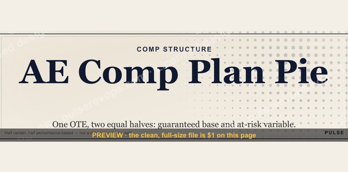 graphicAE Comp Plan Pie — 50/50 Split
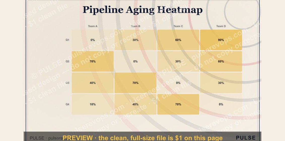 graphicPipeline Aging Heatmap
 graphicComp Plan Rollout — Title Slide
 graphicGTM Org Wheel
 graphicQuestions — Section Divider Slide
 graphic“Revenue for marketing tech.” — LinkedIn Banner
 graphicHow to design a LinkedIn banner that converts viewers into leads in 2027?