


Channel Account Manager — LinkedIn Banner
Quality
Certified
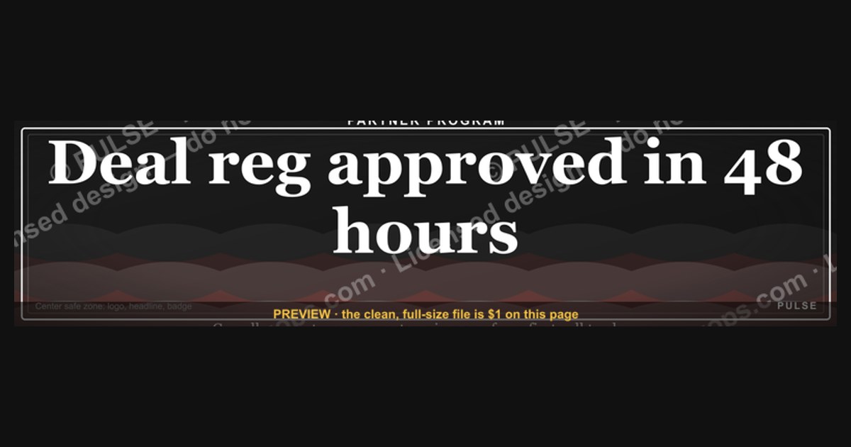
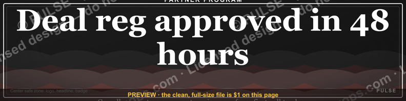
A Channel Account Manager's LinkedIn banner should be a 1584×396 px image that states, in eight to twelve words, what partners gain from working with you — not your job title. Keep the logo, one benefit headline, and program affiliation inside the center safe zone so mobile cropping never severs the message.
The Tuesday afternoon tab test
Picture a reseller principal in Columbus who has just been handed three vendor contacts by their distributor. It is a Tuesday afternoon, they have twenty minutes before a QBR, and they are deciding which of the three to reply to first. They open all three LinkedIn profiles in browser tabs. The first banner is the LinkedIn default — a flat blue-gray gradient nobody chose. The second is a stock photo of a handshake over a city skyline with the words "Channel Account Manager" set in 60px white type, which is redundant, because the job title already appears directly under the name in LinkedIn's own type treatment. The third banner reads "Deal reg approved in 48 hours. Co-sell support on every enterprise opp," with a partner-program badge in the upper right.
The third one gets the reply. Not because it is prettier, but because it answered the only question the principal actually had: what happens to my deals when I work with this person. That is the entire job of a Channel Account Manager LinkedIn banner. It is not decoration and it is not a personal brand statement. It is a 1584×396 pixel answer to a partner's operational question, sitting on a page that gets visited by people who are mid-decision.
This matters more in channel than in direct sales because the buying committee is different. A direct AE's profile is viewed by a prospect who already has a problem and is evaluating a solution. A CAM's profile is viewed by a partner principal, a partner's sales leader, or a partner's practice manager who is evaluating *you as a route to revenue* — deciding whether allocating a rep's time to your product beats allocating it to the three other vendors already sitting in the portfolio. Partner attention is the scarce resource in channel, and every element of your profile competes for a slice of it against vendors who may have larger margins, better MDF, or a longer relationship with that partner.
There is a second audience that gets forgotten: your own company's field sellers. When a direct AE finds a partner-sourced opportunity in their territory and wants to know who owns the relationship, they look you up. A banner that names your partner segment ("MSPs and MSSPs, US Central") or your program tier ("Elite tier partner enablement") saves that AE a Slack message and positions you as the routing authority rather than someone they need to work around. In organizations where channel conflict is a live problem, that framing has real operational value — it shortens the time between an AE spotting overlap and the right person adjudicating it.
The scenario also clarifies what the banner should *not* try to do. It cannot close a partner. It cannot substitute for a partner business plan, a joint marketing budget, or a deal registration SLA that actually gets honored month over month. What it can do is compress the first ten seconds of evaluation into a favorable impression, and prevent the far more common failure mode: a profile that gives a partner principal no reason to prioritize you over the other two tabs still open in their browser.
How the banner actually renders and where it breaks
Understanding the mechanism means accepting that LinkedIn does not display your banner the way you designed it. It displays a cropped, compressed, partially-obscured version that differs by device, and the differences are large enough to destroy an otherwise good design.
The upload spec is 1584×396 pixels — a 4:1 aspect ratio — with a maximum file size of 8 MB and support for PNG, JPG, and GIF (static only; LinkedIn does not animate profile banners). Upload at exactly those dimensions. If you upload something larger with the same ratio, LinkedIn downsamples it, and the resampling frequently softens thin type and logo edges. If you upload something smaller, it upscales, and you get visible blur on anything with a hard edge — which is every letterform and every logo boundary you care about.
On desktop, the banner sits behind the top of your profile card. Your profile photo occupies a circular slot in the lower-left, and LinkedIn draws it *on top of* the banner with a white ring around it. Depending on browser width, that photo circle covers roughly the leftmost 12–15% of the banner's width and the bottom 60–70% of its height. Anything you place there is gone. Directly to the right of the photo, your name, headline, and location render as dark text on the page background below the banner — but on narrower viewports the banner's bottom edge can crowd that text, so a busy or high-contrast bottom strip makes your own name harder to read.

On mobile, the crop is more aggressive. The LinkedIn app renders the banner in a shorter, narrower frame and center-crops horizontally, cutting a meaningful slice from each side. The practical consequence: a logo tucked into the far-right corner and a tagline starting at the far-left edge can both disappear on a phone while looking perfectly balanced on your 27-inch monitor. Because a large share of LinkedIn sessions happen on mobile, designing for desktop-only is designing for the minority of your viewers.
The working rule that survives both renderings: treat the center 1100×396 region as the only reliable canvas, and treat the lower-left corner of that region as already occupied. That leaves a usable band roughly from x=242 to x=1342, with the leftmost portion of the bottom half compromised by the profile photo. Put the headline in the upper-center or upper-right of that band. Put any logo or program badge in the upper-right. Keep the bottom-left dark, low-detail, or empty.
Compression is the third mechanism, and the one people forget entirely. LinkedIn re-encodes uploads server-side, and the artifacts land hardest on fine detail: 1px rules, small serif type, subtle gradients between similar hues, and busy photographic texture. A design that depends on delicate detail will look degraded after upload even though the source file was pristine. Designs that survive compression share traits — flat or broad-gradient backgrounds, type at 40px or larger, and high contrast between foreground and background.
The practical test is not "does it look good in Figma." It is: upload it, then open your own profile on a phone, on a laptop in a narrow window, and on a laptop maximized. If the headline survives all three, the layout works. If it does not, move the type inward and re-upload. Iterating this way costs about five minutes and catches the crop failures that no amount of desk-checking will surface, because the crop and the compression simply do not exist until after the file leaves your machine.
Numbers worth designing against

Numbers make this actionable, so here are the ones that matter, separated from the ones people invent.
Canvas and export. 1584 × 396 px, 4:1, 72 PPI, sRGB color profile. Export PNG-24 when the banner contains type, a logo, or flat color fields — PNG preserves hard edges without the ringing artifacts JPEG produces around high-contrast text. Export JPEG at quality 80–90 only if the banner is dominantly photographic and the PNG exceeds a few megabytes. LinkedIn's stated ceiling is 8 MB; in practice a well-built PNG banner lands between 150 KB and 900 KB, and if yours is sitting at 6 MB you have almost certainly embedded a full-resolution photo you should be downsampling first.
Safe zone. Keep every element you cannot afford to lose inside a centered 1100 px-wide band — roughly 242 px of sacrificial padding on each side. Vertically, treat the bottom-left quadrant as claimed by your profile photo. If you want a single guide rectangle to design inside, use x: 300–1300, y: 40–260. Anything inside that box renders on every device you are likely to be viewed on.
Type sizing. At 1584 px wide, a headline at 48–64 px reads cleanly on desktop and survives the mobile downscale. A subhead at 28–36 px is the floor — below about 24 px, mobile rendering plus compression turns it into a gray smear. Cap the total word count at 8–12 words across headline and subhead combined. That constraint is what forces the message to be good; a banner carrying 30 words is a slide, not a banner.
Contrast. Aim for a contrast ratio of at least 4.5:1 between banner text and its immediate background, which is the WCAG AA threshold for normal text. Large display type is permitted to go to 3:1 under AA, but 4.5:1 is the safer target once compression softens the edges. Free contrast checkers return the exact number from two hex values in about ten seconds, so there is no reason to guess.

Color count. Two to four colors total. One dominant background, one accent, one type color, and optionally one badge or logo color. Every color past the fourth reduces the perceived deliberateness of the design and increases the odds you have drifted off your company's palette without noticing.
Logo sizing. A wordmark logo at roughly 180–260 px wide sits comfortably in the upper-right of the safe zone without dominating the composition. An icon-only mark works at 80–120 px square. Use the approved lockup from your brand kit rather than pulling a logo off the company website, which is frequently a lower-resolution or outdated variant that nobody remembered to replace.
QR codes, if you use one. They can work, but hold them to roughly 120–160 px square minimum — smaller than that and phone cameras struggle, especially after LinkedIn's compression. Place it in the upper-right or far-right of the safe zone, ensure a quiet zone of white space around it equal to about four module widths, and test the scan from an actual phone held at arm's length from a laptop screen before you publish. Be honest about the yield: a QR code on a LinkedIn banner gets scanned far less often than one on a conference booth backdrop, because the viewer is usually already holding the device that is showing the banner.
Refresh cadence. Review the banner every 6–12 months, and immediately on three triggers: a company rebrand, a partner-program name or tier-structure change, or a change in your own segment or territory. A banner referencing a program tier that no longer exists is worse than a default banner, because it tells a partner your information is stale — and in channel, stale information is exactly the failure mode partners fear when they invest rep time in your product.
What not to claim. Do not put unverifiable performance numbers on a banner. "Partners grew revenue 340%" invites a question you cannot answer with a source, and a partner principal who has sat through a decade of vendor pitches will discount everything else on the profile the moment they spot one number they suspect is decorative. If you want to use a number, use one that is structurally true and checkable — a deal-registration SLA in hours, a program tier count, the number of countries your segment covers, the number of partners you personally support.
Four ways to build it, and what each one costs
There is no single correct production path. The right choice depends on what you are optimizing for: speed, brand compliance, editability, or independence from your marketing team.
Option one: use the corporate-issued template. Many vendors with mature partner programs distribute a social media kit to their channel team — pre-sized banners with the logo locked, the palette applied, and an editable text field. If yours exists, it is almost always the right starting point. Zero brand-compliance risk, zero design time, and it visually links you to colleagues, which reinforces that a partner is dealing with an organization rather than a lone individual. The trade-off is sameness: if eight CAMs use the identical banner with only a name swapped, none of them differentiate, and your specific value to a specific partner segment goes unsaid. Mitigate by adopting the template and changing only the headline copy to match your segment.
Option two: a template tool like Canva. Search the template library for LinkedIn banner layouts, set the canvas to 1584×396, apply your brand hex values and fonts, drop in the approved logo file, export PNG. Realistic time investment is 20–40 minutes for a first version. Strengths: no design skill required, the safe zone can be drawn as a locked rectangle layer you design inside, and the file stays editable forever, so the next rebrand is a ten-minute swap. Weaknesses: default templates are recognizable to anyone who has seen a few, stock imagery is heavily reused across profiles, and free-tier font choices may not match your brand typeface — which produces the subtle wrongness of a near-match font.
Option three: full design tooling — Figma, Illustrator, Photoshop. Best precision, best typography control, and Figma in particular is convenient because you can build the safe-zone guides as a frame overlay and export at exact dimensions in a single click. This is the right path if you own the design skill or have a designer who owes you a favor. The trade-off is time and dependency: if you cannot edit the file yourself, every future change becomes a ticket, and banners that require a ticket do not get updated when the program tier names change.
Option four: an SVG or vector asset you recolor. Vector sources scale without resolution loss, which means one file can serve the LinkedIn banner, an email signature, and a slide header. Recolor to your palette, then export a 1584×396 PNG for upload — LinkedIn does not accept SVG as a profile banner, so vector is the working format and PNG is the delivery format. The trade-off is that vector abstractions (network graphs, node diagrams, waveforms) read as generic unless the copy carries the meaning. A pulse line or node graphic supports a partnership message; it does not communicate one on its own.
Across all four paths, the compliance question is identical and worth settling before you design anything: does your company's brand policy allow employees to place the corporate logo on personal social profiles, and if so, which lockup. Some organizations require the icon-only mark on personal profiles specifically to distinguish employee accounts from official company pages. A five-minute question to marketing prevents a full rebuild later.
One more trade-off worth naming: static versus periodically-rotated. Some CAMs swap the banner to promote a specific moment — a partner summit, a new program tier, a quarterly incentive. That works only if you actually rotate it back afterward. The failure mode is a banner still advertising a summit that happened seven months ago, which reads worse than a generic evergreen design because it broadcasts neglect. If you are not confident you will maintain a rotating banner, build one evergreen banner that stays true across a full fiscal year and put time-bound promotions in your Featured section instead, where staleness is less visually loud and easier to clean up.
The failure modes that show up again and again
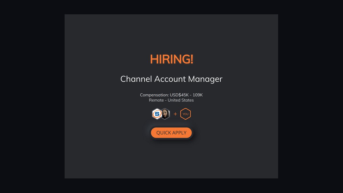
Restating the job title. "Channel Account Manager" in 60px type is the single most common mistake, and it wastes the entire canvas. LinkedIn already renders your title under your name. Use the space for something the profile does not already say — your segment, your program, your SLA, or what a partner gets.
Edge-anchored elements. A logo flush to the right margin and a tagline flush to the left looks composed on a wide monitor and gets guillotined on mobile. This is the crop failure, and it is entirely preventable by drawing the safe-zone rectangle before you place a single element.
Bright, busy lower-left. Your profile photo lands there with a white ring around it. If the banner behind it is high-detail or high-contrast, the photo reads as noisy, and your face — the thing that builds familiarity in a relationship-driven role — becomes hard to parse. Reserve that corner for a flat dark or muted field.
Partner logos without written permission. Displaying customer or partner marks on a personal profile is a trademark-use question, not a design question. Many partner agreements govern logo use tightly, and most vendors restrict co-branding to approved marketing collateral. A partner principal who sees their own logo used without a request is not flattered — they are quietly calculating whether you will be similarly loose with their pipeline data. If you want to signal ecosystem membership, use your *own* program badge, which you are authorized to display.
Unsourceable statistics. Anything of the shape "increases profile views by X%" that you cannot trace to a named study should not go on the banner and should not drive your design decisions either. Channel professionals are unusually good at spotting a number invented to sound persuasive, because they hear vendor claims all week long.
Font drift. Using a lookalike font because the real brand typeface is not available in your tool produces a design that is subtly, unplaceably off to anyone who knows the brand — including your own marketing team. Either get the licensed font file or use a clean neutral sans and lean on the palette and logo to carry brand recognition.
Low-resolution logo pulled from a webpage. Right-clicking the logo off your company's site usually yields a small, sometimes outdated PNG that visibly blurs at banner scale. Get the vector or high-resolution raster from the brand kit instead; it takes one message to marketing.
Text over photographic detail. White type across a photo with varied luminance means parts of the headline hit 8:1 contrast and other parts hit 1.5:1. If you must overlay a photo, add a solid or gradient scrim behind the type — a dark overlay at roughly 45–65% opacity across the text block reliably brings the whole line above the 4.5:1 threshold.
Designing once and never testing. The five-minute upload-and-check loop on a real phone catches more real problems than an hour of desk review, because the crop and compression only exist after upload. Skipping it is how carefully-built banners ship broken.
Ignoring the rest of the profile. The banner earns the next ten seconds, not the meeting. If the headline underneath still reads "Channel Account Manager at Acme" and the About section is three sentences written in 2019, the banner has delivered a partner to a dead end. The banner, the headline, and the first two lines of About should tell one continuous story about what partners get and how quickly they get it.
Related questions
Should a Channel Account Manager put the company logo on their LinkedIn banner?
Usually yes, but check brand policy first. Some companies require the icon-only mark on personal profiles to keep employee accounts visually distinct from official company pages. Use the approved lockup from the brand kit, sized around 180–260 px wide, placed in the upper-right of the safe zone.
What size is a LinkedIn banner?
1584 × 396 pixels, a 4:1 ratio, under 8 MB, in PNG, JPG, or static GIF. Design inside a centered 1100 px safe zone so mobile center-cropping does not remove your headline or logo, and keep the lower-left clear for the profile photo overlay.
Can I put partner or customer logos on my banner?
Only with written permission, and usually not. Most partner and customer agreements restrict trademark use to approved co-marketing collateral, and personal social profiles rarely qualify. Display your own partner-program badge instead — that is a mark you are authorized to use.
How is a CAM banner different from a direct AE banner?
Audience. An AE's banner speaks to an end buyer with a problem. A CAM's banner speaks to a partner principal deciding whether to allocate scarce rep time to your product versus a competing vendor's. The message should be about partner economics, not product features.
How often should I update it?
Every 6–12 months, plus immediately on a rebrand, a partner-program name or tier change, or a shift in your segment or territory. A banner citing a program tier that no longer exists signals stale information, which is precisely what partners fear when they invest in a vendor relationship.
FAQ
What should the headline on a Channel Account Manager LinkedIn banner actually say?
Say what a partner gets, in the partner's language. "Deal reg reviewed in 48 hours" or "Co-sell support on every enterprise opportunity" or "MSP practice building, US Central" all beat "Channel Account Manager," because they name an outcome or a scope rather than repeating a title LinkedIn already displays under your name. Hold the whole banner to 8–12 words so the message stays legible in the two or three seconds a profile visit actually lasts.
Do I need a designer to make one?
No. A template tool with the canvas set to 1584×396, your brand hex values, the approved logo file, and a locked safe-zone rectangle will produce a competent banner in under an hour. A designer buys you precision typography and a distinctive layout, which matters more if your competitors' CAMs are all using recognizable stock templates. Whichever path you take, keep the editable source file so the next brand refresh is a ten-minute change rather than a fresh project.
Will a better banner get me more partner conversations?
It removes friction rather than generating demand. A partner who was already going to evaluate you forms a faster, more favorable first impression; a partner who has never heard of you does not appear because of a banner. The measurable lift comes from the whole profile working together — banner, headline, About section, and a Featured section holding your partner program overview or onboarding guide. Treat the banner as the entry point to that system, not as a standalone source of revenue.
Should I include my email or phone number on the banner?
Generally no. LinkedIn already exposes contact info through the contact panel, banner text is not clickable or selectable, and a phone number rendered as an image invites scraping while giving a partner nothing they cannot get in one click. The one exception is a short branded URL to a partner portal or onboarding page — memorable enough to type, and it points somewhere genuinely useful.
Is a photo of me a good banner background?
Rarely for a CAM. Your profile photo already carries your face, and duplicating it in the banner spends the canvas on something the page already shows. Speaking-engagement or event photography can work when it establishes credibility with a partner audience — a shot from a partner summit stage, for instance — but the copy still has to carry the message, and photographic backgrounds need a scrim behind any text to stay readable after compression.
What single change improves most CAM banners fastest?
Delete the job title from the design and replace it with the specific thing partners get from you. That one edit fixes the most common failure — spending prime canvas restating information LinkedIn already renders — and forces you to articulate your value in partner terms, which is the same articulation you need for partner business plans, QBRs, and recruitment conversations anyway.
Sources
- https://brand.linkedin.com/ — LinkedIn's official brand and asset guidelines
- https://www.linkedin.com/help/linkedin/answer/a563025 — LinkedIn Help: adding and editing a profile background photo
- https://www.linkedin.com/help/linkedin — LinkedIn Help Center index for profile and media specifications
- https://www.w3.org/WAI/WCAG21/quickref/ — WCAG 2.1 quick reference, including contrast minimums
- https://webaim.org/resources/contrastchecker/ — WebAIM contrast checker for verifying text and background ratios
- https://www.bls.gov/ooh/sales/ — U.S. Bureau of Labor Statistics, Occupational Outlook Handbook: sales occupations
- https://hbr.org/ — Harvard Business Review, channel and partner management research
- https://www.gartner.com/en/sales — Gartner sales and channel practice research
- https://developer.mozilla.org/en-US/docs/Web/SVG — MDN Web Docs on SVG, for vector-source workflows
- https://www.uspto.gov/trademarks — USPTO trademark basics, relevant to third-party logo use
Related on PULSE
This page will be disappearing soon. Save it to your device for $1 — or read it free while it is here.
@Kory-White- · if Venmo asks, the last 4 of my number are 2012
This page is gone.
This one is off the shelf now. $1 keeps it on your phone for good — the whole page, pictures and diagrams included.
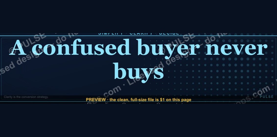 graphic“A confused buyer never buys.” — LinkedIn Banner
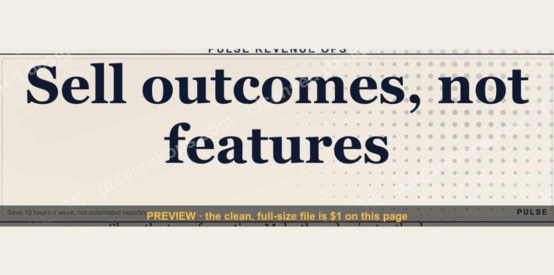 graphicSell outcomes, not features. — LinkedIn Wallpaper
 graphicLLM Builder AI Engineer — LinkedIn Banner
 graphicFractional CRO — LinkedIn Banner
 graphicProduct Marketing Lead — LinkedIn Banner
 graphic“Open to sales leadership roles.” — LinkedIn Banner
 graphicOne team. One number. — LinkedIn Wallpaper
 graphicHow to design a LinkedIn banner that converts viewers into leads in 2027?
 graphic“Stay in the deal.” — LinkedIn Banner
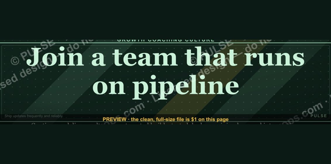 graphic“Join a team that runs on pipeline.” — LinkedIn Banner