


“Selling to developers.” — LinkedIn Banner
Quality
Certified
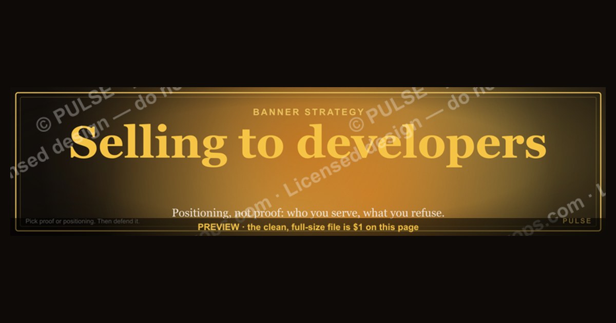
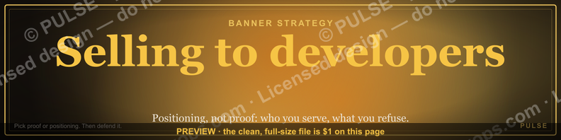
Selling to developers means earning technical credibility before asking for anything. A LinkedIn banner for that audience should state one specific, verifiable claim, skip stock imagery and buzzwords, and point to something a developer can try themselves — docs, a sandbox, a repo. Vague promises read as noise and cost you the click.
Two banner strategies: the proof banner versus the positioning banner
Almost every effective developer-facing LinkedIn banner falls into one of two camps, and choosing between them is the first real decision you make. The proof banner leads with evidence: a latency number, an adoption figure, a named integration, a benchmark result. The positioning banner leads with identity: who you serve, what problem you own, what you refuse to do. "Selling to developers." sits in the second camp — it is a positioning statement, not a proof point.
The proof banner works when you have a claim you can defend in the first reply. If your banner says something like "cuts CI wall-clock time on large monorepos," a developer who clicks through expects a methodology page, the hardware the test ran on, and the percentile distribution — not a marketing page with a gradient and a demo form. The upside is that proof banners convert faster among senior engineers, because they collapse the evaluation step. The downside is fragility: one unverifiable number and you have burned the profile. Developers screenshot bad benchmarks and post them.

The positioning banner works when your audience is broad, your product is early, or your role is relationship-first — a founder, a developer advocate, a technical account executive covering many products. "Selling to developers." tells a visitor, in three words, what your whole feed is about. It does not promise a number, so it cannot be falsified. Its weakness is that it earns nothing on its own; it is a frame that the rest of your profile has to fill. A positioning banner attached to a profile with no technical substance behind it is worse than a blank banner, because it advertises a gap.
There is a third hybrid that most people should actually run: positioning as the headline, proof as the subline. The banner in question does this — "Selling to developers." over a "Docs · DX · Trust" line. The top line claims a territory; the second line names the three things you believe make that territory work. A developer reading it for two seconds gets a thesis, not a pitch. That is roughly the maximum a 1584×396 slot can carry.
The trade-off between the two is also a trade-off in maintenance cost. Proof banners go stale — a number you posted eight months ago is now a liability if the product changed. Positioning banners age well but require the feed underneath to keep earning them. Pick based on how often you are actually willing to update the asset. If the honest answer is "once a year," go positioning.
How to decide which banner your profile should carry

Work backward from who lands on your profile and what they can do about it. A developer who cannot sign a contract still decides whether your tool gets evaluated at all, so the banner's job is to survive their skepticism, not to close them. A VP of Engineering scanning the same profile is deciding whether you are worth a thirty-minute call. Those two readers want different things from the same 1584×396 pixels, and you cannot serve both with a generic line.
The decision hinges on four inputs: whether you have a defensible number, whether your product is self-serve, whether your background is technical, and how broad your territory is. If you have a hard number and a self-serve product, run proof — the shortest path from banner to trial is the whole point. If you have no number yet, a sales-led motion, and a technical background, run positioning and let the feed do the convincing. If you have neither a number nor a technical background, do not fake either one; run a plain, honest role statement and invest the effort in content instead.
One more filter worth applying: how often does your territory change? Salespeople who move between products every eighteen months should avoid banners tied to a specific product's metrics, because the asset dies with the job change. A role-level positioning banner — the thing you do, not the thing you currently sell — survives the move and keeps its accumulated profile authority.

Finally, decide what the banner links to in the reader's mind, even though LinkedIn banners are not clickable. The banner sets an expectation; the featured section, headline, and first post have to pay it off within one scroll. If the banner says "Selling to developers." and the first pinned item is a generic webinar registration, the mismatch does more damage than the banner does good. Treat the banner as the top of a three-element unit: banner, headline, first pinned item. They should read as one sentence.
The numbers that actually matter behind each option
Start with the fixed constraints, because they are the ones people get wrong most often. LinkedIn's personal profile cover image is 1584×396 pixels — a 4:1 ratio. That is unusually wide, and it means any centered composition gets cropped differently across devices. On mobile, the profile photo overlaps the lower-left region and the visible vertical band narrows considerably. The practical rule: keep all critical text inside the horizontal middle band and away from the bottom-left quadrant, and assume roughly the middle 60 percent is what everyone sees regardless of device.
Text size is the second constraint. At 1584 pixels wide displayed in a feed-adjacent context, a headline needs to be large — think a single short phrase, not a sentence. "Selling to developers." is four words including the period, and that is close to the ceiling for a primary line. A secondary line like "Docs · DX · Trust" adds three tokens without adding reading load, because the separator makes it scannable rather than readable. Three supporting tokens is a good target; five starts to feel like a tag cloud.

Format matters for a different reason. SVG is the right authoring format because it scales without loss and stays editable — you can open it in Figma, Canva, or PowerPoint and change the color, the text, or the layout. LinkedIn itself wants a raster upload, so the workflow is: author in SVG, export PNG at 1584×396, upload the PNG. Keeping the SVG as the master means the next revision takes minutes instead of a redesign. If you recolor to brand, do it in the vector and re-export; do not recolor a PNG.
On the messaging side, the useful numbers are ranges rather than benchmarks, and it is worth being honest that publicly cited banner conversion figures are mostly unverifiable. What you can measure yourself is the delta on your own profile: profile views before and after, connection acceptance rate on outbound requests, and reply rate on the messages you send in the two weeks following the change. Run the banner for at least a full month before judging it, because profile traffic is lumpy and a single well-performing post distorts a short window. If you are sending fewer than fifty connection requests a month, you will not get a signal worth acting on — the sample is too small.
The cost side is worth stating plainly. A banner is a near-zero-cost asset with a long shelf life, which is exactly why it is under-optimized: nobody assigns budget to it, so it stays whatever the design team made two years ago. The realistic effort is an hour to author, twenty minutes per revision. Against a profile that might get several hundred to several thousand views a year in a focused territory, that is one of the better hours you will spend on your own revenue surface. Compare it to the effort of writing one more sequence and the math is not close.
One anti-pattern with a real number attached: logo walls. Putting six customer logos in a 4:1 strip gives each logo roughly 250 pixels of width, which on mobile renders them illegible. If you use logos at all, use one or two, sized large enough to read at thumbnail scale. An illegible logo wall reads as clutter and signals that you are optimizing for an enterprise buyer's slide deck, not for the engineer looking at your profile.
Building it, shipping it, and what happens downstream

The build sequence is short but order-dependent, and skipping the audit step is the most common failure. Start by auditing what the profile currently says — headline, about section, featured items, last five posts — because the banner has to be consistent with all of it. Then pick the strategy using the decision flow above. Then author in vector, export, upload, and only then start measuring. Changing the banner and the headline and the about section simultaneously means you learn nothing about which change moved the number.
Downstream, the banner changes what your outbound looks like. A connection request sent from a profile that clearly states a technical territory converts differently than one sent from a generic sales profile, because the recipient checks the profile before accepting. This is the part most teams miss: the banner is not a branding exercise, it is a pre-qualification asset sitting in the middle of your outbound motion. Every InMail, every comment on a technical post, every conference follow-up routes traffic back to that profile. Improving the profile improves the conversion of everything upstream of it, which is why it belongs in the revenue conversation and not only in the personal-brand one.

There are adjacent surfaces worth treating the same way once the banner is done. Your GitHub profile README, if you have one, is the equivalent asset for an audience that will never open LinkedIn. Your conference talk slide template, your email signature, and the header image on a technical blog post all occupy the same "who is this person" slot. Keeping one consistent three-token thesis across those surfaces compounds — a developer who sees the same framing in a Slack community, on a GitHub profile, and on LinkedIn forms a much stronger impression than one who sees three different taglines.
Sequencing across a team introduces a coordination question. If eight people on a developer-focused sales team all run the identical banner, the effect is corporate and slightly hollow; if all eight run something different, you lose the compounding. The workable middle is a shared visual system — same palette, same layout grid, same supporting-token treatment — with a per-person headline. That way a developer who talks to two of your reps recognizes the family without feeling processed by a template.
Watch for the failure modes that show up weeks later rather than immediately. The first is drift: the banner says one thing, the person's actual territory has moved, and nobody updated the asset. Set a calendar reminder each quarter. The second is over-claiming under pressure — a rep behind on quota adds a number to the banner that the product cannot support, and it surfaces in a technical call. The third is the accessibility miss: low-contrast text on a dark banner is unreadable for a meaningful share of viewers and on low-brightness mobile screens. Check contrast before you export, not after someone mentions it.
What developers are actually reacting to when they judge the banner

Underneath the design choices is a set of predictable reactions, and they are worth naming because they explain why certain banners fail despite looking good. Developers optimize for correctness and verifiability. When a claim arrives without a way to check it, the default response is not neutral curiosity — it is suspicion, because the pattern of unverifiable vendor claims is so well established that skepticism is the efficient prior.
That is why specificity beats intensity. "Optimize your DevOps" and "reduce CI pipeline wall-clock on large monorepos" occupy the same number of characters and land completely differently, because the second one names a condition under which it could be false. Claims that can be wrong are more credible than claims that cannot. A banner that names a constraint — a stack, a scale, a workflow — signals that you know the boundaries of your own product.
The second reaction is risk aversion about recommendations. When a developer champions a tool internally and it fails in production, the reputational cost lands on them, not on you. Anything in your banner or profile that reduces that perceived risk is doing real work: a link to thorough documentation, a self-serve sandbox with no sales follow-up, a public changelog, an honest limitations page. "Try it without talking to anyone" is one of the strongest things you can put near a developer-facing profile, and it is underused because it feels like giving up control of the process.
The third is a preference for autonomy in the evaluation sequence. Developers frequently discover tools through communities, repos, and colleagues long before any seller knows they exist, and by the time they surface they have already formed opinions. The banner's job in that world is to be a useful landmark rather than a gate. If the visible next step is a demo request form, you are asking someone mid-evaluation to restart on your terms. If it is documentation or a playground, you are joining an evaluation already in progress — a much better position.

The fourth is time. Every second of ambiguity is a cost. Jargon used slightly wrong, a typo, a slow-loading destination, a claim that requires three clicks to substantiate — each one is a small signal that you will be expensive to deal with. Efficiency reads as respect in this audience in a way it does not in most others.
Worth flagging: developers are not one audience. A frontend engineer evaluating a component library, a platform engineer choosing a service mesh, and a security engineer reviewing a scanning tool have different authority levels, different triggers, and different tolerance for vendor contact. A banner tuned to one may land flat with another. If your territory spans several of those, positioning beats proof, because a specific proof point necessarily picks a sub-audience.
Related questions
Should the banner mention a specific technology stack?
Only if your product is genuinely stack-specific and you are willing to narrow. Naming a language or framework sharply increases relevance for that segment and eliminates you for everyone else. For a broad territory, name the workflow instead of the stack.
Does a personal photo belong in a developer-facing banner?
Usually no — the profile photo already covers identity, and it overlaps the banner's lower-left region on most layouts. A conference photo can work if it shows genuine community involvement, but a posed stock-style shot actively hurts.
How often should the banner change?

Review quarterly, change when the underlying claim changes. Proof banners with numbers need the most frequent checks because stale metrics become liabilities. Positioning banners can run a year or more if the territory holds.
Is this worth doing for a non-technical product?
Only if the product solves a real developer pain. A developer-framed banner on a profile selling a general business tool confuses the actual buyer and attracts unqualified attention. Match the banner to the persona who signs.
What if I have no technical background at all?
Do not fake one — it surfaces within one exchange. Position on what is true: the territory you cover, the problems you have seen repeatedly, and who you bring in for depth. Honest framing outperforms borrowed credibility.
FAQ
What does "Selling to developers." signal on a LinkedIn banner?
It stakes a territory rather than making a product claim. It tells a visitor that your feed, your outreach, and your expertise are organized around technical buyers — engineers, platform teams, technical leads — who evaluate by testing rather than by sitting through a pitch. It works only if the rest of the profile backs it up.
What size and format should the banner file be?
The LinkedIn personal cover slot is 1584×396 pixels, a 4:1 ratio. Author the master as SVG so it stays editable and recolorable, then export a PNG at that exact size for upload. Keep critical text in the middle horizontal band and clear of the lower-left area where the profile photo overlaps.
Should I put a metric on the banner?
Only one, and only if you can defend it in your first reply — methodology, hardware, percentile, sample. A number you cannot substantiate is worse than no number, because developers verify. If you cannot back it, use a positioning line and put the proof in a pinned post where it has room to breathe.
How do I measure whether the new banner is working?
Track profile views, connection acceptance rate, and reply rate over a full thirty days, and change only one profile element at a time so the signal is attributable. If you are running fewer than fifty outbound touches a month, the sample is too small to conclude anything — measure the qualitative shift in who replies instead.
Can the same banner work across a whole sales team?
Share the visual system, not the exact asset. Same palette, grid, and supporting-token treatment, with a per-person headline. Identical banners across eight reps read as corporate wallpaper; completely different ones lose the recognition effect. The middle option gets both.
What is the most common mistake?
Treating developers as one audience. A frontend engineer, a platform engineer, and a security engineer differ in authority, triggers, and vendor tolerance. Generic "code on a screen" imagery and a one-size claim signal that you have not done the segmentation work — which is exactly the thing this audience screens for.
Sources
- https://www.linkedin.com/help/linkedin/answer/a563309 — LinkedIn Help: profile image and background photo specifications
- https://business.linkedin.com/marketing-solutions/blog — LinkedIn Marketing Solutions blog, B2B campaign and profile best practices
- https://survey.stackoverflow.co/ — Stack Overflow Annual Developer Survey, tooling and developer preference data
- https://docs.github.com/en/account-and-profile — GitHub Docs: profile READMEs and developer profile surfaces
- https://www.w3.org/WAI/WCAG21/quickref/ — W3C WCAG 2.1 quick reference, including text contrast requirements
- https://developers.google.com/style — Google developer documentation style guide
- https://www.writethedocs.org/guide/ — Write the Docs guide to documentation practice
- https://developer.mozilla.org/en-US/docs/Web/SVG — MDN Web Docs: SVG format reference
Related on PULSE
This page will be disappearing soon. Save it to your device for $1 — or read it free while it is here.
@Kory-White- · if Venmo asks, the last 4 of my number are 2012
This page is gone.
This one is off the shelf now. $1 keeps it on your phone for good — the whole page, pictures and diagrams included.
 graphicRegional Sales Director — LinkedIn Banner
 graphic“Never give without a get.” — LinkedIn Banner
 graphic“The next call is the most important one.” — LinkedIn Banner
 graphicPipeline cures all. — LinkedIn Wallpaper
 graphicHead of Sales — LinkedIn Banner
 graphicTrust compounds. — LinkedIn Wallpaper
 graphicHow to design a LinkedIn banner that converts viewers into leads in 2027?
 graphicBring the energy. — LinkedIn Wallpaper
 graphicFaster deals, fewer leaks. — LinkedIn Wallpaper
 graphicRevOps Manager — LinkedIn Banner