


Your pipeline is your paycheck. — LinkedIn Wallpaper
Quality
Certified
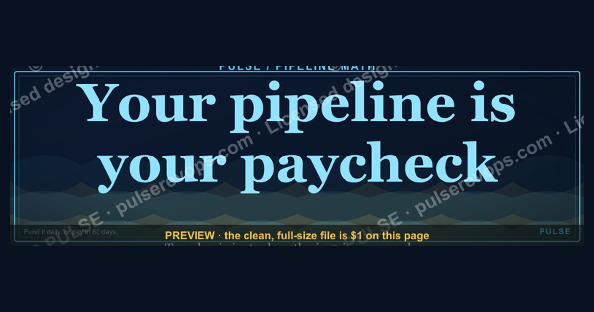
This banner is a 1600×500 px LinkedIn background image reading "Your pipeline is your paycheck." in bold serif type, white on charcoal, centered in the safe zone LinkedIn won't crop behind your profile photo. Download the PNG free and upload it as your LinkedIn cover photo to broadcast a pipeline-first mindset to every visitor.
The scenario: swapping your banner before a pipeline push
Picture a mid-market account executive two weeks into a new quarter with a number on the board and a mostly-empty pipeline underneath it. She's about to run a 30-day outbound sprint — cold calls, LinkedIn connection requests, a handful of warm intros from customer success. Before she sends a single message, prospects and hiring managers who click through to her profile will see one thing first: the banner behind her headshot. A default LinkedIn background (that pale, generic blue-gray texture everyone gets automatically) says nothing. It's wasted real estate on the single most-viewed square inch of her professional identity.
This is the moment this banner is built for. Swapping in "Your pipeline is your paycheck." does two things at once. First, it's a private commitment device — every time she opens her own profile to check a message or post an update, the line is staring back at her, a reminder that activity this week becomes commission next quarter. Second, it's a public signal to anyone who lands on her profile: a prospect deciding whether to take her call, a sales manager evaluating candidates, a peer at a industry meetup who screenshots it and reposts it. Reps in industries where LinkedIn is the primary prospecting surface — SaaS, agency services, staffing, financial services — get outsized value from this kind of banner because the platform itself is the sales floor. The banner isn't decoration there; it's the storefront window.

The same scenario plays out for sales managers building team culture around pipeline discipline. A manager who asks every AE on the team to run this banner during a quarter-end push turns an individual mindset cue into a visible, shared ritual — anyone scrolling LinkedIn sees six or eight reps from the same company all carrying the same line, which reads as coordinated intensity rather than one person's personal branding experiment. That's a deliberate use case this banner supports: it was designed at 1600×500 px specifically so it drops in cleanly across an entire team without anyone needing design software or a freelancer.
What's actually on the banner, element by element
The file is a single flattened PNG, no layers, no editable text baked in — what you see is what uploads. Reading left to right, three elements make up the whole composition.

The headline: "Your pipeline is your paycheck." sits in a bold serif face (a Times-adjacent, high-contrast serif rather than a geometric sans) because serif type at large sizes photographs and screenshots better than thin sans-serif weights, which can wash out when LinkedIn re-compresses the upload. The line is set in a single weight, no italics, no mixed case tricks — just sentence case for maximum legibility at the thumbnail sizes LinkedIn renders in search results and the "People You May Know" module.
The ground: a near-black charcoal field, not pure #000000 (pure black clips harshly against LinkedIn's white UI chrome and reads as a printing error on some phone screens), but a warm dark gray that keeps the text crisp without looking like a mistake. The attribution line — "— LinkedIn Wallpaper" — sits smaller, lower-right, in the same serif family at roughly a third of the headline's point size, functioning the way a caption functions under a photograph: it names what the object is without competing with the message.
Positioning respects LinkedIn's own layout, not just the canvas edges. LinkedIn overlays your circular profile photo on the bottom-left corner of the banner, roughly 20% of the image width, so the composition keeps the headline text weighted toward the center-right two-thirds of the frame, never running text through the bottom-left zone where a face and photo border would slice through letters.

That diagram is the actual render pipeline a single upload goes through — one file, two very different final crops depending on whether the viewer is on desktop or the mobile app, which is exactly why the safe-zone discipline in the design matters more than it would for a banner meant for one fixed placement like a website hero image.
Specs, dimensions, and the LinkedIn crop reality
The banner downloads at 1600×500 px, a 3.2:1 aspect ratio, delivered as a PNG under 8 MB (LinkedIn's hard upload ceiling; PNG compression on a mostly-flat charcoal background typically lands this file in the 200–500 KB range, well under the limit). LinkedIn's own stated recommendation for a personal profile background photo is 1584×396 px, an 4:1 aspect ratio — slightly shorter and wider than this master file. That mismatch is intentional, not an error: uploading at 1600×500 gives LinkedIn's cropper vertical headroom to work with rather than forcing it to crop horizontally into the headline text, which is the more common failure mode when people upload an image sized exactly to LinkedIn's stated dimensions with no margin.

In practice, expect roughly a 10–15% vertical trim off the top and bottom of the 1600×500 master when LinkedIn renders it in the 1584×396 slot. Because the headline sits in the vertical center third of the canvas, that trim never touches the type — only the charcoal background above and below it. If you inspect the rendered banner at 100% zoom on a 1440px-wide desktop monitor, the headline should read comfortably from a normal reading distance without pinch-zooming; on a phone screen (LinkedIn's mobile app renders the banner at roughly 390–430 px wide, a fraction of the master), a headline set below about 60pt-equivalent in the master file starts to blur into unreadable at that scale, which is why this design keeps the type oversized relative to what a typical Canva LinkedIn template ships with.
Contrast is the other number that matters and is easy to get wrong when people try to reskin this banner themselves. White text (#FFFFFF or close to it) on the charcoal ground here sits at roughly a 14:1 luminance contrast ratio — well above the WCAG AA minimum of 4.5:1 for normal text and comfortably into AAA territory. If you customize the palette (see the next section), dropping to a mid-gray or pastel headline color on the same dark ground can fall below 3:1, which reads as legible on a calibrated desktop monitor and nearly invisible on a phone screen in direct sunlight — the single most common reason a customized banner looks "off" without anyone being able to say why.
When this banner works — and when it backfires

This banner earns its place on a profile in a specific set of situations and actively hurts in others, and the difference usually comes down to audience and whether the claim matches reality.
It works well for individual contributors in outbound-heavy roles — SDRs, AEs, agency new-business reps, recruiters running a candidate pipeline — where the audience visiting the profile already understands sales culture and reads a pipeline-focused banner as competence signaling, not bravado. It works for sales managers who want a low-cost, zero-design-effort way to visually unify a team during a specific push (a quarter-end sprint, a new product launch, a post-reorg reset) because it's free, it's a direct upload with no editing required, and it can come down just as fast once the push ends. It also works reasonably well for solo consultants and agency owners whose entire business development motion runs through LinkedIn, where the banner functions as ongoing marketing copy rather than an internal reminder.

It backfires in a few predictable spots. On a senior leadership or C-suite profile, a slogan this blunt can read as performative — an SVP of Sales with a "pipeline is your paycheck" banner risks sounding like they're coaching themselves rather than running the org, which undercuts authority rather than building it. On a profile for a company or brand page rather than an individual, it violates most enterprise brand guidelines outright (wrong colors, wrong typography, an unsanctioned slogan) and should never be uploaded there — this asset is built for personal profiles only. And for anyone whose actual pipeline activity doesn't back up the claim — someone posting the banner while their calendar shows zero prospecting blocks — the gap between the wallpaper and the calendar becomes visible fast to anyone who works closely with them, which is a credibility cost, not a branding win.
Alternatives worth considering instead of, or alongside, this exact wording: a metrics-forward banner ("Q3: 40 meetings booked" style, updated each period, which trades evergreen simplicity for freshness); a company-branded banner using employer colors and logo for reps who need to stay inside brand guidelines; or a rotating quote series where this slogan is one of three or four swapped monthly so the profile never looks static to repeat visitors.
Common mistakes people make swapping banners

The most frequent failure is uploading a low-resolution or re-compressed copy — someone screenshots the banner off this page instead of downloading the source PNG, and LinkedIn's own re-compression on top of an already-lossy screenshot produces visible text blur, especially around serif letterforms with thin strokes. Always pull the actual downloadable file from this page rather than a screenshot.
The second is not checking the mobile crop before publishing. Desktop preview during upload can look perfect while the mobile app's tighter vertical crop clips the attribution line or pushes the headline closer to the profile-photo overlay than intended. Open the profile in the LinkedIn mobile app after uploading, not just the desktop editor, and re-crop if the headline sits too close to the photo circle.
Third is color or brand clash — pairing a dark charcoal banner with a very bright, high-saturation profile photo background (a lime-green home office wall, a busy branded photo backdrop) creates visual noise right at the seam where the two images meet. A simple fix is choosing a profile photo with a neutral or softly blurred background so the transition into the banner reads as intentional rather than accidental.
Fourth, people forget the banner goes stale. A slogan tied to a specific push (quarter-end, a launch, a hiring sprint) left up for six months past its relevance starts to look like profile neglect rather than intention — treat it the way you'd treat a status update, not a permanent fixture, and swap it out once the moment it was built for has passed.

Fifth, and most avoidable: skipping the file-size and format check before upload. LinkedIn silently re-encodes anything over its size ceiling or in an unsupported format, sometimes introducing compression artifacts you won't see until after the fact. Downloading the provided PNG directly (already optimized under 500 KB) sidesteps this entirely — there's no need to re-save, re-compress, or convert the file before uploading it.
Related questions
What size should a LinkedIn banner be?
LinkedIn's stated recommendation is 1584×396 px. This banner ships at 1600×500 px on purpose, giving LinkedIn's cropper vertical margin so the headline text never gets cut off during the automatic resize.
Can I edit the wording on this banner myself?
The downloadable file is a flattened PNG with no editable layers. To change the wording, recreate the layout in a design tool using the same dark-ground, high-contrast-serif approach described in the specs section above.
Does a LinkedIn banner actually affect pipeline results?

Indirectly. It won't generate meetings by itself, but it raises profile-view-to-response conversion by signaling intent and activity to anyone who clicks through before deciding whether to reply.
Should sales managers put every rep on the same banner?
Only for a defined, time-boxed push. A shared banner across a team reads as coordinated intensity during a sprint but starts to look uniform and impersonal if left up indefinitely.
What file format does LinkedIn actually want for banners?
PNG or JPG under 8 MB. PNG is preferred here because it compresses flat, high-contrast graphics like this one more cleanly than JPG, which introduces visible artifacts around sharp text edges.
FAQ
Is this banner free to use? Yes. Download the PNG directly from this page at no cost and upload it to your LinkedIn profile's background photo slot; no attribution or account creation is required.
Will the text get cut off when I upload it? Not if you upload the full 1600×500 master file. The headline is positioned in the vertical center and horizontal center-right, outside both LinkedIn's automatic crop margins and the profile-photo overlay zone.

Can I use this banner on a company LinkedIn page instead of my personal profile? No — it's built for individual profiles. Company pages have their own banner dimensions and typically need to follow internal brand guidelines rather than a generic slogan graphic like this one.
Why is the background charcoal instead of pure black or brand colors? Pure black can clip harshly against LinkedIn's white interface and print as an error on some screens; a warm dark charcoal keeps the white text at a strong contrast ratio while looking intentional rather than broken.
How often should I change my LinkedIn banner? There's no fixed rule, but tying it to something time-bound — a quarter, a launch, a hiring push — keeps it feeling current. A slogan banner left up for many months past its relevance can read as neglect.
Does a bold slogan like this ever hurt more than it helps? Yes, mainly on senior or executive profiles where blunt sales language can undercut authority, and on any profile where the claim doesn't match visible daily activity — the gap becomes a credibility problem rather than a branding win.
Sources
- https://www.linkedin.com/help/linkedin
- https://business.linkedin.com/sales-solutions
- https://www.hubspot.com/sales-pipeline
- https://www.salesforce.com/resources/articles/sales-pipeline/
- https://www.gartner.com/en/sales/insights
- https://www.forbes.com/sales/
- https://www.canva.com/create/linkedin-banners/
- https://www.w3.org/WAI/WCAG21/Understanding/contrast-minimum.html
Related on PULSE
- How to build a sales pipeline that doesn't leak between stages
- What counts as a qualified pipeline opportunity vs. a hopeful one
- How to structure a 30-day outbound sprint for a new quarter
- LinkedIn prospecting cadences that actually book meetings
- How sales managers reinforce pipeline discipline across a team
- Personal branding moves that support (not replace) pipeline generation
This page will be disappearing soon. Save it to your device for $1 — or read it free while it is here.
@Kory-White- · if Venmo asks, the last 4 of my number are 2012
This page is gone.
This one is off the shelf now. $1 keeps it on your phone for good — the whole page, pictures and diagrams included.
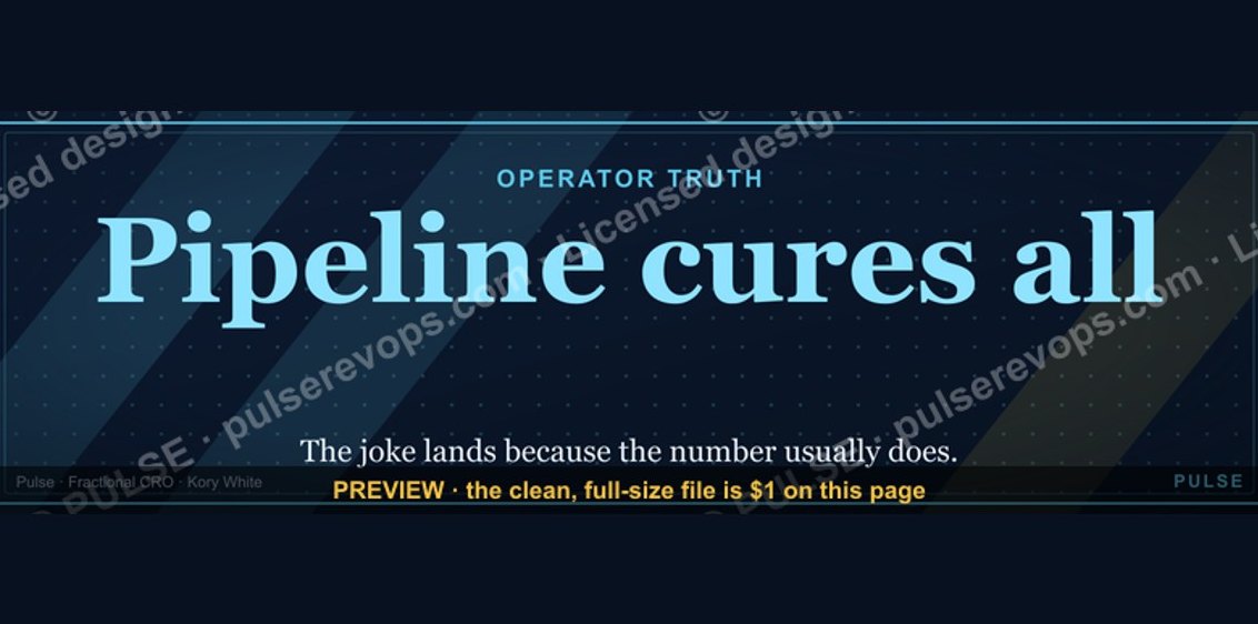 graphicPipeline cures all. — LinkedIn Wallpaper
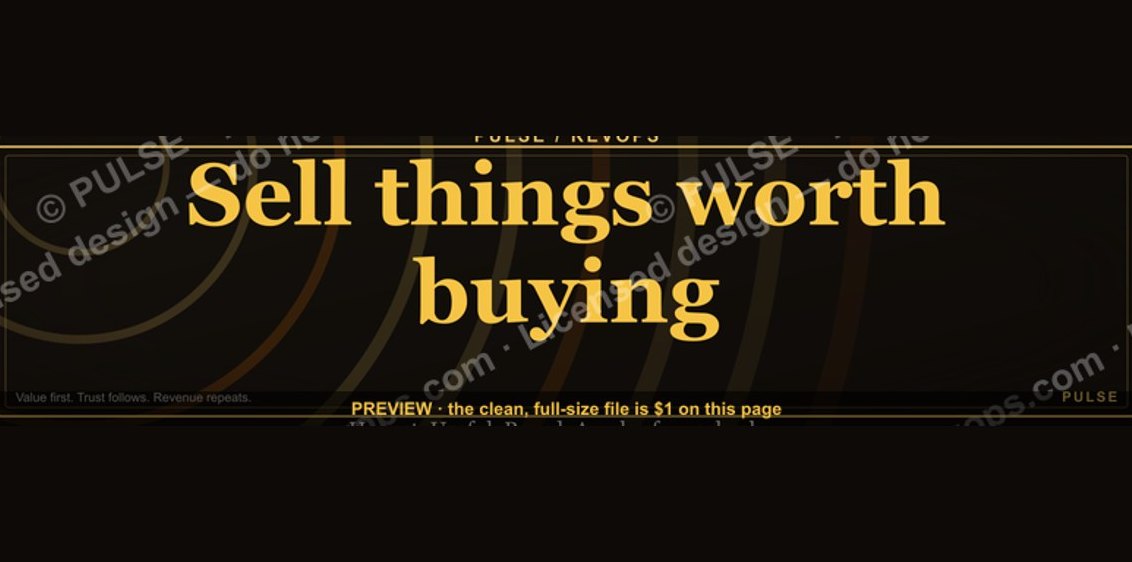 graphic“Sell things worth buying.” — LinkedIn Banner
 graphic"Pipeline is the product." — LinkedIn Banner
 graphicIndustrial Robotics CRO — LinkedIn Banner
 graphicInspect. Qualify. Commit. — LinkedIn Wallpaper
 graphicHead of Sales — LinkedIn Banner
 graphicOffensive Security Pentest CRO — LinkedIn Banner
 graphicWhat do top-performing graphic designers do differently in 2027?
 graphicSell outcomes, not features. — LinkedIn Wallpaper
 graphicCommercial Director — LinkedIn Banner