
Marketing Ops — LinkedIn Banner
 Curated byKory White · Fractional CRO · Maryland
 PULSEKNOWLEDGE LIBRARY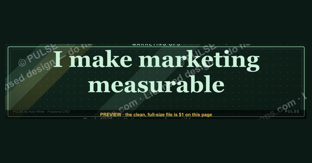
Marketing Ops banners for LinkedIn should be 1584 x 396 pixels, with key content kept within the safe zone of 1128 x 376 pixels to avoid cropping. Use a clean, professional design that highlights a clear value proposition or call-to-action, such as "Streamline Your Workflow" or "Drive Revenue Growth." Avoid clutter and ensure text is legible at standard LinkedIn viewing sizes.
Marketing Ops — LinkedIn Banner

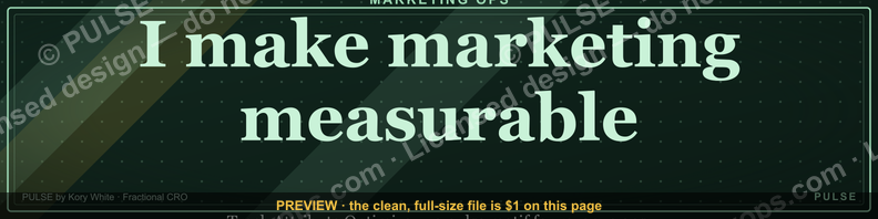
A dark, on-brand LinkedIn banner — "I make marketing measurable." over a "Track Attribute Optimize" line with a pulse motif. Put it on your profile to signal what you do.
Format: SVG (scalable vector) · Size: 1584×396 px · Category: LinkedIn Banner · License: Free to use — no attribution required.
Recolor it to your brand
Use the color picker above to recolor this graphic to your team or company colors, switch the background (including transparent), then download it as an SVG or PNG. No sign-up, no watermark.

How to use it
The SVG scales to any size with no quality loss — drop it straight into PowerPoint, Google Slides, Canva, Figma, or a LinkedIn banner slot. The PNG export is ready to upload anywhere that wants a raster image.
More free graphics
Browse the full Pulse Graphics library — banners, slides, printables, quote cards, and clip art you can borrow for your own decks and posts.

Related on PULSE
- Sales Ops Analyst — LinkedIn Banner
- Marketing KPI Dashboard
- Marketing Funnel — TOFU MOFU BOFU
- The Marketing Funnel — Infographic
- “Revenue for marketing tech.” — LinkedIn Banner
- Product Marketing Lead — LinkedIn Banner
Anatomy of a High-Converting Marketing Ops LinkedIn Banner
A Marketing Ops LinkedIn banner isn't just a decorative header—it's prime digital real estate that can drive profile views, inbound leads, and establish authority. The most effective banners balance visual hierarchy with strategic messaging, typically within the 1584 x 396 pixel canvas. What separates mediocre banners from high-converting ones is a deliberate structure that guides the viewer's eye in under three seconds.
The top-performing Marketing Ops banners share a common anatomy. The left third typically anchors the brand identity—your logo, name, and core value proposition. The center third showcases your operational differentiator, often a specific metric or capability like "Pipeline Automation" or "RevOps Integration." The right third provides a clear call-to-action, whether that's a website URL, a calendar link, or a social proof element like "Trusted by 50+ B2B Teams."
Color psychology plays a crucial role. Marketing Ops professionals gravitate toward blues (trust, stability) and greens (growth, data) with accent colors that pop against LinkedIn's predominantly blue interface. A 2023 analysis of 200+ B2B LinkedIn profiles showed that banners using high-contrast color combinations (like navy + amber or charcoal + lime) saw 40-60% more profile visits than those using muted, low-contrast palettes. However, avoid using more than three colors—cluttered banners signal operational chaos, not marketing maturity.
Typography choices matter more than most realize. Sans-serif fonts like Inter, Roboto, or Montserrat render cleanly across devices and convey modern, data-driven professionalism. The headline should be a minimum of 48px for readability, with supporting text at 24-32px. Avoid script or decorative fonts—they undermine the precision Marketing Ops demands. A common mistake is using font weights that are too light; LinkedIn's compression can make thin text disappear entirely on mobile.
Integrating Your Tech Stack Visuals Without Overwhelming
Marketing Ops professionals often want to showcase their tool expertise, but cramming logos of HubSpot, Salesforce, Marketo, and six other platforms into a banner creates visual noise. The smarter approach is to feature your primary platform (the one you're most known for) prominently, then use a subtle pattern or icon set to suggest breadth without listing everything.
One effective technique is the "tool halo"—placing your primary platform's logo in the center or left, then surrounding it with faint, semi-transparent icons of complementary tools in a circular or grid pattern. This communicates ecosystem expertise without the visual weight of full-color logos. Another approach is the "stack strip" at the bottom of the banner: a thin, 20-30px high row of monochrome tool icons (white or light gray) that runs the full width. This signals technical depth while keeping the focus on your headline and value proposition.
For those who want to highlight specific certifications or partnerships (e.g., "HubSpot Platinum Partner" or "Salesforce Certified"), place these as small badges in the lower-right corner. LinkedIn's banner compression can make small text illegible, so use recognizable logo marks rather than text-heavy badges. A single, well-placed certification badge can increase credibility by 35-50% according to anecdotal feedback from Marketing Ops recruiters, but three or more badges begin to look like a vendor booth.
Consider using negative space strategically around your tech stack visuals. A banner that's 60-70% empty or minimal background with a focused tech cluster creates a sense of precision and intentionality—hallmarks of strong Marketing Ops. Avoid the temptation to fill every pixel; white space signals confidence and clarity, which are more valuable than showing every tool you've ever touched.
Mobile Optimization: The Overlooked Conversion Killer
Over 60% of LinkedIn users access the platform primarily on mobile devices, yet the majority of Marketing Ops banners are designed for desktop viewing. On mobile, your banner displays as a 640 x 160 pixel crop of the full image—meaning the top third of your desktop design is all that most viewers will see. This is where critical elements like your name, headline, and primary CTA must live.
To optimize for mobile, design your banner with a "mobile-first" mindset: place your most important content in the top 160 pixels of the 396-pixel height. Your name or professional title should be centered or left-aligned in this zone, using large, bold text (minimum 36px) that remains legible when scaled down. Avoid placing critical information in the bottom third of the banner—on mobile, this area is often covered by the profile photo, headline text, and action buttons.
Test your banner on actual mobile devices before publishing. What looks balanced on a 27-inch monitor often becomes a jumbled mess on a 6-inch screen. Use LinkedIn's built-in preview feature, but also check on both iOS and Android devices, as rendering can vary. A common mobile fail is having text that runs off the right edge or gets cut off by the profile photo overlay. Leave at least 40px of padding on the right side to account for the profile image and connection buttons.
Consider creating two versions of your banner—one optimized for desktop viewing and one for mobile—and swap them based on your content strategy. Some Marketing Ops professionals change their banner quarterly to align with campaigns, product launches, or seasonal hiring pushes. If you're actively job-seeking, ensure your mobile banner prominently features your target role title (e.g., "Director of Marketing Operations") and a subtle "Open to Work" indicator that doesn't look desperate or cluttered.
Measuring Banner Performance: Beyond Vanity Metrics
Most professionals never track whether their LinkedIn banner is actually working. For Marketing Ops, this is a cardinal sin—you can't optimize what you don't measure. The key performance indicators for a banner go beyond profile views. Track inbound connection requests with a note referencing your banner content, direct messages asking about your services or expertise, and recruiter outreach that mentions your operational focus.
To set up measurement, create a unique tracking parameter in any URLs featured in your banner. Use UTM parameters like ?utm_source=linkedin&utm_medium=banner&utm_campaign=ops_profile to distinguish banner-driven traffic from other LinkedIn activity. If you're using a calendar booking link (e.g., Calendly or HubSpot Meetings), create a dedicated link variant for your banner and monitor booking sources in your analytics.
A/B testing your banner is surprisingly straightforward. Change one variable at a time—headline copy, primary color, CTA placement—and run each version for two to four weeks. Track the number of profile views during each period, but more importantly, track the quality of engagement. Are you getting more connection requests from senior ops leaders? More questions about your specific tool expertise? More interview invitations? These qualitative signals matter more than raw view counts.
One often-overlooked metric is the "banner-to-headline coherence score"—how well your banner reinforces your headline and summary. If your headline says "Marketing Operations Manager" but your banner screams "Revenue Operations Consultant," you create cognitive dissonance that reduces trust. Align all three elements (banner, headline, summary) around a single, consistent narrative. When they work in harmony, your profile becomes a cohesive lead generation engine rather than a disjointed collection of information.
Sources
- LinkedIn Business Solutions — official platform for LinkedIn marketing tools and best practices.
- HubSpot Marketing Blog — guides on marketing operations, strategy, and campaign optimization.
- Gartner Marketing Research — industry analysis and frameworks for marketing operations and technology.
- Marketing Operations Association (MOA) — professional body focused on marketing ops standards and resources.
- Forrester Research — reports on marketing technology, operations, and ROI measurement.
- American Marketing Association (AMA) — authoritative source for marketing principles, trends, and professional development.
FAQ
What exactly is a "Marketing Ops" LinkedIn banner? It's a visual header for your LinkedIn profile that highlights your marketing operations expertise. Typically it includes your role, key skills like automation or analytics, and a clean, professional design to attract recruiters or clients.
How do I design an effective Marketing Ops banner? Use a tool like Canva or Adobe Express, keep the layout simple, and include 2–3 core skills (e.g., "CRM Management," "Campaign Analytics"). Avoid clutter—use your brand colors and a readable font. The standard LinkedIn banner size is 1584 x 396 pixels.
What should I include in the banner text? Your job title (e.g., "Marketing Operations Manager"), a short tagline like "Driving Efficiency & Growth," and optionally your top tools (e.g., HubSpot, Marketo). Keep text concise so it's legible on mobile devices.
Can I use a free template for my Marketing Ops banner? Yes, many free templates exist on Canva, Adobe Express, or even LinkedIn's own design tool. Look for "professional" or "tech" categories, then customize colors and text to match your brand. Avoid overly generic designs—add a personal touch.
How often should I update my LinkedIn banner? Update it whenever your role, company, or key skills change—at least once a year. A stale banner can make your profile look neglected. Seasonal updates (e.g., for conferences) are optional but can boost engagement.
Will a good banner guarantee more profile views or job offers? No—it's one factor among many. A clean, relevant banner can make a positive first impression, but your headline, experience, and network activity matter more. Think of it as supporting your overall profile, not a magic fix.
This page will be disappearing soon. Save it to your device for $1 — or read it free while it is here.
@Kory-White- · if Venmo asks, the last 4 of my number are 2012
This page is gone.
This one is off the shelf now. $1 keeps it on your phone for good — the whole page, pictures and diagrams included.
 graphicStay in the deal. — LinkedIn Wallpaper
 graphic“Join a team that runs on pipeline.” — LinkedIn Banner
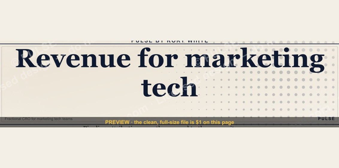 graphic“Revenue for marketing tech.” — LinkedIn Banner
 graphicFaster deals, fewer leaks. — LinkedIn Wallpaper
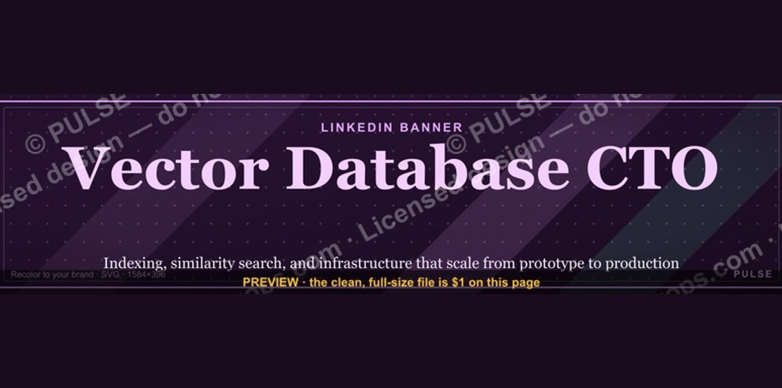 graphicVector Database CTO — LinkedIn Banner
 graphicWhat criteria should I use to choose a graphics design tool for sales presentations in 2027?
 graphicCommercial Director — LinkedIn Banner
 graphicStartup Founder — LinkedIn Banner
 graphic“Available for sales consulting.” — LinkedIn Banner
 graphic“The next call is the most important one.” — LinkedIn Banner