
“Revenue for marketing tech.” — LinkedIn Banner
 Curated byKory White · Fractional CRO · Maryland
 PULSEKNOWLEDGE LIBRARY
Quality
Certified
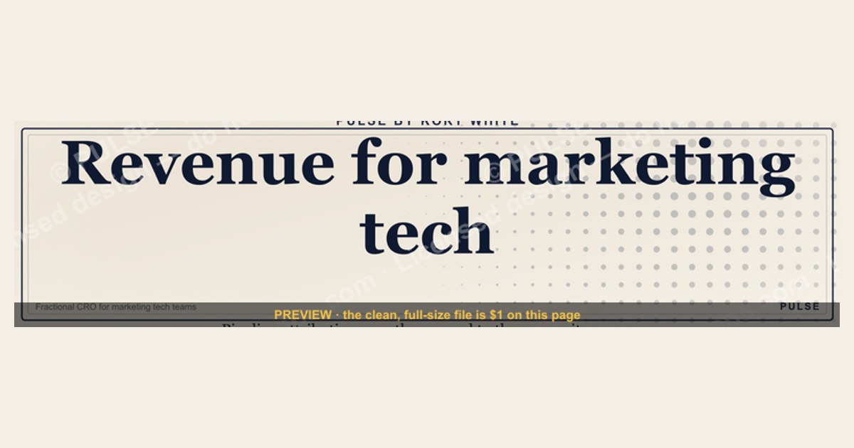
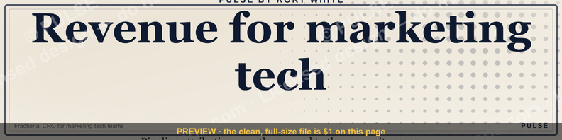
This is a LinkedIn profile banner sized 1584×396 pixels that reads "Revenue for marketing tech." in bold white sans-serif type, left-aligned on a dark charcoal background with a thin gold underline rule beneath the phrase. It's built for marketing technology operators — RevOps, growth, and martech leaders — who want their profile to state their function before a visitor reads a single word of their headline.
What it is and why it matters
The banner is a single-message design: one line of text, one accent element, one background field. The headline — "Revenue for marketing tech." — sits in the left two-thirds of the frame, in a bold sans-serif face sized large enough to read at LinkedIn's compressed mobile crop (roughly the top 300px of the full 1584×396 canvas, since LinkedIn's desktop and mobile renderers crop the banner differently and mobile shows noticeably less vertical space). Below the headline sits a thin gold horizontal rule, about 120px wide, which acts as a visual full stop and keeps the text from floating in empty space. The right third of the canvas is left intentionally clear — that's the zone LinkedIn's circular profile photo and name card overlap on desktop, so any graphic element placed there gets clipped or obscured behind the photo.
The reason a banner like this matters is positioning, not decoration. A LinkedIn profile gets scanned in under three seconds by most visitors — recruiters, prospects, partners — before they decide whether to read further. The headline field (the text directly under your name) already states your title; the banner is unclaimed real estate that almost everyone either leaves blank, fills with a stock photo, or fills with company branding that says nothing about the person. A banner that states a function — "Revenue for marketing tech." — does the positioning work a headline alone can't: it frames the visitor's next click (your headline, your About section) with context before they arrive there. For a marketing-tech-adjacent RevOps or growth role specifically, that phrase signals the visitor is looking at someone who thinks about martech spend in terms of revenue outcomes, not campaign volume or lead counts — a distinction that matters to the CFOs, CMOs, and VPs of Sales who are increasingly the ones vetting these hires.

The wording itself is deliberately compressed to four words plus a period, ending on a stop rather than a colon or ellipsis, because banner text at that width reads better as a declarative statement than as a teaser. A longer phrase — anything past roughly six to eight words — starts wrapping awkwardly on mobile crops or shrinking past a comfortable reading size, which is why the copy stays this short.
The step-by-step process
Installing the banner and pairing it correctly with the rest of the profile is a five-step sequence, not a single upload. Skipping the pairing steps is the single most common reason a banner like this underperforms — the graphic alone doesn't do the positioning work if the headline directly below it contradicts or duplicates it.
Step one is downloading the graphic at full 1584×396 resolution as a PNG — LinkedIn re-compresses whatever you upload, so starting from a soft or resized copy compounds into visible banding around the text edges. Step two is previewing the crop before uploading: open the file and mentally (or with a crop guide) block off the top ~25% and right ~30%, since that's what mobile visitors and the desktop photo overlap will hide. If the headline text sits too low in that safe zone, it gets clipped on phones, which is where a large share of LinkedIn profile views now happen. Step three is the upload itself through LinkedIn's profile editor — "Edit intro," then the banner/cover photo icon, then adjust the built-in crop tool LinkedIn provides, which lets you nudge and zoom before saving.
Step four is the one people skip: rewriting the headline field underneath the name so it doesn't just restate the banner. If the banner already says "Revenue for marketing tech.", a headline that repeats "Marketing Technology Revenue Leader" wastes the second surface. A stronger pairing puts the specific role and scope in the headline — title, company or category, and a metric or focus area — while the banner carries the broader positioning statement. Step five is checking the overlap zone again post-upload, since LinkedIn's crop tool sometimes shifts the visible window slightly differently than the raw file preview suggested. Step six, functionally the wait step, is confirming the change actually rendered: LinkedIn caches profile images aggressively, so a banner swap can take several hours to a full day to show consistently across search results, connection suggestions, and the mobile app, even though the edit page shows it immediately.

Costs, timelines, and typical ranges
The banner itself is a free download from this page as a PNG — there's no licensing cost, no attribution requirement, and no recurring fee, which distinguishes it from stock-photo banner backgrounds that often carry per-use or per-seat licensing on commercial stock sites. The only "cost" is time: figure five to ten minutes for the full install-and-pair sequence above if you're doing it once, closer to twenty minutes if you're also rewriting the headline and About section to match the new positioning, which is the recommended full pass rather than a banner-only swap.
Dimension-wise, 1584×396 pixels is LinkedIn's current standard cover-photo size as of this writing; LinkedIn has changed this dimension before (it moved from a narrower ratio years ago), so if a downloaded banner looks stretched or letterboxed on upload, it's worth confirming the platform hasn't shifted the spec again before assuming the file is wrong. File size for a clean PNG at this resolution typically lands in the 200KB–1.5MB range depending on how much flat color versus gradient or texture the design uses — a solid charcoal background with white text, as this one is, compresses efficiently and should stay well under LinkedIn's upload ceiling.
On timeline for visibility: the change is functionally live within minutes for anyone viewing your profile fresh, but propagation through LinkedIn's own caching, search index, and mobile app sync can lag anywhere from a few hours to about a day. Don't judge whether the banner "worked" — in the sense of a visible engagement or profile-view lift — inside that first 24-hour window; measure from the point it's confirmed rendering everywhere, not from the moment of upload. For profile-view or search-appearance impact more broadly, LinkedIn's own analytics (visible to Premium subscribers, and to a lesser extent free accounts) update on roughly a weekly cadence, so a fair before/after comparison needs at least one full week on each side of the change, not a same-day comparison.
Where teams get it wrong
The most common mistake is treating the banner as a logo placement instead of a positioning statement. Teams roll out a "brand kit" version of this banner across every employee's profile with the company logo dropped into the clear right-third zone — and the logo gets partially or fully hidden behind the profile photo on both desktop and mobile, so the investment in brand consistency produces a banner that looks broken rather than branded. If a company wants shared visual identity across profiles, the accent color (the gold rule in this design) and the type treatment are the elements to standardize — not a logo lockup that will collide with the photo circle on most screens.

The second mistake is a mismatch between the banner's claimed positioning and what the rest of the profile actually supports. A banner reading "Revenue for marketing tech." on a profile whose About section is a generic career summary with no mention of martech, revenue attribution, or marketing operations creates a credibility gap — visitors notice when the boldest claim on the page isn't backed up two scrolls down. The fix isn't necessarily rewriting the whole profile before installing the banner, but it does mean the banner should be the last piece added, not the first, once the headline and About section already carry the substance.
The third mistake is ignoring the mobile crop entirely. A design that looks perfectly balanced on a wide desktop monitor can have its headline text sitting almost entirely outside the visible window on a phone, where LinkedIn shows a much shallower vertical slice of the same 1584×396 file. Anyone previewing only on desktop before publishing is testing the wrong device — check the profile on a phone, in the actual LinkedIn app, before calling the rollout done.
A fourth, subtler failure is over-frequent swapping. Because the banner is free and quick to change, some teams cycle it every time there's a new campaign, product launch, or event — a job fair, a webinar promo, a conference logo. That turns a positioning asset into a billboard, and it erodes the original statement's weight; a visitor who's seen three different banners on the same profile in a month stops reading any of them as a considered signal and starts reading them as noise.
Decision framework: when to choose what
Not every role or team should run this exact wording. The decision of whether to use this banner as-is, adapt its wording, or skip a text-forward banner entirely comes down to how specific and durable the role's positioning is.
If a person's day-to-day work genuinely centers on connecting marketing technology spend to revenue — martech stack ownership, attribution, lifecycle operations tied to pipeline — the phrase as written is accurate and worth using without modification. If the role is adjacent but broader (general RevOps, growth marketing, demand generation without a strict martech-revenue mandate), the layout, type treatment, and gold-rule accent are reusable, but the wording should be swapped to match — "Revenue operations, built to scale" or similar reads more honestly than a martech-specific claim for someone whose scope is wider.
The second branch of the decision is durability. A banner is a slow-moving asset — it should describe something true for the next six to twelve months, not the current quarter's project. If a role is mid-transition (moving from a marketing function into a revenue-operations function, for instance, or the reverse), it's often better to either hold off on a text-forward banner until the new positioning is settled, or use a neutral banner (solid color, subtle logo, no specific functional claim) as a placeholder rather than publishing a claim that will need correcting in a few months. Teams outfitting multiple profiles at once should run each person through this same two-question check individually rather than applying one banner variant company-wide — role accuracy matters more than visual uniformity here.
Related questions
Can I use this banner if my title isn't "marketing" or "revenue"?
Yes — the wording is a positioning statement, not a job title. What matters is whether the claim ("revenue for marketing tech") accurately describes your actual scope of work, regardless of what your formal title says on paper.
Does LinkedIn compress the image quality after upload?
Yes, LinkedIn re-encodes uploaded banners, which can introduce mild artifacting around sharp text edges. Uploading the full-resolution 1584×396 PNG rather than a smaller or pre-compressed version minimizes visible quality loss after their processing.
Should the banner match my company's brand colors instead of gold and charcoal?
It can — the layout (left-aligned headline, thin accent rule, clear right-third zone) is the reusable part. Swapping the accent color to match brand guidelines is a reasonable customization as long as contrast against the background stays high enough to read on mobile.
How often should I update my LinkedIn banner?
Infrequently — treat it like a positioning statement, not a campaign asset. Cycling it for every announcement or event undercuts its credibility; a banner that changes every few weeks reads as noise rather than a considered signal about who you are professionally.
Will this banner look different on the LinkedIn mobile app versus desktop?
Yes — mobile shows a shallower vertical crop of the same file, so text placed low in the frame can be cut off on phones even though it looks fine on a desktop monitor. Always preview on the mobile app before finalizing.
FAQ
What exact text does this LinkedIn banner display? The banner reads "Revenue for marketing tech." in bold white sans-serif type, left-aligned, with a thin gold horizontal rule beneath the phrase, set against a dark charcoal background.
What are the exact pixel dimensions I need? 1584×396 pixels, which is LinkedIn's standard profile cover photo size. Downloading the graphic at this native resolution avoids the stretching or softness that comes from uploading an undersized file.
Can I edit the wording myself before downloading? The version on this page ships with the fixed wording shown above; if you want different text, colors, or a role swap, treat the layout as a template and rebuild the text layer in any basic image editor, keeping the same safe zones described in the customization sections above.
Where exactly should I place my profile photo relative to this banner? LinkedIn positions your circular profile photo automatically in the lower-left of the banner, overlapping roughly the left quarter to third of the image — this design keeps its headline text clear of that zone so nothing gets obscured.
Is this banner free to use commercially on a company page as well as a personal profile? It's provided as a free download for personal LinkedIn profile use; if you're deploying a variant across an entire company's employee profiles, treat that as a brand rollout and confirm the wording matches each person's actual role rather than copying it verbatim.
Why does my uploaded banner look blurry even though the download was sharp? This is almost always LinkedIn's post-upload compression combined with an undersized source file. Re-download the full 1584×396 PNG (not a screenshot or a resized copy) and re-upload directly from that file.
Sources
- https://www.linkedin.com/help/linkedin/answer/a566331
- https://business.linkedin.com/marketing-solutions/success/best-practices/linkedin-profile-best-practices
- https://www.canva.com/create/linkedin-banners/
- https://www.hubspot.com/marketing-statistics
- https://www.hootsuite.com/social-media-image-sizes-guide
- https://www.adobe.com/creativecloud/photography/discover/linkedin-banner-size.html
- https://blog.hubspot.com/marketing/linkedin-summary-tips
Related on PULSE
- How does revenue operations differ from marketing operations?
- What belongs in a martech stack audit before a budget renewal?
- How do you attribute pipeline to specific marketing channels?
- What should a RevOps leader's LinkedIn headline actually say?
- When does a marketing tech stack need consolidation versus expansion?
This page will be disappearing soon. Save it to your device for $1 — or read it free while it is here.
@Kory-White- · if Venmo asks, the last 4 of my number are 2012
This page is gone.
This one is off the shelf now. $1 keeps it on your phone for good — the whole page, pictures and diagrams included.
 graphic“Trusted advisor, never a vendor.” — LinkedIn Banner
 graphicVector Database CTO — LinkedIn Banner
 graphic“Stay in the deal.” — LinkedIn Banner
 graphicOne team. One number. — LinkedIn Wallpaper
 graphic“Hire slow. Ramp fast.” — LinkedIn Banner
 graphicRenewals Manager — LinkedIn Banner
 graphic“Available for sales consulting.” — LinkedIn Banner
 graphicMake it predictable. — LinkedIn Wallpaper
 graphic“Sell something people love.” — LinkedIn Banner
 graphic“Revenue that delights.” — LinkedIn Banner