
Startup Founder — LinkedIn Banner
 Curated byKory White · Fractional CRO · Maryland
 PULSEKNOWLEDGE LIBRARY
Quality
Certified
A startup founder's LinkedIn banner should visually reinforce their personal brand, typically featuring the company logo, a concise tagline or value proposition, and a clean, professional design. The standard banner dimension is 1584 × 396 pixels, with key content kept within the center safe zone to avoid the profile-picture overlap on the lower-left and the mobile edge crop. Use a high-resolution image that aligns with your industry — tech founders often opt for abstract gradients or product shots, while service-based founders may prefer team photos or client logos. Avoid cluttered layouts; focus on one clear message that tells viewers what you do in under three seconds.
Startup Founder — LinkedIn Banner
A dark, on-brand LinkedIn banner — "I build revenue from zero." over a "Build Sell Scale" line with a pulse motif. Put it on your profile to signal exactly what you do.
Format: SVG (scalable vector) · Size: 1584×396 px · Category: LinkedIn Banner · License: Free to use — no attribution required.

Recolor it to your brand
Use the color picker above to recolor this banner to your team or company colors, switch the background (including transparent), then download it as an SVG or PNG. No sign-up, no watermark.
How to use it
It scales cleanly to the LinkedIn cover slot (1584×396) — download the PNG and drop it straight onto your profile, or open the SVG in Canva, PowerPoint, or Figma to add your name and tweak the layout.
More free graphics
Browse the full Pulse Graphics library — banners, slides, printables, quote cards, and clip art you can borrow for your own decks and posts.

Related on PULSE
Strategic Placement: Where This Banner Works Best
While the banner is designed for LinkedIn, its impact varies depending on where you place it and how you integrate it with your overall profile strategy. The "I build revenue from zero" message lands differently across different sections of your profile.
Primary placement: the banner/hero slot. This is the most impactful location. The 1584 × 396 pixel dimensions mean your SVG renders crisply at any screen size. The banner area has one critical constraint: on mobile, the left and right edges get cropped, and the profile photo covers part of the lower-left corner. Keep your "Build Sell Scale" line within the center 60% of the canvas so it survives both. Preview your profile on a phone before finalizing.
Secondary placement: Featured section thumbnails. Many founders overlook the "Featured" section, which displays as a grid of rectangular cards. You can upload a compressed version of your banner as a featured media item; when someone clicks it, they see the full image. This creates a second touchpoint that reinforces your positioning without making people scroll back to the top.
Tertiary placement: in-post headers. When you share content about fundraising, pivoting, or early traction, use a cropped version of this banner (focusing on the "Build Sell Scale" portion) as the post's header image. This creates visual consistency across your profile and content. Keep these cropped versions at 1200 × 627 pixels for clean display in the feed.
Avoid these placements: Don't use this banner as your profile-picture thumbnail — the circular crop destroys the text — and don't bury it in the "About" section where it competes with written copy. The banner's power comes from immediate recognition, not from sitting inside text-heavy areas.
Integration with your headline: Your headline (the text right below your name) should echo the banner's message without repeating it verbatim. If your banner says "I build revenue from zero," your headline might read "Founder @ [Company] | Zero-to-Revenue Builder | Currently scaling [Industry] SaaS." The banner sets the tone; the headline supplies the factual context.
Color Psychology and Brand Alignment
The dark background with contrasting accent colors isn't only aesthetic — it shapes how viewers read your founder identity. Understanding these dynamics helps you customize the banner while keeping its core impact.
Dark backgrounds read as authority and focus. A deep navy or charcoal base (for example #1a1a2e or #16213e) communicates seriousness and depth, and it stands out against LinkedIn's predominantly white interface. There's a trade-off: dark backgrounds can feel less approachable for B2C or creative-industry founders. If your startup is in wellness, education, or consumer social, consider a slightly lighter dark (like #2d3436) or a subtle gradient that introduces warmth.
The accent color carries weight. The pulse motif and accent elements typically use a bright color — often electric blue (#00d2ff), vibrant green (#00b894), or amber (#fdcb6e). Common associations:
- Electric blue: innovation, technology, forward-thinking. Works well for SaaS, AI, and deep tech.
- Vibrant green: growth, sustainability, financial health. Suits climate tech, fintech, or health startups.
- Amber/gold: prestige, exclusivity, high-value outcomes. Fits luxury, consulting, or enterprise-focused founders.
If you're bootstrapping, green or amber can signal resourcefulness and profitability. If you're venture-backed, blue aligns with the disruption narrative.
The pulse motif's design role. A pulsing element — a circle or line that appears to throb — adds a focal point that draws the eye to your headline rather than letting it scatter across the canvas. Treat it as a visual anchor that points viewers at "I build revenue from zero," not as decoration competing with the text. Keep it small and high-contrast so it guides attention instead of stealing it.
Contrast ratios matter for accessibility. LinkedIn overlays white text (your name and headline) near the banner. If your banner uses similar tones in that zone, readability suffers. Aim for a contrast ratio of at least 4.5:1 between your banner text and its background — you can check this with WebAIM's contrast checker. The "I build revenue from zero" line should stay legible even at the small size shown when someone hovers over your profile in search results.
Tactical Text Variations for Different Founder Stages
The core message "I build revenue from zero" is strong, but it isn't one-size-fits-all. Your banner text can evolve as your startup progresses. Running the exact same banner for 18 months can read as stagnation rather than consistency.
Pre-revenue / idea stage: "Building from zero — revenue starts here." This acknowledges you're early while claiming the intent to generate revenue. Pair it with a calmer pulse motif (lower-opacity oscillation) to suggest gathering momentum.
First 10 customers / validation stage: "Zero to revenue — now scaling the playbook." This shows you've proven the model and are moving toward repeatability. The "playbook" framing signals systematization. A faster, brighter pulse suits this stage.
Post-seed / Series A stage: "Revenue from zero — built the engine, now fueling growth." This positions you as someone who's done the hard part (finding product-market fit) and is now focused on scaling. It tells hires and partners you're past the most existential risk.
Bootstrapped and profitable: "Zero to revenue — profitable and growing without dilution." A strong move for bootstrapped founders: it tells investors you don't need them and tells customers you're stable. Amber or gold accents reinforce the profitability narrative.
Pivoting or restarting: "Building revenue from zero — again." This signals resilience and experience. Founders who've pivoted successfully often find this version resonates with investors who value founder-market fit over a pristine track record.
Character-count considerations: LinkedIn's banner has no hard character limit, but readability does. Keep your main line under 40 characters (including spaces) for desktop legibility, and the secondary line (like "Build Sell Scale") under 30. If you need more text, use the "Featured" or "About" sections — the banner is for instant recognition, not full explanation.
Font pairing: If you customize the text, stick to sans-serif fonts with geometric or grotesque shapes (Montserrat, Inter, or Plus Jakarta Sans, which this banner likely uses). Avoid script or serif fonts; they lose legibility at small sizes and clash with LinkedIn's clean interface. Use a weight of at least 600 (semi-bold) for the main message and 500 (medium) for supporting text.
The "Build Sell Scale" Framework: Why This Specific Trio Works
The three-word progression "Build Sell Scale" mirrors the actual sequence of startup growth while using plain, concrete language. Understanding why it was chosen helps you decide whether to keep it or adapt it.
"Build" signals a maker identity. The word positions you as someone who constructs and executes — not just an idea person. For technical founders it feels authentic; for non-technical founders it signals you understand the product-development process even if you don't code. Avoid swapping "Build" for "Code" or "Design" unless those are your literal daily activities — "Build" is broader and more inclusive.
"Sell" is the uncomfortable but necessary word. Many founders avoid "sell" because it feels transactional. On a banner, that's exactly why it works. Most startup profiles say "innovate," "disrupt," or "transform" — vague terms that blur together. "Sell" is concrete and rare; it tells viewers you're not afraid of revenue conversations. In a highly regulated industry you might soften it to "Deploy" or "Launch," but you lose some of the directness that makes this banner effective.
"Scale" implies ambition without arrogance. "Scale" is the startup world's favorite buzzword, but here it works because it's the logical conclusion of "Build" and "Sell." You're not claiming to have scaled already — you're stating the trajectory, which suits early-stage founders. If you've already scaled (say, past $10M ARR), consider "Optimize" or "Systematize" to reflect your current focus.
The order is deliberate. "Build Sell Scale" follows the chronological reality of startups: you build something, you sell it, then you scale the process. Reversing it would break that logic. If your startup is acquisition-focused, you might end with "Exit" instead of "Scale" — but that shifts the banner's energy from growth-oriented to exit-oriented, a meaningful change in positioning.
Cultural considerations: In some markets, direct statements about selling can read as aggressive. If your primary audience sits in those regions, "Build Launch Grow" is a softer alternative that keeps the three-word rhythm while easing the directness.
Sources
- LinkedIn Help Center — Adding or editing a background photo — official guidance and dimensions for profile banner images
- Canva Design School — tutorials and best practices for social media banner design
- HubSpot Blog — How to Create a LinkedIn Profile — personal branding and profile optimization
- Forbes — Leadership & Entrepreneurs — coverage of founder branding and professional networking
- Adobe — Image sizes for social media — visual design principles and banner specs
- WebAIM Contrast Checker — tool for verifying text-to-background contrast ratios
FAQ
Can I use this banner if I'm pre-revenue? Yes. It's designed for founders at any stage. It centers on founder identity rather than traction metrics, so you can swap in your own headline and value prop — for example, "Building from zero — revenue starts here."
Will this banner work for a B2B SaaS startup? Yes. The clean layout and bold typography suit B2B SaaS especially well, but they're flexible enough for most tech or service-based startups without being locked to one industry.
How do I customize the banner for my own startup? Recolor it with the picker on this page, or open the SVG in Canva, Figma, or Photoshop to replace the text, logo, and background. The layered structure is straightforward to edit.
Does the banner include a call to action? A CTA is optional. The default focuses on your title and brand, but you can add a subtle line like "Let's connect" or a website link in a lower corner without cluttering the layout.
Is this banner optimized for mobile LinkedIn? Yes. It uses LinkedIn's wide 1584 × 396 aspect ratio with key text kept large and centered, so the core message stays readable on smaller screens even after the mobile edge crop.
Can I use this banner if I'm a solo founder? Definitely. It's intentionally neutral, so it works for solo founders, co-founders, or small teams. Adjust the wording to match your role — for instance, "Solo Founder & CEO."
Recently Added — Related
This page will be disappearing soon. Save it to your device for $1 — or read it free while it is here.
@Kory-White- · if Venmo asks, the last 4 of my number are 2012
This page is gone.
This one is off the shelf now. $1 keeps it on your phone for good — the whole page, pictures and diagrams included.
 graphic“Process over pressure.” — LinkedIn Banner
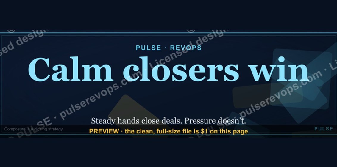 graphicCalm closers win. — LinkedIn Wallpaper
 graphic“Ready to lead a sales team.” — LinkedIn Banner
 graphic“More pipeline, less panic.” — LinkedIn Banner
 graphic“Revenue for marketing tech.” — LinkedIn Banner
 graphicSales Coach — LinkedIn Banner
 graphicRevOps Manager — LinkedIn Banner
 graphic“Revenue that delights.” — LinkedIn Banner
 graphic“Trusted advisor, never a vendor.” — LinkedIn Banner
 graphicOne team. One number. — LinkedIn Wallpaper