
VP of Sales — LinkedIn Banner
 Curated byKory White · Fractional CRO · Maryland
 PULSEKNOWLEDGE LIBRARY
Quality
Certified
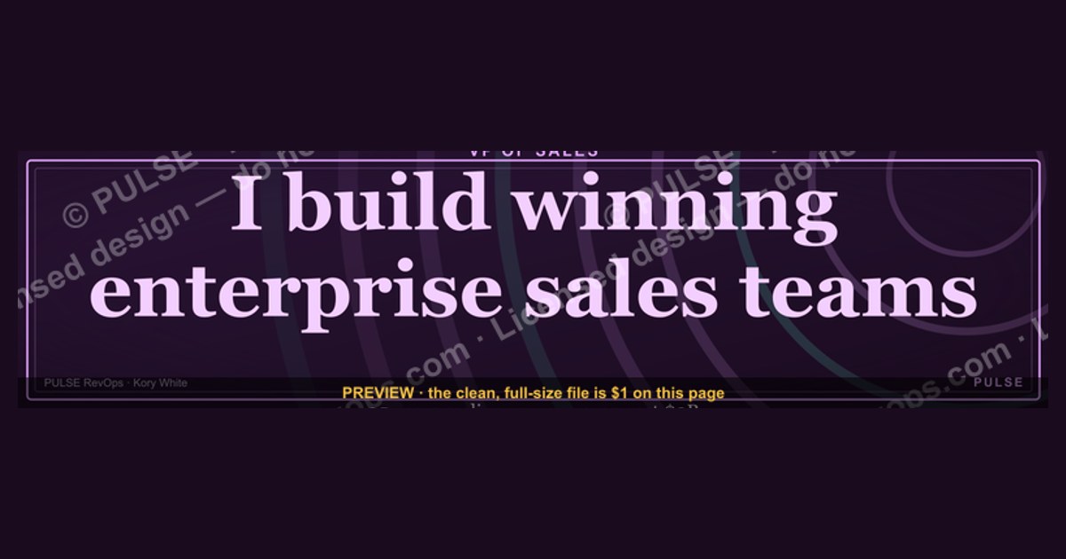
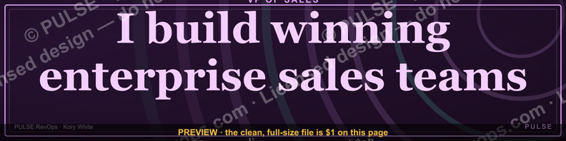
This is a LinkedIn profile banner sized 1584x396 px, built for a VP of Sales headline. It reads a short authority statement (title, function, and a proof line such as a growth number or team size) in a clean sans-serif over a dark navy or charcoal field, with a thin gold or brand-accent rule underlining the title. Download the PNG free from this page and drop it straight into your LinkedIn cover-photo slot.
The two ways to brand a VP of Sales LinkedIn banner
There are really only two credible directions for a Sales leadership banner, and almost every version you see on LinkedIn is a variant of one of them. The first is the text-forward identity banner: your name, your title ("VP of Sales" or a more specific flavor like "VP of Sales, EMEA" or "VP, Enterprise Sales"), and one supporting line that names the company or the function you own — pipeline, revenue, GTM. No charts, no headshots, no logos beyond your own company's wordmark in a corner. This is the safest, most durable choice because it never goes stale; a banner that just states who you are and what you run doesn't need updating when a quarter closes.
The second is the proof-forward banner, which trades some of that stability for immediate credibility. Instead of (or alongside) the title, it surfaces a concrete achievement: "Built and led an $80M ARR sales org," "3x'd pipeline in 18 months," "Promoted from AE to VP in 4 years." This version does more selling — a recruiter, a prospective hire, or a board member skimming your profile gets the headline result in under two seconds — but it carries risk. Numbers age. A banner boasting last year's growth rate looks stale the moment this year's numbers land, and a number that can't be substantiated if someone asks about it in an interview or a reference call creates more doubt than it removes.

A hybrid exists and is arguably the most common choice among senior sales leaders: title and function stated plainly in the largest type, with a smaller, evergreen proof line underneath that's phrased so it doesn't need a refresh — "Scaling revenue teams from Series A through IPO" reads as credible three years from now the same way it does today, unlike "Grew ARR from $10M to $40M in 2025." The banner on this page is built in that hybrid register: bold title treatment as the anchor, a slim accent rule for visual structure, and room for one line of positioning text that you can swap for your own wording without breaking the layout.
Which of the two — or the hybrid — is right depends heavily on what the banner needs to do for you. A VP actively fundraising internally or job-hunting benefits from the proof-forward version because the banner is doing outbound work every time someone views the profile. A VP focused on internal visibility, team recruiting, or partner-facing credibility usually does better with the calmer text-forward or hybrid version, because it reads as senior and settled rather than a highlight reel.

How to decide between them
Use the decision path below whenever you're choosing which variant to actually publish. The core question is what job the banner needs to do this quarter — recruiting talent onto your team, being found by executive recruiters, signaling internally after a reorg, or just looking sharp and current. Each branch below maps to one of the two approaches (or the hybrid) described above.
Two things fall out of this that are easy to miss. First, a banner tied to a specific metric commits you to a maintenance cadence — if you're not willing to revisit the graphic every time the number moves, don't put the number on the banner. Second, the "internal" branch is underused: sales leaders update their banner when they're looking outward (new job, new visibility push) far more often than when something changes inward, but a reorg, a new territory, or a title change ("Head of Sales" to "VP of Sales") is exactly the moment a banner mismatch gets noticed by the people who matter most — your own team and your peers.

Concrete numbers behind each option
The dimensions are fixed by LinkedIn regardless of which direction you choose: the desktop banner canvas is 1584x396 px (a 4:1 ratio), and LinkedIn's mobile crop keeps roughly the center 1584x350 safe, meaning the top and bottom ~23 px on each edge can be clipped on a phone. Keep your title text and any proof line inside the center 60% of the vertical space — a common working safe zone is the middle 240 px of the 396 px canvas — so nothing important sits in that clipped strip. Export as PNG (not JPEG) if the design has flat color fields or a gradient, since PNG avoids the compression banding that shows up on solid dark backgrounds; keep the file under LinkedIn's 8MB cap, though a well-optimized banner at this size typically lands between 200KB and 900KB.
On the proof-forward version, the strongest performing pattern among sales leaders isn't a single giant number — it's a number paired with a timeframe and a scope qualifier, because that combination is what a skeptical reader actually finds credible: "$40M to $95M ARR in 3 years, enterprise segment" reads as verifiable in a way "Grew revenue 137%" doesn't. Keep the headline number to one; banners that try to stack two or three metrics (revenue growth, team size, quota attainment) in a 396px-tall strip almost always end up too small to read at the thumbnail size LinkedIn actually renders on a feed or in search results, which is closer to 400x100 px effective viewing size on desktop and smaller on mobile.
Typography matters more than color choice at this size. A title set below roughly 40–48px in the full-resolution 1584px-wide file will read as a thin, hard-to-parse line once LinkedIn compresses it; conservative, high-contrast sans-serif faces (the kind used in the hybrid banner on this page) hold up better under LinkedIn's own re-compression than serif or script faces, which tend to lose their fine strokes. High-contrast color pairing — light text on a dark navy or charcoal field, or the reverse — outperforms mid-tone-on-mid-tone combinations specifically because the banner sits directly above your profile photo circle and the "Open to work" or "Hiring" banner ribbon LinkedIn sometimes overlays in the same region, both of which compete for attention in that strip.
Building and rolling it out across a sales team
If you're the one setting this standard for more than just your own profile — say, rolling a consistent banner out to your whole sales leadership bench or your AE team — sequencing matters more than the design itself. Start with the template, not the individual copy: lock the layout, the color field, the accent rule, and the safe zone first, and leave only the title line and the proof line as swappable fields. This is the same reason design systems separate structure from content — it lets ten VPs and directors adopt one visual identity in an afternoon instead of each person redesigning a banner from a blank canvas.

The step most teams skip is the legal or brand review in the middle of that chain — the moment a banner states a hard revenue or growth number, it becomes a public claim about company performance, and depending on your company's disclosure posture (particularly if you're anywhere near being a public company or in a fundraising process), that single line on a personal LinkedIn banner can create a compliance headache nobody intended. A quick sanity check with whoever owns external communications before a proof-forward banner goes live across multiple leaders' profiles is cheap insurance against having to ask everyone to take it down later.
On the export side, work from the full 1584x396 canvas rather than resizing a smaller graphic up — upscaling introduces visible softness in the title text at the size LinkedIn renders it, and once compressed a second time by LinkedIn's own pipeline, soft source art turns visibly blurry. If you're producing this for several people, export each person's version as its own flat PNG rather than relying on LinkedIn or a third-party tool to overlay text dynamically; LinkedIn has no live-template feature for banners, so every variant needs to be a finished, individually-exported image file, uploaded through Profile → "Add cover photo" → drag-to-reposition, one person at a time.

Finally, set a real reminder to revisit the banner, not just a mental note. A hybrid or text-forward banner can go a year or more without needing a touch; a proof-forward one needs a review trigger tied to whatever event changes the number — end of fiscal year, a funding round close, a milestone like crossing a new ARR threshold — so the banner never sits publicly wrong for months after the underlying fact has changed.
Related questions
What size should a LinkedIn banner be for any role, not just sales?
LinkedIn's banner canvas is 1584x396 px for every profile type. The safe zone that survives both desktop and mobile cropping is roughly the center 1584x350 px, so keep text and logos out of the top and bottom edges.
Should a VP of Sales put their headshot in the banner too?
Generally no — LinkedIn already overlays your profile photo circle on top of the left side of the banner, so a face or portrait placed there gets covered. Reserve the banner for text and accent graphics only.
How often should a sales leader update their LinkedIn banner?
Text-forward and hybrid banners can last a year or more unchanged. Proof-forward banners with a specific metric should be revisited every time that number moves materially — typically each fiscal year-end or after a major milestone.
Can I use my company's brand colors instead of the ones on this template?
Yes — swap the background field and accent rule to your company's primary and secondary brand colors, but keep the same high-contrast pairing (light text on a dark field or vice versa) so the title stays legible at thumbnail size.
FAQ
What exact dimensions does this LinkedIn banner use? 1584x396 pixels, which is LinkedIn's standard desktop cover-photo canvas. The file exports as a PNG at that resolution so it drops in without any resizing on your end.
Will this banner get cropped on mobile? LinkedIn's mobile view crops roughly the top and bottom edges of the desktop canvas, showing closer to the center 1584x350 px. This banner keeps its title and accent line inside that safe zone so nothing important is cut off.
Can I edit the wording on this banner myself? Yes. Treat the title line and the proof or positioning line underneath it as the two swappable fields — replace them with your own name, title, and scope, and keep the layout, color field, and accent rule as-is for the cleanest result.
Is a PNG better than a JPEG for a LinkedIn banner? For a banner with flat color fields, gradients, or thin text like this one, yes — PNG avoids the compression artifacts and banding that JPEG introduces on solid dark backgrounds, especially after LinkedIn re-compresses the upload.
Should the banner include a specific revenue or growth number? Only if you're comfortable updating it as soon as that number changes and you can back it up if asked. A number-free or evergreen positioning line lasts far longer without going stale.
Where do I actually upload this once I've downloaded it? From your LinkedIn profile, click the pencil/camera icon on your existing cover photo (or "Add cover photo" if you don't have one), upload the downloaded PNG, and drag to reposition before saving.
Sources
- https://www.linkedin.com/help/linkedin/answer/a566331
- https://www.linkedin.com/business/marketing/blog/linkedin-best-practices
- https://www.canva.com/create/linkedin-banners/
- https://sproutsocial.com/insights/social-media-image-sizes-guide/
- https://buffer.com/library/linkedin-image-sizes/
- https://www.hubspot.com/linkedin-marketing
- https://www.hootsuite.com/social-media-image-size-guide
Related on PULSE
- How to write a VP of Sales LinkedIn headline that recruiters search for
- The right proof points to put on a sales leadership resume
- How to structure a 30-60-90 day plan as a new VP of Sales
- What separates a Director of Sales from a VP of Sales in scope and comp
- Building a personal brand as a sales leader without oversharing pipeline data
This page will be disappearing soon. Save it to your device for $1 — or read it free while it is here.
@Kory-White- · if Venmo asks, the last 4 of my number are 2012
This page is gone.
This one is off the shelf now. $1 keeps it on your phone for good — the whole page, pictures and diagrams included.
 graphicWin the day. — LinkedIn Wallpaper
 graphicPredictable revenue, by design. — LinkedIn Wallpaper
 graphicCustomer Success — LinkedIn Banner
 graphic“Trusted advisor, never a vendor.” — LinkedIn Banner
 graphic“Sell something people love.” — LinkedIn Banner
 graphicWhat do top-performing graphic designers do differently in 2027?
 graphicComputer Vision Engineer — LinkedIn Banner
 graphicHow do you build a Champions sell motion from scratch in 2027?
 graphic“Process over pressure.” — LinkedIn Banner
 graphic“Champions are made before the call.” — LinkedIn Banner