
Field Sales Rep — LinkedIn Banner
 Curated byKory White · Fractional CRO · Maryland
 PULSEKNOWLEDGE LIBRARY
Quality
Certified
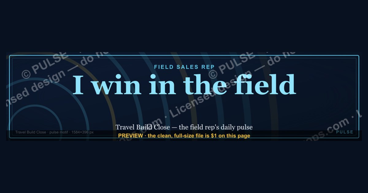
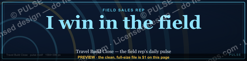
This is a LinkedIn profile banner sized 1584×396 px, built specifically for a Field Sales Rep. It carries a short role-and-territory headline (for example, "FIELD SALES REPRESENTATIVE — Northeast Region") in bold white sans-serif over a deep navy background, with a thin route-line motif suggesting territory coverage. Download the free PNG above and set it as your LinkedIn cover image to signal your role, focus, and territory at a glance.
What's on the banner and the two wording options
The banner is built from four layered elements, and every field sales rep using it should understand what each one is doing before swapping in their own words. Element one is the background field: a solid or subtly gradiented color block that fills the full 1584×396 canvas edge-to-edge, because LinkedIn stretches and crops any banner that doesn't fill the frame, leaving ugly white bars on wide monitors. Element two is the headline, set large — roughly 90 to 110 point in the rendered file — positioned in the right two-thirds of the canvas so it clears the circular profile photo that LinkedIn overlays on the bottom-left corner. Element three is a subhead line, smaller and lighter in weight, that carries the specific detail (territory, quota tier, or specialty) under the bold role title. Element four is a graphic motif — in this design, a thin dotted or dashed line evoking a driving route or map path — that reinforces "field" without needing a literal photo of a car or road, since photographic backgrounds tend to fight with text legibility at banner scale.
There are two wording options built into this template, and a field sales rep should pick based on what a profile visitor needs to know first. Option A is the Role + Territory layout: the headline reads "FIELD SALES REPRESENTATIVE" and the subhead names the specific region or vertical, such as "Southeast Region — Industrial Equipment." This version is best when your title alone is ambiguous — a lot of companies use "Field Sales" loosely, and a recruiter or prospect scanning a search results page benefits from immediately knowing which patch of the map or which vertical you cover. Option B is the Results-led tagline layout: the headline swaps to a short outcome-oriented phrase — for example, "Feet on the street. Deals in the pipeline." — with your actual job title and territory moved into the smaller subhead line instead. This version works better for reps who are more focused on personal branding and top-of-funnel visibility (prospecting via LinkedIn, building an inbound reputation) than on being found by internal recruiters searching by exact job title.

Both options share the same navy-and-white base palette so they read as one family, but Option A is more literal and scannable in half a second, while Option B is more memorable and gives a stronger first impression on a cold profile visit — the trade-off is discoverability versus personality, and it's worth thinking about which one matters more for how you actually use LinkedIn day to day.
How to decide which version fits your LinkedIn profile
The decision mostly comes down to who looks at your profile and why. If most of your profile traffic comes from recruiters, hiring managers, or internal mobility searches inside your own company — people actively searching by job title, region, or industry keyword — the Role + Territory option (Option A) wins, because LinkedIn's search and the human eye both key on the literal words first. If most of your profile traffic comes from prospects, partners, or your own outbound activity — people who already know your name and are checking you out after a call or an InMail — the Results-led tagline (Option B) wins, because it does more work building rapport and personality in the three seconds before they scroll to your experience section.
A second factor is how crowded your title is in your market. "Field Sales Representative" is an extremely common title, and if your industry has hundreds of reps with the identical headline, a plain Role + Territory banner blends into the wallpaper. In that case, even a recruiter-facing profile benefits from a distinguishing tagline paired with the territory detail moved to the subhead — you get discoverability from your actual headline field (the text field under your name, which is indexed separately from the banner image) while the banner itself does the differentiation work.
A third, smaller factor is how often your territory or title actually changes. Field Sales roles get re-territoried more than almost any other sales function — a rep might move from a regional patch to a named-account list, or absorb a neighboring territory after a resignation. If that kind of change happens more than once a year for you, lean toward Option B, because updating a tagline banner only means re-rendering the graphic, while a Role + Territory banner effectively goes stale (and slightly misleading) the moment your patch changes, and stale territory claims on a public profile are the kind of small credibility ding that's easy to avoid.
The exact specs and numbers behind each option
LinkedIn's banner canvas is a fixed 1584 pixels wide by 396 pixels tall — an exact 4:1 aspect ratio — and that number does not change based on which option you pick; both Option A and Option B are exported at the same 1584×396 PNG dimensions so the file drops in without LinkedIn re-cropping it unexpectedly. The safe zone that both layouts respect is the bottom-left circle, roughly 200 pixels in diameter on desktop, where your profile photo overlaps the banner — text or logo elements should not sit inside that circle or within about 20 pixels of its edge, or they get visually clipped by the photo.
For Option A, the headline text sits at roughly 96pt in the master file, set in a bold sans-serif (the kind of weight that reads clearly even when LinkedIn's feed and search thumbnails render the banner at a fraction of its native size), with the subhead at about 40pt — a size ratio of a little under 2.5:1 between headline and subhead, which keeps the hierarchy obvious without the subhead disappearing. For Option B, the tagline headline runs slightly smaller, around 84pt, because taglines tend to run longer than a job title and need room to breathe across the wider two-thirds of the canvas, with the job-title-plus-territory subhead at around 32pt underneath it.

Color-wise, the base navy is a deep, near-black blue (roughly hex #0A1F44), chosen because it renders as "professional" rather than "flashy" across every device and doesn't clash with LinkedIn's own blue chrome around the profile header. Headline text runs pure or near-pure white for maximum contrast against that navy — well above the 4.5:1 contrast ratio that's the general accessibility baseline for text-on-background legibility — and the route-line motif and any accent details use a muted gold (roughly hex #C9A227) at low opacity so it reads as texture, not competing content. One more number worth knowing: LinkedIn's mobile app crops the banner more aggressively toward the center than the desktop view does, so both options deliberately keep their most essential words — the role title in Option A, the tagline in Option B — within the middle third of the 1584-pixel width rather than pushed all the way to either edge.
Downloading, customizing, and installing the banner
Getting this banner live on your profile is a short, linear sequence, and skipping a step is the most common reason a downloaded banner looks wrong once it's live. Start by downloading the PNG directly from the top of this page — it's already rendered at the correct 1584×396 dimensions, so you do not need to resize anything before uploading. If you want to customize the wording (swap in your own territory name, region, or a different tagline), open the file in any editor that supports layered PNGs or, more simply, recreate the layout in a free design tool and match the same canvas size, font weights, and the navy/white/gold palette described above so the result still reads as a coherent, professional graphic rather than a mismatched patchwork.

Once you have the final file, go to your LinkedIn profile, click the pencil/edit icon on your current cover photo area (or the camera icon if you have no banner set yet), and upload the new file. LinkedIn will show you a crop preview — because the upload tool sometimes offers a slightly different aspect ratio window than the raw 1584×396, use that preview to confirm your headline text isn't sitting right at the crop edge before you save. After saving, check how the banner renders in both the desktop view and the LinkedIn mobile app specifically, since — as covered above — the mobile crop is tighter, and a headline that looked perfectly centered on desktop can occasionally sit closer to one edge on a phone screen.
The last step, and the one people skip most often, is aligning the small text "headline" field under your name (the one LinkedIn actually indexes in search) with whatever your banner says. If your banner reads "Field Sales Representative — Southeast Region" but your headline field still says something generic from three jobs ago, you've built a nice graphic that contradicts the text next to it — take thirty seconds to update that field in the same sitting so the banner and the headline tell one consistent story.

Related questions
Can I use this banner if my title isn't exactly "Field Sales Representative"?
Yes — the layout works for any field-based sales title (Territory Manager, Outside Sales Rep, Regional Account Executive). Just swap the headline text to match your actual title; keep the same font weight and navy/white palette so the design stays intact.
Does a LinkedIn banner actually affect who views your profile?
There's no way to fabricate a hard number here, but a banner that clearly states your role and territory reduces ambiguity in the first few seconds a visitor spends on your profile, which is the same logic behind any clear above-the-fold messaging.
Should the banner match my company's brand colors instead?
If your employer has a strict personal-branding policy, defer to that. Otherwise, a personal navy/white/gold palette tends to travel with you between employers, which matters more for field reps who change territories or companies more often than desk-based roles.
What file format and size does LinkedIn require?
LinkedIn accepts PNG or JPG for the banner image, with a practical file size cap in the low single-digit megabytes; the PNG on this page is already sized and compressed to fit comfortably within that limit.
Can I put my phone number or email directly on the banner?
It's technically possible but not recommended — banners get cropped differently across devices, and small contact text risks becoming illegible or getting clipped; keep contact details in your "Contact info" section instead.
FAQ
What exact dimensions does this LinkedIn banner use? 1584 pixels wide by 396 pixels tall, LinkedIn's standard fixed banner size, exported as a PNG so it drops straight into the upload tool without additional resizing.
Why is there a blank-feeling area on the bottom left of the design? That space is intentional — it's the safe zone reserved for your circular profile photo, which LinkedIn overlays on top of the banner in that exact corner on both desktop and mobile.
Is the route-line graphic required, or can I remove it? It's a design accent, not a functional element — you can remove or simplify it if you prefer a plainer background, as long as you keep enough contrast for the headline text to stay legible.
Which of the two wording options should a brand-new field sales rep pick? Default to Option A (Role + Territory) when you're new to a territory and want to be found and correctly identified quickly; switch to Option B once you have an established reputation and want the banner to do more personality-driven work.
Will this banner look right if I only fill in a job title with no territory? Yes — the subhead line can carry a specialty or vertical instead of a geographic territory (for example, "Medical Device Sales" instead of a region name) if that's a more accurate way to describe your coverage.
How often should a field sales rep update this banner? Update it whenever your territory, title, or region changes in a way that would make the current text inaccurate — for most field reps that's roughly once a year, sometimes sooner after a reorg.
Sources
- https://www.linkedin.com/help/linkedin/answer/a541912
- https://business.linkedin.com/marketing-solutions/success/best-practices/linkedin-profile-best-practices
- https://www.canva.com/create/linkedin-banners/
- https://www.hubspot.com/linkedin-banner-size
- https://www.adobe.com/express/create/banner/linkedin
- https://www.webfx.com/social-media/learn/linkedin-image-sizes/
- https://sproutsocial.com/insights/linkedin-image-sizes/
Related on PULSE
- What should a field sales rep's LinkedIn headline say?
- How to structure a LinkedIn profile for outside sales roles
- Best LinkedIn banner practices for account executives
- How often should sales reps update their LinkedIn profile?
- LinkedIn profile photo guidelines for sales professionals
This page will be disappearing soon. Save it to your device for $1 — or read it free while it is here.
@Kory-White- · if Venmo asks, the last 4 of my number are 2012
This page is gone.
This one is off the shelf now. $1 keeps it on your phone for good — the whole page, pictures and diagrams included.
 graphicWin the day. — LinkedIn Wallpaper
 graphic“Great reps are coached, not born.” — LinkedIn Banner
 graphicSales Recruiter — LinkedIn Banner
 graphicOffensive Security Pentest CRO — LinkedIn Banner
 graphic“More pipeline, less panic.” — LinkedIn Banner
 graphic“Champions are made before the call.” — LinkedIn Banner
 graphic“Open to sales leadership roles.” — LinkedIn Banner
 graphicCustomer Success — LinkedIn Banner
 graphicWhat criteria should I use to choose a graphics design tool for sales presentations in 2027?
 graphic“Looking for my next quota.” — LinkedIn Banner