
“Champions are made before the call.” — LinkedIn Banner
 Curated byKory White · Fractional CRO · Maryland
 PULSEKNOWLEDGE LIBRARY
Quality
Certified
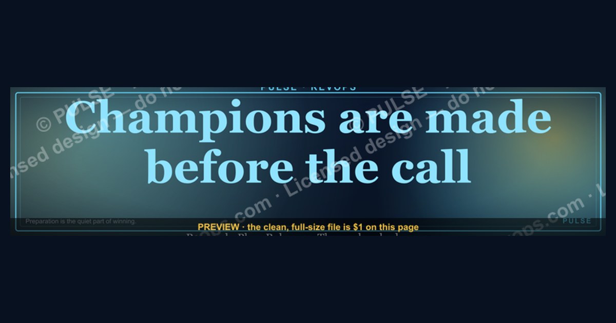
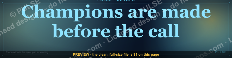
This is a LinkedIn profile banner (1584×396px) that reads "Champions are made before the call." in gold serif type, centered on a matte charcoal-black field with a thin double-rule border framing the edges. It's built for sales reps, SDR leads, and coaches who want their profile to open on a discipline-and-preparation message before a prospect ever scrolls down to a headline or About section.
The two layout options compared
The download page offers two versions of the same LinkedIn Banner, and the difference between them is deliberate rather than cosmetic — each one is tuned for a different spot on the funnel of "who is looking at this profile and why."
Option A — Quote-only, centered. This is the cleaner of the two. The full line, "Champions are made before the call.", sits dead-center on the canvas in a serif display face (something in the Playfair or Freight Display family reads correctly at this scale), set in a warm gold (roughly #C9A227 on a #0B0B0C ground) so it survives LinkedIn's automatic compression without turning muddy. Above and below the quote is a hairline double rule — two 1px gold lines with about 6px of black between them — that keeps the text from feeling like it's floating in empty space on the wide 4:1 aspect ratio. There is no attribution line, no logo, no company name. This version is meant for an individual contributor: an AE, an SDR, a closer who wants the banner to read as a personal philosophy, not a corporate asset.

Option B — Quote plus role subline. Same typography, same gold-on-black palette, same double-rule frame, but a second line sits below the quote in a smaller, lighter-weight sans (roughly 40% the point size of the headline) carrying a role or team tag — something like "SALES DEVELOPMENT · PRE-CALL DISCIPLINE" in letter-spaced small caps. This version exists because managers and team leads asked for a way to brand the banner to a specific function without turning it into a full company ad. It reads as "this is the standard this team holds," which is a different message than the individual version's "this is how I operate."
The choice between them isn't about which looks better — both are built from the same file and the same color system, so visually they're siblings. It's about audience. A rep whose profile gets visited mostly by prospects and hiring managers benefits from the quieter Option A, because it reads as a personal value statement. A team lead whose profile gets visited by their own reps, by recruiters sourcing for the team, or by peers benchmarking sales culture benefits from Option B, because the subline does the work of saying "this is a team, not just a person" without needing a paragraph of About-section copy to explain it.
There's a secondary consideration worth naming: turnover. Option A travels with the person — if they change roles or companies, the banner still makes sense because it never named an employer or team. Option B is tied to a function, so it needs to be swapped the moment the role tag stops being accurate (a rep promoted from SDR to AE, for instance, should not keep a banner that still says "SALES DEVELOPMENT").
How to decide between them
A quick way to settle the decision without overthinking it: picture the last five people who looked at this profile before an inbound message, a connection request, or a job inquiry. If most of them were external — prospects doing pre-call research on you, or a hiring manager scanning your history — Option A is the better fit, because it needs no context to land; the line stands on its own. If most of them were internal — a rep on your team checking in, a peer manager comparing notes, a recruiter pulling a slate of candidates from the same org — Option B earns its keep, because the subline gives them one extra data point (what team, what discipline) that the quote-only version deliberately withholds.
There's also a simpler tell: job title. Anyone with "Manager," "Lead," "Director," or "Head of" in their current title is almost always better served by Option B, because their profile is doing double duty as a recruiting signal for their team, not just a personal one. Individual contributors without a direct-report line under them are almost always better served by Option A.
One more branch worth building into the decision that the diagram above doesn't show: if you're unsure, default to Option A. It's the lower-commitment choice — nothing about it needs to be updated when your role changes, your team gets renamed, or you move companies. Option B is the higher-commitment choice, and it should only be picked when the subline is actually adding information a viewer would otherwise be missing.
Specs and numbers behind each version
The file itself follows LinkedIn's current cover-image guidance, which matters because a banner that doesn't match spec gets stretched, cropped oddly, or rejected outright on upload:
- Canvas size: 1584 × 396 px, a 4:1 aspect ratio. This is LinkedIn's recommended size for the desktop banner; LinkedIn will accept smaller images (their stated minimum is 1192 × 268 px) and upscale them, but text that's crisp at 1584×396 turns soft when the platform has to stretch a smaller source file, so start at full size.
- File format and weight: exported as PNG for the crispest edges on the serif type and the hairline rules (JPG introduces compression artifacts right along thin gold strokes on a dark field, which is the worst possible combination for this design). LinkedIn's file-size ceiling is 8MB; this banner, as a mostly-flat-color PNG with limited color range, comes in well under 1MB, so there's no compression trade-off to make.
- Safe zone: the bottom-left corner of the desktop banner sits behind the profile photo circle, which on desktop is roughly 200×200px, positioned about 24px from the left edge and vertically centered on the seam between banner and profile body. Both Option A and Option B keep all text centered horizontally and vertically within the full canvas, which naturally clears that corner — but if you customize the wording and it runs long, check that corner specifically before uploading.
- Mobile crop: LinkedIn's mobile app shows a narrower slice of the same banner — effectively a center crop that loses roughly the outer 15-20% of the left and right edges compared to desktop. Because the quote in both versions is centered with generous side margins (roughly 12% of canvas width per side, before any text starts), it survives that mobile crop intact; the double-rule frame is the part most likely to get trimmed at the edges on a phone, which is an acceptable loss since it's a decorative border, not content.
- Type scale: at 1584×396, the quote headline sits around 72-80pt equivalent for Option A, dropping to roughly 64-70pt for Option B to make room for the subline underneath, which itself runs about 26-28pt in the letter-spaced small caps treatment.
- Color values: the gold used across both versions is a warm, slightly desaturated gold rather than a bright yellow-gold, specifically because bright gold on pure black tends to vibrate or halo when LinkedIn's CDN re-compresses an uploaded image; a desaturated gold in roughly the #C0A030 to #D4AF37 range holds its edge better after that re-compression pass.
Installing it and sequencing your profile
The sequencing matters more than it looks like it should, because LinkedIn's own crop-and-reposition tool at upload time is where most banners go visibly wrong. The steps, in order:
- Download the PNG for whichever option you settled on above. Keep it at native 1584×396 resolution — don't resize it in a photo editor first, since LinkedIn's uploader does its own scaling and a pre-resized file just adds an extra, unnecessary compression pass.
- Check the corner before uploading. Open the file and zoom to the bottom-left region where your profile photo will sit. Because both versions are centered, this should already be clear, but it's the one spot worth a manual look, especially if you've customized the wording.
- If you've customized the subline or swapped in your own line entirely (see the note on customization below), re-check that the new text still sits inside roughly the center 76% of the canvas width. Text that runs edge-to-edge risks getting clipped on the mobile crop described above.
- Upload through LinkedIn's own flow: from your profile, click Edit intro (or the pencil icon near your photo), then the camera icon on the banner area itself, then Upload photo. LinkedIn gives you a crop-and-reposition preview before you save — because the source file is already exactly 4:1, you shouldn't need to adjust anything in that preview, but it's worth glancing at rather than blindly confirming.
- Verify on both surfaces. Open your live profile on desktop and in the mobile app separately. This banner is designed to survive both, but any custom edits you made should be checked on both, not just the one you happen to be looking at when you upload.
- Consider the ripple effect on the rest of the profile. A banner this declarative works best when it isn't contradicted by the two lines directly below it — your headline and the first sentence of your About section. It doesn't need to repeat the banner's message, but a headline that reads purely as a job title ("Account Executive at [Company]") sitting under a banner about pre-call discipline is a missed connection; even a small nod ("Account Executive — I run every call prepped, not winged") ties the two together without being redundant.
Customizing the wording, colors, or role tag
Because this is a template graphic rather than a locked asset, the layout tolerates reasonable customization without breaking. For teams building their own version:
- Swapping the quote itself: the layout was built around a single sentence in the 30-40 character range. Shorter lines just get more breathing room around them at the same point size; longer lines (anything past roughly 55-60 characters) need the point size dropped, or they'll start crowding the safe margins described above. Keep it to one sentence — a two-sentence quote breaks the vertical centering this design relies on.
- Swapping the subline (Option B): the role tag is meant to be short and structural — a team name, a discipline, a quarter or cohort marker — not a second quote. "SALES DEVELOPMENT," "ENTERPRISE AE TEAM," or "Q4 2026 COHORT" all fit the intended tone; a full clause under the headline tends to compete with it rather than support it.
- Swapping the palette: gold-on-black is the default because it reads as premium and holds contrast well after LinkedIn's compression, but the same layout with the same margins works in other combinations — a deep navy field with a warm white or light-gold text, for instance, keeps the same "quiet confidence" register without being a literal palette copy. What doesn't translate well: high-saturation brand colors (a bright company blue or red) directly on black, since they tend to either wash out or buzz visually at this aspect ratio — better to use a brand color as the text color against a near-black or near-white ground rather than mixing multiple saturated colors.
- Team rollout: if a manager wants every rep on a team using a matching banner, the cleanest approach is producing one Option B file with the team's name locked in, distributing that single PNG, and leaving individual quote text alone — that keeps visual consistency across the team's profiles without asking each rep to redesign anything themselves.
The message behind it — and when it backfires
The line itself is a preparation argument dressed as a motivational one: the idea that outcomes on a sales call are mostly decided by research, agenda-setting, and rehearsal done beforehand, not by improvisation once the call starts. As a banner, it functions as a standing reminder every time the rep opens their own profile, and as a small signal to anyone else who lands on the page — a prospect doing reciprocal research before a meeting, a hiring manager evaluating how a candidate presents themselves, a peer sizing up team culture.
It works best in a few specific situations: for reps or teams where pre-call prep genuinely is the differentiator being coached on — where the banner reinforces a real behavior already being built through call-prep checklists, account research routines, or pre-call huddles, rather than standing in for those things. It also works well as a recruiting signal, since candidates evaluating a sales org often read banners and headlines as a proxy for culture before they ever get a job description.
It backfires in two specific ways worth naming plainly. First, if the profile's actual activity contradicts it — a rep who's visibly winging calls, showing up late, or has a pattern of no-shows on their own scheduled meetings — the banner reads as aspirational at best and ironic at worst to anyone who's actually worked with them. A banner claiming a discipline the person doesn't practice is worse than no banner at all, because it invites the comparison. Second, it can read as slightly stiff or corporate-slogan-like to prospects who prefer a more personal, less polished profile presence — for some audiences (particularly earlier-career buyers, or industries where informality is the norm), a banner that reads like a framed poster in an office can undercut the approachability a rep is otherwise trying to project. In those cases, Option A's quieter, quote-only treatment is the safer choice over Option B's more declarative team-standard framing, since it reads more like a personal note-to-self than a corporate mandate.
Related questions
What size should a LinkedIn banner be?
1584×396px is LinkedIn's recommended desktop size (4:1 ratio). The platform accepts smaller files down to roughly 1192×268px and upscales them, but starting at full resolution keeps text and fine details sharp after LinkedIn's own compression.
Does a LinkedIn banner affect profile views or connection acceptance?
LinkedIn doesn't publish banner-specific performance data, so no verified number exists either way. What's reasonable to say: a banner is one of the first visual elements a visitor sees, so a clear, on-brand one supports the impression the rest of the profile is trying to make.
Should my banner match my company's brand colors?
Not necessarily. A personal banner (like Option A here) can carry its own tone distinct from company branding; a team-facing banner (like Option B) benefits more from at least a nod to team or company identity, since its audience is more internal.
How is a personal-brand banner different from a corporate one?
A personal banner reflects an individual's stated philosophy or value and travels with them between roles. A corporate or team banner is tied to a function or employer and should be retired or swapped the moment that affiliation changes.
Can I use this banner if I'm not in sales?
Yes — the underlying message (preparation drives outcomes) generalizes to any role built around scheduled conversations: recruiting, customer success, consulting, or account management all fit the same logic.
FAQ
"Champions are made before the call." — LinkedIn Banner This is the caption and core text of a downloadable 1584×396px LinkedIn profile banner, rendered in gold serif type on a matte black field with a thin double-rule frame. It's offered in two layouts — a quote-only version and a version with a small role subline beneath the quote.
What file format should I download? PNG. It preserves the crisp edges of the serif type and the hairline gold rules far better than JPG would at the same file size, and the finished file sits well under LinkedIn's 8MB upload limit either way.
Can I edit the wording myself? Yes. The layout tolerates a shorter or longer quote (roughly 30-60 characters works best before the point size needs adjusting) and a customized role subline on the Option B version. Keep it to a single sentence — the vertical centering is built around one line, not two.
Will it look right on mobile? Yes, with one caveat. LinkedIn's mobile app shows a center-cropped slice of the banner that trims roughly the outer 15-20% of each side. Because both versions keep text centered with generous margins, the wording survives that crop; the decorative border may get trimmed slightly, which is expected.
Does the banner cover my profile photo? No — both layouts keep all text and rules clear of the bottom-left corner where the profile photo circle sits on desktop, so nothing gets obscured or crowded.
How often should I refresh a banner like this? There's no fixed schedule. The natural trigger points are a role or title change (especially for the Option B team-subline version, which should be updated or swapped immediately if the team name changes) or simply wanting a refreshed first impression after a long stretch with the same one.
Sources
- https://www.linkedin.com/help/linkedin/answer/a541912
- https://www.linkedin.com/business/marketing/blog
- https://www.canva.com/create/linkedin-banners/
- https://sproutsocial.com/insights/social-media-image-sizes-guide/
- https://blog.hootsuite.com/social-media-image-sizes-guide/
- https://blog.hubspot.com/marketing/linkedin-profile-optimization
- https://www.adobe.com/express/create/linkedin-banner
Related on PULSE
- The pre-call research checklist top reps actually use
- How to build a discovery-call prep routine that scales across a team
- LinkedIn headline formulas for SDRs and AEs
- More downloadable LinkedIn banners for sales teams
- What to put in your About section as a quota-carrying rep
- How sales managers brand a team's LinkedIn presence without a company logo
This page will be disappearing soon. Save it to your device for $1 — or read it free while it is here.
@Kory-White- · if Venmo asks, the last 4 of my number are 2012
 graphicHow to build a champion seller playbook in 2027
 graphicComputer Vision Engineer — LinkedIn Banner
 graphic“Sell with the buyer, not at them.” — LinkedIn Banner
 graphic"Win the quarter." — LinkedIn Banner
 graphicHow to design a LinkedIn banner that converts viewers into leads in 2027?
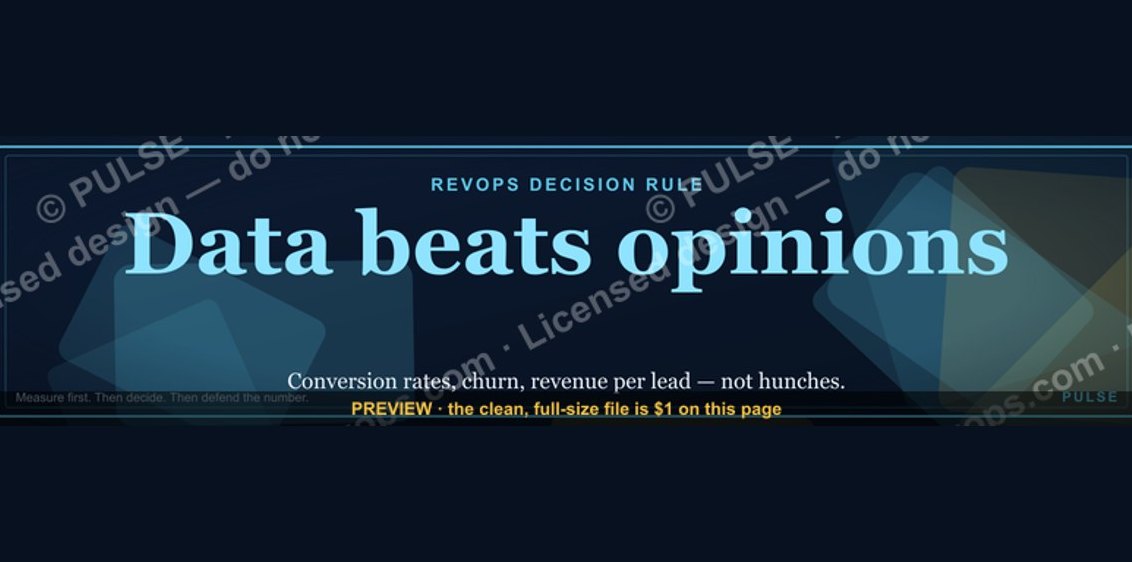 graphic“Data beats opinions.” — LinkedIn Banner
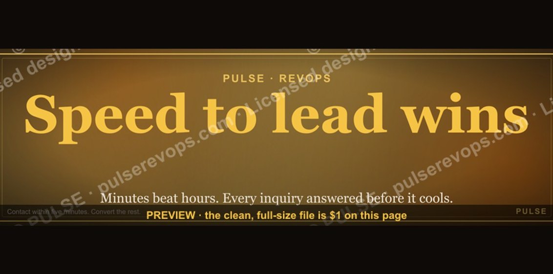 graphicSpeed to lead wins. — LinkedIn Wallpaper
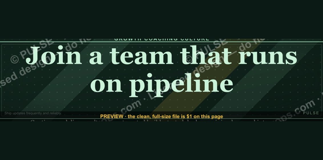 graphic“Join a team that runs on pipeline.” — LinkedIn Banner
 graphicHow to build a champion champion plan in 2027?
 graphic“Sell the future, not the feature.” — LinkedIn Banner